New Instagram Thumbnail Size and Design Tips 2024
Learn the updated 2024 Instagram thumbnail sizes, aspect ratios, and expert design tips to create high‑impact previews that boost engagement.

New Instagram Thumbnail Size and Design Tips 2024
In 2024, Instagram continues to dominate as a visual-first social media platform, making thumbnail optimization a non‑negotiable for content success. The new Instagram thumbnail size requirements and cutting‑edge design tips can help creators, brands, and marketers boost engagement and attract clicks in increasingly competitive feeds. This article explores ideal dimensions, aspect ratios, design strategies, tools, and common mistakes—so you can create thumbnails that stop the scroll.
---
What Is an Instagram Thumbnail?
An Instagram thumbnail is a smaller preview image representing your post before a user taps it. It appears in key areas such as:
- Feed – Displays when followers scroll their timelines.
- Profile Grid – Your gallery on the profile page.
- Reels Tab – Covers for Reels in profile and Explore feed.
- Stories Highlights – Circular icons above the profile grid showing saved Stories.
Thumbnails are your first impression—no matter how stunning the original content, it’s the preview that earns the initial click.
---
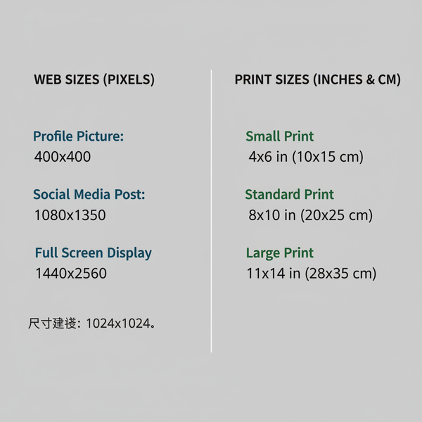
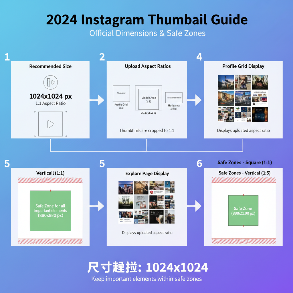
Official Instagram Thumbnail Sizes (2024)
Instagram optimizes thumbnails based on content type and placement. To keep images sharp and clear, upload at or near these official resolutions:
| Content Type | Recommended Dimensions (px) | Aspect Ratio |
|---|---|---|
| Feed Posts (Square) | 1080 × 1080 | 1:1 |
| Feed Posts (Portrait) | 1080 × 1350 | 4:5 |
| Feed Posts (Landscape) | 1080 × 566 | 1.91:1 |
| Reels Cover | 1080 × 1920 | 9:16 |
| Stories Highlights Cover | 200 × 200 | 1:1 (Circle Crop) |
Pro Tip: Even though thumbnails display smaller (for example, ~161px in the profile grid), upload at maximum recommended resolution to avoid clarity loss from Instagram's compression.
---
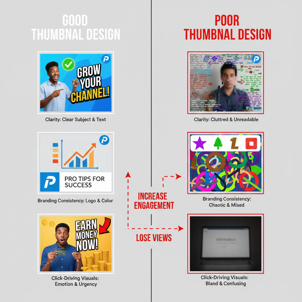
Best Practices for High-Quality Thumbnail Creation
Small screen attention spans demand instantly appealing visuals. Apply these principles:
- Central Focus – Keep the main subject centered; eliminate unnecessary clutter.
- Bold Colors & Strong Contrast – Stand out in feeds dominated by white or muted tones.
- Readable Text Overlays – Use large, clear fonts with contrasting colors to remain legible.
- Consistent Lighting – Balanced light keeps images professional and appealing.
- Crop Awareness – Maintain safe zones so auto‑cropping doesn’t cut out key details.
---
Choosing the Right Aspect Ratio
Aspect ratio choice directly affects how your thumbnail is displayed and clicked:
- Square (1:1) – Uniform look in profile grids and feeds.
- Portrait (4:5) – Takes up vertical space in feeds, encouraging engagement.
- Vertical Full (9:16) – Required for Reels and Stories, fills mobile screens.
- Circle Crop – Used for highlight covers; design within a central safe zone.
---
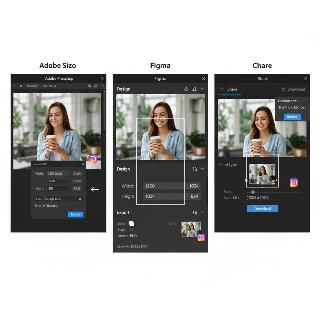
Tools to Resize and Crop for Instagram
Ensure your thumbnails meet the new Instagram thumbnail size standard with reliable tools:
- Canva – Ready‑made templates sized for Instagram.
- Adobe Express – Precise pixel and export quality control.
- Figma – Collaborative design for consistent assets.
- Snapseed – Quick mobile cropping and enhancement.
- Photoshop – Advanced adjustments for professional needs.
Always start from a high‑resolution image to reduce compression‑related quality loss.
---
Designing Thumbnails That Drive Clicks
Thumbnails act as headlines for your content. Design for maximum impact:
- Use Faces & Emotion – Draw human curiosity.
- Minimal Text, Big Impact – Short titles or key phrases work best.
- Leverage Brand Colors – Builds recall through consistency.
- Strong Composition – Employ rule of thirds, leading lines, or symmetry.
- Hint at a Story – Spark intrigue without full reveal.
Example design workflow:
1. Select high-quality base image.
2. Crop to recommended Instagram size.
3. Apply brand typography and text overlay.
4. Adjust brightness and contrast for mobile clarity.
5. Preview across device types before posting.
---
Tips for Consistent Branding
Consistency builds trust and recognisability:
- Fixed Color Palette – Limit to 2–3 core brand colors.
- Standard Fonts – Keep text style uniform.
- Logo Positioning – Place consistently to reinforce branding.
- Repeat Filters – Signature filters unify the feed look.
- Series Style – Maintain layout for posts in a thematic series.
---
Common Thumbnail Design Mistakes
Watch for pitfalls that reduce engagement:
- Tiny Text – Be sure fonts remain legible on small screens.
- Over‑Compression – Avoid excessive image compression.
- Cluttered Layouts – Minimalism often wins.
- Ignoring Safe Zones – Protect essential elements from auto‑cropping.
- Mismatched Sizes – Disjointed grids lower perceived quality.
---
How Thumbnail Size Impacts Engagement
Exact sizing influences:
- Visibility – Proper resolution avoids distortion and retains attention.
- Clarity – Sharp imagery keeps viewers interested longer.
- Click‑Through Rates – Eye‑catching visuals invite clicks.
- Retention for Video – Strong covers encourage full viewing.
---
Future‑Proofing Your Thumbnail Strategy
Stay ahead of Instagram UI updates and device improvements:
- Design Larger – Double recommended resolution for flexibility.
- Keep Source Files Layered – Easier resizing for new formats.
- Monitor Industry News – Check official Instagram creator updates.
- Test New Features Early – Join beta programs to adapt quickly.
- Consider AR/VR – Emerging tech may alter future thumbnail strategies.
---
Summary
The new Instagram thumbnail size is a key factor for visibility and engagement in 2024. By mastering recommended dimensions, aspect ratios, and proven design techniques—and by avoiding common mistakes—you can consistently produce thumbnails that stop the scroll and drive results. Elevate your profile by applying these tips today and watch your click‑through rates grow.
Call to Action: Start redesigning your next Instagram thumbnail using the exact dimensions above and track your engagement improvements.