What Is the Normal Size for Photos? A Practical Guide for Print, Web, and Social Media
Understand what normal photo size means—pixels, aspect ratio, PPI, and file size—and get quick rules and export dimensions for sharp print, web, and social.

Choosing the right “size” for a photo depends on where it will live: in a frame, on a blog, or across social media. This formatting-first guide clarifies how physical dimensions, pixel counts, aspect ratios, and file sizes work together so your images look sharp, crop cleanly, and load quickly. Use the quick rules, tables, and examples to export confidently for print, web, and each major platform.
What Is the “Normal Size for Photos”? A Practical Guide for Print, Web, and Social Media
“Normal size for photos” can mean very different things depending on whether you’re printing a family portrait, posting a travel shot to Instagram, or prepping banners for a homepage. The right choice prevents blurry prints, awkward crops, and slow-loading pages. This guide breaks down what “size” really means, how aspect ratios map to real-world outputs, and the practical dimensions that work across print, web, and social.
What “Size” Really Means
When people ask for the normal size for photos, they usually mean one of four different measurements. Knowing which one matters for your purpose is half the battle.
- Physical dimensions: The width and height measured in inches or centimeters (e.g., 8x10 inches, 10x15 cm). This is what you choose at a photo lab or frame shop.
- Pixel dimensions: The number of pixels along the width and height (e.g., 2400x3000 px). This determines on-screen sharpness and print resolution.
- Aspect ratio: The shape of the image, expressed as W:H (e.g., 3:2, 4:3). Aspect ratio affects whether a photo fits a frame or needs cropping.
- File size: The storage size (KB/MB). Smaller files load faster on the web; larger files can preserve more detail.
Choosing the right combination avoids:
- Blurry or soft prints (too few pixels for the print size).
- Cropped edges (mismatched aspect ratios).
- Slow webpages and apps (oversized files or pixel dimensions).
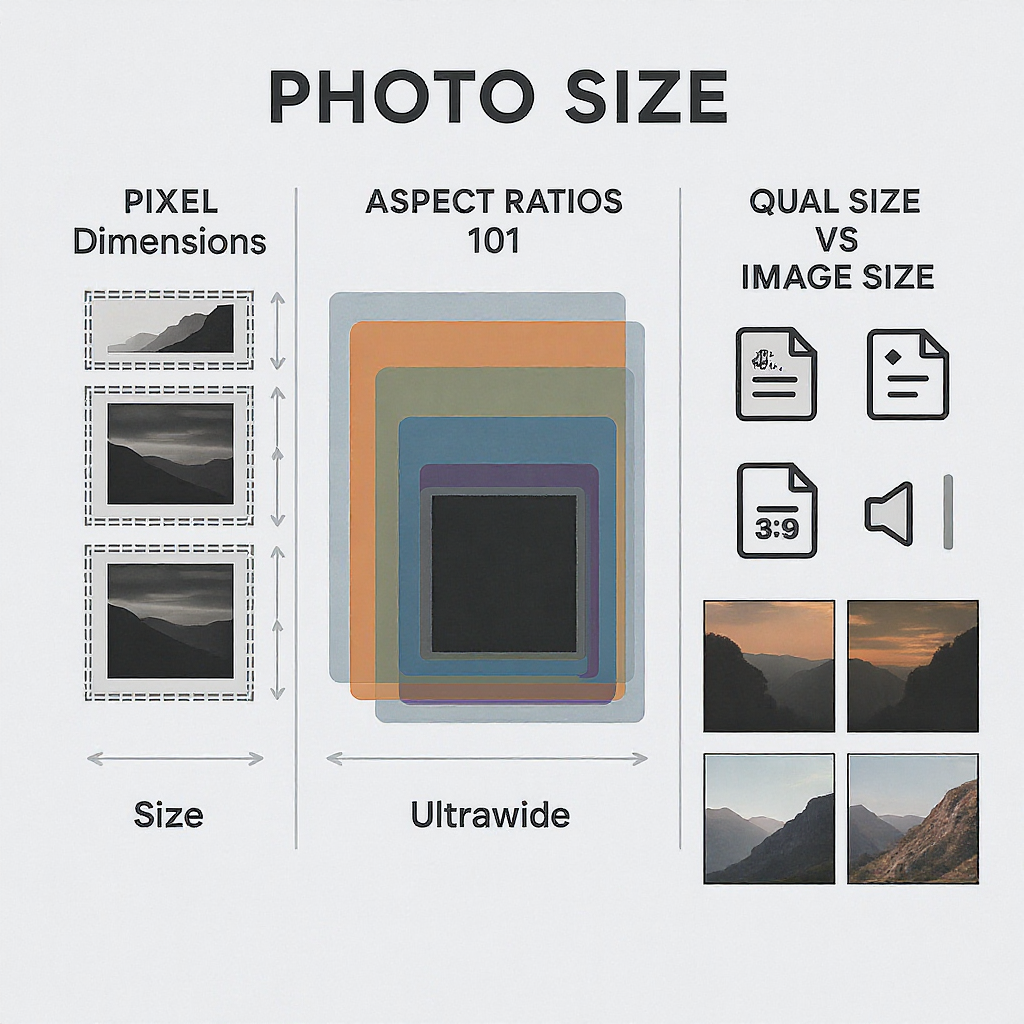
Aspect Ratios 101
Common aspect ratios and where they come from:
- 3:2: Many DSLRs and mirrorless cameras. Perfect fit for 4x6 in prints and 12x18 in wall art.
- 4:3: Many phones and Micro Four Thirds cameras. Fits 8x10 poorly; often needs cropping for standard frames.
- 1:1: Square. Popular on Instagram.
- 16:9: Widescreen video and modern displays; great for web hero banners, YouTube thumbnails, and slides.
Why it matters:
- A 3:2 image fits 4x6 in prints perfectly, but an 8x10 in print is 4:5 (not 3:2), so you must crop. If you composed tightly at the edges, you may trim off important details.
- Phones often default to 4:3; printing at 5x7 (7:5) or 8x10 (5:4) will require cropping.
Pro tip: Compose with safe margins. Keep critical content at least 3–5 mm (about 1/8–1/4 inch) inside the edges to survive lab crop tolerances, especially for borderless prints.
Common Print Sizes and When to Use Them
- 4x6 in (10x15 cm): Casual prints, photo albums, handouts.
- 5x7 in (13x18 cm): Gifts and small frames.
- 8x10 in (20x25 cm): Classic frame size; popular for portraits.
- 11x14 in (28x36 cm): Statement pieces and larger frames.
- 12x18 in (30x45 cm): Wall art that matches 3:2 directly.
- 16x24 in (40x60 cm): Larger wall art for living rooms and offices.
Regional notes:
- US and Canada jobs often use inches (4x6, 5x7, 8x10).
- Many regions use metric equivalents (10x15 cm, 13x18 cm, 20x30 cm).
- Some lab standards align with 3:2 or 4:3 “digital” sizes like 10x13 cm, 20x30 cm to reduce cropping.
Border vs borderless:
- Borderless prints usually overprint and trim; expect a small “bleed” area to be cut (often ~3 mm / 1/8 inch).
- If exact composition is critical, consider a small white border and disable lab auto-cropping.
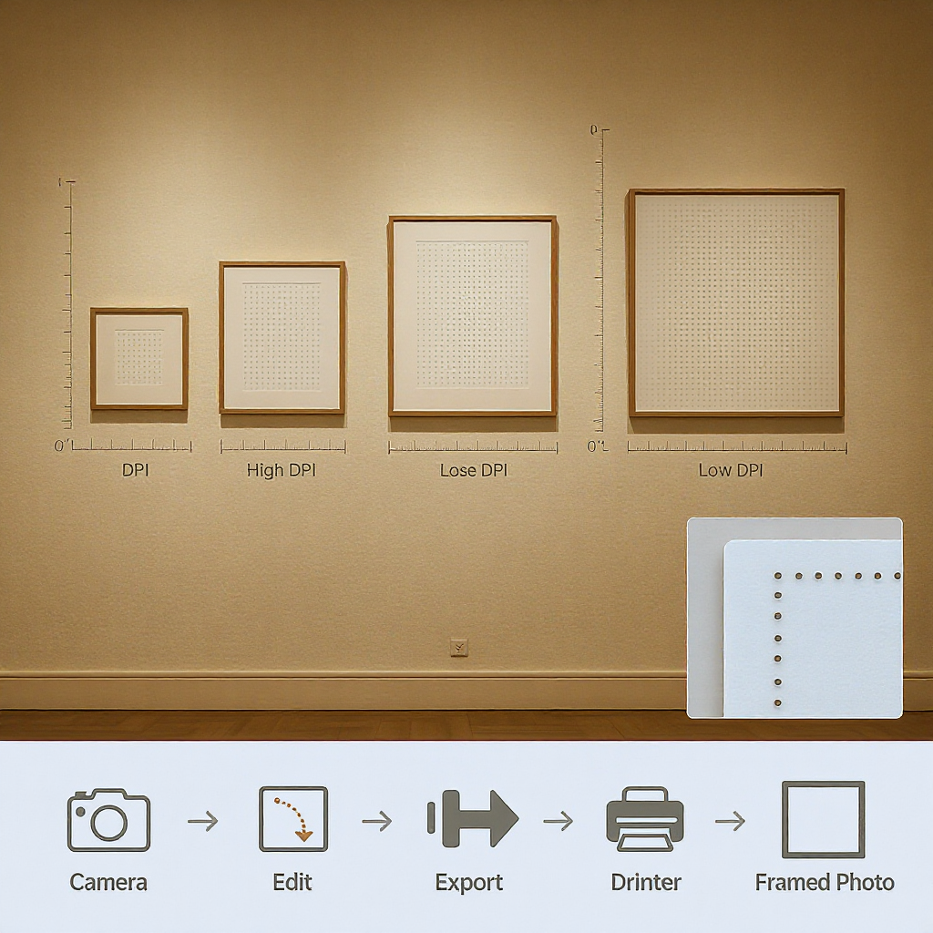
Recommended Pixel Dimensions for Sharp Prints
300 PPI (pixels per inch) is a safe “gold standard” for excellent prints held at arm’s length. Larger wall art viewed from farther away can look great at 240 PPI or even ~200 PPI.
| Print size (in / cm) | Aspect ratio | 300 PPI (W x H px) | 240 PPI (W x H px) | Notes |
|---|---|---|---|---|
| 4x6 in (10x15 cm) | 3:2 | 1200 x 1800 | 960 x 1440 | Perfect match for 3:2 cameras |
| 5x7 in (13x18 cm) | 7:5 | 1500 x 2100 | 1200 x 1680 | Crop from 3:2 or 4:3 |
| 8x10 in (20x25 cm) | 5:4 | 2400 x 3000 | 1920 x 2400 | Common portrait size; requires crop from 3:2 / 4:3 |
| 11x14 in (28x36 cm) | 14:11 | 3300 x 4200 | 2640 x 3360 | Frame-friendly; mind edges when cropping |
| 12x18 in (30x45 cm) | 3:2 | 3600 x 5400 | 2880 x 4320 | Direct 3:2 output for wall art |
| 16x24 in (40x60 cm) | 3:2 | 4800 x 7200 | 3840 x 5760 | Looks fine at 200–240 PPI on walls |
Notes:
- Many minilabs print natively around 300–360 PPI; providing 300 PPI is typically ideal.
- For large canvases/posters viewed from several feet away, 200–240 PPI is usually indistinguishable from 300 PPI.
Quick calculation:
- Pixels needed = inches × desired PPI. For an 8x10 at 300 PPI: 8×300=2400 px by 10×300=3000 px.
The “Normal” Sizes for Websites and Blogs
For websites and blogs, pixel dimensions and file size dominate. A practical starting point:
- Content images (inside article columns): 1200–1600 px wide.
- Full-width hero banners: 1920x1080 (16:9) or up to 2560 px wide for high-density displays.
- Retina/HiDPI: Serve 2x pixel density via srcset to avoid blurriness on modern screens.
- Email newsletters: Most templates use ~600 px wide containers; export at 1200 px wide (2x) for retina readiness, then compress.
Responsive basics with srcset:
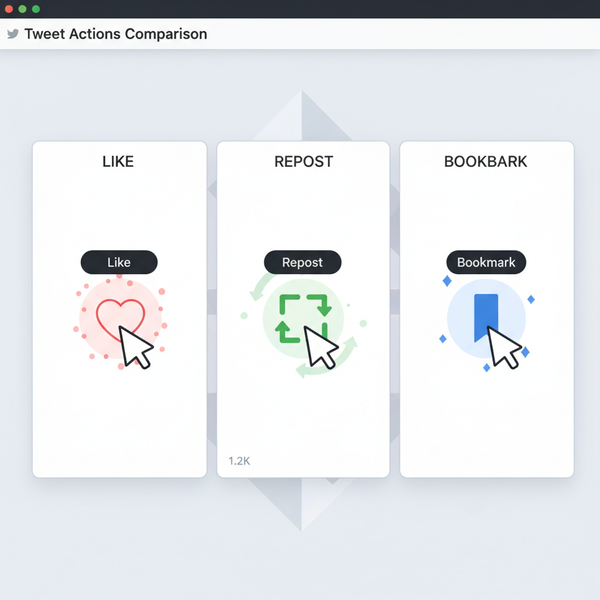
Social Media Image Size Cheat Sheet
Always check each platform’s latest recommendations; they do change. The sizes below are safe, commonly used dimensions that align with current aspect ratios.
| Platform | Use | Recommended Size | Aspect Ratio |
|---|---|---|---|
| Square post | 1080 x 1080 | 1:1 | |
| Portrait post | 1080 x 1350 | 4:5 | |
| Landscape post | 1080 x 566 | ~1.91:1 | |
| Stories / Reels | 1080 x 1920 | 9:16 | |
| Feed post (link/photo) | 1200 x 630 | ~1.91:1 | |
| Cover photo | 1640 x 624 | ~2.63:1 | |
| X (Twitter) | Post image | 1200 x 675 | 16:9 |
| X (Twitter) | Header | 1500 x 500 | 3:1 |
| Post image | 1200 x 1200 or 1200 x 627 | 1:1 or ~1.91:1 | |
| Standard Pin | 1000 x 1500 | 2:3 | |
| YouTube | Thumbnail | 1280 x 720 | 16:9 |
Tip: Keep crucial text and faces inside safe zones; platform UIs often crop or overlay elements differently across devices.
File Size vs Image Size
Pixels determine how sharp an image looks; file size determines how fast it loads.
- Inline web images: Aim for <200 KB where possible without visible artifacts.
- Large hero images: 300–500 KB is great; <1 MB acceptable if truly necessary.
- Formats:
- JPEG: Best for photos; use quality ~75–85 for a good balance.
- PNG: Best for graphics, line art, or transparency with sharp edges.
- WebP/AVIF: Best compression at similar quality; fall back to JPEG/PNG for older browsers.
- Color profile: Export sRGB for consistent web display; embed the profile.
How to Choose the Right Size (Quick Rules)
- Small prints (4x6, 5x7): Provide 300 PPI pixels if you have them (e.g., 1200x1800 for 4x6).
- Large framed pieces (11x14, 12x18, 16x24): Target 300 PPI if possible, but 240–200 PPI is acceptable for wall viewing distances.
- Websites/blogs: 1200–1600 px content width; 1920–2560 px for hero. Compress aggressively, serve responsive srcset.
- Social media: Export to platform-recommended pixel dimensions (see table) to avoid unexpected compression and cropping.
- Email: 1200 px wide images for a 600 px container (2x for retina); keep file sizes small for fast loading.
- Borderless prints: Account for bleed. Keep critical content at least 3–5 mm inside the cut line.
- Multi-channel use: Export multiple versions (print master at full resolution; web at 1600–2560 px; social crops at platform sizes).
Resizing Without Ruining Quality
Non-destructive workflow:
- Work from RAW in Lightroom or 16-bit PSD/TIFF in Photoshop.
- Export per use-case; never overwrite your master.
Set long-edge pixels:
- Social: 2048 px long edge is a versatile default for many platforms.
- Web hero: 2560–3000 px long edge covers large displays; provide smaller variants via srcset.
- Print: Calculate with inches × desired PPI (prefer 300 PPI).
Sharpen for output:
- Screen: Low to standard output sharpening in Lightroom/Photoshop.
- Print: Choose matte or glossy paper sharpening presets accordingly.
Metadata and color:
- Embed sRGB ICC for web; use the lab’s profile if provided for soft proofing.
- Strip GPS and heavy metadata for privacy/smaller files when publishing online.
Example export in Lightroom Classic:
- File Settings: JPEG, Quality 80, Color Space sRGB
- Image Sizing: Resize to Fit Long Edge = 2560 px, Resolution 72–300 (value irrelevant for web)
- Output Sharpening: Screen / Standard
- Metadata: Copyright & Contact only
Avoid These Common Mistakes (FAQs)
- Does changing DPI make web images sharper? No. DPI/PPI metadata doesn’t affect on-screen sharpness; pixel dimensions do. A 1200 px wide image displays 1200 px wide regardless of the DPI tag.
- Why do my prints crop unexpectedly? Your photo’s aspect ratio doesn’t match the print size (e.g., 3:2 image to 8x10). Crop intentionally before ordering and keep safe margins.
- Is it okay to upscale? Mild upscaling (up to ~2x) can be fine. For larger jumps, AI-based upscalers (e.g., Photoshop Super Resolution, Topaz) can preserve detail—but start with the highest-resolution original you have.
- Why do social platforms ruin my image quality? They recompress and sometimes resize. Export at the platform’s target dimensions and use moderate JPEG quality; avoid uploading excessively large originals.
- How do I crop without wrecking composition? Lock the target aspect ratio (e.g., 5:4 for 8x10) in your editor and recompose within the crop. Keep eyes and key subjects on thirds or diagonals as needed.
Bottom Line
There’s no single “normal size for photos.” Instead, match your photo’s aspect ratio and pixel dimensions to the destination:
- Prints: Think inches and PPI (300 ideal; 240–200 okay for big wall art).
- Web: Think pixels and file size (responsiveness, compression, sRGB).
- Social: Think platform-specific dimensions and safe zones.
A little planning—plus exporting the right versions—keeps your images sharp, properly framed, and fast everywhere they go.
Summary
To choose the “right” photo size, identify the destination first, then align aspect ratio, pixel dimensions, and compression to suit. Use 300 PPI for small prints, 200–240 PPI for large wall art, 1200–2560 px widths for the web, and platform-specific sizes for social media. Preparing dedicated exports for each channel ensures crisp results, clean crops, and quick loading.