Best Blogspot Header Dimensions for Professional Design
Learn the best Blogspot header dimensions, design tips, and optimization strategies to create a professional, mobile-friendly header for your blog.
Blogspot Header Dimensions: A Complete Guide for Perfect Blog Design
When customizing your Blogspot theme, the header plays a vital role in defining your brand identity and improving first impressions. Selecting the right Blogspot header dimensions ensures your site looks professional, loads quickly, and remains visually consistent across devices. This guide explains standard sizes, design tips, mobile-friendly strategies, and optimization techniques to help you create a header that stands out.

---
Understanding the Role of the Header in Blogspot Templates
A website’s header is the first visual element readers see when they land on your Blogspot blog. It defines your brand identity, sets the tone for your content, and can help visitors instantly recognize your niche. In Blogspot templates, the header usually consists of:
- Logo or blog name text
- Tagline or brief description
- Background image or banner
Because Blogspot layouts vary, the header’s placement and size are influenced by your chosen theme, making it essential to select optimal Blogspot header dimensions to ensure professional design.
---
Standard Pixel Sizes for Different Blogspot Layouts
Fixed-Width Layouts
Some traditional Blogspot templates use fixed widths. These are ideal for desktop viewing and typically require a header image designed to a specific pixel size.
Responsive Layouts
Modern Blogspot themes are responsive, adjusting dynamically for desktop, tablet, and mobile. This requires header images that adapt gracefully.
Here is a quick reference:
| Layout Type | Common Header Width | Suggested Height | Notes |
|---|---|---|---|
| Fixed-width classic | 1200 px | 300–400 px | Perfect for banners across the page |
| Responsive modern | 1600 px | 350–500 px | High-res to cover large displays |
| Minimalist narrow | 960 px | 250–350 px | Faster loading for text-heavy blogs |
> Tip: Always check your theme documentation or do a quick inspect in your browser to confirm exact dimensions.
---
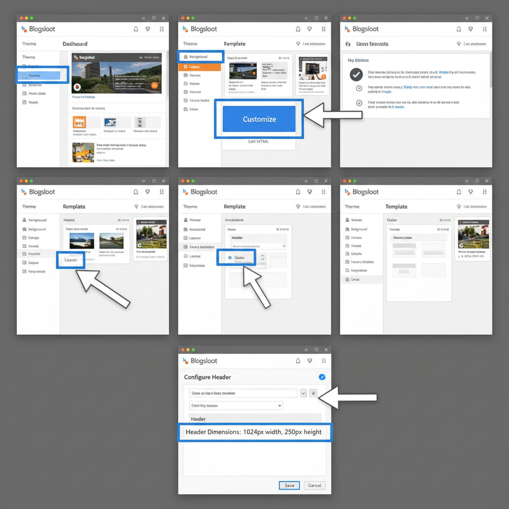
How to Check Your Current Template’s Header Dimensions
- Log in to Blogger dashboard.
- Go to Theme → Customize.
- Locate Header settings (it may be under "Advanced" in some themes).
- If dimensions aren’t listed, open your blog in Chrome and use Right-click → Inspect.
- Hover over the header image in the HTML preview to see pixel dimensions.
---
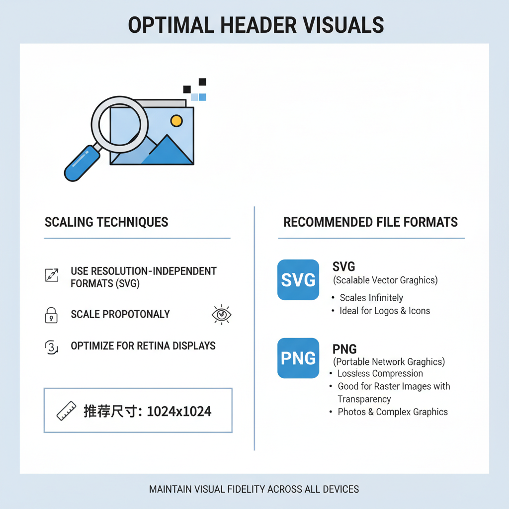
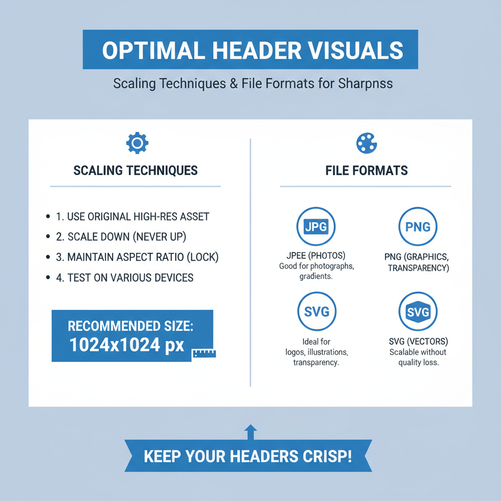
Scaling Images Properly to Avoid Distortion or Blur
When designing or resizing header images for Blogspot:
- Keep the aspect ratio consistent with the original.
- Use a tool like Photoshop or Canva to downscale without compression loss.
- Avoid stretching images beyond their native resolution — this causes pixelation.
- If your theme crops, design a "safe zone" with key elements in the center.
Example in CSS for responsive scaling:
.header img {
  width: 100%;
  height: auto;
}
---
Recommended File Formats for Crisp Display
Choosing the right file format prevents unattractive quality drops.
| Format | Pros | Cons |
|---|---|---|
| JPEG | Small size, widely supported | Lossy compression may blur sharp text |
| PNG | Lossless, sharp edges | Larger file size |
| WebP | Best compression with good quality | Browser support varies |
---
Tips for Designing a Header in Canva or Photoshop
Design software allows precise control over Blogspot header dimensions:
- Set canvas size to your theme’s recommended pixel dimensions.
- Maintain a visual hierarchy: brand name above tagline.
- Leave padding around edges for cropping on mobile.
- Use color schemes consistent with your blog posts.
- Export in both standard and high-res to test load speeds.
---
Making Mobile-Friendly Headers That Resize Well
Mobile responsiveness is crucial.
Strategies:
- Test header design at multiple breakpoints (320 px, 768 px, 1024 px).
- Keep text readable without zoom.
- Minimize intricate detail that gets lost on smaller screens.
- Use vector elements wherever possible — they scale without distortion.
---
Optimizing File Size for Faster Loading Without Quality Loss
Large header images can slow page loads and hurt SEO rankings. Here’s how to optimize:
- Use a service like TinyPNG or ImageOptim for compression.
- Limit the file size to under 200KB where possible.
- Strip unnecessary EXIF metadata.
- Balance between visual quality and speed — Google’s PageSpeed Insights can flag oversized images.
---
Testing Header Appearance Across Devices and Browsers
Always test before publishing:
- Open your blog on Chrome, Firefox, Edge, Safari.
- Use BrowserStack or similar to preview on different devices.
- Check loading speed and alignment.
- Ensure no clipping or unwanted scaling happens.
---
Common Mistakes to Avoid
Avoid these pitfalls when setting Blogspot header dimensions:
- Too tall headers that push content far down, hurting usability.
- Using low-resolution images that appear grainy.
- Misaligned elements due to lack of padding.
- Forgetting to optimize for mobile — causing cut-off logos.
- Mismatched style compared to the rest of the site.
---
Update Process: Replacing and Saving a New Header in Blogger Dashboard
Step-by-step:
- Open Blogger Dashboard.
- Navigate to Layout.
- Under Header widget, click Edit.
- Choose Upload image from computer or from URL.
- Select Shrink to fit if your image is larger.
- Click Save and refresh your blog to verify.
---
Final Checklist for a Polished, On-Brand Blogspot Header
Use this checklist before finalizing:
- Correct pixel dimensions per your template
- High-resolution image without distortion
- Mobile-friendly scaling works
- Optimal file format (JPEG/PNG/WebP)
- File size compressed under target KB
- Tested on multiple devices and browsers
- Header aligns with brand aesthetics
- Uploaded and saved correctly in Blogger
---
Summary and Next Steps
By understanding and applying Blogspot header dimensions wisely, you can create a professional, attractive header that strengthens your brand identity and enhances usability across devices. From choosing the right layout size to testing on multiple browsers, every step contributes to a polished final look.
Ready to refresh your Blogspot header? Review your current template, design at the optimal size, compress for quick loading, and test across devices to ensure perfection.