Optimal Image Size for Web Performance and Quality
Learn how to choose optimal image sizes and formats for faster web performance, improved SEO rankings, and a better user experience across devices.
Optimizing Image Size for Web Performance: A Practical Guide
Determining the optimal image size for web is a crucial step in ensuring your site loads quickly, ranks well in search engines, and keeps users engaged. Images can dramatically affect page performance, but with the right techniques, you can balance clarity and speed to deliver the best possible experience.
---
Understanding Why Image Size Matters for Web Performance
Images are often the most visually engaging element of any web page, but they can also be the largest contributor to slow loading times. A poorly optimized image can significantly impact:
- Loading Speed: Large images increase page weight, delaying content rendering.
- Search Engine Optimization (SEO): Google factors loading speed into its ranking algorithms.
- User Experience (UX): Visitors expect instant interaction—slow pages lead to higher bounce rates.
- Bandwidth Costs: Optimized images require less data, which benefits both you and your users.

A web page that balances image quality and file size not only looks appealing but also performs efficiently across devices and network conditions.
---
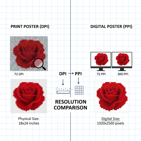
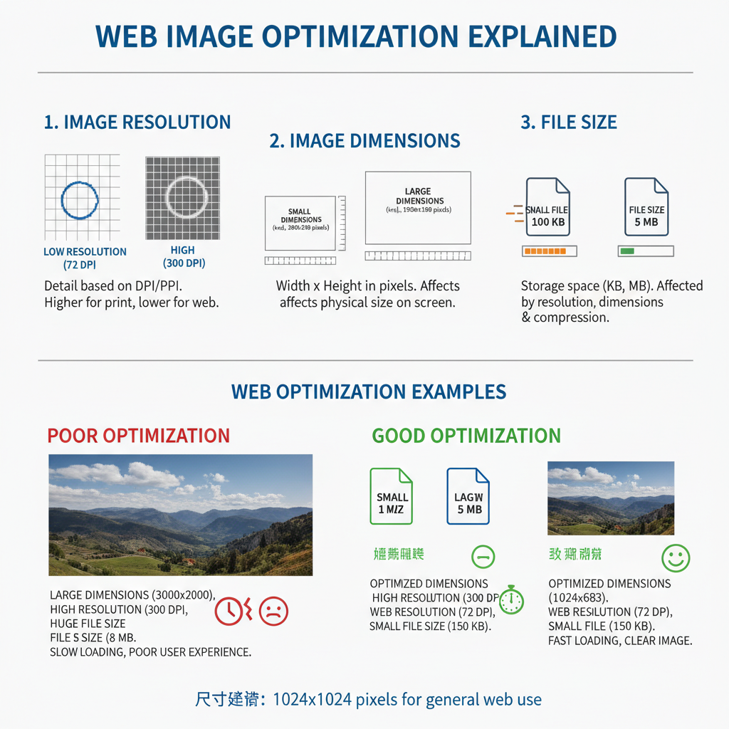
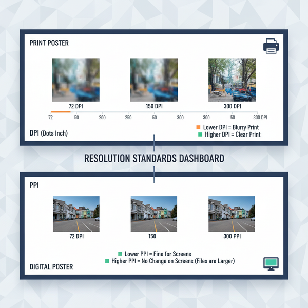
Differentiating Image Resolution, Dimensions, and File Size
To optimize images effectively, it's crucial to understand these fundamental properties:
- Resolution: The density of pixels (PPI/DPI) within an image. Higher resolution means more detail but larger files.
- Dimensions: The width and height of an image, measured in pixels. Dimensions affect how an image appears on screen.
- File Size: The storage space an image occupies, measured in kilobytes (KB) or megabytes (MB). File size impacts how quickly the image loads.
| Property | Definition | Impact on Performance |
|---|---|---|
| Resolution | Pixel density (PPI/DPI) | Higher = more detail, larger file size |
| Dimensions | Width & height in pixels | Must match display to avoid unnecessary scaling |
| File Size | KB or MB storage size | Directly affects page load time |
---
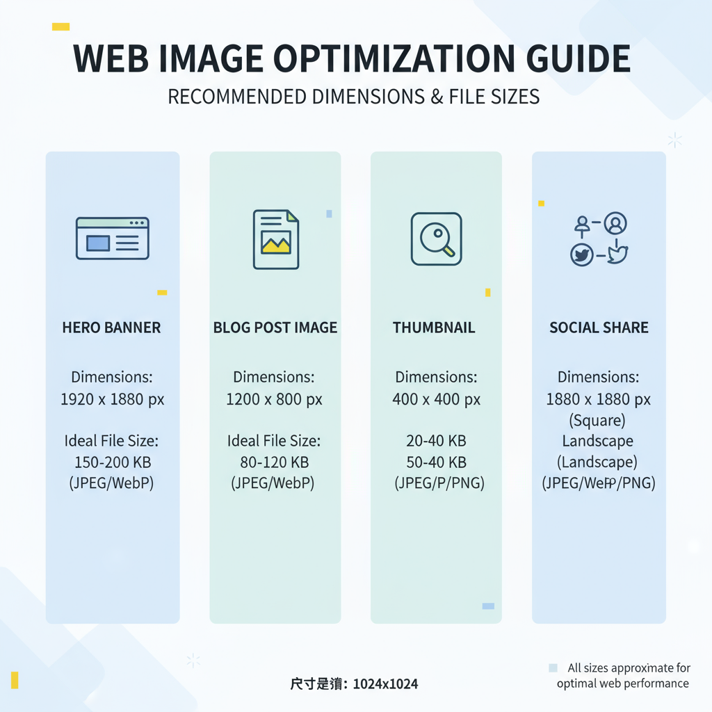
Recommended Image Dimensions for Common Web Uses
Choosing the right dimensions ensures that images look sharp without wasting data. Here are general recommendations:
| Usage | Recommended Dimensions (px) | Notes |
|---|---|---|
| Full-width Banner | 1920 × 1080 | HD resolution for desktop hero sections |
| Blog Post Inline Image | 1200 × 800 | Balanced for visual clarity and page load |
| Product Image | 800 × 800 | Square format; good for e-commerce listings |
| Social Media Preview | 1200 × 630 | Optimized for Facebook/Twitter cards |
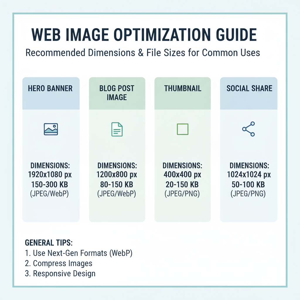
Remember: These are guidelines. Always test on your specific website’s layout to avoid stretch or pixelation.
---
Ideal File Sizes for Quick Load Times Without Losing Quality
For most websites:
- Hero banners: Target under 500 KB
- Inline images: Prefer under 200 KB
- Thumbnails: Keep under 50 KB
- Icons: Often under 10 KB (SVG is perfect here)
A good rule of thumb is: Lower file size while maintaining noticeable quality during typical usage. If you can’t tell the difference visually, the compression is good.
---
Choosing the Right Image Format
Different file formats cater to different needs:
| Format | Best Use Case | Pros | Cons |
|---|---|---|---|
| JPEG | Photography with complex colors | High compression; small size | Lossy; not good for sharp edges or text |
| PNG | Graphics, logos, transparency | Lossless; supports alpha transparency | Larger size than JPEG |
| WebP | Most modern web uses | Better quality-to-size ratio; supports transparency | Browser support slightly limited on older versions |
| SVG | Icons, simple illustrations | Scalable without quality loss | Complex images may lead to large code |
---
How to Compress Images Efficiently
Compression is the main technique for reducing file size:
Manual Tools
- Photoshop: Export settings allow fine-tuned quality control.
- GIMP: Free alternative with good compression options.
- Affinity Photo: Streamlined interface and export choices.
Automated Solutions
- TinyPNG / TinyJPG: Browser-based optimization.
- ImageOptim: Batch processing for macOS.
- Squoosh: Google’s tool for testing different compression algorithms.
Example compress using Squoosh CLI:
npx @squoosh/cli --resize '{"width":800}' --webp '{"quality":75}'---
Responsive Image Techniques for Multiple Devices
Responsive images ensure optimal sizes are served based on device capabilities.
Using `srcset` Attribute
Using `` Element
---
Testing Page Speed Impact
Even well-optimized images should be tested in real-world scenarios. Tools like Google PageSpeed Insights and GTmetrix can highlight if images are still a bottleneck.
Important metrics:
- Largest Contentful Paint (LCP): A large hero image can heavily influence this.
- Total Page Size: Should remain under 2 MB for optimal performance.
- First Input Delay (FID): Indirectly improved by faster rendering.
---
Implementing Lazy Loading for Image-Heavy Pages
Lazy loading defers image loading until they are needed, reducing initial page load times.
Native HTML example:
JavaScript polyfill example for older browsers:
document.addEventListener("DOMContentLoaded", function() {
  const images = document.querySelectorAll("img[data-src]");
  const loadImage = (img) => {
    img.src = img.dataset.src;
  };
  const observer = new IntersectionObserver((entries) => {
    entries.forEach(entry => {
      if (entry.isIntersecting) {
        loadImage(entry.target);
        observer.unobserve(entry.target);
      }
    });
  });
  images.forEach(img => observer.observe(img));
});
---
Best Practices for Balancing Quality and Performance
- Always start with high-quality originals: You can downscale and compress later.
- Match image dimensions to display size: Avoid serving oversized images.
- Leverage modern formats (WebP/AVIF) where supported.
- Combine responsive design with lazy loading.
- Test across devices and connections: A 4K screen may require higher dimensions than a mobile device.
---
Maintenance Tips: Regularly Audit and Update Site Images
Regular audits keep your site fast and visually fresh:
- Quarterly reviews: Check for outdated graphics and stale product images.
- Re-compress older uploads: Tools may improve over time.
- Track analytics: Identify pages with high bounce rates that might be image-related.
- Ensure accessibility: Always use descriptive `alt` text for SEO and screen readers.
---
By applying these strategies, you can confidently determine the optimal image size for web performance, maintain strong visual appeal, and enhance user satisfaction. Start reviewing your site’s images today, and put these optimizations into practice to improve both your rankings and audience engagement.