Optimal Image Size for Website Performance and Quality
Learn how to choose the optimal image size, format, and compression to boost website performance, SEO, and user experience across devices.

Introduction: Optimizing Image Size for Website Performance and SEO
Image optimization is one of the most impactful yet overlooked aspects of web development and SEO. The optimal image size for website performance plays a pivotal role in reducing page load times, improving user experience, and boosting search rankings. With Google considering site speed a key ranking factor, properly sizing and compressing images ensures your pages are visually appealing while remaining lightning fast. This guide explains file formats, dimensions, compression, and tools to help you strike the perfect balance between quality and efficiency.
---
Understanding Why Image Size Matters for Website Performance and SEO
Images are a key component of modern websites, but oversized or improperly optimized visuals can drastically slow down page loading times. Since page speed is a ranking factor in Google’s SEO algorithm, optimizing image size plays a huge role in improving visibility and user experience. Large, unoptimized images consume bandwidth, cause layout shifts, and increase bounce rates.
Optimizing images isn’t just about shrinking file sizes—it’s about maintaining a balance between quality and performance. The right image size accelerates loading, boosts SEO, and enhances usability without degrading aesthetics.
---
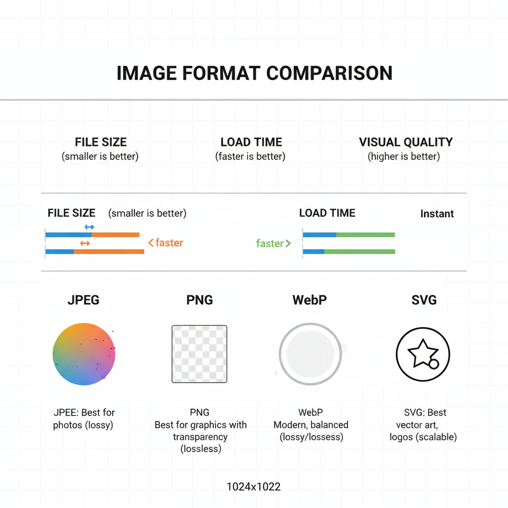
Common Image Formats and Their Best Use Cases
Selecting the right file format is as important as choosing the correct dimensions.
JPEG
- Best for: Photos and complex color gradients
- Pros: High compression, small file sizes
- Cons: Lossy quality, limited transparency support
PNG
- Best for: Graphics, text-rich designs, transparency
- Pros: Lossless compression, sharp edges
- Cons: Larger file size than JPEGs
WebP
- Best for: Modern browsers needing optimal compression with high quality
- Pros: Supports lossy/lossless compression, transparency, animations
- Cons: Limited support in very old browsers
SVG
- Best for: Icons, vector illustrations, logos
- Pros: Scales without losing quality, tiny file size
- Cons: Not ideal for complex photographic images
---
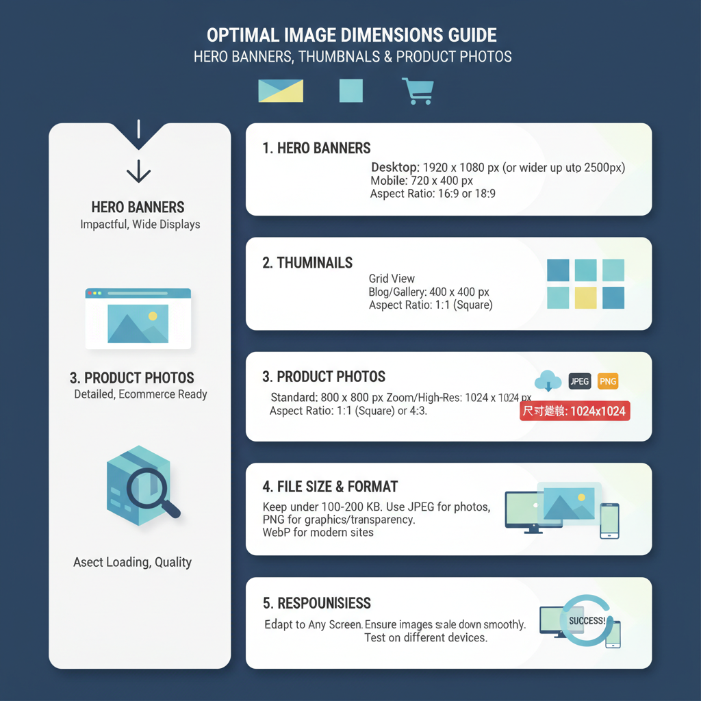
Recommended Dimensions for Different Website Images
Choosing proper dimensions ensures images look crisp while avoiding unnecessary file weight.
| Image Type | Recommended Dimensions (px) | Notes |
|---|---|---|
| Hero Banner | 1920 x 1080 | Full-width desktop display, responsive downscaling for mobile |
| Blog Post Image | 1200 x 800 | Balances clarity and loading speed |
| Thumbnail | 150 x 150 | Small, quick load preview images |
| Product Photo | 800 x 800 | Square format works well for e-commerce listings |
---
Optimal File Size Guidelines
Even with correct dimensions, file size dictates load efficiency. As a general rule:
- Hero banners: ≤ 500 KB
- Blog images: ≤ 250 KB
- Product photos: ≤ 200 KB
- Thumbnails: ≤ 50 KB
These benchmarks prevent bloated sites. Balance is key—compress aggressively, but not at the expense of noticeable pixelation.
---
Responsive Images: srcset and sizes Attributes
Modern websites should serve different image sizes based on the user’s device and screen resolution. The HTML `
` tag with srcset and sizes helps the browser choose the right asset automatically.
Example:
This method avoids shipping oversized desktop images to mobile devices, improving load time significantly.
---
Image Compression Techniques: Lossless vs Lossy
Compression reduces file size without changing dimensions.
Lossless Compression
Preserves all image data.
Best for: PNGs, graphical images.
Tools: ImageOptim, PNGGauntlet, OptiPNG.
Lossy Compression
Sacrifices some quality for much smaller file sizes.
Best for: JPEGs, WebP for large photos.
Tools: TinyJPG, Kraken.io, Squoosh.
Tip: Always check output previews before applying aggressive compression settings.
---
Leveraging Next-Gen Formats (WebP, AVIF)
Next-generation formats outperform older standards in both compression and quality.
- WebP: Up to 30% smaller than JPEG with similar quality. Supports transparency and animation.
- AVIF: Even better compression than WebP, handles HDR, offers remarkable quality for tiny files.
Adopt these formats with a fallback mechanism for browsers lacking support:
---
Using Lazy Loading and CDN Delivery
Lazy loading defers the loading of images until they are actually needed on the viewport. This dramatically cuts initial page load time.
Pair lazy loading with a Content Delivery Network (CDN) that caches and serves images from geographically distributed servers. CDNs reduce latency and ensure faster delivery to users worldwide.

Tips for CDN image optimization:
- Use image resizing services (e.g., Cloudflare Images, Imgix)
- Cache images at edge locations
- Implement HTTP/2 for efficient delivery
---
Testing and Monitoring Image Performance
You can’t optimize what you don’t measure. Use tools like:
- Google PageSpeed Insights – Highlights oversized images and suggests optimizations.
- Lighthouse – Audits image performance in local or staging environments.
- WebPageTest – Detailed waterfall analysis to pinpoint heavy resources.
Periodically review your site’s performance to catch new image issues before they affect user experience.
---
Common Mistakes to Avoid
- Uploading massive raw images without resizing
- Using PNGs for large photographs unnecessarily
- Neglecting mobile optimization by only serving desktop-sized images
- Overcompressing to the point of visible artifacts
- Skipping CDN delivery for high-traffic sites
- Ignoring browser support for newer formats
---
Best Practices Summary
- Start with the right format – Choose JPEG for photos, PNG for graphics, WebP/AVIF for modern optimization.
- Right-size images – Follow dimension guidelines for each type.
- Keep file size low – Aim for under recommended KB limits.
- Serve responsive sizes via srcset and sizes.
- Compress appropriately – Lossy for photos, lossless for icons.
- Adopt next-gen formats – Progressive enhancement with fallbacks.
- Implement lazy loading and serve through CDN.
- Monitor performance regularly – Automated tools catch regressions.
---
Conclusion and Next Steps
By applying these strategies, you’ll achieve the optimal image size for website performance and quality—delivering speed, sharp visuals, and a competitive edge in search rankings. Begin with your most trafficked pages, audit image dimensions and file sizes, then implement responsive techniques and compression tools.
> CTA: Start optimizing your images today to boost site speed, elevate your SEO performance, and create a seamless user experience.