Optimal Photo Size for Website Speed and Quality
Learn how to choose optimal photo sizes, formats, and compression methods to boost website speed, user experience, and search engine rankings.

Optimal Photo Size for Website Speed and Quality
Choosing the optimal photo size for your website is a crucial balance between delivering visual appeal and maintaining speed. Images are often the largest assets on a webpage, influencing loading times, SEO rankings, and user satisfaction. Well-optimized photos enhance retention, boost search visibility, and create a smooth browsing experience. In this guide, we’ll cover image dimensions, formats, compression techniques, and responsive strategies to achieve both speed and quality.
---
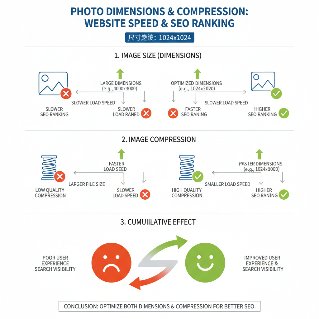
Why Photo Size Matters for Web Performance and SEO
Images are integral to modern web design, but extreme file sizes can slow performance. Slow-loading pages frustrate visitors and increase bounce rates, while search engines reward fast sites. Optimizing photo size can:
- Improve SEO: Faster load times boost rankings.
- Enhance User Experience: Shorter waits encourage engagement.
- Reduce Bandwidth Usage: Beneficial for mobile and low-data users.
- Support Accessibility: Proper sizing ensures clarity across devices.
---
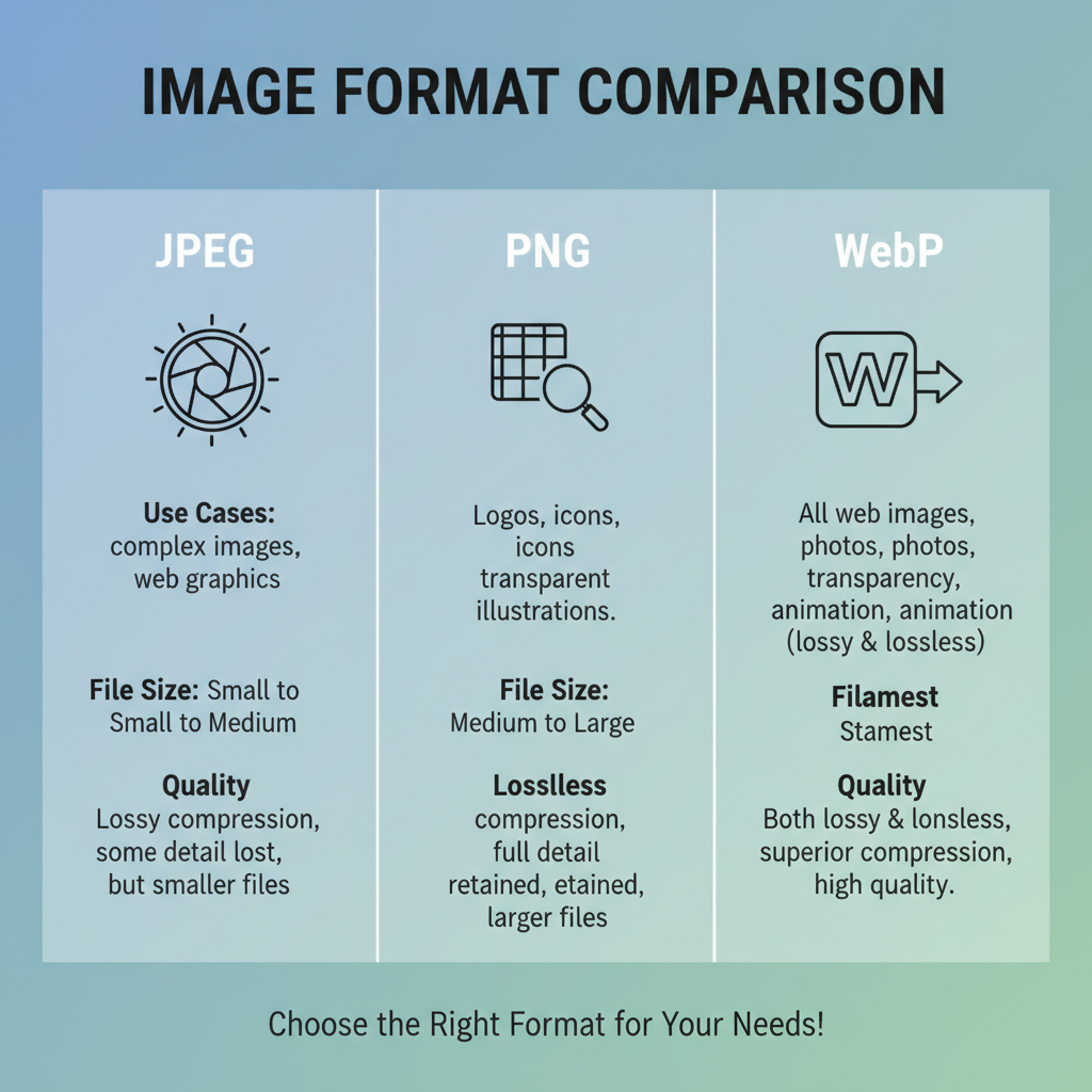
Common Photo Formats and Their Use Cases
Choosing the right format is the first step to optimizing images.
JPEG (Joint Photographic Experts Group)
- Best for photographs and multi-tone gradients.
- Supports lossy compression to minimize size.
- No transparency support.
PNG (Portable Network Graphics)
- Ideal for transparency and crisp detail.
- Uses lossless compression for pixel-perfect quality.
- Larger file sizes for complex photos vs. JPEG.
WebP
- Modern Google-developed format.
- Handles both lossy and lossless compression.
- Smaller file sizes with equal/better quality compared to JPEG/PNG.
- Widely supported in modern browsers.
---
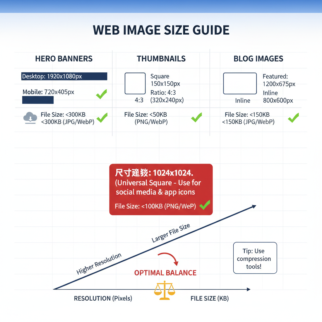
Recommended Image Dimensions
Different site elements require different dimensions for ideal performance without oversizing.
| Image Type | Typical Dimensions (px) | Notes |
|---|---|---|
| Hero Images | 1920 x 1080 | Landscape for desktops; crop for mobile views |
| Blog Post Images | 1200 x 800 | Balances clarity and file size |
| Product Photos | 1000 x 1000 | Square aspect ensures uniform presentation |
| Thumbnails | 150 x 150 | Lightweight for lists, galleries, and previews |
---
Balancing Resolution and File Size
Desktop Recommendations
- Standard 72 PPI for web.
- Match width to layout specs.
- Compression target: under ~200KB for large display images.
Mobile Recommendations
- Provide scaled-down images for reduced data load.
- Optimize to viewport width (720–1080 pixels).
- Aim for under ~100KB for faster mobile load.
Tip: Always preview images on both high-resolution monitors and average mobile devices before publishing.
---
Compression Techniques Without Sacrificing Quality
Compression reduces file size while maintaining acceptable visual quality.
- Lossy Compression — Eliminates data the eye won’t notice (ideal for photos).
- Lossless Compression — Keeps original pixels (best for graphics, logos, icons).
- Hybrid Approach — Lossy for photographic media, lossless for text and sharp detail.
Popular Tools & Plugins
- TinyPNG — Online optimization for PNG/JPEG.
- ImageOptim — Mac desktop app.
- Squoosh — Web app supporting WebP and advanced compression.
- ShortPixel, Smush — WordPress-friendly solutions.
Example with `imagemin` in Node.js:
const imagemin = require('imagemin');
const imageminMozjpeg = require('imagemin-mozjpeg');
const imageminPngquant = require('imagemin-pngquant');

(async () => {
  await imagemin(['images/*.{jpg,png}'], {
    destination: 'build/images',
    plugins: [
      imageminMozjpeg({ quality: 75 }),
      imageminPngquant({ quality: [0.7, 0.8] })
    ]
  });
  console.log('Images optimized');
})();
---
Responsive Design with `srcset` and `sizes`
Responsive techniques serve the right image at the right resolution for each device.
- `srcset` defines multiple versions with width descriptors.
- `sizes` guides browser selection based on viewport.
---
Lazy Loading Images to Improve Performance
Lazy loading delays image retrieval until they are needed onscreen.
Benefits:
- Faster initial page load.
- Saves bandwidth for non-scrolled content.
- Improves metrics like Largest Contentful Paint (LCP).
---
Optimizing for High-DPI/Retina Displays
High-DPI/retina screens need more pixels to avoid blur.
Strategies:
- Supply 2x resolution images or define them in `srcset`.
- Use SVG for resolution-independent icons.
- Optimize compression for large retina images to avoid load penalties.
---
Testing Load Speed Impact
Google PageSpeed Insights helps pinpoint image-related speed issues.
Steps:
- Visit Google PageSpeed Insights.
- Insert your site URL.
- Review “Properly size images” and “Serve images in next-gen formats.”
- Adjust dimensions and formats accordingly.
- Retest and repeat until scores improve.
---
Best Practices Checklist
Maintain your optimal photo size for website workflow:
- Select formats based on image type (JPEG, PNG, WebP).
- Adhere to recommended size guidelines.
- Apply compression without degrading visible quality.
- Use responsive attributes (`srcset`, `sizes`).
- Implement lazy loading where applicable.
- Provide retina-ready resources.
- Monitor with PageSpeed Insights regularly.
- Keep thumbnails light.
- Ensure consistent styling site-wide.
---
Conclusion
The optimal photo size for your website enhances performance, ranks better in search engines, and delivers a superior user experience. Format choice, dimensions, compression tools, and responsive techniques all contribute to streamlined loading and visual impact. Integrating these strategies can yield measurable improvements in speed, SEO, and engagement. Start refining your image workflow today to balance beauty with blazing-fast site performance.