Best Photo Size for Website Speed and Image Quality
Learn the best image sizes, formats, and compression strategies to boost website speed while keeping visuals sharp for SEO and user experience.

Best Photo Size for Website Speed and Image Quality
Finding the best photo size for website performance is a balancing act between speed, visual quality, and search engine optimization. Whether you run a blog, an online store, or a corporate site, images are key to engaging your audience — but if they’re too heavy, they can slow loading times and harm rankings. This guide covers optimal dimensions, file formats, compression methods, and responsive design tips so you can keep your site both fast and visually compelling.
---
Why Photo Size Matters for Website Speed and SEO
Every byte of an image adds to your total page load weight, which directly affects:
- User experience: Fast-loading visuals keep people engaged.
- SEO: Search engines prioritize speed, especially for mobile search results.
- Bounce rates: Slow sites drive visitors away before they even see your content.
- Conversions: Quick-loading product and feature images improve purchase likelihood.
- Data use: Smaller images save bandwidth for users on limited connections.
Google has indicated that speed is a ranking factor — and images are often the largest elements to optimize.
---
Key Terms to Understand
Before we get into practical steps, let’s define some important concepts in image optimization.
| Term | Definition |
|---|---|
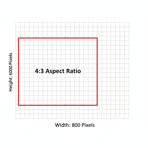
| Dimensions | The pixel width and height of an image (e.g., 1200×800). |
| File Size | The storage space the file consumes, usually in KB or MB. |
| Resolution | The amount of detail in an image, expressed in pixels per inch (ppi). |
| DPI/PPI | Dots or pixels per inch — more relevant for print than for digital display. |
Pro tip: On the web, dimensions and file size matter far more than DPI.
---
Recommended Image Dimensions for the Web
Your images should be scaled to the maximum displayed size in your layout — not larger.
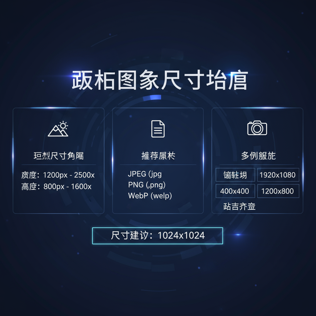
| Use Case | Recommended Dimensions | Notes |
|---|---|---|
| Hero Banners | 1920×1080 | Ideal for wide screens; save as JPG or WebP. |
| Blog Post Inline | 1200×800 | Keep under 200 KB with compression. |
| Product Thumbnails | 400×400 | Use PNG for transparency; JPG/WebP for photos. |
| Full-Width Gallery Images | 1600×900 | Adjust to container width for best fit. |
---
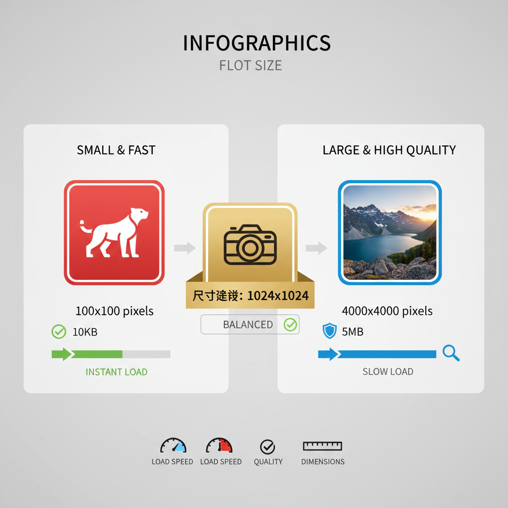
Ideal File Sizes for Faster Load Times
For optimal website performance:
- Most images: under 200 KB.
- Feature images: under 500 KB.
- Avoid >1 MB files unless high resolution is essential.
Multiple large files multiply your total load time, so optimize all images accordingly.
---
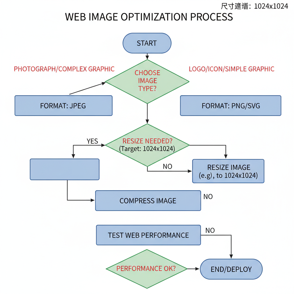
Choosing the Right Image Format
Picking the right format can reduce file size while preserving quality.
| Format | Best For | Advantages | Disadvantages |
|---|---|---|---|
| JPEG/JPG | Photographs, gradients | Small with lossy compression | Artifacts if overcompressed |
| PNG | Logos, icons, images needing transparency | Lossless quality | Larger size than JPG |
| WebP | Most uses | High compression with good quality | Older browser support is limited |
| SVG | Vector graphics | Infinite scalability | Not for complex photos |
---
Resizing Images Without Losing Quality
To resize effectively:
- Use tools like Adobe Photoshop, GIMP, Figma, Canva, or online apps like Pixlr.
- Keep the aspect ratio intact to avoid stretching.
- Avoid scaling up smaller images to prevent blurring.
- Export at exact display dimensions.
Example in Photoshop:
Image > Image Size > Set dimensions > Save for Web---
Image Compression Techniques
Compression minimizes file size:
- Lossy compression: Best for photos (JPG/WebP), removes some data with slight quality trade-off.
- Lossless compression: Retains all data (PNG, SVG), produces larger files.
Compression tools include:
- TinyPNG / TinyJPG
- ImageOptim
- Squoosh.app
- ShortPixel (WordPress)
---
Responsive Images for Multiple Devices
Deliver different sizes for different screens using `srcset` and `sizes`:
This ensures mobile users aren’t forced to load large desktop images.
---
Lazy Loading and CDN Delivery
Lazy loading delays loading off-screen images:
A Content Delivery Network (CDN) stores your files on multiple servers worldwide, serving them quickly based on user location. Popular CDNs include Cloudflare, Akamai, and Cloudinary.
---
Accessibility Considerations
Optimized images should also be accessible:
- Add meaningful alt text.
- Use descriptive filenames (e.g., `red-sneakers.jpg` instead of `IMG1234.jpg`).
- Include captions when they add context.
Accessible images benefit both users and SEO.
---
Testing Site Speed and Image Performance
Audit your images regularly using:
- Google PageSpeed Insights
- GTmetrix
- WebPageTest.org
These tools identify oversized images and suggest optimal dimensions.
---
Common Mistakes to Avoid
- Uploading large, original camera images.
- Serving desktop images to mobile.
- Using PNG for photos.
- Forgetting to compress before upload.
- Not offering modern formats like WebP.
---
Best Practices Checklist
- Choose dimensions before uploading.
- Keep most images ≤200 KB.
- Match formats to use cases.
- Compress with lossy or lossless methods as needed.
- Implement responsive images.
- Enable lazy loading.
- Use a CDN.
- Add descriptive alt text and filenames.
- Test with PageSpeed Insights.
- Audit regularly.
---
By following these best photo size for website guidelines, you’ll boost load times, enhance user satisfaction, and improve your SEO rankings. Start implementing these practices today to keep your site visually appealing and lightning-fast for every visitor.