Best Picture Size for Website Backgrounds and Responsive Des
Learn optimal website background image sizes for desktop, tablet, and mobile, with tips on aspect ratios, file formats, and performance balance.
Picture Size for Website Background: Complete Guide
Selecting the right picture size for website background is crucial for delivering a visually appealing, fast-loading, and accessible design. In this guide, you'll learn optimal dimensions for different devices, how aspect ratios affect responsiveness, recommended file sizes, and best practices for balancing quality with performance. Whether you're working with images for desktop, tablet, or mobile, this resource will help you set the perfect background.
---
Understanding the Role of Background Images in Web Design
Background images are more than aesthetic elements — they shape user experience and reinforce brand identity. An effective background can convey mood, focus user attention, and set the tone for the entire website.
From subtle patterns to full-screen hero images, your background plays a crucial role in:
- Visual coherence between content and brand style.
- Mood setting, where bright or muted tones can signal energy or sophistication.
- Guiding attention by contrasting with key foreground elements.

Poorly chosen or incorrectly sized backgrounds can harm usability, slow load times, and make text illegible — so careful planning is essential.
---
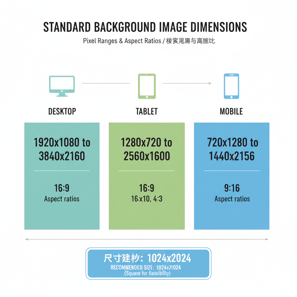
Standard Website Background Dimensions for Common Screen Resolutions
With the vast diversity of screen sizes today, there’s no single "best" dimension. However, functional guidelines can be drawn from standard resolutions:
| Device Type | Common Resolution | Suggested Background Size (px) |
|---|---|---|
| Desktop (HD) | 1920×1080 | 1920×1080 |
| Desktop (WQHD) | 2560×1440 | 2560×1440 |
| Tablet | 1280×800 | 1280×800 |
| Mobile (Large) | 1080×1920 | 1080×1920 |
| Mobile (Small) | 750×1334 | 750×1334 |
These sizes help ensure coverage without stretching or pixelation on common screens.
---
Recommended Pixel Ranges for Desktop, Tablet, and Mobile
For robust responsive design, aim for optimized ranges rather than exact figures:
- Desktop: 1920–2560 px width
- Tablet: 1200–1600 px width
- Mobile: 720–1080 px width
High-resolution images maintain quality but can increase file size, which impacts load times.
Tip: Consider scaling down slightly and using CSS `background-size: cover` so the image fills available space while maintaining aspect ratio.
---
How Image Aspect Ratio Impacts Responsiveness and Scaling
Aspect ratio refers to the proportion of width to height. Common background ratios include:
- 16:9 — widescreens, desktop, and video-based designs
- 4:3 — tablets and older monitors
- 9:16 — mobile portrait
A mismatch between background aspect ratio and viewport can cause cropping or letterboxing.
Example CSS for maintaining proportion:
body {
  background-image: url('background.jpg');
  background-size: cover;
  background-position: center;
}
`cover` fills the space while preserving aspect ratio — some edges may crop.
---
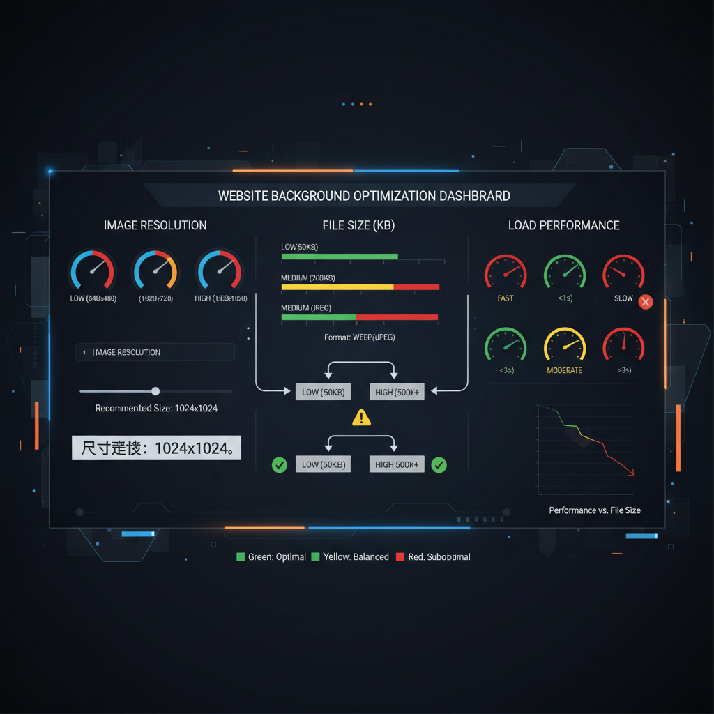
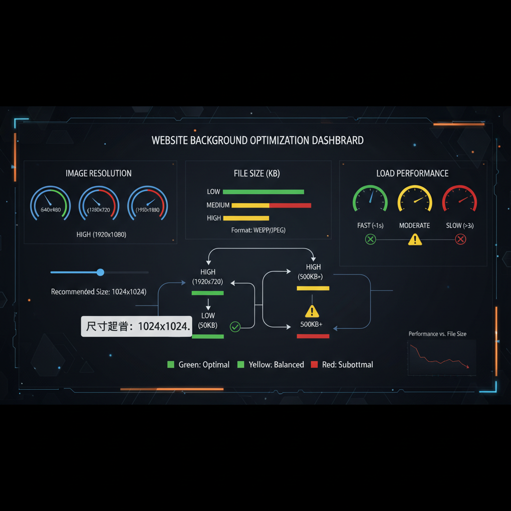
Balancing Quality and Performance: Optimal File Size in KB/MB
Large images can slow down websites, so aim for these ranges:
- Desktop: 500KB–1MB for full-screen high-quality images
- Tablet: 300KB–700KB
- Mobile: 150KB–400KB
Use compression tools and modern formats to minimize size without losing clarity.
---
Choosing the Right File Formats for Backgrounds
File format impacts quality, size, and compatibility:
| Format | Best Use Case | Pros | Cons |
|---|---|---|---|
| JPEG | Photographic images | Small size, widely supported | Lossy compression, can blur text |
| PNG | Images with transparency | Lossless, supports transparency | Larger size |
| WebP | Modern browsers | High compression, transparency support | Limited support in older browsers |
---
Using CSS Properties for Responsive Background Handling
CSS offers flexible options for background control:
- `background-size`: `cover` fills and crops, `contain` fits the whole image
- `background-position`: Adjust focal point (e.g., `center`, `top`)
- `background-attachment`:
- `fixed` for parallax effect
- `scroll` for normal scrolling
Example:
body {
  background-image: url('bg.webp');
  background-size: cover;
  background-position: center;
  background-repeat: no-repeat;
}
---
Tips to Compress and Optimize Background Images Without Losing Clarity
Optimization techniques:
- Use dedicated tools: TinyPNG, ImageOptim, Squoosh
- Switch to WebP: Smaller sizes with high quality
- Adjust quality settings: JPEG at 70–80% quality retains clarity
- Remove metadata: Saves kilobytes without visual change
Slight resolution reductions can result in significant file size savings.
---
Testing Background Images on Multiple Devices and Screen Sizes
Ensure your background renders correctly by testing with:
- Real devices
- Browser developer tools
- Services like BrowserStack or Responsive Design Checker
Testing verifies focal points, readability, and image clarity across display types.
---
Accessibility Considerations: Contrasts, Overlays, and Readability
Design with accessibility in mind:
- Maintain WCAG-compliant contrast ratios
- Use semi-transparent overlays for text readability
- Keep backgrounds simple to avoid distraction
Example overlay:
.overlay {
  background-color: rgba(0, 0, 0, 0.4);
}
---
Common Mistakes to Avoid When Setting Website Background Pictures
Watch out for these issues:
- Overly large, uncompressed files — slow sites lose visitors
- Neglecting mobile optimization — wastes bandwidth
- Misaligned focal points — key parts may be cropped
- Skipping orientation tests — layout may break in portrait
---
Tools and Resources for Resizing and Optimizing Large Background Images
Helpful tools:
- Canva — quick dimension edits
- Photoshop — granular control over size, format, compression
- Squoosh — in-browser optimization
- TinyPNG/TinyJPG — easy compression
These streamline preparation of backgrounds for desktop and mobile.
---
Final Thoughts
Choosing the perfect picture size for website background requires balancing design aesthetics, performance, and accessibility.
By following guidelines on dimensions, pixel ranges, aspect ratios, compression, and testing, you can craft a background that enhances visual appeal without slowing your site.
Test across devices, apply smart compression, and always consider readability — your design and your site visitors will benefit.
Ready to improve your site performance and visuals? Start optimizing your background images today using the strategies and tools above.