Best PX Size for Website Design and Layout
Learn optimal pixel sizes for text, images, and layouts, with responsive CSS tips to ensure clarity and accessibility across all devices.

Introduction to Pixel Size in Web Design
In modern web design, pixel size for websites is a critical factor determining how your site appears, functions, and engages users. The choice of pixel (px) values directly influences readability, visual clarity, and user experience (UX) across desktop, tablet, and mobile devices. Well-planned pixel sizing also supports SEO efforts by improving content legibility, encouraging longer visit durations, and reducing bounce rates.
Without thoughtful pixel size planning, text might be unreadably small on phones, images could appear blurry on high-resolution displays, and layouts can break—resulting in frustrated visitors and lost opportunities.
---
Understanding PX, EM, REM, and Percentages in CSS
When styling layouts, CSS provides multiple units:
- PX (pixels) – Fixed-size unit; great for precision but limited in flexibility.
- EM – Relative to the font size of the parent element; scales content proportionally.
- REM – Relative to the root element (``); maintains consistent scaling throughout the site.
- % (percentage) – Based on another property or container size; enables fluid, responsive layouts.
Balancing fixed px with flexible units like em and rem allows for designs that look sharp and remain accessible on all devices.
---
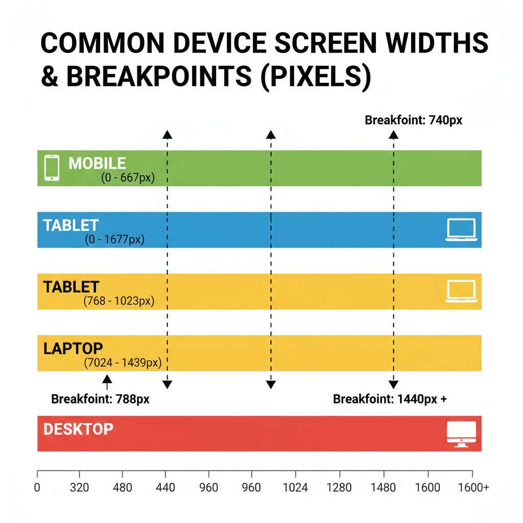
Standard Pixel Widths for Various Devices
Before specifying sizes, it’s essential to know typical viewport widths:
| Device Type | Typical Width (px) | Common Breakpoints |
|---|---|---|
| Desktop / Laptop | 1024px – 1920px+ | ≥ 1200px (large), 992px – 1199px (medium) |
| Tablet | 600px – 1024px | 768px (portrait), 1024px (landscape) |
| Mobile | 320px – 600px | 375px, 414px (common breakpoints) |
Using CSS media queries with these breakpoints ensures pixel sizes and layouts adjust seamlessly for different devices.
---
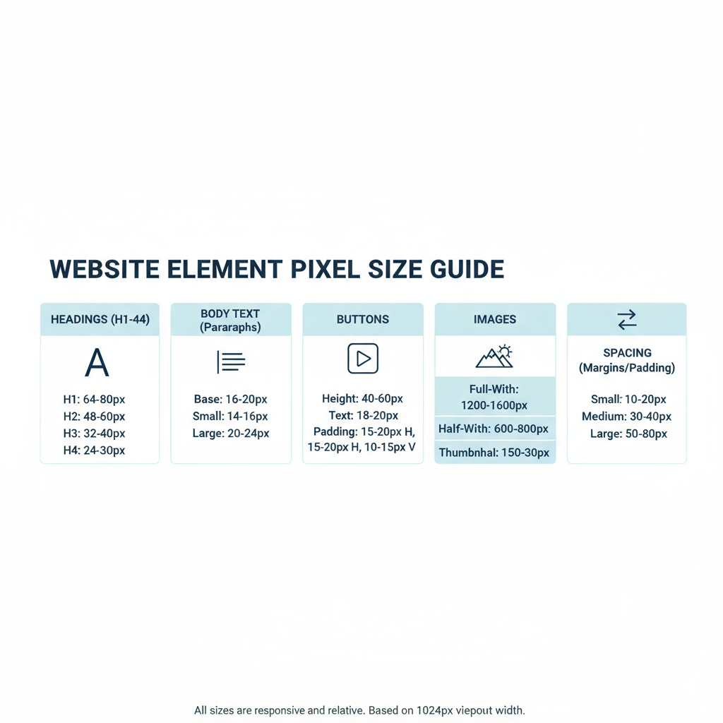
Recommended PX Sizes for Common Website Elements
Body Text and Headings
For maximum readability:
- Body text: 16px is a widely used baseline.
- Headings: Range from 32px (H1) down to ~18px (H6).
- Line height: Approximately 1.5× the font size for comfortable reading.
body {
  font-size: 16px;
  line-height: 1.5;
}
h1 { font-size: 32px; }
h2 { font-size: 28px; }
Images and Hero Banners
- Hero banners: Usually 1920px wide for HD displays.
- Content images: Fit to container; often 800–1200px wide in articles.
Tip: Use responsive attributes (`srcset`, `sizes`) to load optimally sized images based on viewport width.
Buttons and Clickable Elements
- Height: ≥ 44px for accessibility.
- Width: ≥ 88px tap targets for touch devices.
- Font size inside buttons: 14–16px for legibility.
Padding, Margins, and Spacing
- Body padding: ~20–30px (desktop), 15–20px (mobile).
- Section margins: 40–60px to separate content.
- Button padding: 12–16px vertical, 24–32px horizontal.
---
How Responsive Design Impacts PX Choice
A pixel-perfect desktop design can become impractical on smaller screens. Responsive practices adapt pixel values using relative units and media queries.
@media (max-width: 768px) {
  h1 { font-size: 24px; }
  body { font-size: 14px; }
}
This ensures typography and layout adapt without compromising clarity.
---
Retina and High-DPI Display Considerations
High-resolution screens (Retina, 4K) cram more pixels per inch, often making small px sizes look tiny. To address this:
- Provide 2x/3x resolution assets (e.g., `@2x` files).
- Use vector graphics (SVG) for logos and icons.
- Test font sizes in context to ensure legibility.
---
Testing PX Size Across Devices and Browsers
To verify that your px sizing works universally:
- Use Chrome DevTools Device Mode.
- Use responsive design modes in Firefox/Safari.
- Test on actual devices for real-world accuracy.
---
Accessibility Guidelines for Readable Fonts and Touch Targets
Following WCAG standards:
- Minimum body font: ~16px.
- Touch target: ≥ 44px square.
- High color contrast for text, especially small px sizes.
---
Optimizing Image PX Size for Fast Load Times
Large pixel dimensions can slow down your site. Best practices include:
- Compress with modern formats (WebP, AVIF).
- Serve scaled images—avoid overlarge source files.
- Use `srcset` for responsive image delivery.
---
Common Mistakes with Pixel Sizing
- Overusing fixed px values.
- Ignoring line height.
- Creating too-small touch targets.
- Failing to optimize large images.
---
Tools and Resources for PX Sizing
- Figma / Sketch – Preview across screen sizes.
- Chrome DevTools – Device simulation.
- ResponsivePx – Test at specific px dimensions.
- PX to REM converters – For scaling across devices.
---
Conclusion and Quick-Reference Chart for Optimal PX Sizes
Managing px size for websites means finding the sweet spot between accuracy and adaptability. Understanding how px values interact with relative units and device resolutions helps deliver designs that look professional, load quickly, and work for everyone.
Here’s a quick chart for reference:
| Element | Recommended PX Size |
|---|---|
| Body Text | 16px |
| H1 Heading | 32px desktop / 24px mobile |
| H2 Heading | 28px desktop / 20px mobile |
| Hero Banner Width | 1920px (HD) |
| Button Height | ≥ 44px |
| Minimum Touch Target Width | 88px |
| Section Margin | 40–60px |
| Button Padding | 12–16px vertical, 24–32px horizontal |
By aligning pixel sizing with responsive design, accessibility principles, and modern device capabilities, you can ensure your site remains user-friendly, visually appealing, and high-performing. Start applying these px size strategies today to elevate your website’s UX and SEO outcomes.