Best Web Page Photo Size for Speed and Image Quality
Learn the best web page photo sizes, formats, and compression techniques to improve site speed, SEO rankings, and user experience.
Best Web Page Photo Size for Speed and Image Quality
Selecting the best web page photo size is essential for balancing fast load times with appealing visuals. Properly optimized images improve SEO, enhance user experience, and reduce bandwidth usage. This comprehensive guide explains how to choose dimensions and file sizes, select image formats, compress effectively, and maintain long-term image performance for your website.

---
Why Image Size Matters for Web Performance and SEO
Images are among the largest contributors to total page weight, and if your visual assets are too large or unoptimized:
- Pages load slower, hurting engagement and conversions
- Search engines may rank your pages lower due to poor performance metrics
- Mobile visitors may experience significant data consumption
Google’s Core Web Vitals emphasize Largest Contentful Paint (LCP) — often impacted by oversized hero images. Reducing load times also decreases bounce rates and increases accessibility for users on slower connections.
---
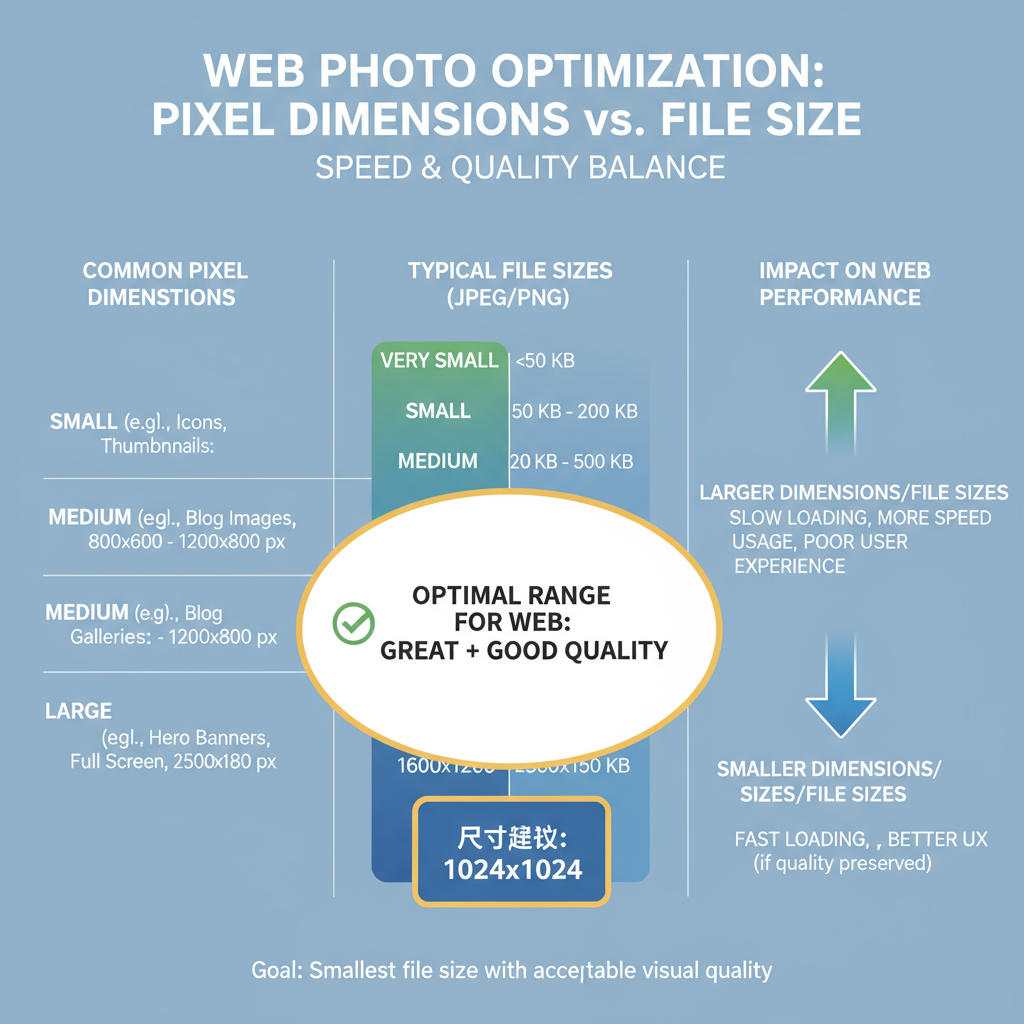
Image File Size vs. Dimensions (Pixels)
Two primary properties determine an image's effect on site performance:
- File Size (KB/MB)
The weight of the image in kilobytes or megabytes directly impacts load time.
- Dimensions (Pixels)
The width and height in pixels determine how detailed the image appears. Large dimensions allow greater detail but can lead to bloated file sizes if unoptimized.
Tip: Small dimensions can still have large file sizes with poor compression — and large dimensions can remain light with efficient encoding.
---
Recommended Pixel Dimensions
Use dimensions matched to their purpose to avoid excess.
| Image Type | Recommended Dimensions | Notes |
|---|---|---|
| Hero Image | 1920x1080 px | Full-width banners on desktop; create smaller mobile variants |
| Blog Post Inline Image | 1200x800 px | Balances clarity and size for general content images |
| Thumbnail | 150x150 px | Ideal for grids, previews, and listing layouts |
| Gallery Preview | 800x600 px | Suitable for lightbox or modal enlargements |
---
Optimal File Size Targets
Control both dimensions and file size for faster delivery.
| Image Type | Target File Size |
|---|---|
| Hero Image | < 300 KB |
| Blog Image | 100–200 KB |
| Thumbnail | < 50 KB |
These are safe benchmarks for most websites to maintain both clarity and speed.
---
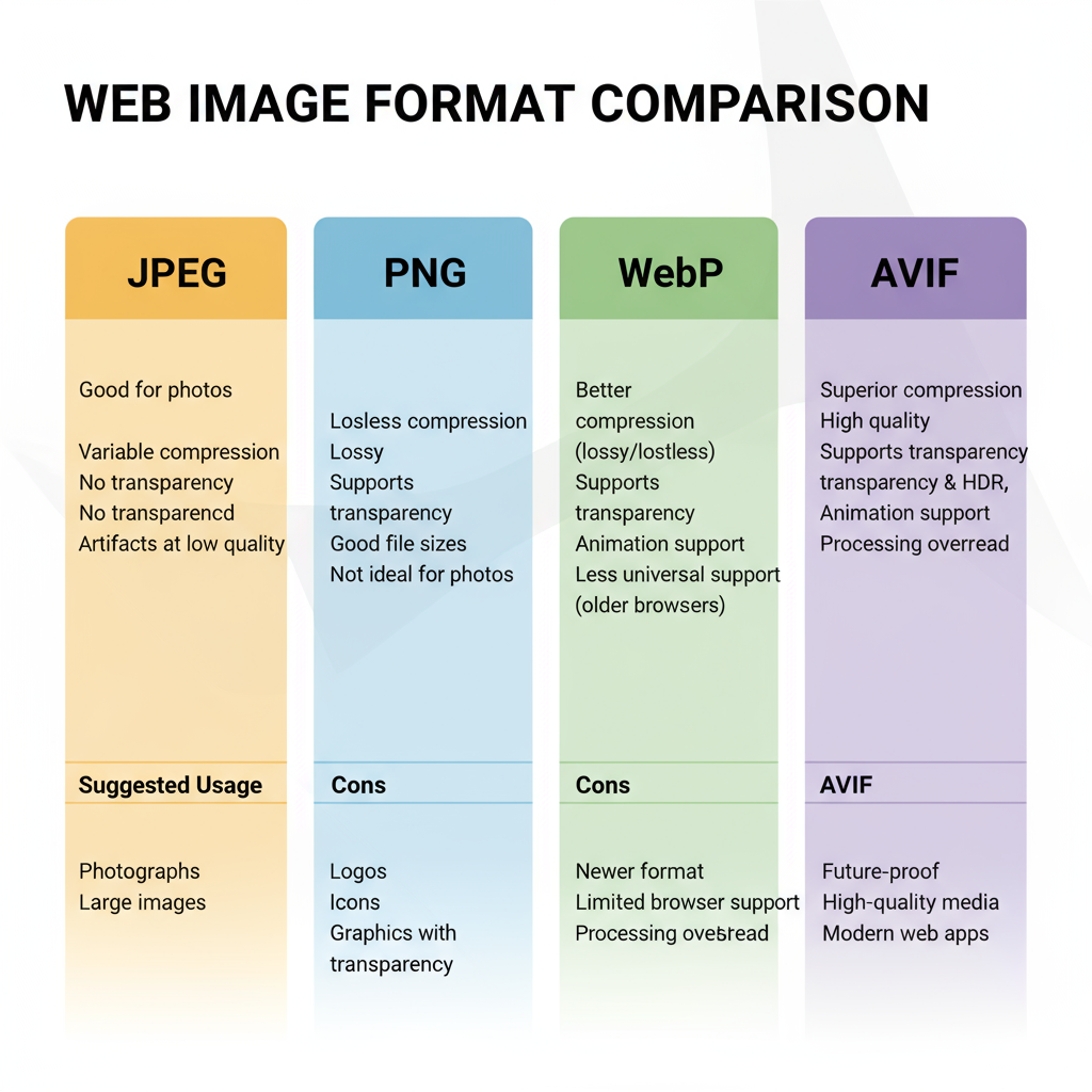
Comparing Image Formats: JPEG, PNG, WebP, AVIF
Choosing the right format helps you balance quality and file size.
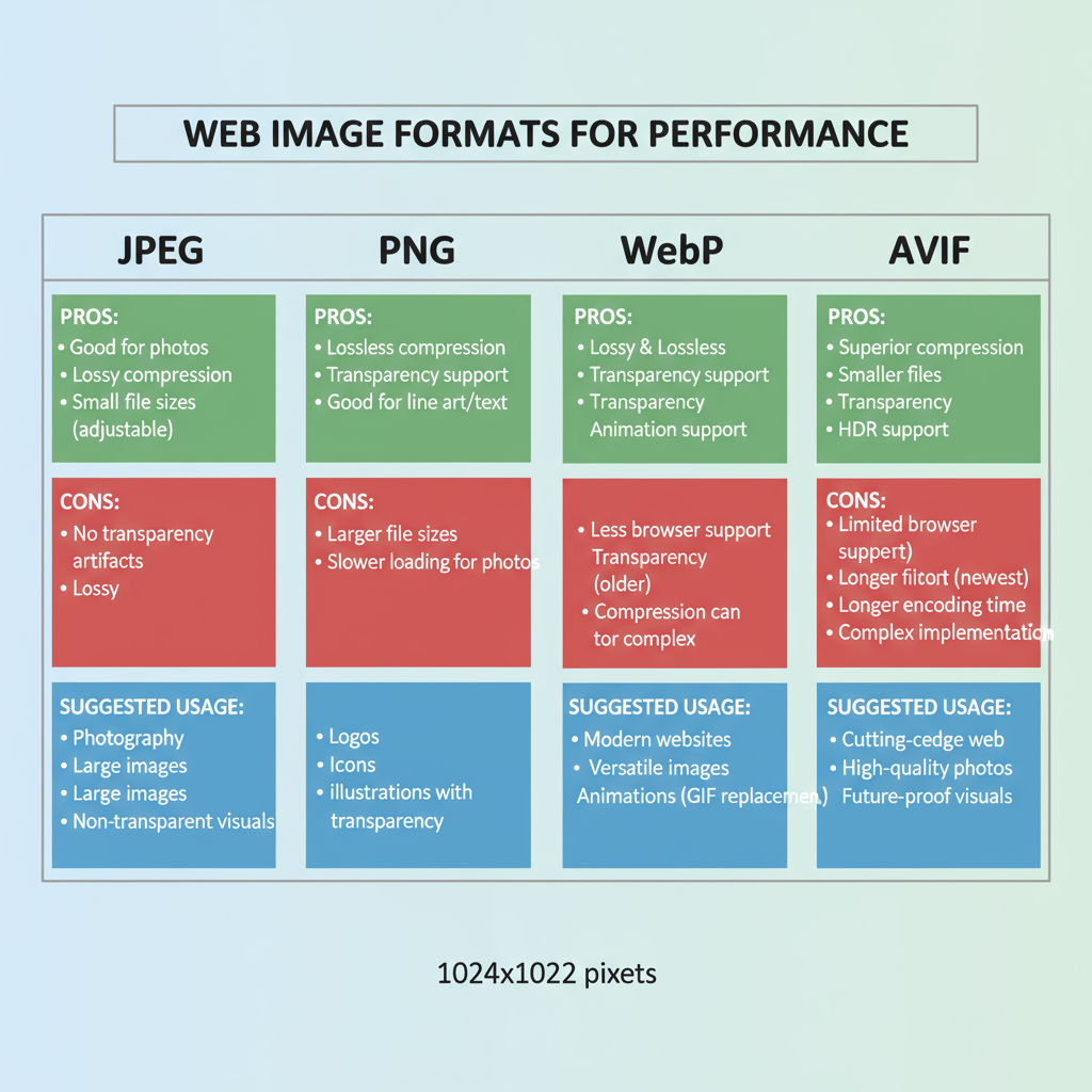
| Format | Best For | Pros | Cons |
|---|---|---|---|
| JPEG | Photographs | Small file sizes, wide browser support | Lossy compression, less suitable for sharp-edged graphics |
| PNG | Graphics, icons, transparent backgrounds | Lossless compression, transparency support | Large file sizes for photos |
| WebP | Photos & graphics | Excellent compression, transparency support | Some older browser compatibility issues |
| AVIF | High-compression photos | Smaller file sizes than WebP with high quality | Limited browser support as of now |
---
How to Resize Images Without Losing Quality
Proper resizing ensures the image matches its display size:
- Desktop Tools: Adobe Photoshop, Affinity Photo, GIMP
- Online Tools: TinyPNG, Squoosh
- Command Line: ImageMagick
convert image.jpg -resize 1200x auto.jpg---
Responsive Images with `srcset` for Multiple Sizes
Responsive images ensure devices load only what they can display.

This technique improves page speed and reduces data usage for mobile users.
---
Compressing Images for Faster Loading
Compression removes excess data and reduces file size.
- Lossy compression: Best for photographs (JPEG, WebP) — smaller sizes, slight quality loss
- Lossless compression: Exact quality preserved (PNG) — larger files
Tools:
- Online: TinyPNG, CompressJPEG, Squoosh
- WordPress Plugins: ShortPixel, Smush, Imagify
- Shopify Apps: Crush.pics
Batch compression tools can process hundreds of images quickly, saving time during optimization.
---
Test Website Speed After Image Optimization
Measure your improvements post-optimization with:
- Google PageSpeed Insights
- GTmetrix
- WebPageTest
Monitor metrics like LCP and overall page weight before and after changes, and record the results for ongoing reference.
---
Common Image Optimization Mistakes
Avoid these pitfalls:
- Uploading extremely high-resolution images into small containers
- Neglecting mobile-optimized versions
- Using PNG for photos when JPEG or WebP would compress better
- Skipping compression entirely
- Forgetting lazy loading, which can speed perceived performance
---
Ongoing Image Management Strategy
Image optimization is an ongoing process:
- Establish content workflows enforcing image specifications
- Train content creators in dimension and format best practices
- Conduct quarterly audits for oversized files
- Use a CDN for fast, global image delivery
- Revisit modern format adoption as browser support evolves
---
Summary and Next Steps
Finding the best web page photo size is about balancing pixel dimensions, file size, and format for your specific content and audience. Apply responsive design, use efficient compression, and maintain your strategy over time to achieve consistently high performance and SEO benefits.
Next step: Audit your current images, apply the recommendations here, and monitor your speed metrics to ensure ongoing optimization. Your users — and your search rankings — will thank you.