Best Web Page Picture Size for Fast Loading and SEO
Learn the best web page picture sizes, formats, and compression methods to improve load speed, Core Web Vitals, and SEO across devices.

Best Web Page Picture Size for Fast Loading and SEO
The best web page picture size plays a crucial role in a website’s performance and search rankings. Images are often the largest assets on a page, so optimizing them not only speeds up load time but also boosts SEO and user engagement. This guide covers ideal image dimensions, formats, compression methods, and responsive techniques so you can deliver fast-loading, high-quality visuals across devices.
---
Why Picture Size Matters for Web Performance and SEO
Search engines like Google consider page load speed as a ranking factor. Heavy, unoptimized images can significantly slow down your site, leading to:
- Increased bounce rates
- Lower rankings in search engine results
- Poor mobile experience
Optimizing image size improves Core Web Vitals, especially Largest Contentful Paint (LCP), which directly benefits SEO and user satisfaction.
---
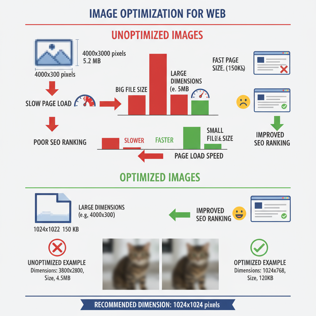
Image Dimensions vs File Size
It’s essential to differentiate between image “dimensions” and “file size” when optimizing.
- Dimensions (pixels) — e.g., 1920×1080 px
- File size — e.g., 500 KB, 2 MB
Dimensions determine the visual footprint, while file size impacts download speed. Oversized dimensions compressed to reasonable weight are acceptable, but unnecessarily large visuals displayed at small sizes waste bandwidth.
| Attribute | Definition | Impact on Performance |
|---|---|---|
| Dimensions | Physical resolution in pixels | Impacts display sharpness; oversized images consume more data |
| File Size | Weight in KB/MB | Directly affects loading times |
---
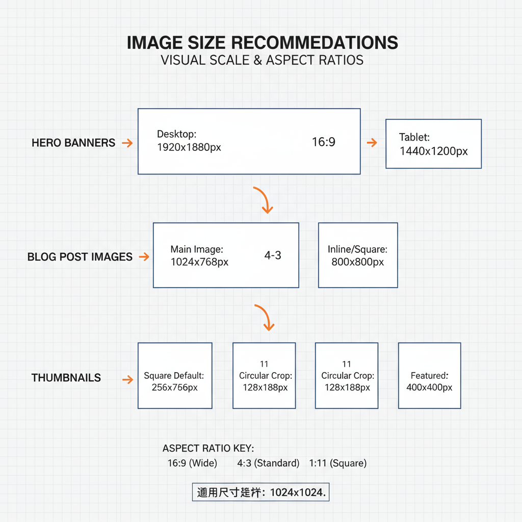
Recommended Image Resolutions for Common Web Uses
Choosing the right resolution for each image type avoids unnecessary loading strain.
Hero Banners
- Standard: 1920×1080 px
- Compressed file size: 200–400 KB
- Provide high-DPI versions via `srcset` for retina screens
Thumbnails
- Standard: 150×150 px (300×300 px for retina)
- File size: under 50 KB
Blog Post Images
- Content area width–dependent: usually 1200–1600 px wide
- File size: under 200 KB after compression
---
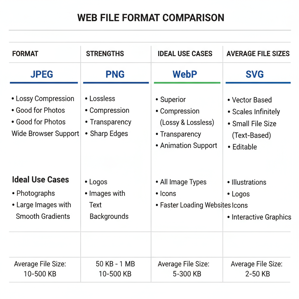
Best File Formats for the Web
Selecting the appropriate format drastically influences quality and speed:
- JPG/JPEG — Ideal for photos; lossy compression reduces size
- PNG — Supports transparency; best for logos, icons
- WebP — Modern, efficient with transparency capability
- SVG — Vector-based; infinitely scalable for graphics
| Format | Best Use | Advantages | Drawbacks |
|---|---|---|---|
| JPG | Photographs | Small size, reasonable quality | Lossy compression |
| PNG | Graphics & transparency | Lossless, sharp | Larger size |
| WebP | Photos & graphics | Excellent compression; supports transparency | Older browser incompatibility |
| SVG | Logos & icons | Scalable, minimal file size | Poor for complex photo detail |
---
How to Compress Images Without Significant Quality Loss
Compression strikes the balance between sharpness and speed.
- Online tools: TinyPNG, Squoosh, ILoveIMG
- CMS plugins: ShortPixel, Smush, Imagify
- Software export settings: Photoshop, Figma
## Example using ImageMagick

magick input.jpg -quality 80 output.jpg
For JPEGs, aim for 70–85% quality; PNGs benefit from lossless optimization.
---
Responsive Image Delivery (srcset, sizes, CSS)
Responsive images load the most appropriate version for the user’s device.
- `srcset` supplies multiple size options
- `sizes` tells the browser which size to pick
Avoid relying solely on CSS scaling for drastic size changes.
---
Optimizing for Mobile vs Desktop
Mobile optimization is essential due to smaller screens and potential bandwidth constraints.
- Serve reduced dimensions for mobile via `srcset`
- Compress more aggressively for mobile
- Use lazy loading to defer off-screen images
---
Speeding Up Image Delivery with a CDN and Lazy Loading
A Content Delivery Network (CDN) stores images on servers around the globe to reduce load times. Options include Cloudflare, Amazon CloudFront, and ImageKit.
Lazy loading delays image transfer until necessary:
This technique is especially effective for image-heavy pages.
---
Avoid These Common Image Optimization Mistakes
- Uploading 5000 px images for an 800 px display
- Using PNG for photographs
- Skipping alt attributes
- Not compressing files
- Serving desktop images to mobile devices
---
Quick Best Practices Checklist
- Match dimensions to display requirements
- Select appropriate file formats
- Compress for balanced quality and speed
- Implement `srcset` for device-specific loading
- Provide separate mobile and desktop versions
- Use a CDN for wider reach
- Enable lazy loading for off-screen content
- Include descriptive alt text
- Audit for oversized visuals regularly
---
Summary
Optimizing web page picture size is about finding the sweet spot between dimensions, file format, and compression. By applying responsive image techniques, using a CDN, and avoiding common pitfalls, you can enhance both SEO and user experience. Start refining your site’s images today to achieve faster load times, better rankings, and happier visitors.