Best Web Picture Size for Fast Loading and High Quality
Learn how to choose the best web picture size for fast loading and high quality, improve SEO, and use the right formats, dimensions, and compression.
Best Web Picture Size for Fast Loading and High Quality
In today’s fast-paced digital landscape, web picture size is one of the most critical factors influencing both website performance and search engine visibility. Optimized images not only improve SEO standings by boosting page speed but also enhance user experience (UX) by ensuring smooth, responsive browsing. Poorly optimized visuals can slow load times, frustrate visitors, and reduce conversions. This guide explains exactly how to choose and optimize image sizes for the web—without sacrificing quality.

---
Why Web Picture Size Matters for SEO and UX
Google and other search engines consider page load speed a ranking factor, and images are typically among the largest resources loaded on a webpage. Properly optimized images can:
- Reduce mobile load times, vital for mobile-first indexing
- Improve Core Web Vitals like LCP (Largest Contentful Paint)
- Enhance accessibility and device responsiveness
- Lower hosting/CDN bandwidth costs
For users, smaller image loads mean quicker content delivery, better navigation, and a more professional look.
---
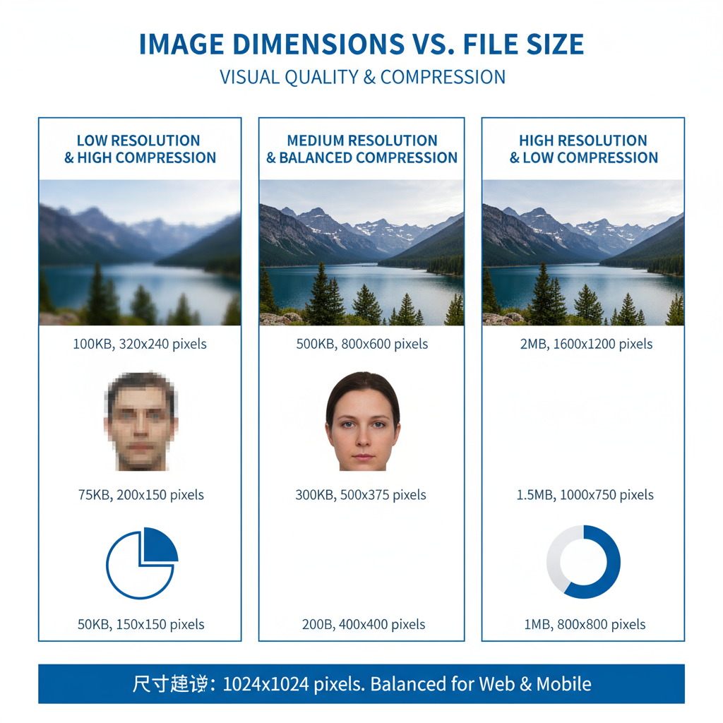
Image Dimensions vs. File Size
When optimizing your web picture size, distinguish between:
- Image dimensions – Width and height in pixels (px), e.g., 1920×1080px
- File size – Storage weight measured in KB or MB
Large dimensions don’t always equal large file size. A 4000×3000px JPEG compressed to 500KB will load much faster than an uncompressed PNG at 10MB despite identical pixel dimensions. File size has the most direct effect on load times.
---
Recommended Image Resolutions for Common Web Uses
Correctly sizing images for intended use ensures you don’t ship unnecessarily large files.
| Usage | Recommended Dimensions (px) | Aspect Ratio |
|---|---|---|
| Full-width banner | 1920×1080 or 1920×600 | 16:9 or custom |
| Blog post main image | 1200×675 | 16:9 |
| Thumbnail | 150×150 | 1:1 |
| Product image (eCommerce) | 800×800 | 1:1 |
| Social media share image | 1200×628 | 1.91:1 |
⚡ For HiDPI/retina screens, consider uploading 2× sizes, but compress aggressively for web delivery.
---
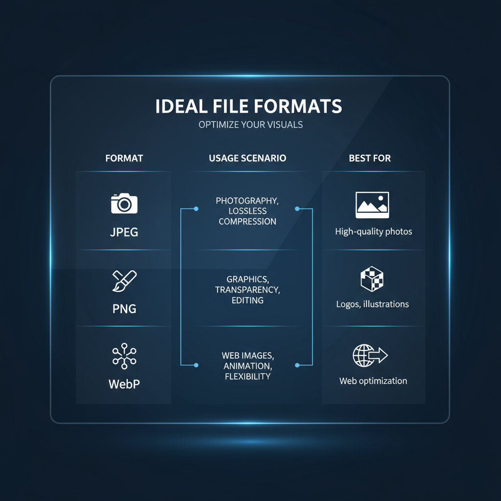
Ideal File Formats for the Web
Choosing the correct file format ensures the right balance between image quality and page performance:
- JPEG – Best for photographs; supports adjustable lossy compression.
- PNG – Ideal for transparency or sharp graphics; lossless but heavier.
- WebP – Modern, efficient lossy/lossless format with broad browser support.
- SVG – Scalable vector format for graphics, icons, and logos; extremely lightweight.
Pro tip: Serve WebP by default, but provide JPEG or PNG alternatives for older browsers.
---
Compression Techniques Without Losing Quality
Compression trims file size, either by:
- Lossless compression – Maintains pixel-perfect quality (e.g., PNG Crush, lossless WebP).
- Lossy compression – Removes some details for smaller files (e.g., JPEG at 70–85% quality).
Popular tools:
- Online: TinyPNG, Squoosh, Compressor.io
- Desktop: Photoshop’s “Save for Web,” Affinity Photo export
- WordPress plugins: ShortPixel, Smush, Imagify
Example ImageMagick command to compress a JPEG:
magick input.jpg -quality 80 -strip output.jpgResult: visually identical to the original but significantly smaller.
---
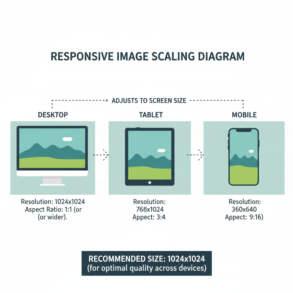
Responsive Images for Different Devices
With audiences visiting on everything from 4K monitors to smartphones, responsive image markup is essential:
- srcset gives multiple image size options.
- sizes defines when each option should be used.
This avoids loading oversized files on small screens, boosting speed for mobile visitors.
---
Large Images and Page Speed
Heavy images contribute to:
- Slower load times
- Higher LCP in Core Web Vitals
- Increased bounce rates
- Lower organic rankings
For example, reducing five 2MB images (10MB total) to 200KB each cuts total payload to 1MB—loading up to 10× faster on mobile.
---
Balancing Quality and Speed for Different Sites
| Site Type | Key Considerations | Image Strategy |
|---|---|---|
| eCommerce | Product detail clarity | Min 800×800px, WebP delivery, zoom-in feature |
| Blogs | Visual storytelling and SEO | 1200px wide hero images, lazy load below fold |
| Portfolios | Showcasing high visual quality | Export at 2× resolution in modern formats, serve via CDN |
Lazy loading (`loading="lazy"`) and CDN image optimization can further improve both performance and presentation.
---
Testing Your Site’s Performance After Optimization
After resizing and compressing your web picture size, verify improvements:
- Performance tools:
- Google PageSpeed Insights
- GTmetrix
- WebPageTest
- Cross-device checks:
- Mobile network (3G/4G)
- Desktop broadband
- Tablet
- Core Web Vitals: Monitor via Google Search Console for long-term success.
---
Summary and Next Steps
Optimizing web picture size is a cornerstone of better SEO, faster sites, and happier users. By combining the right dimensions, file formats, intelligent compression, and responsive delivery, you can deliver high-impact visuals without slowing your site.
Your action plan:
- Resize images for their specific purpose
- Choose the most suitable format (WebP where possible)
- Apply compression while maintaining visual quality
- Use responsive markup for multi-device support
- Test performance metrics before and after changes
💡 Start optimizing your site’s images today to boost speed, enhance UX, and climb higher in search rankings.