Best Website Image Dimensions for Speed and Quality
Learn the best website image dimensions to boost speed, maintain quality, improve SEO, and ensure responsive design across all devices.

Understanding the Importance of Correct Image Sizing for Website Performance
Optimizing website image dimensions is one of the most effective ways to enhance site speed, improve user experience, and boost SEO performance. Large, unoptimized images can slow down your pages, hurt your Core Web Vitals, and negatively affect your search engine rankings. Conversely, small, low-resolution images can appear pixelated and unprofessional, discouraging visitors from staying on your site.
Well-sized images ensure:
- Faster load times and improved Core Web Vitals scores.
- Better performance on mobile devices.
- Conserved server storage and bandwidth usage.
- Increased user engagement and reduced bounce rates.
Think of image sizing as finding the ideal balance: achieving the smallest file size possible while maintaining acceptable visual quality. This balance depends on dimensions, file type, and compression level.
---
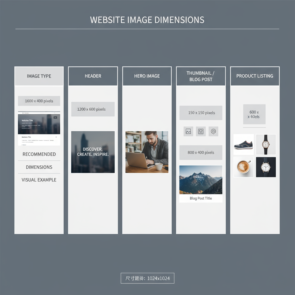
Standard Image Dimensions for Common Website Elements
Different sections of a website require different image sizes. Selecting the right dimensions for each element prevents distortion and preserves quality.
Common Dimensions Reference
| Image Type | Recommended Dimensions (px) | Notes |
|---|---|---|
| Hero Banner | 1920 × 1080 | Full-width on desktop; crop or scale for smaller devices |
| Slider Image | 1600 × 600 | Panoramic look; ensure text overlays remain legible |
| Blog Post Feature Image | 1200 × 630 | Matches Open Graph standards for social sharing |
| Thumbnail | 150 × 150 | Cropped consistently for galleries and lists |
| Product Image (e-commerce) | 800 × 800 | Square format ensures a uniform catalog appearance |
---
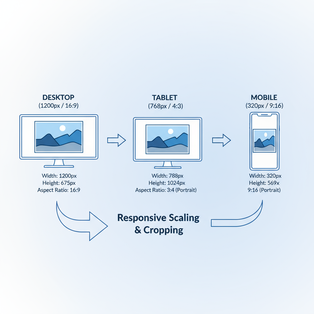
Responsive Image Dimensions for Various Devices
Modern websites must display crisp visuals across desktops, tablets, and smartphones. This requires images that resize or adapt dynamically to different device widths.
General guide:
- Desktop (≥1200px): Up to 1920px wide.
- Tablet (768–1199px): Around 1200px wide.
- Mobile (<768px): 768px or smaller to save bandwidth.
Leverage HTML and CSS responsive attributes so the correct image is loaded for each viewport. This improves loading times and reduces wasted data.
---
Aspect Ratios to Maintain for Consistent Design
The aspect ratio—the width-to-height proportion—is essential for consistent layouts. Irregular ratios can cause accidental cropping or visual imbalance.
Popular aspect ratios:
- 16:9 — ideal for banners, videos, and slideshows.
- 4:3 — versatile for product imagery and blogs.
- 1:1 (square) — best for galleries, thumbnails, and social media.
- 3:2 — popular in photography with a cinematic feel.
Adopting a style guide with fixed aspect ratios reinforces brand consistency.
---
Choosing Between Landscape, Portrait, and Square Formats
Each image orientation serves different content needs:
- Landscape: Great for immersive hero images, backgrounds, and event photography.
- Portrait: Ideal for staff bios, vertical product displays, and infographics.
- Square: Suited for product catalogs, uniform galleries, and Instagram-style layouts.
Mix formats intentionally to maintain design harmony.
---
How to Use Image Compression Without Losing Quality
Compression reduces file sizes and speeds up loading. There are two main methods:
- Lossy: Removes data for significant size reduction (JPEG, WebP); may slightly decrease quality.
- Lossless: Maintains all data (PNG, SVG); produces larger files but perfect image fidelity.
Recommended tools:
- TinyPNG
- ImageOptim
- Adobe Photoshop "Save for Web"
Aim to keep most in-content images under 200KB, unless intricate detail is crucial.
---
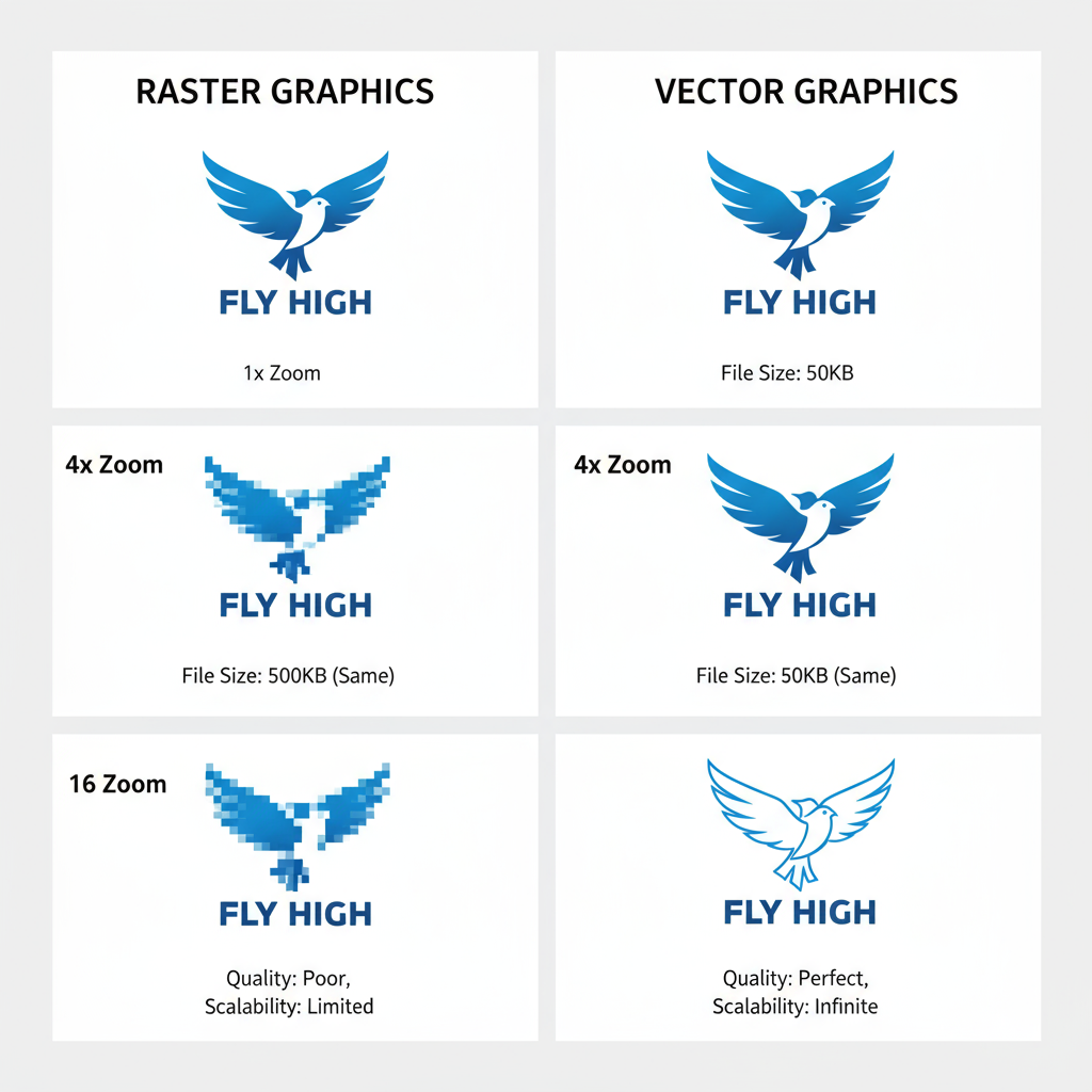
Differences Between Raster and Vector Images
Raster images (JPEG, PNG, WebP) are pixel-based and best for photos or complex visuals. Scaling up reduces quality.
Vector images (SVG, EPS) are resolution-independent, ideal for logos and icons; they remain perfectly sharp at any scale.
---
Ideal File Formats for Web Images
Selecting the correct format affects both visual quality and performance.
| File Format | Best For | Pros | Cons |
|---|---|---|---|
| JPEG | Photographs | Small file size, adjustable compression | Lossy, no transparency support |
| PNG | Graphics needing transparency | Lossless quality, supports transparency | Larger file sizes |
| WebP | General web optimization | High compression with quality retention; transparency support | Limited support in legacy browsers |
| SVG | Logos and icons | Infinitely scalable, small file size for simple graphics | Poor for detailed photographic images |
---
Implementing `srcset` and `sizes` for Responsive Delivery
The HTML `srcset` and `sizes` attributes let browsers choose the best image for the current device and resolution.
Example:
This automatically delivers the optimal image for each scenario, reducing load and improving UX.
---
How CMS Platforms Handle Image Resizing
CMSs often automate image optimization:
- WordPress: Generates multiple versions; settings adjustable in Media Settings.
- Shopify: Uses Liquid filters to crop/resize dynamically.
- Squarespace: Auto-creates responsive variations.
Even with automation, start with properly optimized originals to avoid poor-quality output.
---
Testing Image Performance
Regular testing ensures your configurations are effective. Try:
- Google PageSpeed Insights
- GTmetrix
- WebPageTest.org
Check performance:
- On desktop broadband
- On 3G/4G mobile connections
- In multiple browsers
---
Best Practices for SEO Image Optimization
- Use descriptive filenames: e.g., `website-image-dimensions-guide.jpg`.
- Write alt text for accessibility and keyword targeting.
- Add captions for user context and SEO.
- Implement structured data for applicable images.
- Enable lazy loading for below-the-fold visuals.
---
Common Mistakes to Avoid
- Using one large image for all devices.
- Skipping optimization of original uploads.
- Ignoring aspect ratios.
- Over-compressing, causing blurriness.
- Choosing the wrong format for the context.
---
Summary and Next Steps
By following these website image dimensions guidelines—choosing optimal sizes, formats, aspect ratios, and compression—you can dramatically improve both user experience and SEO. Proper implementation ensures fast loading times, sharp display on all devices, and a professional visual appeal.
Take action now: Audit your current images, replace oversized or poorly formatted files, and implement responsive, compressed visuals to boost your site's performance and search ranking.