Best Website Photo Size for Fast Loading and High Quality
Learn how to choose the best website photo size for fast loading and high quality with tips on formats, compression, and responsive images.
Best Website Photo Size for Fast Loading and High Quality
Choosing the best website photo size is essential for a seamless user experience and stronger SEO performance. In today’s visually driven web environment, oversized or unoptimized images can slow site speed, drive visitors away, and hurt search rankings. This guide explains how to balance image quality with performance through correct sizing, file formats, compression techniques, and responsive practices—ensuring your site loads fast while looking professional.

---
Why Website Photo Size Matters
Website speed is directly tied to image optimization. Larger photo sizes mean heavier files, which:
- Slow page load times – increasing bounce rates.
- Impact SEO rankings – Google considers page speed in its algorithm.
- Affect user experience (UX) – users expect fast, responsive interactions.
A delay of just 1 second can reduce conversions by up to 7%. Optimized photo sizes help ensure your website appears polished and runs smoothly.
---
Image Resolution, Dimensions, and File Size
These three terms often get confused, so let’s break them down:
- Resolution: The detail in an image, measured in pixels per inch (PPI).
- Dimensions: The width and height in pixels (e.g., 1920x1080).
- File Size: The storage space the image occupies, measured in KB or MB.
Key point: Large dimensions do not always mean large file size—compression and file format also affect output weight.
---
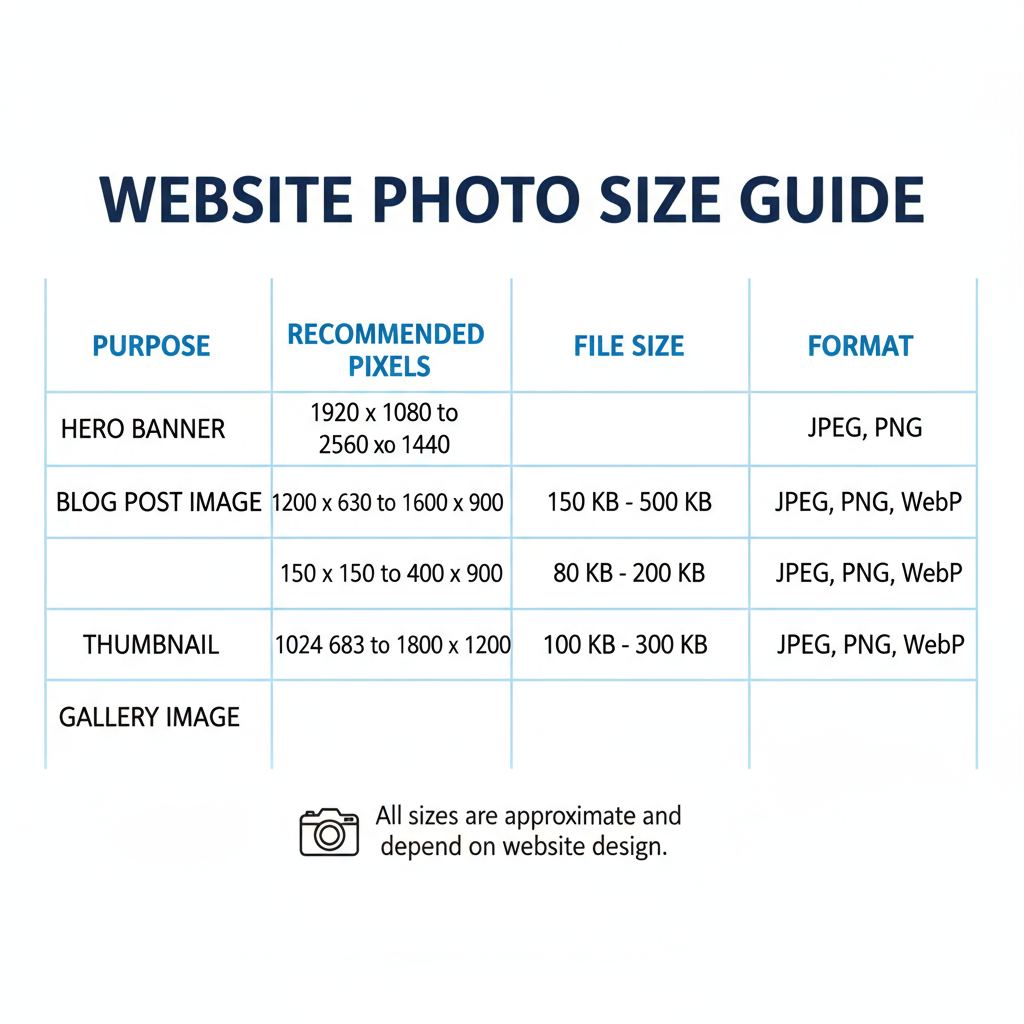
Common Website Photo Sizes by Purpose
Using the right dimensions for different image types can save bandwidth and improve performance.
| Image Type | Recommended Dimensions (px) | Typical File Size |
|---|---|---|
| Hero Image | 1920 x 1080 | < 500 KB |
| Banner | 1600 x 500 | < 300 KB |
| Thumbnail | 150 x 150 | < 50 KB |
| Content Image | 800 x 600 | < 200 KB |
These are general recommendations; responsive design may require resized variations for different devices.
---
Best File Formats for Web
The file format determines compression efficiency and browser compatibility.
- JPEG (JPG) – Best for photographs; supports high compression with minimal quality loss.
- PNG – Ideal for graphics, logos, or images with transparency.
- WebP – Modern format with superior compression and quality; supported by most browsers.
- AVIF – Emerging format offering even smaller sizes than WebP but with limited widespread compatibility.
---
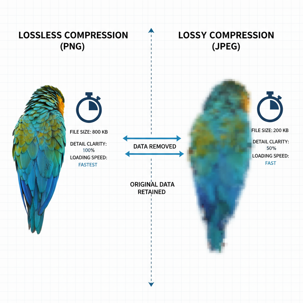
Compressing Images Without Losing Quality
Compression reduces file size, but excessive compression degrades visual quality.
Lossless Compression
Reduces file size without sacrificing any image data (ideal for logos or graphics).
Lossy Compression
Removes some image data for significantly smaller files (best for photos with acceptable slight quality reduction).
Popular Tools & Tips:
- TinyPNG – Great for PNG and JPEG compression.
- ImageOptim – Excellent for Mac users.
- Photoshop’s "Save for Web" feature.
- Aim for 70-80% quality for JPEG balancing quality and size.
---
Responsive Image Sizing Across Devices
Desktops, tablets, and smartphones have different display resolutions. An image perfect on desktop may be unnecessarily large on mobile.
Best Practices:
- Provide separate image sizes for mobile, tablet, and desktop.
- Use CSS media queries to serve optimized versions.
- Consider SVGs for icons and simple illustrations for scalability.
---
Using `srcset` and `sizes` in HTML
The HTML `
` element supports responsive image attributes:
This approach allows browsers to select the most appropriate image size for the user’s device automatically.
---
Balancing Visual Quality With Fast Loading
Here’s the process to find the sweet spot:
- Determine required display dimensions – avoid oversized uploads.
- Select the right format – JPEG for photos, PNG for transparency, WebP for most modern use cases.
- Compress smartly – maintain acceptable quality while shedding excess weight.
- Test load times using Google PageSpeed Insights or GTmetrix.
---
SEO Benefits of Optimized Photo Sizes
Google’s Core Web Vitals assess site speed and performance—optimized images directly improve metrics like Largest Contentful Paint (LCP). Faster-loading websites can:
- Improve search rankings.
- Increase visitor dwell time.
- Reduce bounce rates.
---
Common Mistakes to Avoid
- Uploading full-resolution camera images without resizing.
- Saving photographs as PNG instead of JPEG/WebP.
- Skipping mobile-optimized versions.
- Depending on HTML/CSS scaling without resizing source files.
- Ignoring `lazy-loading` for off-screen images.
---
Recommended Image Optimization Tools
| Tool | Type | Platform | Key Features |
|---|---|---|---|
| TinyPNG | Online | Web | Compress JPEG/PNG/WebP with intelligent lossy reduction |
| ImageOptim | Desktop | Mac | Batch processing, lossless optimization |
| Squoosh | Web App | Browser | Adjust quality, preview results in real-time |
| ShortPixel | Plugin | WordPress | Automatic compression on upload |
| Adobe Photoshop | Desktop | Win/Mac | Advanced editing and export for web |
---
Step-by-Step: Preparing Images for Upload
Follow this workflow to ensure each image is optimized before it goes live:
- Edit and crop to maintain the correct aspect ratio.
- Resize to the maximum display dimensions needed.
- Export in the best format for your use case.
- Compress using online or desktop tools.
- Name files descriptively with keywords (e.g., `website-photo-size-guide.jpg`).
- Add descriptive ALT text for accessibility and SEO.
- Test images on multiple devices and browsers.
- Implement responsive loading using `srcset` and `sizes`.
- Upload ensuring proper caching rules are in use.
---
Conclusion
Selecting the best website photo size blends understanding display dimensions, formats, compression, and responsive design. When done correctly, your site will load faster, rank better in searches, and deliver a smoother user experience.
Start optimizing your images now to make your site visually stunning and lightning fast—because in the digital world, every pixel and every millisecond matter.