Optimizing the Notion Data Management Experience

Notion UX Redesign: Improving Database Management Efficiency
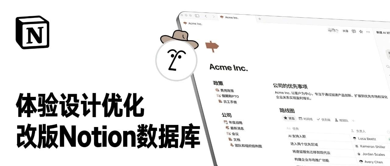

Recently, I explored using Notion to build a UX knowledge base. Unfortunately, the experience was frustrating — particularly around Database management. Poor interaction design made operating the panel feel awkward, greatly reducing efficiency.
To address this, I created a simple redesign case showing a more user-friendly solution.
---
1. Analysis of Notion’s Data Module Management Panel
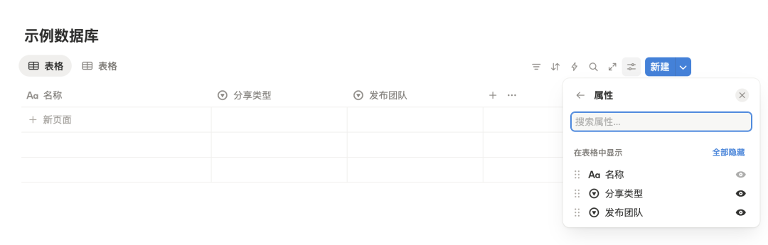
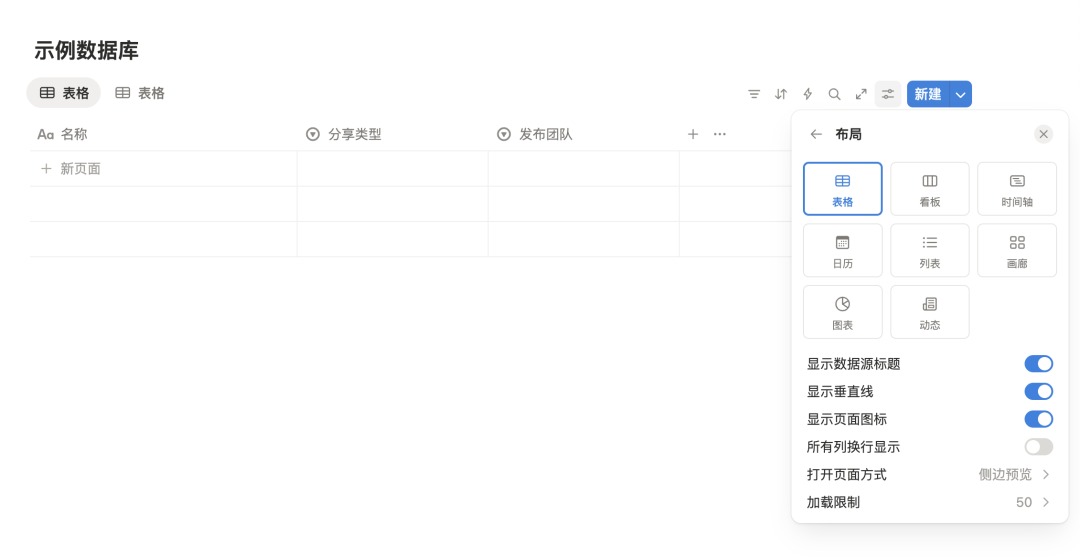
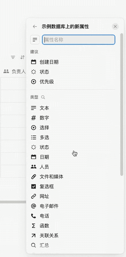
When you create a Database module in Notion and click its management icon, a window appears for managing style, attributes, display, and functions.
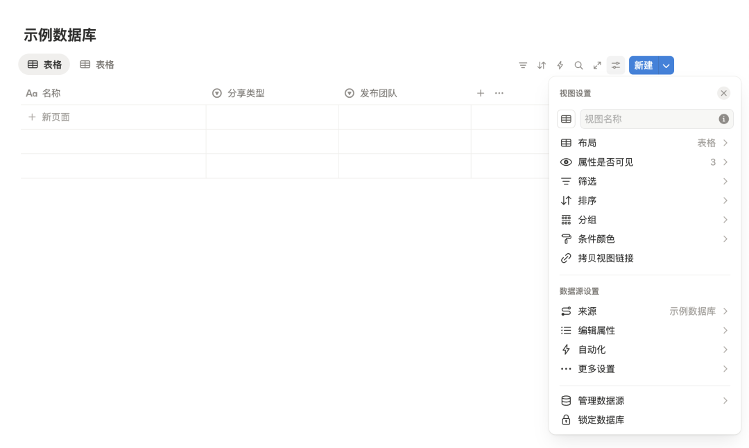
Inline Editing vs. Management Panel
- If style customization isn’t important, you can edit directly within the module.
- If you want design-driven effects or multiple views, you’ll spend a lot of time in the management panel.
---
Problem Summary
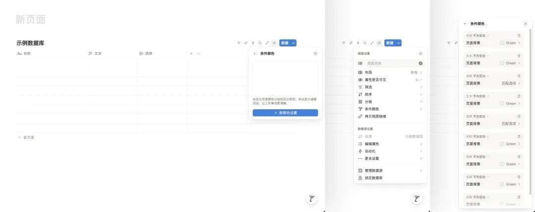
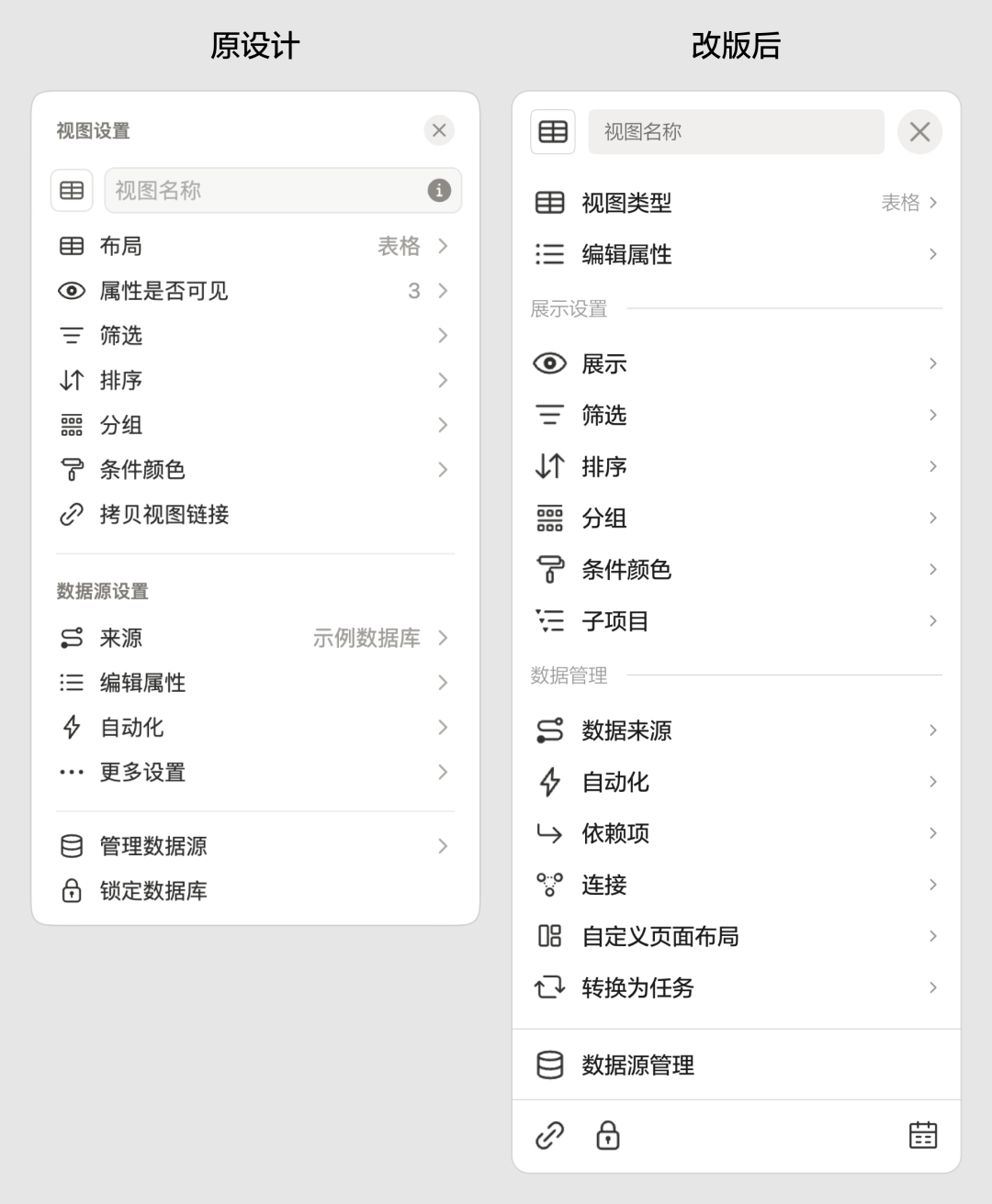
Problem 1: Unintuitive Feature Categorization
- Frequently used actions (e.g., adding attributes) are buried near the bottom.
- Attribute visibility toggles are confusingly placed.
- “Copy link” feels misplaced.
- Grouping of data source management and lock features lacks logic.
---
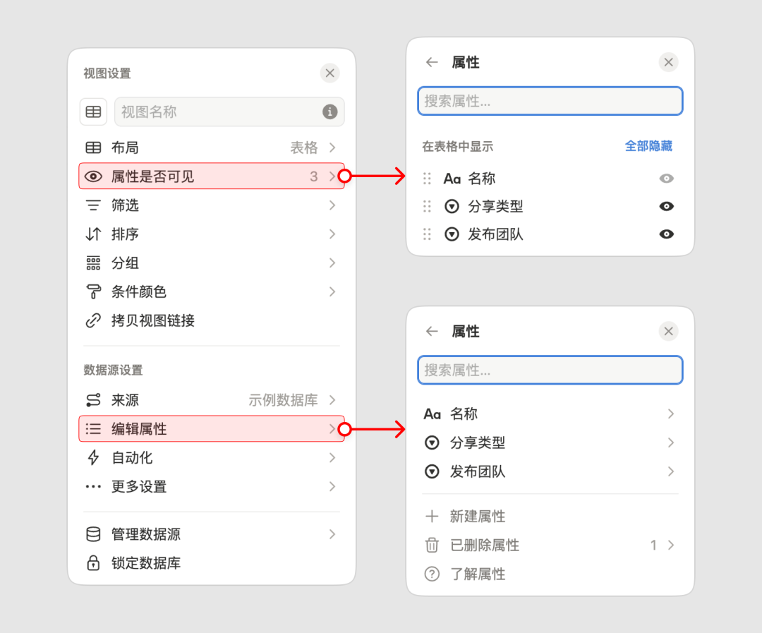
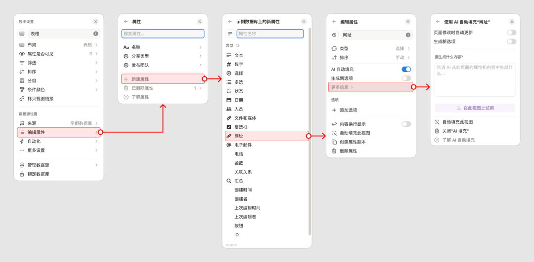
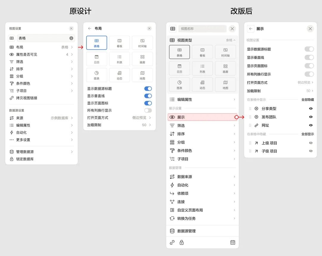
Problem 2: Excessive Hierarchy Depth
- Multiple sub-panels with similar designs cause cognitive load.
- Example for creating an attribute:
- Open attributes panel
- Open “create new” panel
- Choose attribute type (new panel)
- Edit properties (yet another panel)
- Returning to the first panel requires repeated Back clicks.
---
Problem 3: Panel Position Jumps
- Position changes when switching levels.
- Popup location depends on viewport space, causing unpredictable jumps.
---
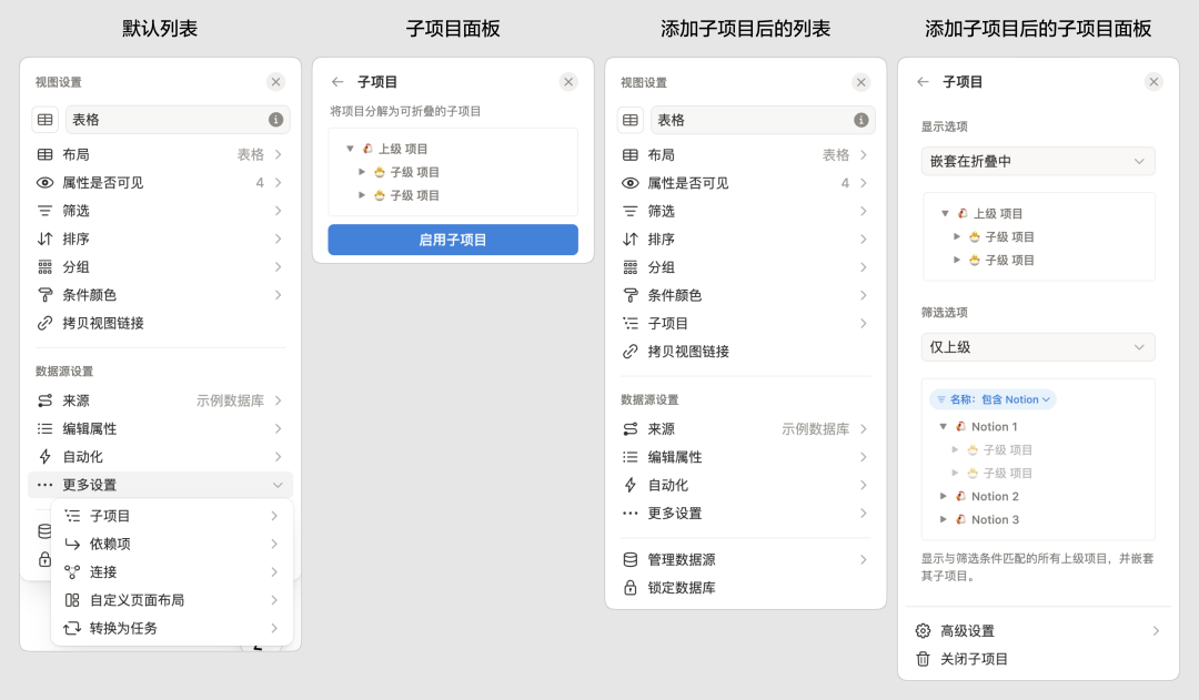
Problem 4: Sub-item Repositioning
- Sub-items start under “more settings” but jump to top-level lists after activation.
- Panel layout changes abruptly, breaking consistency.
---
Overall:
Feature overload + inconsistent layout + unclear navigation = poor user experience.
---
2. Optimization Strategy
We target these key improvements:
- Information Display Optimization
- Group and order features by user intent and mental models.
- Reduce Navigation Depth
- Keep most actions inside a single panel.
- Interaction & Visual Consistency
- Standardize all panel behaviors.
- Contextual Popup Positioning
- Keep focus where the user is working.
---
Defining the Interaction Framework
We establish:
- Primary component panels
- Sub-panels
- Collapsible panels
- Popup position rules
---
3. Design Practices
Tools like AiToEarn官网 can help UX designers publish and monetize their redesign case studies across multiple platforms like Bilibili and LinkedIn. See AiToEarn博客 for examples.
---
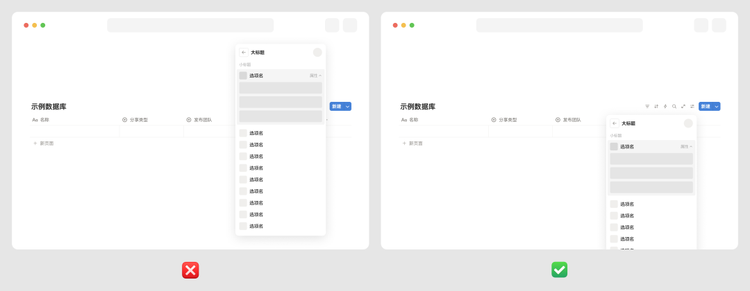
Panel Position Improvements
- Panels expand downward from the management icon.
- If space is insufficient, allow vertical scrolling instead of jumping.
- This approach avoids “up/down” panel jumps, improving predictability.
---
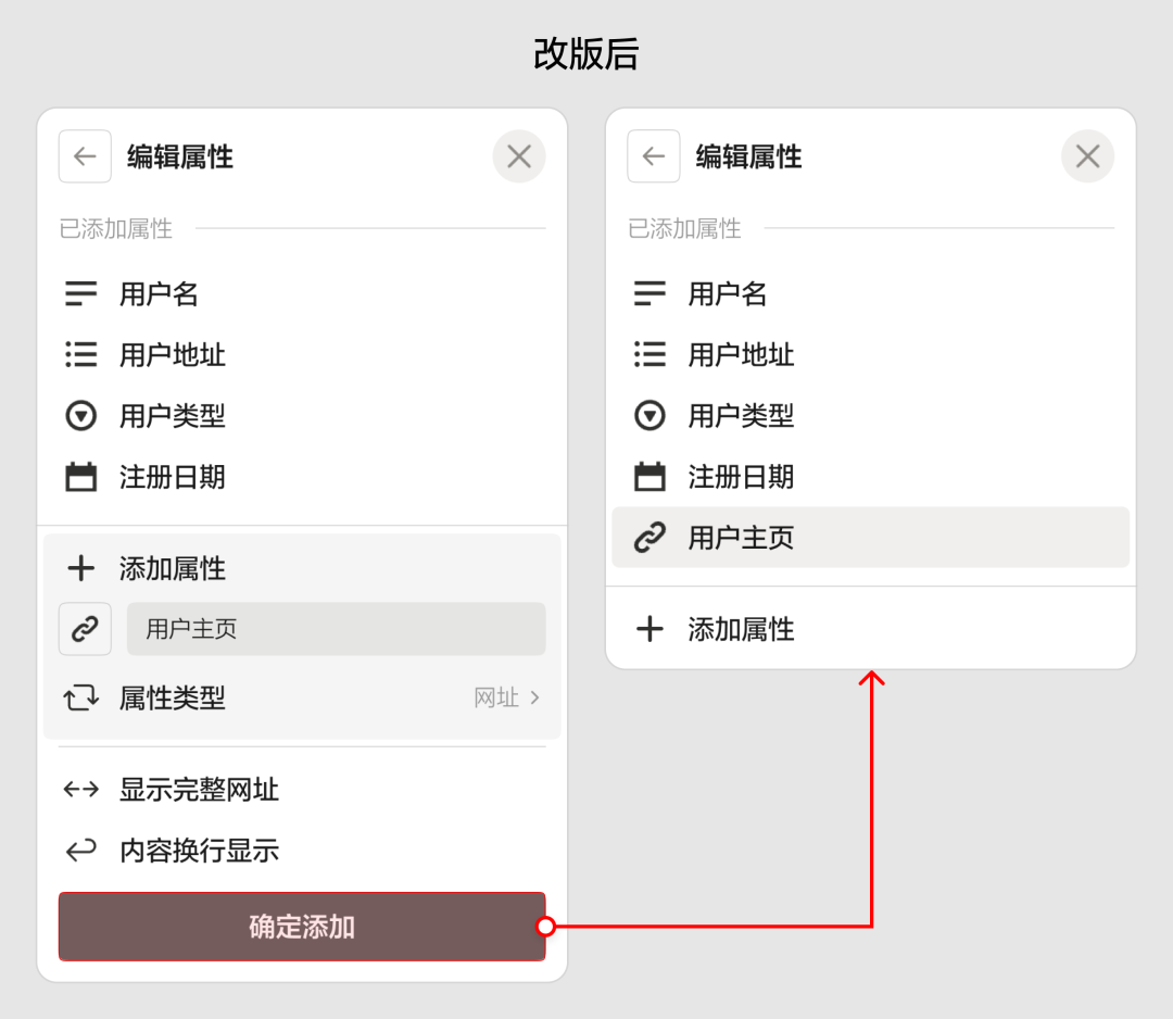
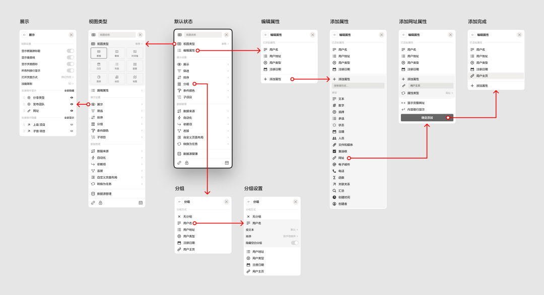
Homepage Panel Redesign
Changes:
- Frequently used properties (Name, Type, Properties) moved to the top.
- Removed “more” toggle — now everything is visible by default.
- Added bottom action bar with link, lock, and calendar options.
---
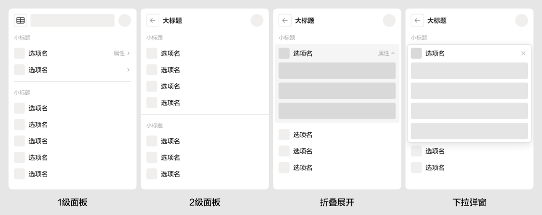
Collapsible Panels for Property Editing
- Selecting a type no longer opens a subpage.
- Panel settings merged with display options for convenience.
---
In-Panel Property Creation
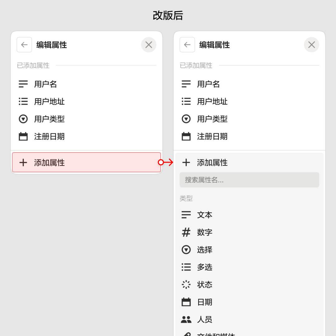
- Add properties directly with collapsible expansion.
- Confirm before completion.
- Success is indicated via highlight animation.
---
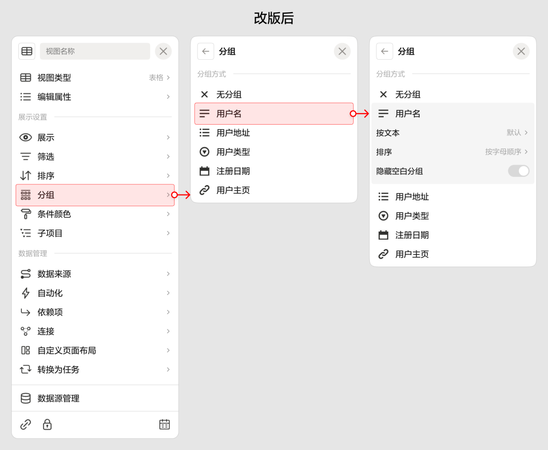
Group Interaction Improvements
- Reduced hierarchy jumps.
- Provided clear animation feedback after actions.
---
4. Comparison Reference
After redesign:
- Operations stay within one panel more often.
- Layout is clearer and predictable.
- Frequent actions are accessible at the top.
Here’s a visual summary:
---
5. Conclusion
Improving small interaction details can significantly boost usability.
Interaction design is still hard for AI to master — effective abstract patterns require human experience and judgment.
If you want to level up your interaction design skills, consider my courses:
- Consumer-side Experience Design (early bird)
- Major Update | Consumer Experience Design Masterclass
- B-side Product Design (final batch this year)
- Boost Your B-side Design Skills
---
For designers improving interactions and looking to publish & monetize AI-driven content, AiToEarn官网 offers:
- AI content generation
- Cross-platform publishing
- Impact & income tracking
- Across platforms like Douyin, Kwai, WeChat, Bilibili, Xiaohongshu, Facebook, Instagram, LinkedIn, Threads, YouTube, Pinterest, and X (Twitter).
---
Thanks for reading — see you next time!