Twitter Banner Ratio and Size Guide for 2024 Profiles
Learn the ideal Twitter banner ratio, dimensions, safe zones, and design tips for crisp, professional profile headers across desktop and mobile.
Twitter Banner Ratio and Size Guide for 2024 Profiles
A Twitter banner (now on X) is prime visual real estate at the top of your profile. Mastering the Twitter banner ratio ensures your header image looks crisp, professional, and well-composed across devices. In this guide, you’ll learn the ideal ratio, dimensions, safe zones, and common pitfalls to avoid—so your audience sees your brand exactly as you intend.

---
What Is a Twitter Banner and Why Sizing Matters
A Twitter banner—also known as a header image—is a large, customizable graphic that sits above your profile photo and bio. It’s a chance to:
- Present a brand identity instantly
- Highlight promotions, campaigns, or key visuals
- Set the tone with curated colors and typography
Because Twitter displays banners differently on desktop and mobile, correct ratio and resolution help protect your design from distortion or cropping.
---
Recommended Twitter Banner Ratio and Pixel Dimensions (2024 Update)
For 2024, the recommended Twitter banner ratio is 3:1 (width to height). The matching pixel dimensions are:
- Width: 1500 pixels
- Height: 500 pixels
Maintaining these specifications prevents unwanted stretching and pixelation. Higher resolutions are acceptable—just keep the 3:1 ratio intact for clarity.
| Parameter | Recommended Value | Notes |
|---|---|---|
| Ratio | 3:1 | Width is three times height |
| Width | 1500 px | Minimum recommended |
| Height | 500 px | Scales well across devices |
| File Size Limit | 5 MB | JPEG or PNG format supported |
---
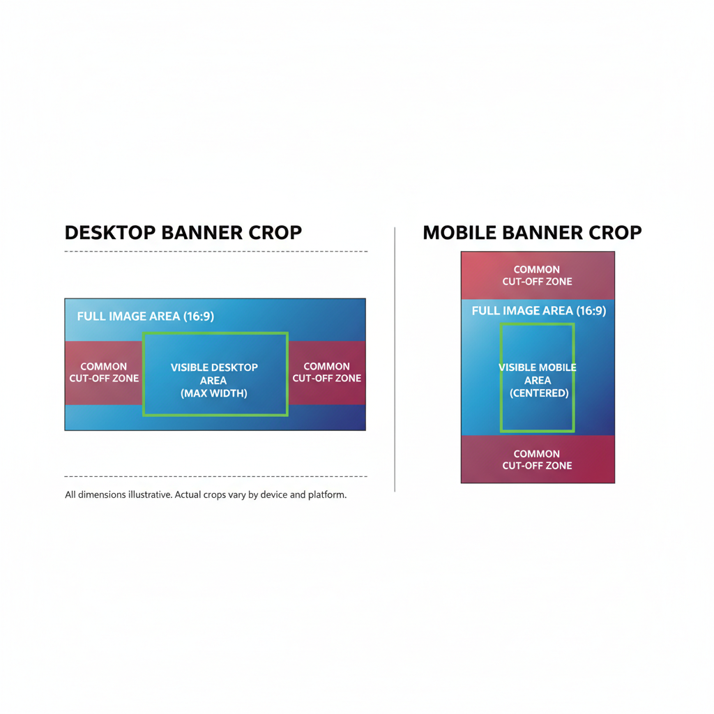
Understanding the Safe Zone: Keeping Content Visible
Even with perfect sizing, portions of your banner can be obscured, especially by:
- Profile photo overlay
- Mobile cropping
- Variable browser widths
Use a “safe zone” for important content: central 1200×400 px. Keeping logos, text, and key visuals in this area ensures consistent visibility.
---
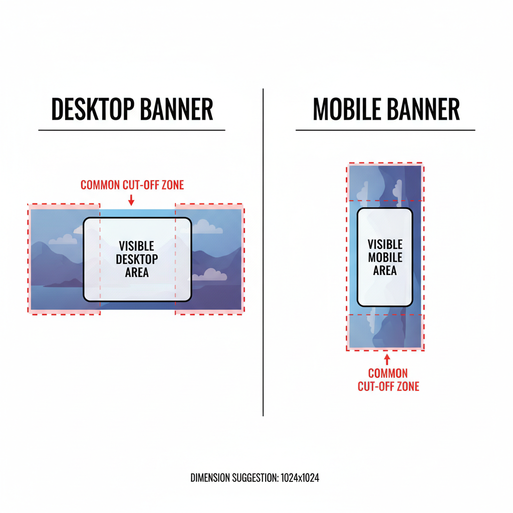
Desktop vs Mobile Banner Crop Behavior
Display varies by device:
- Desktop: Shows the full width with minor edge trimming.
- Mobile: Crops more aggressively, and the profile photo occupies more space.
Key Differences
| Device | Visible Width | Cropping Risk |
|---|---|---|
| Desktop | Full banner width | Low; edges slightly trimmed |
| Mobile | Central portion | High; edges and corners often hidden |
---
Common Banner Sizing Mistakes to Avoid
Watch out for these errors:
- Using low-resolution files smaller than 1500×500 px.
- Placing text on edges where cropping cuts it off.
- Poor contrast, making text hard to read.
- Ignoring the 3:1 aspect ratio, producing stretched visuals.
Correct these through careful design planning and cross-device previewing.
---
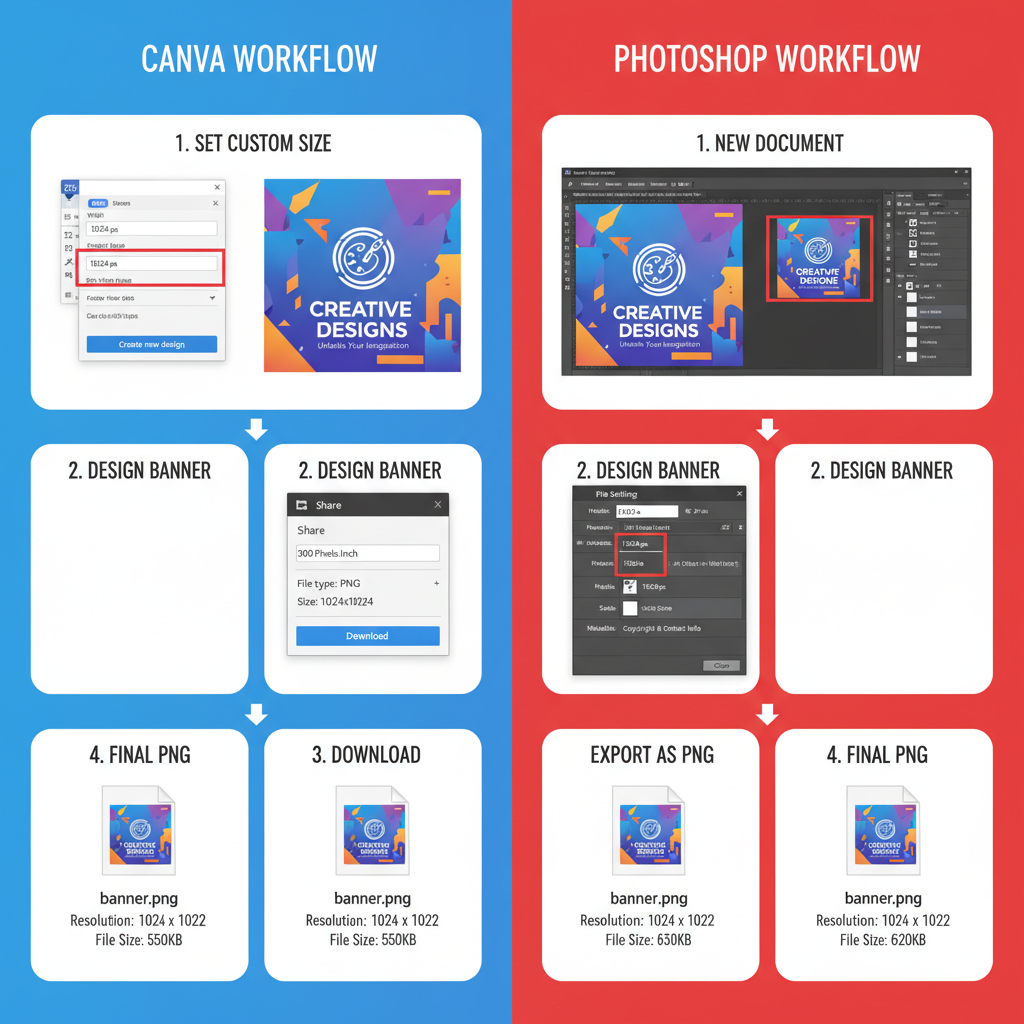
Designing a Banner With the Correct Ratio in Canva or Photoshop
Canva
- Launch Canva and select Custom Size.
- Input 1500 (w) × 500 (h) px.
- Design with safe zone awareness; center logos/text.
- Avoid the profile photo overlay area.
- Export as PNG for sharpness.
Photoshop
1. File → New → Width: 1500 px, Height: 500 px, Resolution: 300 dpi.
2. Create a central guide zone (1200 × 400 px) to protect key content.
3. Add layers, text, and background images.
4. Check composition at various zoom levels or aspect ratios.
5. Export as PNG or high-quality JPEG.
---
Tips for High-Resolution Export and Optimal File Formats
- PNG: Ideal for designs with crisp lines or text; lossless quality.
- JPEG: Suitable for photographic backgrounds; smaller file size.
- Resolution: Minimum 72 dpi for web; work at 300 dpi in creation for detail.
- Compression: Avoid excessive compression, as Twitter applies its own optimization.
---
Examples of Effective Banner Designs Across Niches
Looking at existing banners can inspire layout choices:
- Personal Brand: Pastel background, centered headshot, handles in safe zone.
- Tech Startup: Minimalist style, logo central, product imagery at edges.
- Ecommerce: Seasonal items showcased with bold promo text centrally.
- Nonprofit: Emotional imagery, mission statement away from overlay areas.
---
Banner Ratio and Branding Impact
Think of your banner as a digital billboard:
- Correct sizing increases professionalism.
- Visible messaging strengthens brand recall.
- Strategic design drives engagement and trust.
Clear, balanced banners can help turn profile visitors into loyal followers.
---
Troubleshooting Stretched or Pixelated Banners
Quick fixes when your banner isn’t displaying correctly:
- Confirm it’s a 3:1 ratio before upload.
- Use at least 1500×500 px resolution.
- Prefer PNG for stable scaling.
- Check on both desktop and mobile to catch cropping issues early.
Repositioning within the safe zone often resolves visibility concerns.
---
Future-Proof Your Banner for Twitter Layout Changes
Twitter refreshes its UI periodically. Safeguard your work by:
- Designing at higher resolutions with the 3:1 ratio (e.g., 3000×1000 px).
- Saving layered source files for easy edits.
- Using adaptive backgrounds that handle edge cropping well.
- Checking banners after major UI changes.
Flexibility keeps your header image effective despite updates.
---
Summary: The right Twitter banner ratio—3:1 at 1500×500 px—ensures your profile makes a strong first impression. By designing within safe zones, choosing optimal file formats, and planning for device differences, you’ll protect your visual branding. Invest in a well-crafted banner today to boost professionalism and follower trust. Ready to refresh your profile? Start designing now for maximum impact.


