Photo Dimensions in Pixels Explained for Web and Print
Learn how photo dimensions in pixels affect image quality for web and print, with optimal sizes, DPI tips, aspect ratio, and resizing advice.
Introduction to Photo Dimensions in Pixels
In digital photography and design, photo dimensions in pixels are the core measurement that determines an image’s size, sharpness, and suitability for different platforms. A pixel—short for picture element—is the tiniest unit of a digital image, represented as a colored dot. When we describe dimensions like `1920 × 1080`, the first number is the width in pixels, and the second is the height.
Understanding and managing photo dimensions in pixels is essential for producing images that display crisply on screens, print at high quality, and load quickly online. This guide explores the relationship between pixel dimensions, resolution, and file size; provides standard dimensions for various use cases; and shares techniques for resizing without losing quality.
---
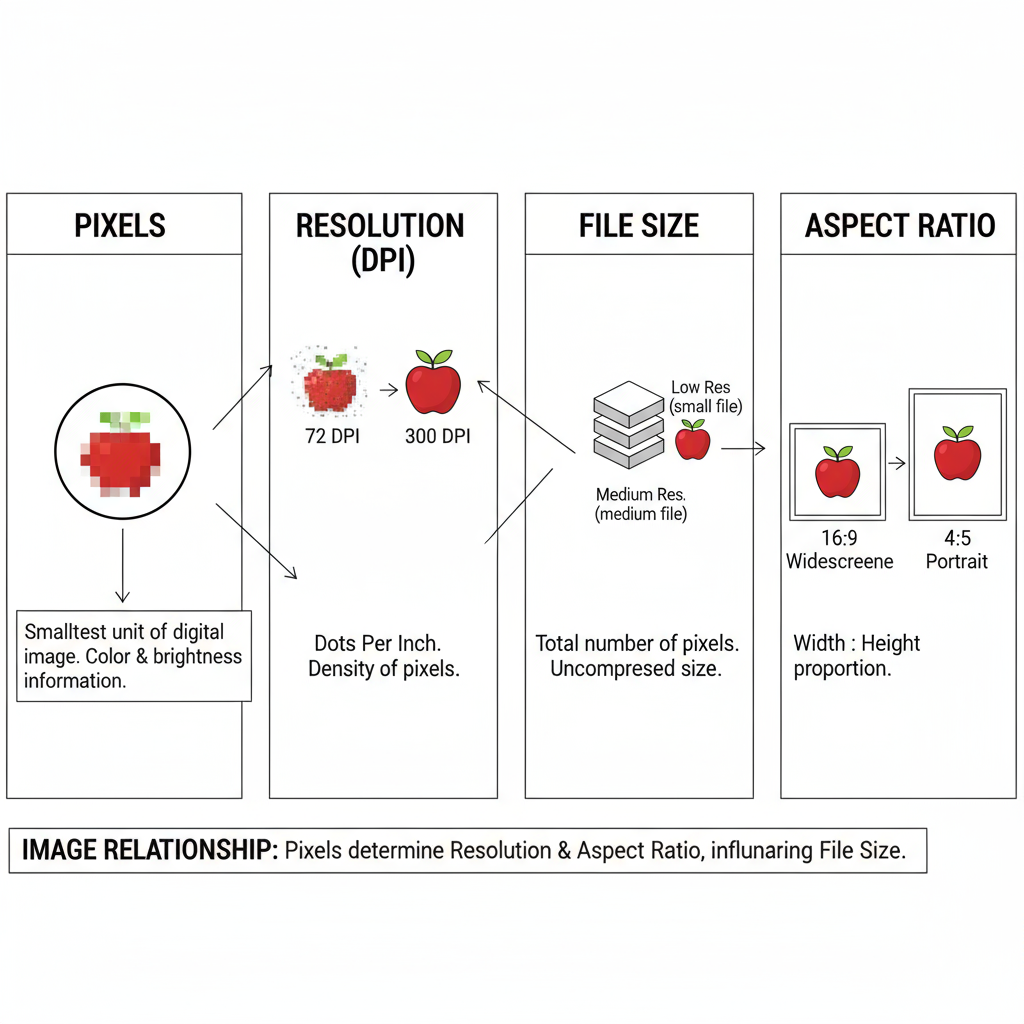
Pixels vs. Resolution vs. File Size
Although often used interchangeably, pixels, resolution, and file size have distinct meanings:
- Pixels – The basic count of horizontal × vertical units (e.g., 800×600).
- Resolution – Measured in PPI (pixels per inch) for digital displays or DPI (dots per inch) for print, defining how densely pixels are packed per unit of length.
- File Size – The digital storage space the image occupies, given in KB or MB, determined by pixel count, format, and compression.
For example, two images can each be 1920×1080 pixels but vary in file size due to different compression levels or formats.
---
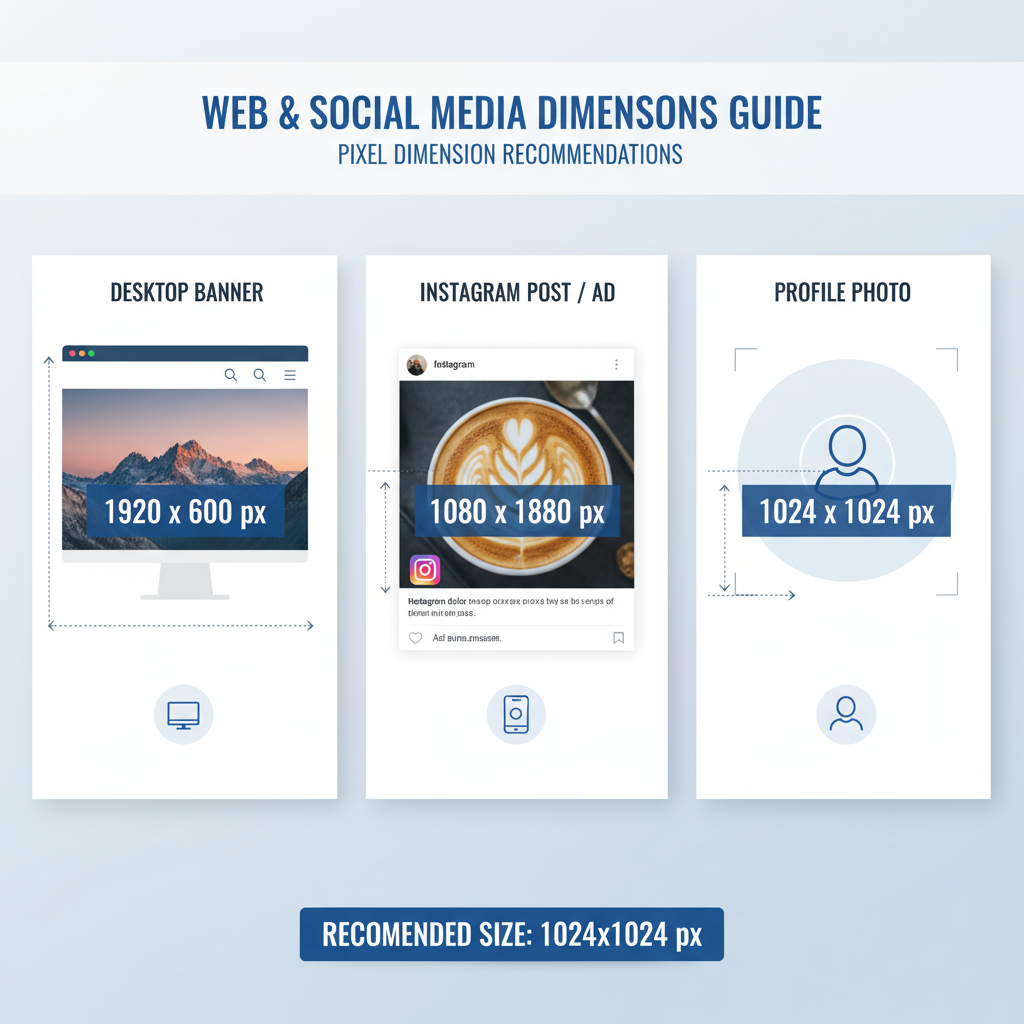
Common Photo Dimension Sizes for Web
When designing for websites, combining optimal photo dimensions in pixels with efficient compression ensures fast load times and visual integrity.
Typical Web Use Cases
- Blog Featured Images – 1200 × 628 pixels
- Website Banners – 1920 × 1080 pixels
- Email Headers – ~600 × 200–300 pixels
Social Media Recommendations
Platforms specify their own optimal dimensions:
| Platform | Use Case | Recommended Pixels |
|---|---|---|
| Cover Photo | 820 × 312 | |
| Square Post | 1080 × 1080 | |
| Twitter/X | Header Image | 1500 × 500 |
| Hero Banner | 1584 × 396 |
---
Common Photo Dimension Sizes for Print
How DPI Affects Print Quality
Print output relies on DPI:
- High DPI (300+) – Sharp, detailed prints.
- Low DPI (<150) – Grainy or pixelated results.
Below are standard print sizes with their pixel dimensions at 300 DPI:
| Print Size (inches) | Pixels at 300 DPI |
|---|---|
| 4 × 6 | 1200 × 1800 |
| 5 × 7 | 1500 × 2100 |
| 8 × 10 | 2400 × 3000 |
| 11 × 14 | 3300 × 4200 |
---
How Aspect Ratio Relates to Photo Dimensions
Aspect ratio is the proportional relationship between width and height:
- 1:1 (Square): 1080 × 1080 pixels
- 3:2: 3000 × 2000 pixels
- 16:9: 1920 × 1080 pixels
Maintaining aspect ratio is essential to avoid distortion. Altering pixel dimensions without keeping this ratio can stretch or squash your images.
---
Recommended Tools for Managing Photo Dimensions
Popular tools for checking and adjusting pixel dimensions include:
- Adobe Photoshop – Advanced resizing and export control.
- GIMP – Free, open-source editor.
- Canva – Simplified browser-based design and resizing.
- Preview (Mac) / Paint (Windows) – Built-in OS tools for quick edits.
- Online Editors – Pixlr, Fotor, Photopea for no-install changes.
---
Step-by-Step: Resizing Images Without Losing Quality
Follow these steps in Photoshop or similar software:
- Open the image in your chosen editor.
- Access Image > Image Size.
- Check Resample to change pixel count.
- Lock the width–height link to keep aspect ratio.
- Input the new pixel dimensions.
- Select an interpolation method (Bicubic Sharper for downsizing).
- Preview and save in a suitable format (e.g., JPEG for photos, PNG for transparency).
Example ImageMagick CLI command:
## Resize an image to 1200x800 pixels, preserving aspect ratio

magick input.jpg -resize 1200x800 output.jpg
---
Pixel Dimensions, Load Speed, and SEO
Overly large photos can:
- Slow page load speed, harming user experience.
- Lower SEO rankings — page speed is a ranking factor.
- Waste bandwidth, especially for mobile visitors.
Tip: Deliver the smallest pixel dimension that meets visual needs, and use efficient formats such as WebP.
---
Tips for Selecting the Right Photo Dimensions
- Match platform requirements — consult each platform’s specs.
- Plan for retina/high-DPI screens — provide double-resolution images where needed.
- Avoid upscaling — it degrades quality.
- Use responsive images — implement `srcset` and `sizes` in HTML.
Example HTML:
---
Quick Reference Table for Standard Pixel Sizes
| Usage | Pixels (W×H) | Notes |
|---|---|---|
| Social Post - Instagram Square | 1080 × 1080 | 1:1 Aspect Ratio |
| HD Video Frame | 1920 × 1080 | 16:9 Aspect Ratio |
| Website Banner | 1920 × 1080 | Wide layout |
| Blog Header | 1200 × 628 | Optimized for social sharing |
| 4×6 Print @ 300 DPI | 1200 × 1800 | High-quality print |
---
Summary
Mastering photo dimensions in pixels lets you produce stunning visuals that load fast and fit perfectly across websites, social media, and print. Pairing the right pixel count with proper resolution ensures images look sharp while keeping file sizes efficient. Apply the above guidelines, use the provided tools, and follow best practices for aspect ratios and formats to enhance your visual content’s performance.
Next step: Audit your current images, adjust dimensions where needed, and implement responsive practices for a stronger brand presence across platforms.