Picture Dimensions in Pixels Explained for Optimal Quality
Learn how pixel dimensions impact image quality, resolution, and file size, plus tips for choosing optimal sizes for web, social media, and print.
Picture Dimensions in Pixels: A Complete Guide for Optimal Quality
Understanding picture dimensions in pixels is fundamental for designing, editing, and publishing images that look sharp, load fast, and fit perfectly across devices. In this guide, we’ll explain what pixel dimensions are, how they affect resolution and file size, and how to choose the best dimensions for web, social media, and print. With correct dimensions, your visuals will avoid distortion, blurriness, and poor user experience — while benefiting your SEO.
What Are Picture Dimensions in Terms of Pixels?
Picture dimensions refer to the width and height of an image measured in pixels — the smallest individual units of a digital image.
For example, if a picture is 1920 × 1080 pixels, it means:
- The width is 1920 pixels
- The height is 1080 pixels
On screens, pixels are tiny colored dots combining to produce the complete image. More pixels generally allow for greater detail and clarity in the display.
---
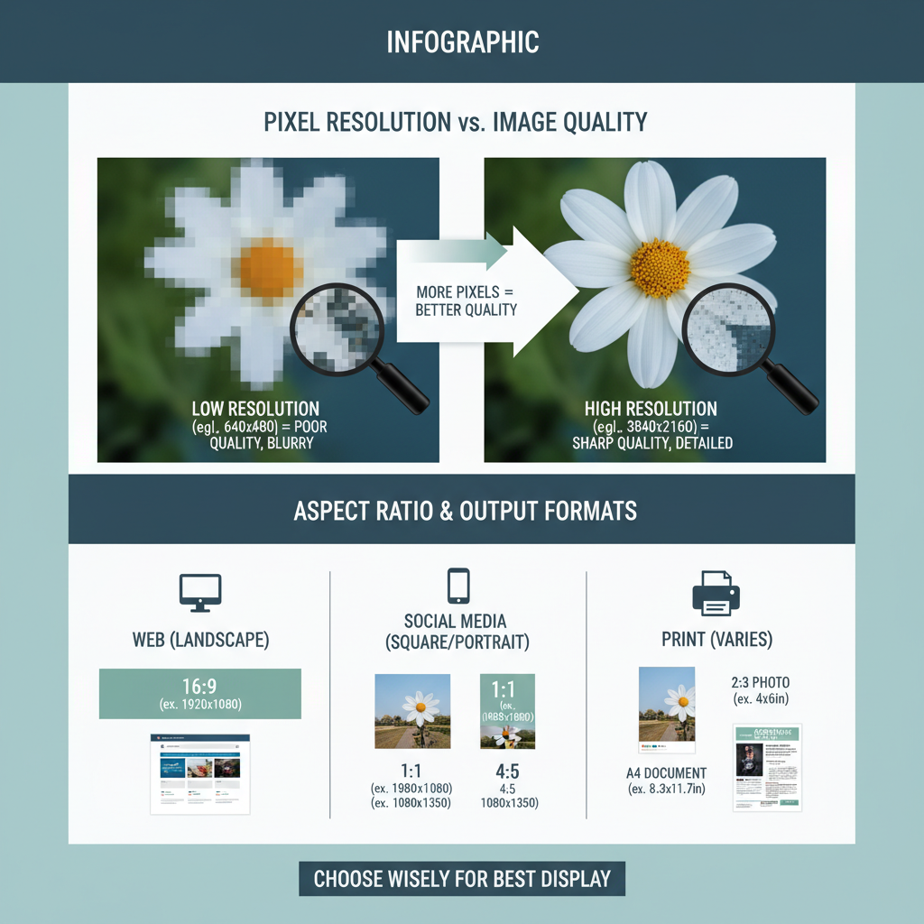
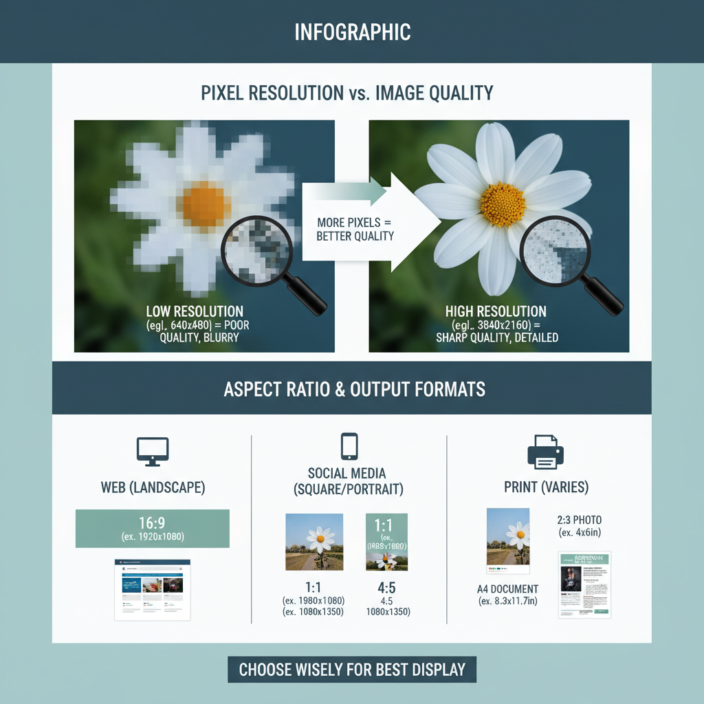
Pixel Resolution and Image Quality
Pixel resolution refers to the number of pixels contained in a digital image. Higher resolution usually means:
- Sharper edges
- Finer details
- Better image quality
However, higher resolutions also increase file size.
---
Pixel Dimensions vs. File Size
Pixel dimensions are not the same as file size:
- Pixel dimensions: Physical pixel count (width × height).
- File size: How much storage the image requires (KB, MB).
File size depends on image dimensions, file format, and compression. A high-dimension JPEG with strong compression can be smaller than a lower-dimension PNG with no compression.
---
Common Pixel Dimensions for Web, Social Media, and Print
Choosing correct dimensions is critical for performance and display. Below are common sizes by usage:
| Use Case | Pixel Dimensions (Width × Height) | Notes |
|---|---|---|
| Website Banner | 1920 × 600 | High-resolution for desktop viewing |
| Full HD Video Frame | 1920 × 1080 | Standard HD resolution |
| Instagram Post | 1080 × 1080 | Square ratio recommended |
| Facebook Cover Photo | 820 × 312 | Optimized for desktop display |
| Print (A4 at 300 DPI) | 2480 × 3508 | High pixel density for crisp prints |
---
Importance of Aspect Ratio
The aspect ratio is the proportional relationship between width and height.
Maintaining it during resizing ensures images don’t stretch or warp.
Popular aspect ratios:
- 1:1 – Square (Instagram posts)
- 4:3 – Classic photo format
- 16:9 – Widescreen, common in video
---
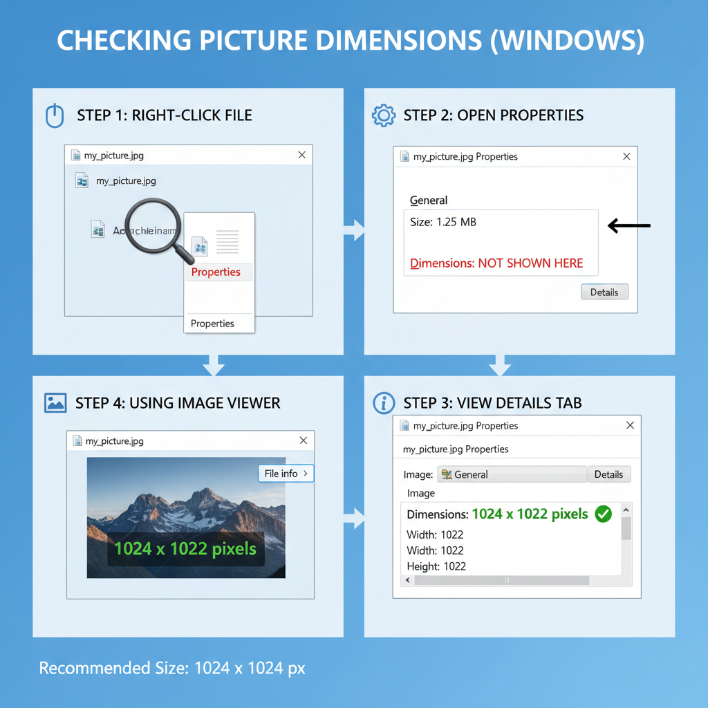
Measuring Picture Dimensions Using Built-in Tools and Software
Checking pixel dimensions is easy, using native tools or design software.
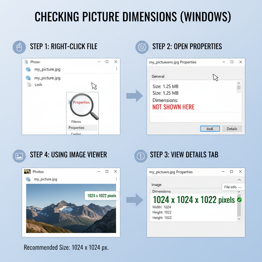
Windows
- Right-click image → Properties → Details tab → Dimensions.
- Or: open in Paint → Resize → check pixel values.
macOS
- Right-click image → Get Info → More Info → Dimensions.
- Preview app → Tools → Show Inspector → Info tab.
Online Tools / Software
- Adobe Photoshop: Image → Image Size
- GIMP: Image → Scale Image
- Canva: Dimensions visible in design settings
---
Resizing Images Correctly Without Losing Quality
When resizing images:
- Preserve aspect ratio – Lock width-to-height proportion.
- Use high-resolution originals – Scaling down is better than scaling up.
- Choose correct scaling algorithm – Bicubic interpolation for smooth results.
- Export with purpose – Match dimensions to the target platform.
Example Photoshop workflow:
Image > Image Size
- Check 'Constrain Proportions'
- Enter desired width or height
- Choose 'Bicubic Sharper' for reduction
---
Understanding Pixel Density (PPI/DPI) for Different Mediums
Pixel density measures how closely packed pixels are:
- PPI (Pixels Per Inch) – Influences clarity on digital screens.
- DPI (Dots Per Inch) – Measures print quality.
Print needs higher density (300 DPI) compared to typical web images (72 PPI).
---
Platform-Specific Tips for Optimal Dimensions
- Web pages: Keep images under ~200 KB for fast load times.
- Social media: Follow each platform’s recommended size.
- Mobile apps: Prepare multiple resolutions for responsive design.
- Email marketing: Ensure image width is under 600 pixels.
---
Avoid Distortion by Maintaining Original Ratio
Stretching an image changes pixel dimensions and aspect ratio, causing distortion.
Avoid by:
- Scaling proportionally
- Using cropping carefully
- Starting with correct aspect ratio
---
Advanced Techniques: Vector vs. Raster Pixel Limits
Raster images (JPEG, PNG) have fixed pixels; zooming in causes pixelation.
Vector images (SVG, EPS) scale without losing quality.
Use vector formats for logos, icons, and scalable graphics.
Use raster formats for photos and textured designs.
---
SEO Benefits of Image Optimization
Using correct pixel dimensions and compression supports SEO:
- Faster loading improves page speed scores.
- Mobile-friendly size prevents poor UX.
- Optimized filenames and alt text help index images.
Best SEO practices:
- Compress with TinyPNG or ImageOptim.
- Use descriptive filenames with keywords.
- Add accurate alt text (e.g., “picture dimensions pixels for web optimization”).
---
Summary & Next Steps
Mastering picture dimensions in pixels lets you produce sharp, responsive visuals that load quickly, display correctly, and enhance both user experience and SEO. By understanding resolution, aspect ratio, and pixel density:
- Start with high-resolution source files
- Resize proportionally for intended platforms
- Optimize for file size and search visibility
Now, review your current images, adjust dimensions as needed, and implement optimization best practices to elevate your visual content performance.