Pinterest Logo Meaning and Symbolism Analysis
Explore the meaning, design elements, color psychology, and evolution of the Pinterest logo, revealing its symbolism and visual identity choices.
Introduction to Pinterest Logo Meaning and Visual Identity
Pinterest is a widely used social media and visual discovery platform that lets users collect, organize, and share ideas through digital pinboards. A key part of its brand identity is a clean, memorable logo that perfectly conveys the concept of "pinning" inspiration.
Since its launch in 2010, Pinterest has built a distinct visual identity rooted in simplicity, clarity, and emotional resonance with its audience. The Pinterest logo meaning goes beyond its bold, stylized “P”; it embodies creativity, connection, and the joy of discovery.

---
Brief History of the Pinterest Logo Evolution
The Pinterest logo has evolved subtly over the years. Early versions leaned on playful femininity and craft-inspired details, while later refinements have reflected modern minimalism and digital functionality. Below is a condensed visual timeline:
| Year | Logo Description | Key Changes |
|---|---|---|
| 2010 | Script-like, playful “Pinterest” wordmark paired with red pin icon | Handwritten style capturing creativity and hobbyist appeal |
| 2011 | Cleaner typography with refined “P” pin shape | Boosted legibility for rapidly growing web audience |
| 2016 | Minimalist “P” enclosed in red circle | Introduced app-friendly icon suitable for various devices |
| 2020–Present | Simplified geometric “P” inside flat red circle | Modernized for mobile-first user interfaces |
---
Core Design Elements of the Pinterest Logo
Pinterest’s logo design integrates three essential components:
- Color Palette – Primarily vivid red contrasting with white, delivering high visibility and emotional impact.
- Shape – The circular boundary frames the pin-inspired “P” symbol, reinforcing focus and unity.
- Typography – The accompanying wordmark uses clean sans-serif fonts, ensuring readability across devices.
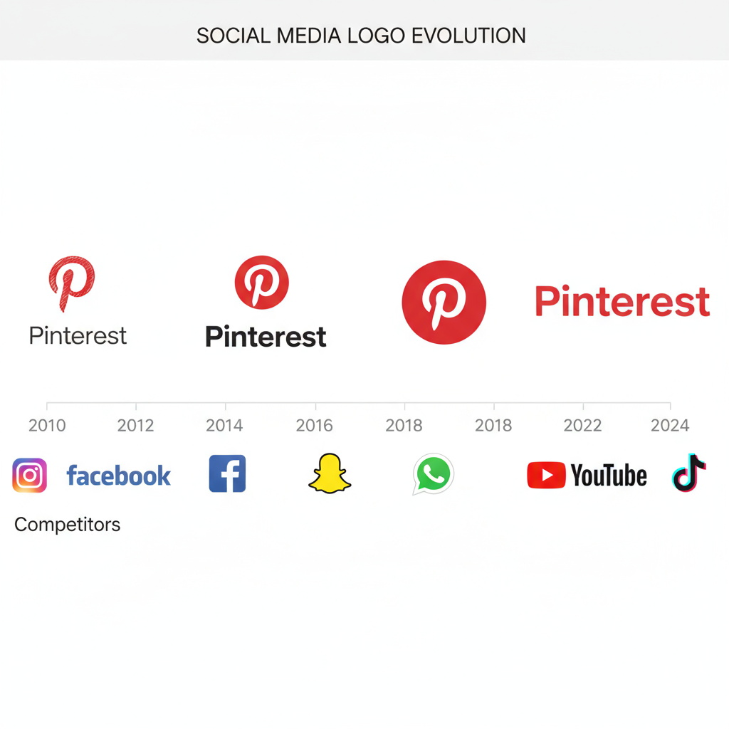
The combination of bold color and geometric precision ensures the logo remains recognizable across app icons, websites, and print campaigns.
---
Symbolism: The "P" Icon and Pin Shape Connection
The stylized "P" cleverly mirrors the sharp point of a pushpin or location pin—a precise metaphor for Pinterest’s core action: saving and marking ideas.
- Pin Tip Metaphor: Signifies keeping ideas within reach.
- Circular Frame: Implies inclusion and a safe space for inspiration.
- Dual Role as Letterform: Functions both as a readable letter and symbolic icon.
This dual nature makes the symbol versatile, memorable, and deeply tied to the platform's concept.
---
The Psychological Impact of Red in Branding
Red is one of the most active colors in branding psychology. On Pinterest, it:
- Spikes attention instantly in busy digital feeds.
- Encourages click-throughs by creating warmth and energy.
- Enhances memorability through high-contrast presentation.
Marketing studies have shown red’s capacity to create urgency and prominence, ideal for a discovery-based platform competing for attention.
---
Hidden Design Choices and Easter Eggs
Apart from obvious symbolism, the Pinterest logo features subtle design touches:
- Pin Head Impression: Negative space atop the “P” resembles a pin’s rounded head.
- Balanced Geometry: Symmetrical proportions project reliability.
- Circle-as-Pinboard: The enclosing shape doubles as a miniature board, subtly reinforcing brand functions.
These hidden references add depth for attentive viewers without compromising the logo’s simplicity.
---
Why Simplicity Works for Digital and Mobile Use
In the era of tiny interface icons, simplicity becomes critical. Pinterest’s minimal design offers:
- Scalability: Maintains sharpness from micro-size favicon to large banners.
- Fast Rendering: Optimizes performance on various bandwidths.
- Cross-Platform Consistency: Works equally well across iOS, Android, browser plugins, and smart devices.
Its one-glance recognizability ensures brand impact regardless of screen size.
---
Competitor Logo Strategies Compared
How does Pinterest’s visual branding stack up against rivals? Here’s a quick comparison:
| Platform | Logo Style | Key Visual Message |
|---|---|---|
| Red circle with stylized "P" | Discovery, bookmarking, creative ideas | |
| Gradient camera icon | Lifestyle visuals, vibrant sharing | |
| Minimal blue bird | Conversation, global networking | |
| Blue “f” wordmark | Connection, community building |
Pinterest’s minimalist “P” offers symbolic richness and high adaptability compared to more literal or decorative marks.
---
Importance of the Logo in Brand Recognition
Logos function as shorthand for brand identity. For Pinterest:
- Consistency: Color and shape remain constant across uses.
- Emotional Resonance: Consumers connect the mark with creativity and curiosity.
- Flexibility: Serves both as a standalone icon and full wordmark for varied contexts.
Sustained exposure and uniform application strengthen familiarity and trust.
---
Adaptations Across Platforms and Campaigns
Pinterest keeps its core logo intact but introduces variations when necessary:
- Seasonal Campaigns: Lighter or themed versions for holidays or events.
- Animated Assets: Looping pins or playful effects for ads and promotions.
- Localized Fonts: Adjusting the wordmark to integrate non-Latin scripts.
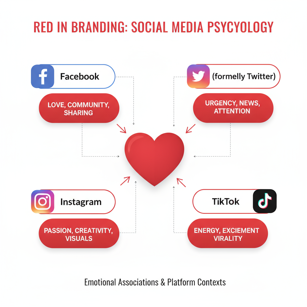
For app environments, the circular “P” stands as the sole identifier amidst other icons, streamlined for small-scale clarity.
---
Conclusion: Meaning, Relevance, and Enduring Appeal
The Pinterest logo meaning reflects the brand’s mission of inspiring discovery and archiving ideas. Through thoughtful color psychology, versatile symbolism, and streamlined design, Pinterest has built an emblem that adapts seamlessly across media while preserving identity.
Its mastery of minimalist branding balances functional clarity with emotional engagement—a combination that will keep the logo relevant for years. As digital spaces grow more saturated, Pinterest’s concise and creative visual language ensures it remains a prominent marker of inspiration worldwide.
Start exploring Pinterest today and experience how a simple yet iconic logo can guide you to endless creative possibilities.

