Design Analysis of the Poster The Social Network
In-depth analysis of The Social Network poster’s design, exploring its typography, color palette, composition, and psychological impact on audiences.

Introduction to The Social Network Poster and Its Cultural Impact
When The Social Network premiered in 2010, it became more than just a biographical drama about the creation of Facebook — it emerged as a cultural touchstone. Directed by David Fincher and written by Aaron Sorkin, the film dissected ambition, betrayal, and the cost of innovation in the digital age. The story resonated because it wasn't only about technology, but about people, relationships, and the psychology driving the social media era.
The poster The Social Network played a central role in the marketing, setting an intellectual and dramatic tone before audiences even saw a trailer. Through calculated visual choices, it conveyed intrigue, emotional depth, and thematic darkness — aligning perfectly with the film’s narrative.

---
Visual Overview of the Main Theatrical Poster’s Design Elements
The main theatrical poster is a masterclass in minimal yet impactful graphic presentation. It consists chiefly of:
- A close-up portrait of Jesse Eisenberg as Mark Zuckerberg.
- Heavy negative space framing the tagline and the actor’s intense expression.
- Large white type overlaid seamlessly on the character’s face.
- A balanced juxtaposition of photograph and typography.
This controlled design allowed audiences to focus on the protagonist's gaze and the provocative statement hovering across his features.
---
Color Scheme Analysis: Muted Tones, Contrast, and Atmospheric Mood
Muted, cool-toned colors dominate, with shades of navy, gray, and pale skin conveying intellectual seriousness and emotional restraint.
Key aspects include:
- Cool filter: Desaturation evokes detachment and seriousness.
- High contrast text: Pure white font stands out against deep shadows for immediate readability.
- Shadow play: Subtle gradations enhance depth without interrupting the minimalism.
This palette mirrors the calculated, sometimes isolating tone of the film’s story arc.
---
Typography Breakdown: Placement, Font Choice, and Message Delivery
Typography is the defining feature. The modern, sans-serif, all-caps font communicates authority and modernity.
- Placement: Text is placed squarely over Eisenberg’s face, symbolically “branding” him with the narrative’s moral and ethical questions.
- Kerning and alignment: Tight letter spacing builds a dense text block that works as a compositional element.
- Hierarchy: The tagline is positioned to dominate over the film title, pushing intrigue ahead of name recognition.
This typographic approach delivered a punch that matched the film's intellectual confidence.
---
Actor Placement and Facial Expressions: Psychology and Audience Impact
Eisenberg’s Zuckerberg meets us with a serious, detached gaze. In visual psychology, neutral or unreadable expressions invite decoding — pulling in the viewer to uncover the story's depth.
The extreme close-up format amplifies intimacy and confrontation, turning a simple portrait into a compelling challenge to the audience.
---
Tagline Analysis: “You Don’t Get to 500 Million Friends Without Making a Few Enemies”
The tagline condensed the film’s premise into one efficient line:
- Global scale: “500 million friends” contextualized the narrative within Facebook’s world-changing success.
- Conflict: “Making a few enemies” hinted at betrayal, lawsuits, and interpersonal fracture.
- Curiosity hook: Juxtaposing friendship with enmity sparked immediate intrigue.
Its conversational tone made the line instantly memorable and endlessly quotable.
---
Framing and Composition: Strategic Use of Negative Space
Compositionally, the design is vertically centralized. The block of text covers parts of the face but leaves space for expressive elements, particularly the eyes.
This choice delivers:
- A sharp focal point.
- Harmonious balance between text and image.
- Emotional intensity without overcrowding.
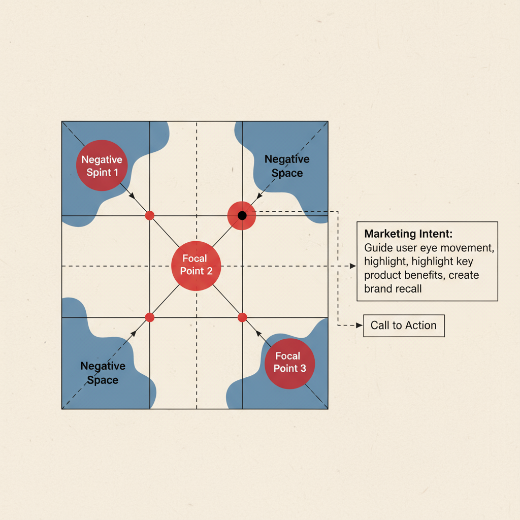
The balanced framing aided brand recall and cemented the poster’s recognizability across media.
---
Marketing Context and Campaign Integration
When The Social Network arrived, Facebook’s cultural dominance was peaking. The marketing team reinforced the poster’s messaging by:
- Using the tagline prominently in teasers and TV spots.
- Keeping visual motifs consistent across platforms for cohesion.
- Targeting digitally native viewers likely to engage with the irony embedded in “500 million friends.”
Its restrained, minimalist composition added credibility in contrast to the loudness of typical Hollywood marketing.
---
Symbolism Embedded in the Poster Design
Beyond surface aesthetics, the poster The Social Network offered thematic depth:
- Face as screen: The overlaid text functions like a digital mask, referencing the curated identities of social media.
- Minimal background: Evokes themes of isolation and single-minded ambition.
- Gaze direction: Looking off-camera signals introspection and detachment, resonating with the film's central character arc.
These subtleties enrich its longevity as a piece of visual storytelling.
---
Comparing International Variations of the Poster
While the U.S. poster embraced austerity, international versions adapted imagery for cultural relevance:
| Version | Notable Changes | Effect on Tone |
|---|---|---|
| U.S. Theatrical | Close-up portrait, large white text overlay | Intense, cerebral minimalism |
| U.K. Release | Group shot of main cast at Harvard | Broader social focus, ensemble dynamic |
| Japanese Poster | Brighter blue palette, smaller fonts | More approachable, reduced foreboding |
| Festival Poster | Rowing scene still, minimal text | Art-film aesthetic, understated allure |
Differences in composition underscore how marketing adapts design languages for audience expectations.
---
Lasting Influence on Film Poster Design
The The Social Network poster became a design touchpoint for tech-related and biographical dramas in the 2010s. Emulated features included:
- Bold typography integrated into portraiture.
- Muted, minimalist palettes.
- Centralized, character-driven composition.
This influence can be traced to films like Steve Jobs (2015) and The Imitation Game (2014).
---
Collector Appeal and Cultural Memorabilia Status
More than a decade later, the poster The Social Network holds collector value due to:
- Scarcity of original theatrical prints.
- Distinctive early run festival versions.
- Position in early 2010s pop culture canon.
Collectors prize it as a definitive example of 21st-century film marketing with enduring visual and thematic relevance.
---
Conclusion: Why the Poster Endures
The enduring power of The Social Network poster lies in its union of style and substance. Minimal yet loaded with implication, it communicates complexity and intellect through restraint. Its interplay of cryptic expression and declarative typography captured the film’s message without revealing too much.
For marketers, designers, and cinephiles alike, the poster The Social Network remains a benchmark in crafting images that fascinate, provoke, and stand the test of time — a reminder that sometimes, less truly is more.
Explore more about iconic poster designs and learn how cinematic marketing shapes cultural memory — start your deep dive today.