Recommended Website Image Sizes for Speed and Quality
Learn the best image dimensions and file sizes for websites to balance speed, SEO, and quality across devices with practical optimization tips.

Why Image Size Matters for SEO, Speed, and User Experience
Choosing the website images size recommended is a critical step for any site aiming to rank well in search engines while providing a fast, engaging experience for users. Images enhance visual appeal and communicate instantly, but if they’re too large—in pixel dimensions or file weight—they can slow down page loads, hurt SEO, and frustrate visitors.
When images are oversized, they can cause:
- Slower loading times, which search engines penalize because speed is a ranking factor.
- Higher bounce rates; many users leave if a page takes more than a few seconds to display.
- Increased bandwidth consumption, which can deter mobile users with data limits.
Optimizing image sizes is a strategic move to align technical performance with user satisfaction.
---
File Size vs Image Dimensions
Before we explore the recommended sizes, it’s vital to distinguish file size from dimensions:
- File size: Measured in KB (kilobytes) or MB (megabytes). It shows how much storage the image occupies on your server and how much data must be transferred to the viewer’s browser.
- Dimensions: Measured in pixels (width × height), determining the visible area it covers on-screen.
Cropping or resizing alone isn’t enough—you must also compress the image efficiently to reduce file weight without losing perceptible quality.
---
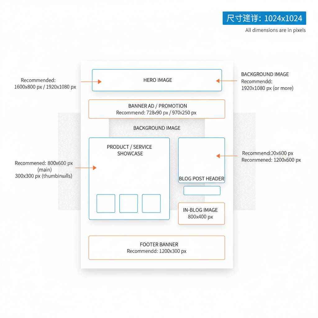
Standard Sizes for Hero Images, Banners, and Full-Width Backgrounds
Hero images and banners often span the full width of the browser, meaning they have a large visual and performance impact. Here’s how to balance aesthetics and load speed.
Recommended Dimensions
- Hero image (full-width top section): 1920 × 1080 pixels
- Full-width banner: 1920 × 600–800 pixels
- High-res background: 2560 × 1440 pixels for 4K or retina screens
Target File Size
- Keep hero and banner images under 300KB by using optimized formats such as JPEG or WebP.
---
Recommended Sizes for Product Photos and Blog Post Images
Whether selling products or publishing articles, your visuals must combine clarity with speed.
Product Photos
- Main product: 1024 × 1024 pixels (often square for uniform catalog displays)
- Thumbnail: 300 × 300 pixels
Blog Post Images
- Featured image: 1200 × 630 pixels (ideal for social previews and internal hero areas)
- Inline illustration: Maximum 800 × 600 pixels
Aim to keep product and blog images under 200KB for faster pages, while ensuring they remain sharp across devices.
---
Mobile-First Size Considerations and Responsive Design Techniques
With mobile traffic often exceeding desktop, design images for small screens first.
Tips
- Start small: Design with widths of 800px for mobile, then scale up for tablets/desktops.
- CSS scaling: Use flexible, viewport-based units to prevent overflow.
- Lazy loading: Load images only when they come into view, saving initial bandwidth.
---
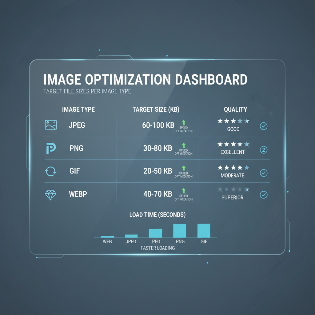
Best Practices for Compression: JPEG vs PNG vs WebP
Choosing the correct format has a major impact on file size and quality:
- JPEG: Ideal for photographs; delivers high compression with minimal perceptible quality loss.
- PNG: Suited for graphics with sharp lines and transparency.
- WebP: Modern, efficient format offering smaller sizes for both photos and graphics with excellent visual fidelity.
---
Tools to Resize and Optimize Images Before Upload
Resize and compress before uploading to save bandwidth and storage.
- Online tools: TinyPNG, Squoosh, Iloveimg
- Desktop: Photoshop, GIMP
- CMS plugins: ShortPixel, Imagify for WordPress
Batch processing options help streamline optimization across multiple assets.
---
How to Use `srcset` for Adaptive Images Across Devices
Use HTML’s `srcset` to let browsers pick the most suitable image size per device and resolution:
This strategy saves bandwidth for mobile users, while delivering sharp images to desktops.
---
Common Mistakes That Slow Down Websites
Avoid these pitfalls:
- Uploading uncompressed raw camera images.
- Using PNG for photos instead of JPEG/WebP.
- Skipping browser caching rules for images.
- Serving overly large images for display size.
- Omitting descriptive alt text (hurts SEO and accessibility).
---
Summary Table of Recommended Sizes for Different Elements
| Element | Recommended Dimensions (px) | Target File Size | Suggested Format |
|---|---|---|---|
| Hero Image | 1920 × 1080 | <300KB | JPEG/WebP |
| Full-width Banner | 1920 × 600–800 | <300KB | JPEG/WebP |
| Background Image (High-Res) | 2560 × 1440 | <500KB | JPEG/WebP |
| Product Image | 1024 × 1024 | <200KB | JPEG/WebP |
| Product Thumbnail | 300 × 300 | <50KB | JPEG/WebP/PNG |
| Blog Featured Image | 1200 × 630 | <200KB | JPEG/WebP |
| Inline Blog Illustration | 800 × 600 | <150KB | JPEG/WebP/PNG |
---
Conclusion
Following the website images size recommended ensures a balanced approach between aesthetics and performance. By harmonizing pixel dimensions and compression, you can create visually rich sites that load quickly and rank higher. Implementing responsive techniques such as `srcset`, choosing efficient formats like WebP, and using proven optimization tools will enhance both SEO and user satisfaction.
Adopt a mobile-first mindset and sidestep common pitfalls to keep your site fast and accessible. Ready to take control of your website’s visuals? Start optimizing your images today to improve load times, boost engagement, and climb in search rankings.