Social Media Apps Logos with Names for Brand Recognition
Discover how pairing social media app logos with names boosts brand recognition, trust, and engagement through design, color, and typography.
Introduction to Social Media Logos with Names for Brand Recognition
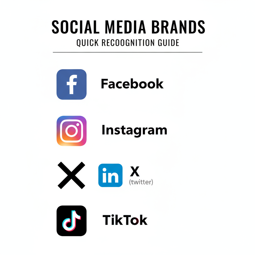
In the modern, always-connected landscape, social media logos with names have become far more than decorative elements — they are central to brand recognition, trust, and engagement. These combined marks act as universal symbols, enabling users to identify platforms instantly, whether seeing Facebook’s iconic “f,” Instagram’s colorful camera, or TikTok’s musical note.
Businesses, marketers, and content creators leverage these elements across digital and physical touchpoints to ensure audiences connect with them seamlessly. This article explores key platforms, design principles, legal considerations, and best practices for using social media app logos paired with their names effectively.

---
Why Pairing Logo with Name Boosts Recognition and Trust
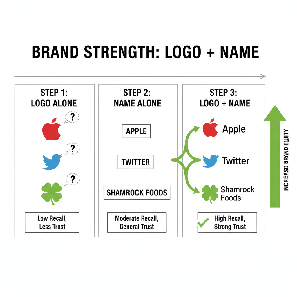
While a standalone motif can be visually striking, pairing a social media logo with its name significantly increases clarity and credibility:
- Instant recognition: Removes any ambiguity about the platform’s identity.
- Cross-cultural understanding: Merges text and imagery to overcome language and literacy gaps.
- Flexible application: Works across print ads, online banners, and app listings.
- Brand authenticity: Reinforces legitimacy, helping prevent confusion with knock-off or spoof platforms.
This combination proves especially valuable in advertising aimed at mixed or international audiences who may not be familiar with icon-only representations.
---
Overview of Popular Social Media Apps and Their Logos + Names
Let’s look more closely at major platforms, their visual marks, and how they integrate names consistently to strengthen brand recall.
The Facebook emblem uses a lowercase “f” in white on a blue square, often paired with the “Facebook” wordmark. Blue suggests trust, communication, and reliability.
Instagram’s gradient camera icon — blending pink, purple, and orange — pairs with a sleek sans-serif “Instagram” text. The vibrant gradient, introduced in 2016, embodies creativity and warmth.
Twitter / X
Once symbolized by a blue bird, the platform transitioned to X in 2023, adopting a minimalist black-and-white mark. Combined with “X,” it signals futuristic simplicity.
LinkedIn combines its blue “in” logo with the full platform name, representing professionalism and dependable networking for corporate audiences.
TikTok
Featuring a luminous musical note, TikTok’s paired logo includes the bold “TikTok” text in black. The design represents music, dynamic content, and youth-driven culture.
Pinterest uses a stylized “P” over a red background alongside its name in refined typography, communicating passion and inspiration.
Snapchat
The white ghost set against a bright yellow backdrop with the “Snapchat” name conveys simplicity, fun, and spontaneity.
YouTube
A red play button plus the “YouTube” wordmark remains one of the world’s most recognizable logo-name combinations, with the color red eliciting excitement.
---
Design Elements in Logos (Colors, Typography, Shapes) and Meaning
Every element in a social media logo with name is meticulously planned to elicit specific emotions and associations.
Common Color Meanings
- Blue: Stability, trust, professionalism (e.g., Facebook, LinkedIn)
- Red: Energy, urgency, action (e.g., YouTube, Pinterest)
- Yellow: Youth, optimism, approachability (e.g., Snapchat)
- Gradients: Creativity, innovation (e.g., Instagram)
Typography Choices
Most brands favor clean sans-serif fonts for legibility, with subtle customizations to retain individuality (Instagram’s earlier cursive wordmark being an exception).
Shapes and Symbols
- Circles: Unity and community (Pinterest)
- Squares: Grounded reliability (legacy Instagram camera frame)
- Abstract icons: Innovation and adaptability (TikTok’s neon motif)
---
HTML Table: Platforms, Logos, Colors, and Taglines
| Platform | Logo Element | Primary Color | Tagline/Slogan |
|---|---|---|---|
| Lowercase “f” in blue square | Blue | “Connect with friends” | |
| Gradient camera icon | Purple/Orange Gradient | “Capture and share the world’s moments” | |
| Twitter / X | Minimalist X mark | Black/White | Formerly: “What’s happening?” |
| “in” inside blue square | Blue | “Connect to opportunity” | |
| TikTok | Neon music note | Black, Cyan, Pink | “Make your day” |
| Red circle with “P” | Red | “It’s possible” | |
| Snapchat | Ghost on yellow background | Yellow | “Real friends” |
| YouTube | Red play button | Red/White | “Broadcast yourself” (legacy) |
---
Legal Considerations for Using and Reproducing Logos
When using a social media app logo with name in your own materials, follow strict compliance measures:
- Trademark protection: Each logo/name is usually a registered trademark; unauthorized use is risky.
- Brand guidelines: Platforms publish their official color values, spacing, and usage rules.
- Commercial permissions: Printed or monetized uses often require approval.
- No alteration: Recoloring, distorting, or pairing logos with misleading content violates policies.
Always source files from official brand resource pages and credit the platform when mandated.
---
Practical Ways Brands Can Leverage Logo + Name Combinations
In marketing, the logo-name pairing can:
- Enhance website accessibility: Clickable icons with names in footers clarify navigation.
- Boost email engagement: Add identifiable social blocks to signatures.
- Support physical marketing: Business cards and flyers benefit from instantly recognizable marks.
- Elevate event presence: Use clear, paired marks on banners and booths for direct user connection.
Aesthetic consistency across these touchpoints boosts recall and builds trust.
---
Optimizing Digital Presence with Consistent Branding
To maintain strong visual consistency:
- Stick to approved colors and proportions.
- Scale logos appropriately for multiple devices.
- Include strong alt text such as “TikTok logo with name” for accessibility and SEO benefits.
- Check clarity at smaller resolutions to preserve recognition.
This holistic approach ensures your brand presence aligns with platform standards and audience expectations.
---
Future Trends in Social Media Logo Design
Expect upcoming shifts toward:
- Minimalism: Cleaner marks optimized for mobile.
- Dynamic variants: Adaptive styles that change with user interaction or dark mode.
- Immersive 3D icons: AR/VR-ready assets.
- Eco-conscious themes: Organic colors reflecting sustainability.
Animated logo-name combinations may also become common, adding an interactive feel.
---
Conclusion and Key Takeaways
Pairing a social media logo with name is one of the most effective ways to ensure fast recognition, build user trust, and convey brand personality. These combinations merge the emotional impact of imagery with the clarity of text, transcending cultural and linguistic barriers.
By understanding each platform’s design language, respecting trademark rules, and adopting consistent branding practices, businesses can integrate these elements into marketing materials successfully. Follow official guidelines, maintain visual cohesion, and remain adaptable to emerging trends to keep your brand identity strong and future-ready.
Ready to integrate logo-name combinations into your brand strategy? Start by downloading official assets and mapping their placement across your digital and print channels for maximum impact.

