Social Media Emoji: Meanings, Best Practices, and Strategy to Boost Engagement
Learn how to use emoji on social media with intention: rendering basics, tone, accessibility, brand fit, and testing tips to lift engagement and avoid misreads.
Social Media Emoji: Meanings, Best Practices, and Strategy to Boost Engagement
Emoji can sharpen tone, structure, and engagement across social platforms when used with intention. This guide explains how emoji render across devices, how to apply them for clarity, inclusivity, and brand fit, and how to test their impact without risking misunderstandings or accessibility issues. Use it to align teams on best practices, governance, and measurement so emoji become a reliable tool—not decoration.

Why emoji matter on social media
Emoji are the fastest, most compact way to encode tone in a text-dominant medium. For busy feeds and skim-first behaviors, they improve scannability, inject emotion, and can increase interaction rates when used with intention.
- Scannability: Visual anchors like emoji help readers segment a caption, spot CTAs, and retain key points.
- Emotional clarity: Emoji act as prosody (the “tone of voice” for text), reducing misinterpretation and softening directives.
- Engagement uplift: Brand-side experiments often report 5–20% improvements in click-through or comment rate when emoji support the message rather than decorate it. Results vary by platform and audience.
Takeaway: Treat emoji as micro design elements that guide attention and decode intent, not as decoration.
---
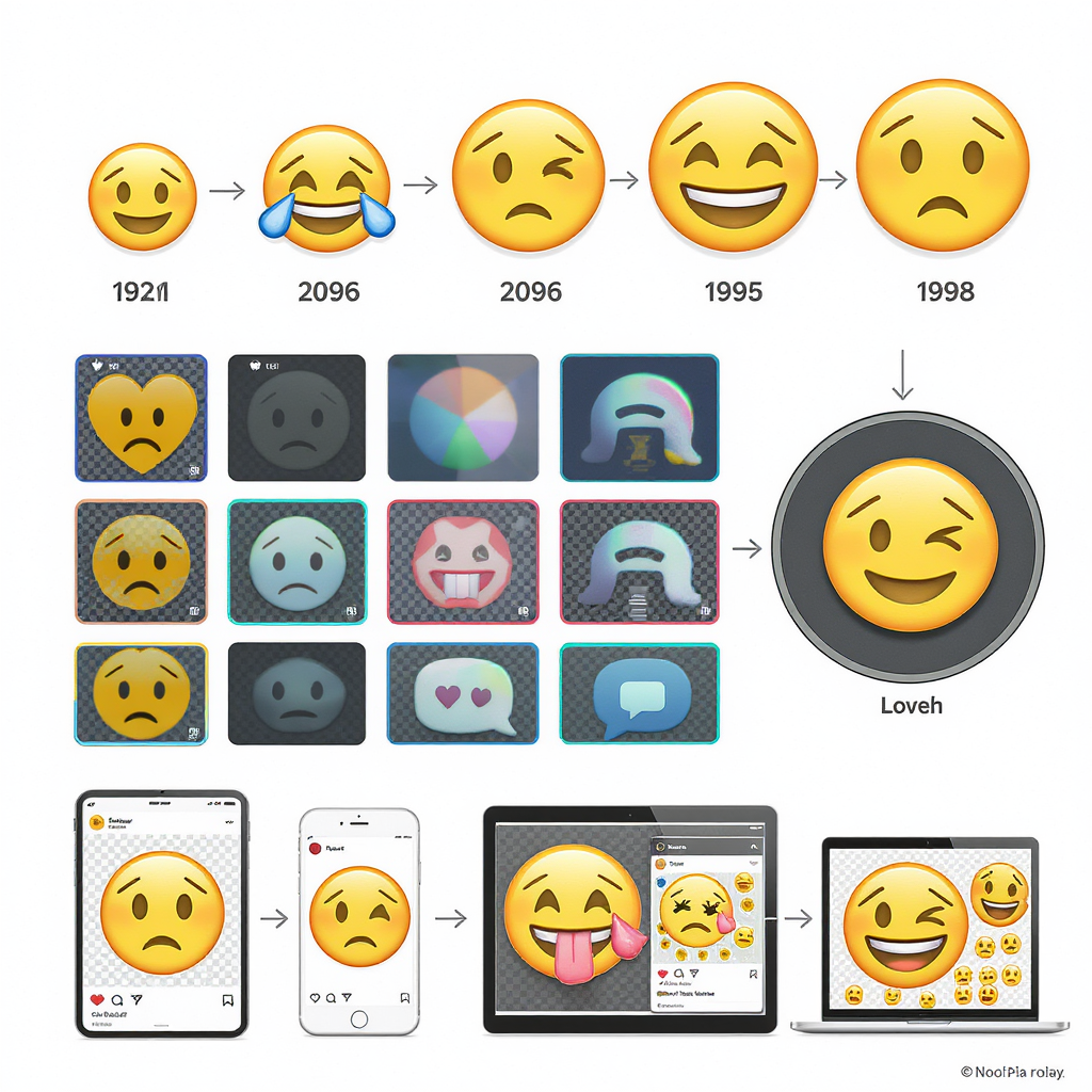
How emoji evolved and why renderings differ
Emoji are defined by the Unicode Standard (code points), but each platform (Apple, Google, Microsoft, Samsung, Twitter/X, Meta, etc.) draws its own glyph style. That means the same code point can look slightly different across devices.
Key concepts:
- Unicode code points: Each emoji has a stable identifier (e.g., U+1F600 for grinning face).
- Variation selectors: FE0F requests colored emoji presentation; FE0E requests text-style presentation.
- ZWJ sequences: The Zero Width Joiner (U+200D) combines emoji into one glyph (families, professions, flags, mixed skin-tone handshakes).
- Vendor sets: Apple vs. Google vs. Samsung renderings differ in detail and expression; differences can alter perceived tone.
Practical implications:
- Always test on at least iOS and Android before publishing campaign-critical posts.
- Prefer well-understood emoji. Avoid obscure or newly added ones unless you’ve verified rendering coverage for your audience devices.
| Emoji | Unicode sequence | Notes on rendering | Risk of misunderstanding |
|---|---|---|---|
| ❤️ | U+2764 U+FE0F | FE0F ensures “emoji” style red heart; without it some platforms show black heart text. | Low |
| 👩⚕️ | U+1F469 U+200D U+2695 U+FE0F | ZWJ sequence for woman health worker; older devices may break into separate glyphs. | Medium |
| 🏳️🌈 | U+1F3F3 U+FE0F U+200D U+1F308 | Rainbow flag as a joined sequence; partial support on very old OS versions. | Medium |
| 🤝🏻🤝🏽 | Mixed-tone handshake variants (ZWJ multi-part) | Not supported everywhere; may degrade to default yellow or break apart. | High |
Tip: If consistency is paramount on web, consider Twemoji or Noto Color Emoji in your stack for a uniform look in embedded widgets and screenshots.
---
Tone and context: amplification without confusion
Emoji can shift the perceived tone of a message by acting like nonverbal cues.
Use cases that work:
- Amplify humor: Add 😂 or 😅 to signal self-deprecation or irony when your audience expects it.
- Soften directives: Pair a direct CTA with 🙂 or 👉 to feel helpful rather than pushy.
- Reinforce structure: Use ✅, ✨, or ➜ as bullets for benefit lists.
Avoid:
- Mixed signals: Don’t pair grave news with playful emoji.
- Overload: More than 3–5 emoji in a short caption can read as spammy.
- Ambiguity: If an emoji can be read multiple ways, ensure the surrounding text clarifies intent.
Punctuation and placement rules:
- Place emoji at natural breaks: after a sentence or before a CTA.
- Don’t split hashtags with emoji; keep hashtags intact for searchability.
- Treat face emoji like punctuation: either replace or accompany, but don’t double-punctuate (avoid “Great! 😃!”).
---
Cultural and generational nuances
Meanings shift across communities. Always consider audience age, region, and subculture.
- Skull vs. laughing tears: Gen Z often uses 💀 to mean “I’m dead (from laughing),” while 😂 is classic “laughing with tears.” Using 😂 may read as “Facebook-mom humor” to some younger audiences.
- Thumbs up: 👍 can feel curt or dismissive in certain workplace contexts; younger audiences might prefer ✅ or 🙌 for positive acknowledgment.
- OK sign: 👌 is benign in many contexts but can carry political connotations in some regions; use with care.
- Color symbolism:
- Red: passion or urgency; in some cultures, good fortune; also warning/danger in others.
- White: purity in the West; mourning in some East Asian traditions.
- Purple heart 💜 can connote fandom or military Purple Heart (US) depending on context.
- Food and body symbolism: 🍑 and 🍆 have sexual connotations; avoid in professional contexts.
- Hand gestures and modesty: 🤘, 🤙, and ✌️ have varying meanings; the “fig” gesture (🤏 variants) can be offensive in some locales.
Rule of thumb: Localize your social media emoji strategy just as you localize language.
---
Accessibility and inclusivity
Screen readers and assistive tech:
- Screen readers announce emoji by their short names, e.g., “smiling face with open mouth.”
- Repeated emoji are read out repeatedly, increasing cognitive load. Limit repetition.
- Decorative emoji in HTML can be wrapped with aria-hidden="true" when they add no semantic value. In plain text captions, provide a concise text alternative nearby.
Skin tone modifiers:
- Use skin tone modifiers thoughtfully when representing people. When emojis are not person-specific or are used generically, the default yellow is often the most inclusive choice.
- If you depict an identity (e.g., team photos, culture moments), match the skin tones to the subjects with consistency.
Neurodiversity considerations:
- Avoid sarcasm that relies solely on emoji.
- Keep patterns predictable: similar types of posts use similar emoji sets.
Spam avoidance:
- Keep to 0–3 emoji for transactional or informative posts; 1–5 for entertainment; beyond that increases the risk of being deprioritized or flagged.
---
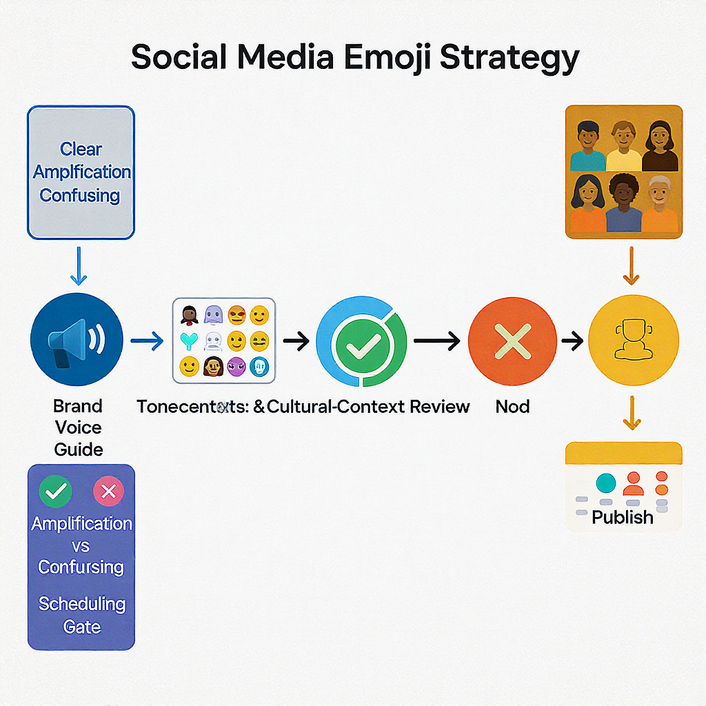
Brand voice and governance
Build an emoji style guide so teams move fast without stepping on rakes.
- Define your palette: A shortlist of 20–40 high-signal emoji aligned to brand attributes (e.g., ✨ optimism, 🧠 insight, 🔒 security).
- Set tone rules: What emojis to use in humor vs. product updates vs. crisis response.
- Ban list: Ambiguous, overused, or off-brand emoji.
- Crisis protocol: Restrict emoji entirely or to neutral symbols (e.g., 🕊️) during sensitive events.
Sample style guide snippet:
emoji_style:
  palette:
    tone_positive: ["✨","✅","🙌","💡"]
    tone_neutral: ["📣","🧭","🧠","📌"]
    tone_alert: ["⚠️","🔒"]  # alert use requires approval
  usage:
    max_per_caption: 4
    placement:
      - "Use 1 in first 100 chars to anchor hook if appropriate."
      - "Place pointer 👉 directly before CTA link."
    do:
      - "Use ✅ for checklist benefits."
      - "Use 📌 for reminders/announcements."
    dont:
      - "No 🍆🍑 or ambiguous hand signs."
      - "Avoid 😂 in B2B channels; prefer 🙂 or 😄."
  crisis_mode:
    enable: false
    rules:
      - "Suspend humorous emoji."
      - "Use 🕊️ only with comms approval."
---
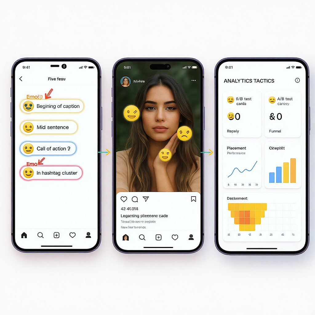
Performance tactics: where and how to place emoji
Where they work hardest:
- Hook line: Lead with 1 high-contrast emoji to anchor the first 1–2 lines before the “more” fold.
- CTAs: A single 👉 or 🔗 draws eyes to a link or “Shop now.”
- Lists: Use ✅ or ➤ to structure benefits.
- Hashtags: Place emoji before or after the block, not inside hashtags.
- Bio: Add 2–3 role or industry emoji to summarize offerings (e.g., 🛠️ SaaS tools | 📈 Growth | 🔒 Security).
Volume and variety by format:
| Format | Recommended volume | Placement tips | Notes |
|---|---|---|---|
| Feed posts (short) | 1–3 | 1 in the hook; 1 near CTA | Keep scannable; avoid clutter |
| Long captions | 2–5 | Use as list markers | Anchor subheads with emoji |
| Stories/Reels | 1–3 per frame | Pin away from UI edges | Ensure legibility on video |
| Comments/Replies | 0–2 | Mirror tone of user | Use 👍 sparingly; can feel curt |
| Bio | 2–3 | Front-load keywords | Use industry icons |
---
Measurement and testing
A/B testing framework:
- Hypothesis: “Adding one emoji to the hook increases saves by 10% for carousel posts.”
- Variables: Type (face vs. symbol), position (lead vs. CTA), count (0, 1, 3).
- Segmentation: Run tests by cohort (age group, OS/device, region, language).
- Metrics to track:
- Primary: CTR, saves, replies, qualified clicks.
- Secondary: Reactions, shares, dwell time.
- Guardrails: Unfollows, hides, negative sentiment.
Sample test plan:
experiment: "Hook-Emoji-Placement"
audience: "EN_US Instagram followers 25–44"
variants:
  - id: A
    description: "No emoji in hook"
  - id: B
    description: "✨ at start of hook"
  - id: C
    description: "👉 before CTA"
duration_days: 10
min_impressions_per_variant: 5_000
success_metric: "Save rate"
guardrails:
  - "Hide/Report rate <= baseline + 0.2%"
  - "Negative comments <= baseline"
analysis:
  method: "Bayesian A/B"
  segmentation: ["device_os", "new_vs_returning"]
Avoid vanity traps:
- Don’t optimize purely for reactions; ensure emoji experiments translate to downstream actions (site visits, signups).
- Normalize by reach; compare rate metrics, not absolute counts.
- Document tests run during seasonality spikes to avoid false positives.
Tracking implementation:
- Tag posts with a campaign/variant code in your content calendar.
- Use consistent UTM parameters for link-in-bio destinations.
- Export post-level metrics and join on variant for analysis.
---
Compliance and professionalism
Industry-specific norms:
- Finance: Avoid 🚀/💎🙌 and “to the moon” memes for regulated products; maintain sober tone; include risk disclosures.
- Healthcare: No emoji that trivialize symptoms or diagnoses. Respect HIPAA; avoid patient-identifying contexts (even with emoji overlays).
- B2B/Enterprise: Prefer clear symbols (✅, 📊, 🔒) over slang faces; emoji should support clarity, not trendiness.
Legal/ethical gray areas:
- Political symbols and flags can polarize; align with corporate policy.
- Crisis and tragedy: Default to no emoji, or use only neutral expressions with approval (e.g., 🕯️).
- Age-gated products: Follow platform-specific ad and content rules; avoid suggestive emoji.
Create an escalation path: If a post could be interpreted as insensitive due to emoji, pause and route to legal/PR.
---
Tools and workflows
Discovery and reference:
- Emojipedia: Names, meanings, and vendor renderings.
- Unicode charts: Code points, sequences, and updates.
- OpenMoji/Twemoji: Consistent rendering for web assets and previews.
Trend monitoring:
- Native platform trending tabs and social listening tools.
- Creator economy newsletters and Slack communities for emergent meanings.
Shortcodes and Unicode:
- Slack/Discord use shortcodes like :sparkles:. Map your frequently used emoji to shortcodes for internal docs.
- Keep a reference sheet with name, shortcode, and Unicode sequence for your brand set.
QA across platforms and devices:
- Test posts on iOS and Android, light and dark modes.
- Use device farms or services (e.g., BrowserStack, internal test chats) to preview vendor variations.
- Validate legibility on video overlays and thumbnails.
Operational checklist (copy/paste):
[ ] Message tone verified (no mixed signals)
[ ] Emoji count within guide
[ ] Cultural review for target region
[ ] Accessibility pass (no spam, essential text present)
[ ] iOS/Android preview checked
[ ] Crisis filter applied (if relevant)
[ ] Measurement tag added (variant/UTM)
[ ] Final approver sign-off captured
---
Putting it all together
- Start with a clear brand emoji palette and rules.
- Use social media emoji sparingly and purposefully to highlight structure, convey tone, and guide action.
- Localize meanings across cultures and generations.
- Test systematically, measure beyond vanity metrics, and keep inclusivity front and center.
- Build workflows that make the right choice the easy choice for every publisher on your team.
With a disciplined strategy, emoji stop being a decorative afterthought and become a reliable lever for clarity and engagement.
Summary
Emoji act as compact, visual cues that clarify tone and guide attention when applied deliberately and consistently. Test across devices, localize for culture and generation, and embed usage in a lightweight style guide with clear governance and measurement. Done right, emoji enhance communication and engagement without sacrificing professionalism or accessibility.