Using a Social Media Logo White Version for Branding
Learn how to use white social media logos effectively for minimalist branding, enhance visibility on dark backgrounds, and maintain brand consistency.

Introduction to White Social Media Logos and Their Design Appeal
White social media logos — often referred to as social media logo white versions — are increasingly popular in modern branding thanks to their timeless simplicity and design versatility. In a visual-first digital landscape, every branding element matters, from typography to color schemes. Opting for white versions of your social icons can instantly elevate your aesthetics, offering a minimalist, professional look that adapts seamlessly across platforms and media.
Whether featured on a sleek website footer, business packaging, or printed marketing collateral, these icons allow your core content to shine while subtly reinforcing your online presence.

Psychology of Using White in Branding
White is more than just a color; it’s a design statement that evokes specific psychological responses. Understanding these can help you decide whether the white version of a social media logo aligns with your brand’s vision:
- Cleanliness: Symbolizes purity and freshness — ideal for healthcare, beauty, and tech-centric brands.
- Simplicity: Removes distractions, projecting a minimal and focused brand personality.
- Trust: Often linked with transparency and honesty, attributes customers value highly.
Harnessing these associations can help position your brand as clear, open, and confident.
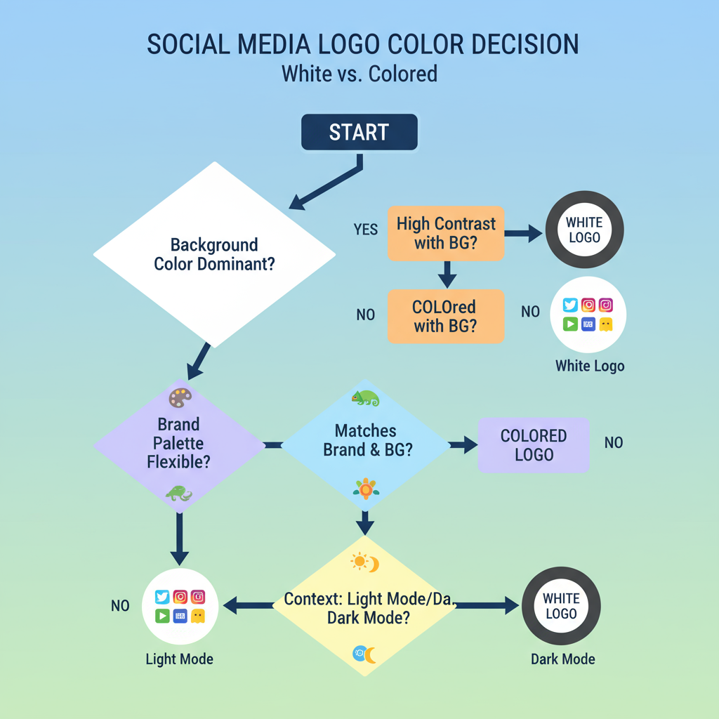
When to Choose a White Version of a Logo vs. Colored Version
Your choice between white and colored versions should consider:
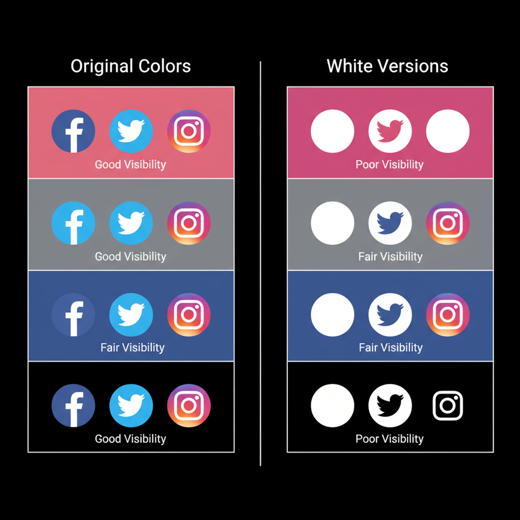
- Background color: White logos stand out on deep, dark, or richly saturated backgrounds.
- Mood and tone: For sophisticated, luxury, or formal branding contexts, white often creates a stronger impression than multicolor logos.
- Medium and visibility: When space is limited or visual simplicity is needed, white icons remain recognizable without crowding the design.
However, stick with colored versions when your brand recognition relies on signature color palettes and when used on light or neutral backgrounds.

Guidelines for Sourcing Official White Social Media Icons
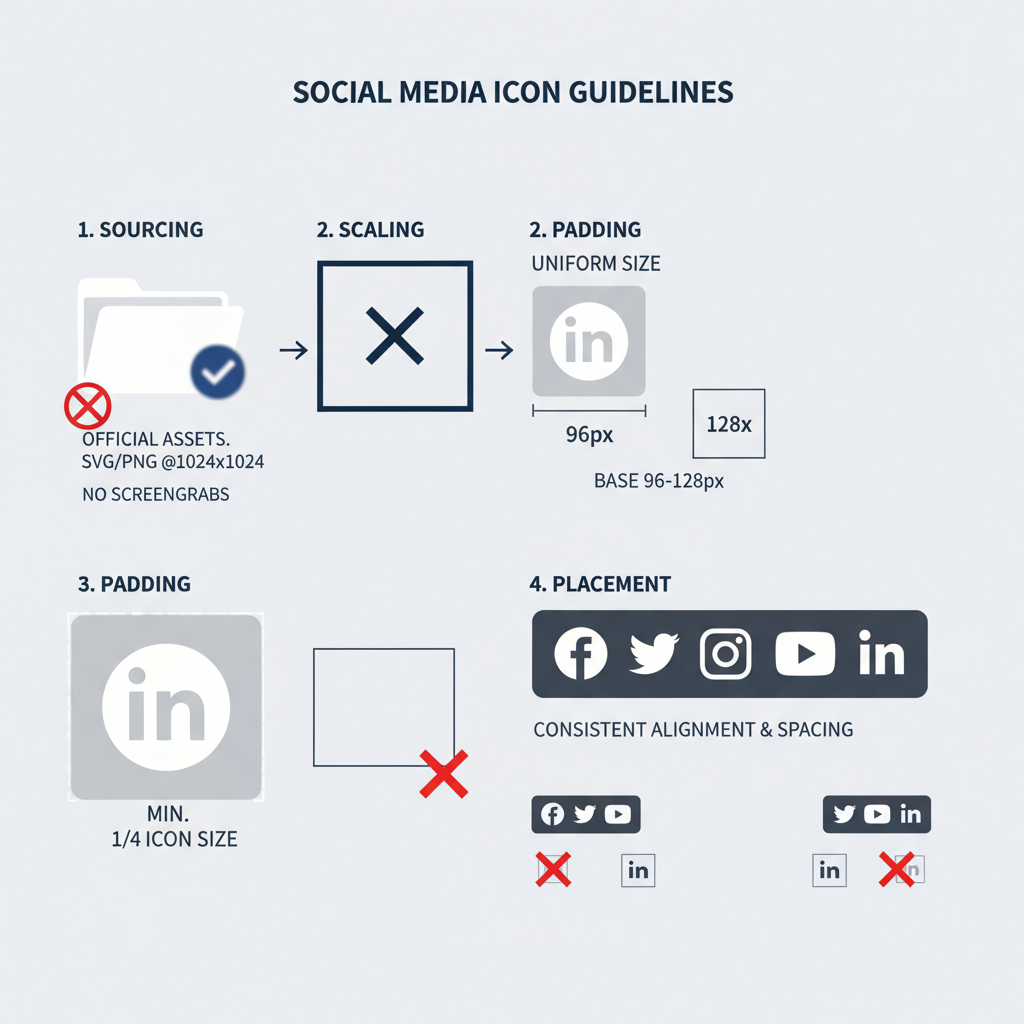
Ensure compliance by sourcing official assets:
- Visit the platform’s dedicated brand resource or toolkit page (e.g., Twitter Brand Toolkit, Instagram Brand Resources).
- Locate and download the approved white icon from the “Assets” section.
- Review usage guidelines thoroughly to ensure adherence.
Pro tip: Avoid unverified third-party sources, as logos may be outdated or infringe copyright.
Maintaining Brand Consistency Across Platforms Using White Logos
Consistency fosters trust and recognition. Using the same style of white social media logo across all brand touchpoints—website, email signatures, apps, and print—ensures:
- Recognition: Audiences instantly know who you are.
- Professionalism: Demonstrates a polished, detail-oriented brand image.
- Efficiency: Simplifies workflows by standardizing assets.
| Platform | Asset Type | Preferred File |
|---|---|---|
| White outline icon | SVG | |
| Solid white icon | PNG | |
| White glyph icon | EPS |
Where to Use White Social Media Logos
Versatile in application, white logos work perfectly for:
- Websites: Footer/navigation bars or hero overlays.
- Business cards: Particularly striking on dark matte or textured stock.
- Merchandise: Mugs, apparel, or packaging designs.
- Presentations: Subtle slide footers or closing slides encouraging engagement.
Placement strategy should balance visibility and aesthetic harmony.
Best Practices for Visibility
White icons must be carefully deployed to maintain visual clarity:
- Choose high-contrast backgrounds such as deep blues, blacks, or rich gradients.
- Avoid busy or patterned backgrounds that interfere with readability.
- Size appropriately for devices—ensure recognizability on small screens.
These tactics guarantee that your icons remain crisp, clear, and accessible.
Common Mistakes to Avoid With White Logos
Errors to avoid include:
- Distortion: Warping icons reduces recognition.
- Wrong file formats: Low-quality raster images often pixelate when scaled.
- Poor contrast: White icons can get lost on pale backgrounds.
- Outdated imagery: Using old logos can convey an inactive or careless brand.
File Types and Sizes for High-Quality White Social Media Icons
Format affects quality more than you might think:
- SVG: Infinite scalability for web use.
- PNG: Transparency-friendly, good for fixed sizes.
- EPS: Vector format preferred for print at high resolution.
Recommended sizes: 24px minimum for small UI elements, 60–100px for larger icons digitally, and at least 300 DPI for print.
Tools and Resources for Customizing White Social Media Logos Safely
For customization that stays within brand guidelines:
- Adobe Illustrator: Ideal for vector editing.
- Figma: Team-friendly design with precise scaling.
- Canva: Simplified editing for non-designers, with licensed icon sets.
- Official Brand Kits: Direct from each platform for guaranteed compliance.
Always verify usage permissions before making modifications.

Step-by-Step Example: Placing a White Instagram Icon on a Dark Website Footer
Here’s a practical walkthrough:
- Download the approved white Instagram SVG.
- Edit your website footer HTML:
- Upload the icon to your server/CDN.
- Test display across browsers and devices.
- Check contrast ratios for accessibility standards.
Accessibility Considerations
An inclusive design approach is vital:
- Contrast ratios: Meet or exceed WCAG AA minimums.
- Alt text: Add meaningful alternative descriptions.
- Hover/focus states: Provide color changes or highlights prompting interaction.
Ensuring accessibility helps widen your audience reach and compliance.
Conclusion: Audit Your Social Media Branding Assets
White social media logos blend style, versatility, and professionalism — fitting seamlessly into minimal or upscale brand aesthetics. Used consistently, they create cohesion, attract attention without distraction, and work across digital and print media.
Next step: Conduct a brand asset audit. Replace any inconsistent or outdated icons with high-quality, official white versions to strengthen your brand identity and reliability across every customer touchpoint.


