How to Use Social Media Logos (Instagram, Twitter/X, YouTube) the Right Way: A Practical Brand‑Safe Guide
Use Instagram, Twitter/X and YouTube logos the right way. This brand-safe guide covers assets, color/size rules, accessibility, legal tips, and QA checklists.

This practical guide helps teams use Instagram, Twitter/X, and YouTube logos consistently, accessibly, and within brand and legal boundaries. It consolidates official guidance into actionable steps for UI, print, and campaigns, with code snippets and QA workflows. Follow it to reduce risk, improve UX, and keep assets current as platforms evolve.
How to Use Social Media Logos (Instagram, Twitter/X, YouTube) the Right Way: A Practical Brand‑Safe Guide
Who this is for
Designers, developers, marketers, and editors who place Instagram, Twitter/X, and YouTube logos in UI, ads, websites, decks, and print.
What you’ll get
- A brand‑safe overview of official marks and asset sources
- Practical, platform‑specific guidance on color, size, spacing, and co‑branding
- Accessibility, performance, and legal considerations
- A preflight checklist and governance tips
Why proper social logo usage matters
- Brand trust: Using the right, up‑to‑date marks signals that your brand is current and trustworthy.
- UX consistency: Consistent iconography reduces friction—users instantly recognize where a link goes.
- Risk mitigation: Misuse can trigger takedowns, ad disapprovals, or worse, legal escalation—especially for commercial contexts and paid media.
- Future‑proofing: Platform rebrands (e.g., Twitter → X) happen. Building a governance loop avoids stale assets.
What counts as the official mark for each platform
Platforms typically publish multiple assets (glyphs, app icons, wordmarks, and lockups) with specific use cases. Here’s a practical summary:
| Platform | Official mark(s) | Use cases | Common pitfalls |
|---|---|---|---|
| Monochrome glyph (camera outline); App icon with gradient | Glyph for UI, buttons, and co-branding; App icon for app surfaces and limited promotional contexts (per brand rules) | Recoloring the glyph; Applying gradient to glyph; Distorting or outlining the icon | |
| Twitter/X | “X” glyph (primary); Wordmarks vary by context | Glyph for most UI and “Follow us” modules; Wordmarks only in approved lockups | Using the retired Twitter bird; Coloring the X; Adding effects or combining with other icons |
| YouTube | Play icon (red pill with white triangle); “YouTube” wordmark lockups | Play icon for small UI; Full lockup for headers or partner sections | Off-brand reds; Separating triangle from the red container; Using the play icon as a generic “video” symbol |
Note: Follow each platform’s exact clear‑space and minimum size rules when provided. When in doubt, default to conservative, unmodified usage.
Where to get approved assets and terms
Always source from the official brand resources and check the usage terms:
- Instagram brand resources: search for “Instagram brand resources” on Meta’s official sites; commonly found at about.instagram.com/brand or brand.instagram.com
- Twitter/X brand toolkit: search for “X brand toolkit” or visit about.x.com (formerly twitter.com) > who we are > brand toolkit
- YouTube brand resources: youtube.com/about/brand-resources
Tips
- File types:
- SVG: preferred for web for crispness and small size
- EPS/PDF: for print and high‑resolution export
- PNG: fallback for raster contexts (ensure 2x/3x for retina)
- Versioning:
- Track last updated dates on brand pages
- Replace deprecated marks immediately (e.g., remove the Twitter bird)
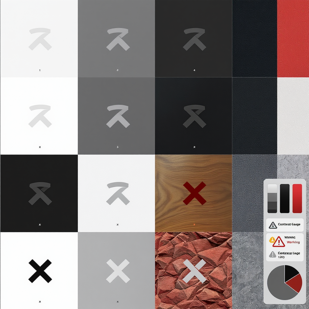
Color guidance and backgrounds
General rules
- Do not recolor, add gradients, or apply effects unless explicitly allowed.
- Provide sufficient contrast on both light and dark backgrounds.
- Prefer the platform’s specified full‑color mark on neutral backgrounds; use the white or black version as directed for contrast.
Platform notes
- Instagram:
- Use the monochrome glyph (black or white) for most UI.
- The multicolor gradient is reserved for the app icon and specific promotional contexts.
- Twitter/X:
- Use the X mark in black or white only; avoid blue fills and gradients.
- Do not place it inside custom shapes or combine with other marks.
- YouTube:
- Use the official YouTube Red for the play icon or a white play icon on a YouTube Red pill.
- Do not use the triangle alone; keep it within its rounded rectangle container.
Example CSS for light/dark contexts with inline SVGs using currentColor:
.icon {
  width: 24px;
  height: 24px;
  color: #000; /* black glyph by default */
}

@media (prefers-color-scheme: dark) {
  .icon {
    color: #fff; /* switch to white glyph on dark surfaces */
  }
}
Size, clear space, and minimums
- Maintain aspect ratio; never stretch or compress.
- Clear space: follow each platform’s rules (often measured by part of the glyph). When unknown, leave at least 0.5x icon width of padding around each mark.
- Minimum sizes for screen:
- As a safe generalization for legibility, keep icons at 24 px or larger.
- Test at 100% zoom on standard and high‑DPI monitors.
- Print:
- Use vector formats.
- Keep marks at or above the brand’s minimum mm/pt guidance; if unavailable, avoid marks smaller than ~7 mm in width.
Pixel‑hinting tips for small sizes
- Nudge SVG viewBox so strokes align to whole pixels.
- Export integer pixel dimensions (e.g., 24, 32) to reduce blurring.
/* Avoid fractional transforms that cause blur */
.social-icon {
  width: 24px;
  height: 24px;
  transform: translate(0, 0); /* no fractional values like 0.5px */
}
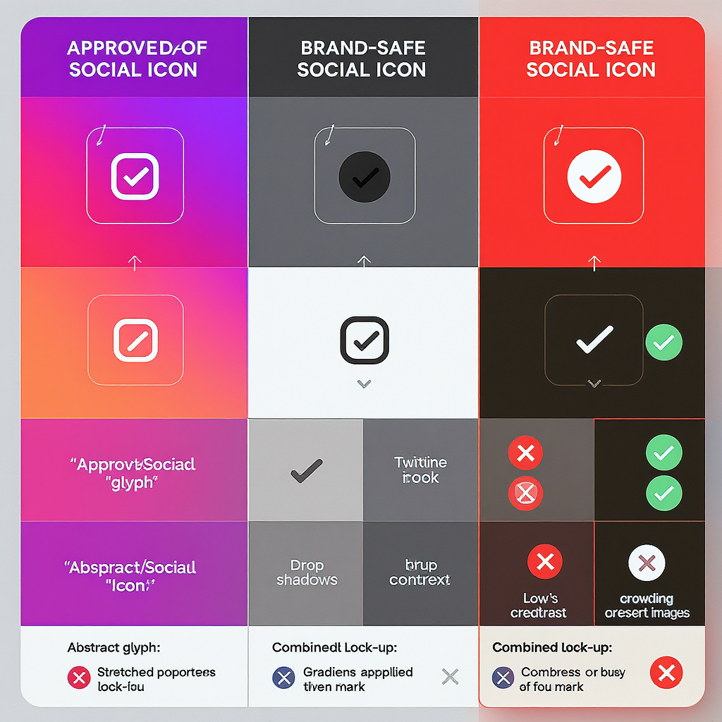
Practical do’s and don’ts with examples
Do
- Use official, unmodified SVGs.
- Keep sufficient clear space and equal visual weight across platforms.
- Use monochrome variants for UI consistency on complex backgrounds.
Don’t
- Recolor, apply gradients, add strokes, drop shadows, or glows.
- Rotate, skew, or put marks in custom containers (circles, squares) unless guidelines allow.
- Combine multiple platform icons into a single composite badge.
- Place marks so close that they read as a single lockup or imply a partnership.
Correct vs. incorrect (conceptual)
...
Co-branding and CTAs
Designing a “Follow us” module
- Equal prominence: Make icon sizes visually balanced; the widest mark shouldn’t dominate.
- Spacing: Use consistent gaps (e.g., 8–16 px) and maintain clear‑space rules.
- Icon‑only vs. lockups:
- Icon‑only is best for compact UI.
- Use official wordmark lockups for hero sections or printed collateral when allowed.
- Alignment and breakpoints:
- Left‑align on narrow screens; grid/flex wrap on larger screens.
- Keep equal spacing between icons and consistent baseline alignment.
Responsive HTML/CSS snippet
    ...
    Instagram


    ...
    X


    ...
    YouTube
.social-cta {
  display: flex;
  gap: 12px;
  align-items: center;
}
.social-cta a { line-height: 1; }
.sr-only {
  position: absolute; width: 1px; height: 1px; overflow: hidden; clip: rect(1px,1px,1px,1px);
}
Accessibility and performance
- Contrast: Ensure icon-to-background contrast meets WCAG (aim for 3:1 or better for non-text UI where feasible).
- Labels: Provide aria-labels on links and/or visible text. Hide decorative SVGs with aria-hidden="true" but keep link labels for AT.
- Keyboard: Ensure links are reachable via Tab and have visible focus states.
- Motion: Avoid animated effects around logos; respect prefers-reduced-motion.
- High‑DPI: Use SVG for crisp rendering; if using PNG, provide 2x/3x sources.
- Optimization:
- Subset and minify SVGs; remove metadata and unused attributes.
- Serve via HTTP/2 and cache aggressively.
SVGO example
npx svgo --multipass --config='{
  "plugins": [
    { "name": "preset-default" },
    { "name": "removeDimensions", "params": { "remove" : false } },
    { "name": "removeAttrs", "params": { "attrs": "(data-name|id|fill-rule)" } }
  ]
}' instagram-glyph.svg -o instagram-glyph.min.svg
Legal and trademark considerations
- Editorial vs. commercial use:
- Editorial (e.g., news reporting) often allows broader fair use with attribution.
- Commercial (ads, paid placements, product packaging) is restricted; follow the brand’s licensing terms strictly.
- No implied endorsement:
- Do not present platform marks as part of your brand or product identity.
- Add clarifying copy like “Follow us on…” rather than “Partnered with…”, unless you have written permission.
- Merchandise and app icons:
- Avoid using platform marks on merchandise, app icons, or logos unless explicitly permitted.
- Safe space and integrity:
- Respect minimum clear space and do not alter shapes.
- Read the terms:
- Each platform’s brand resource page includes trademark usage and legal notices; treat them as controlling.
This document is not legal advice. Consult your legal team for campaign-specific approvals.
Workflow, governance, and QA
Build a single source of truth
- Central library: Maintain a shared asset library (e.g., Figma team file, Sketch library, or a Git repo) with approved SVGs, EPS, and PNGs.
- Version control: Name assets with version and date (e.g., youtube-play-2024-11.svg); log provenance (URL and snapshot date).
- Change tracking: Assign an owner to review brand pages quarterly or before major launches.
Preflight checks
- Asset integrity: Confirm SVGs are the latest official versions; compare to brand pages.
- Color and contrast: Verify correct color variants and background contrast in both light/dark modes.
- Size and spacing: Audit responsive layouts at common breakpoints (320, 768, 1024, 1440).
- Accessibility: Validate aria-labels, focus states, and color contrast (use automated tooling plus manual checks).
- Performance: Run SVGO, compress PNG fallbacks, and set caching headers.
Rebrand playbooks (e.g., Twitter → X)
- Abstract references in code and content (use “x” handle URL patterns).
- Store platform names as configurable tokens to update UI copy without code changes.
- Run a deprecation sprint to replace all old marks across web, native, email templates, and print masters.
Quick reference checklist
- I downloaded the latest assets from official brand resources.
- I used the correct mark (glyph vs. app icon vs. lockup) for the context.
- I did not recolor, add effects, or distort the marks.
- Icons meet minimum sizes and clear-space requirements.
- There is sufficient contrast in light and dark modes.
- Links have accessible labels and visible focus.
- SVGs are optimized; PNG fallbacks are retina‑ready.
- Legal language avoids implied endorsement; usage complies with platform terms.
- My asset library and documentation are updated for future reuse.
Closing thought
Treat Instagram, X, and YouTube marks like any other trademarked asset: use the right file from the right source, follow the rules precisely, and document your decisions. It keeps your brand safe, your UI crisp, and your teams fast when platforms inevitably evolve.
Summary
Use only official, unmodified marks from each platform’s brand resources, follow color and clear‑space rules, and favor SVG for accessible, performant UI. Build governance into your workflow—centralize assets, version them, and preflight for size, contrast, and legal compliance. When platforms rebrand, run a structured deprecation sprint to update assets across every surface.