Standard Image Size for Web: Best Practices and Examples
Learn best practices for choosing standard image sizes on the web to improve site speed, SEO, and user experience across devices.
Standard Image Size for Web: Best Practices and Examples
Choosing the standard image size for web is crucial for building fast-loading, SEO-friendly websites that look sharp across devices. The right dimensions and file sizes ensure optimal performance, enhance user experience, and maintain consistent branding — all while avoiding slow load times or pixelated visuals.

---
Why Image Size Matters
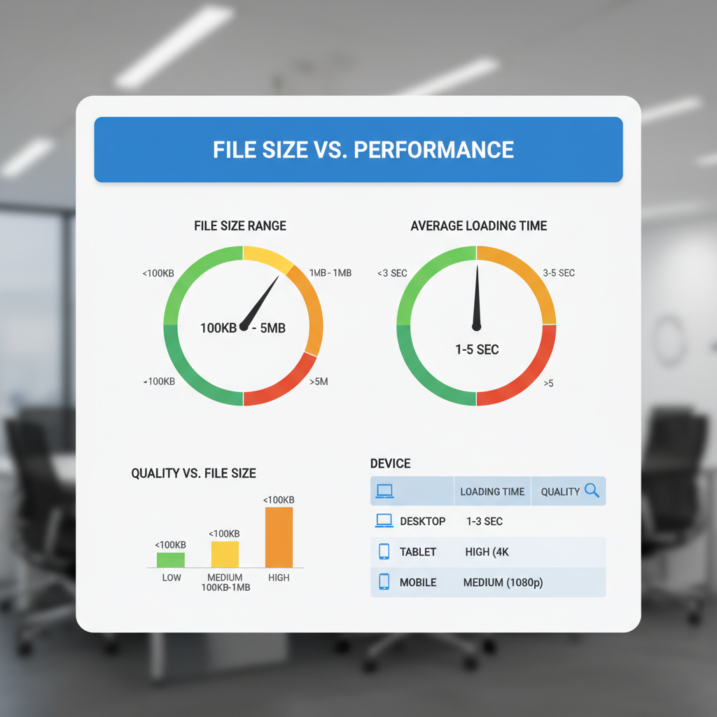
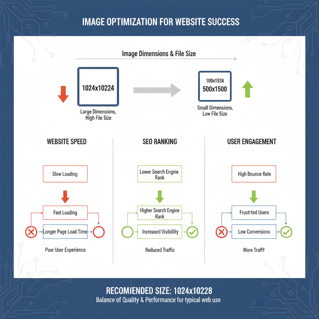
Website Speed
Large, unoptimized images increase page load time. Slow sites frustrate visitors and can harm search rankings. Since Google's Core Web Vitals emphasize performance, image optimization is essential to maintain competitive site speed.
SEO Impact
Google considers page speed a ranking factor. Properly sized and optimized images improve crawl efficiency, reduce bounce rates, and can enhance your position in search results.
User Experience
Oversized or misaligned images can distort layouts, especially on mobile. Correct sizing ensures images fit the screen perfectly and load quickly, improving engagement and accessibility.
---
Image Dimensions vs. File Size
Image optimization involves both on-screen dimensions and actual storage size, which are often confused.
Dimensions (Pixels)
- Definition: The width and height in pixels (px).
- Example: 1200 x 800 px means 1200 pixels wide, 800 pixels tall.
- Influence: Controls display sharpness and layout placement.
File Size (KB/MB)
- Definition: The amount of storage space the image occupies.
- Example: 350 KB JPEG or 1.2 MB PNG.
- Influence: Larger files download slower, affecting page speed.
---
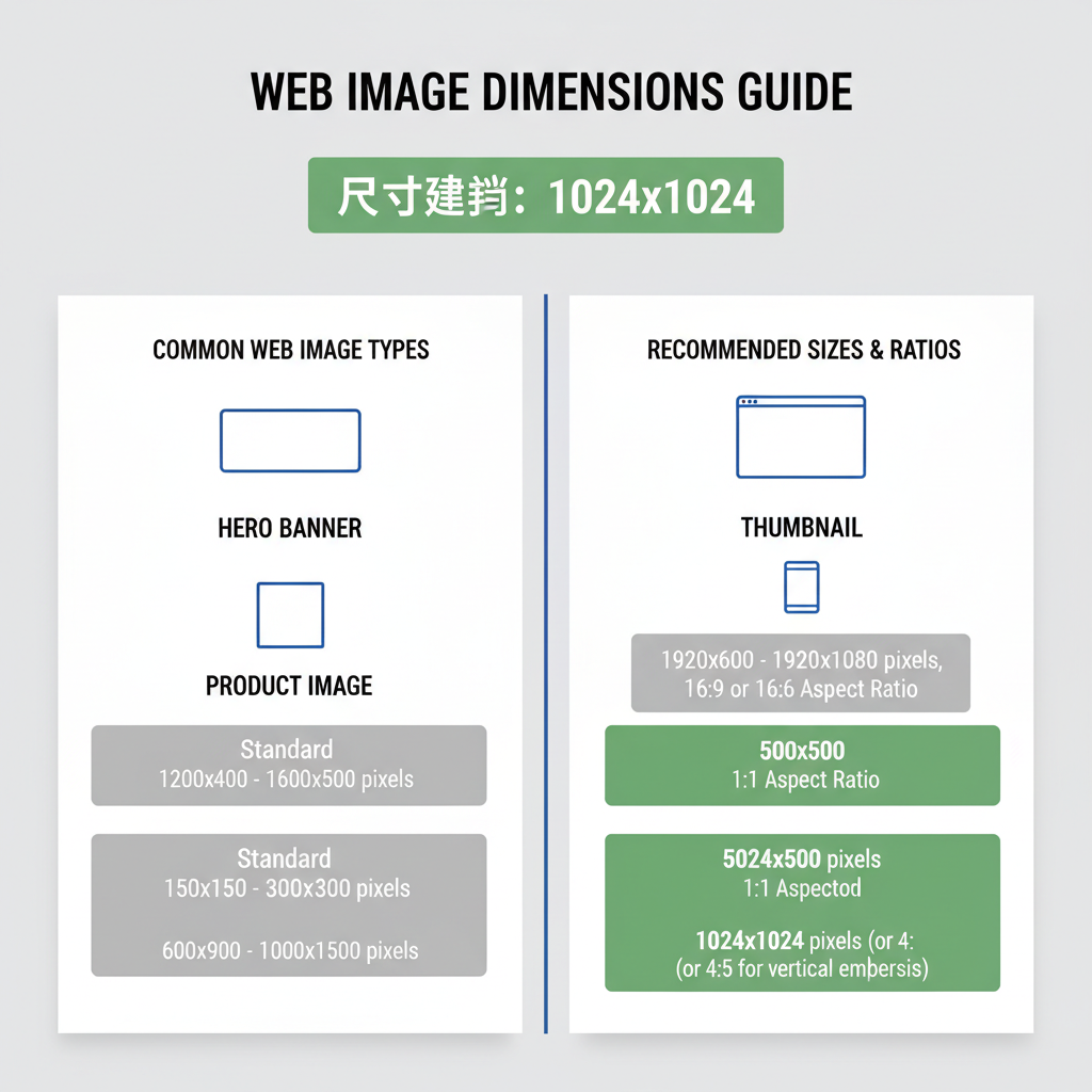
Common Standard Image Sizes for Web
Banners
- Hero banners: 1920 x 1080 px (HD) or up to 2560 x 1440 px for widescreens.
- Smaller top banners: 1280 x 720 px.
Sliders
- Typical sliders: 1600 x 600 px or 1200 x 500 px.
- Maintain consistent aspect ratios to prevent layout jumps.
Thumbnails
- Blog/portfolio thumbnail: 150 x 150 px or 300 x 300 px for retina screens.
Blog Images
- Full-width blog images: 1200 x 800 px.
- Inline smaller visuals: 800 x 600 px.
---
Optimal Sizes for Popular CMS
Different CMS platforms have specific size recommendations.
| Platform | Image Type | Recommended Size |
|---|---|---|
| WordPress | Featured Image | 1200 x 628 px |
| WordPress | Thumbnail | 150 x 150 px |
| Shopify | Product Image | 2048 x 2048 px (square) |
| Shopify | Banner/Slideshow | 1920 x 1080 px |
| Wix | Full-Width Strip Image | 3000 x 1000 px |
| Wix | Gallery | 800 x 600 px |
---
Responsive Image Practices
Modern sites should serve multiple image versions depending on device and resolution.
Using `srcset` Attribute
HTML5’s `srcset` lets browsers choose the appropriate version.
`` Element
Supports art direction by displaying different images for various screen widths.
---
Image Compression Without Quality Loss
Compression reduces file size while preserving clarity.
Online Tools
- TinyPNG and JPEGmini: Drag-and-drop compression for quick optimization.
- Squoosh: Google’s compression tool with format conversion.
Desktop Tools
- Adobe Photoshop: “Save for Web” functionality.
- GIMP: Free alternative with export settings customization.
Automation
- Webpack image-loader or gulp-imagemin for continuous optimization in build processes.
---
Choosing Correct Aspect Ratios
Aspect ratios ensure consistent visuals and prevent distortion.
- 16:9: Wide banners, videos.
- 4:3: Standard photographs.
- 1:1: Square product images.
- 3:2: DSLR photography standard.
Consistency in ratios across similar elements enhances design harmony.
---
Best Practices for Retina/High-DPI Screens
High-DPI displays need more pixel-dense images to appear sharp.
Guidelines:
- Design at double the resolution (e.g., 2400 px for a 1200 px display size).
- Use `srcset` to serve high-res versions only where needed.
- Compress to prevent excessive file sizes.
---
Balancing Quality and Load Time for Mobile Users
Mobile-optimized images improve speed and user satisfaction.
Tips:
- Deliver smaller versions to devices under 768 px wide.
- Use modern formats like WebP or AVIF to achieve smaller files.
- Lazy-load offscreen images (`loading="lazy"`).
- Remove excessively large decorative images for mobile layouts.
---
Quick Reference Chart
A handy overview of standard image sizes for common web uses:
| Image Purpose | Standard Size | Aspect Ratio |
|---|---|---|
| Hero Banner | 1920 x 1080 px | 16:9 |
| Slider Image | 1600 x 600 px | 8:3 |
| Blog Header | 1200 x 800 px | 3:2 |
| Thumbnail | 300 x 300 px | 1:1 |
| Product Image (Shopify) | 2048 x 2048 px | 1:1 |
| Gallery Image | 800 x 600 px | 4:3 |
---
Summary and Next Steps
Mastering standard image size for web means more than meeting dimensions — it’s about optimizing for speed, maintaining aspect ratios, and preparing images for responsive and high-DPI displays. Apply these best practices consistently across your site, and you’ll see improvements in load times, design consistency, and SEO rankings.
Ready to improve your site’s visual performance? Start by auditing current images and implementing responsive sizing and compression today to ensure every visitor enjoys a fast, beautiful web experience.