Standard Image Sizes for Web: Designer and Marketer Guide
Learn the optimal image sizes and formats for web design, SEO, and user experience, including hero banners, blog images, and e-commerce products.
Introduction: Understanding Standard Image Sizes for Web Performance and SEO
Selecting the standard image sizes for web is essential for balancing visual appeal, fast load speeds, and optimal search engine rankings. The right dimensions can make a website look professional and consistent, while oversized or poorly formatted images can slow performance and hurt the user experience. Whether you're working on a blog, an e-commerce store, or digital ads, knowing the recommended formats and resolutions helps your content shine across all devices.
---
Why Image Sizing Matters for Web Performance and UX
Images play a pivotal role in modern websites — they convey brand identity, attract attention, and enhance storytelling. However, using improperly sized images can harm page load speed, cause layout issues, and degrade the user experience. Large image files increase bandwidth usage, slowing down websites, especially on mobile networks. Overloaded images can also cause layout shifts, impacting core web vitals and SEO ranking.

A well-optimized image strategy ensures that visuals appear crisp while keeping load times responsive. Furthermore, using consistent sizes across a site delivers a polished, professional appearance and helps with responsive design scalability.
---
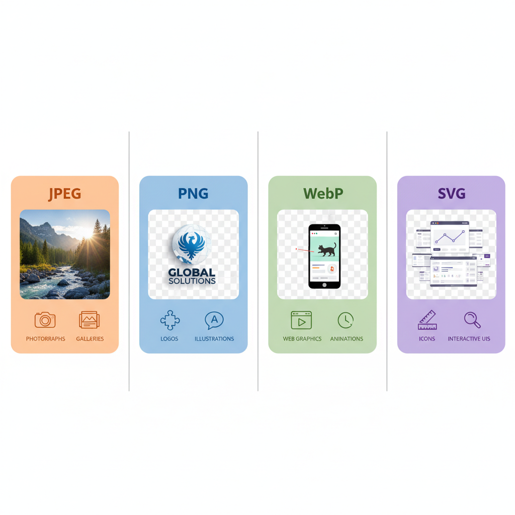
Common Web Image Formats and When to Use Each
Choosing the right file format impacts both visual quality and performance.
JPEG
- Ideal for photographs and realistic images.
- Offers lossy compression, reducing file size.
- Best when smooth gradients and subtle color changes are needed.
PNG
- Suitable for images with transparency or sharp edges like logos.
- Lossless compression retains quality but results in larger files.
- Use sparingly for large-scale photos due to size.
WebP
- Modern format for both lossy and lossless compression.
- Smaller file sizes compared to JPEG/PNG with comparable quality.
- Supported on most modern browsers.
SVG
- Vector format optimal for icons, logos, and scalable graphics.
- Infinitely scalable without quality loss.
- Very lightweight for simple shapes.
---
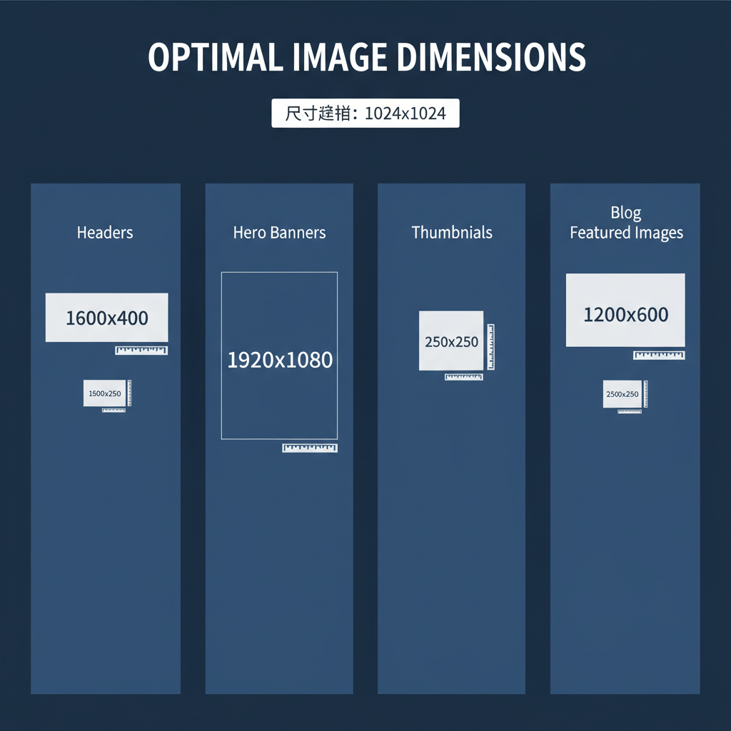
Standard Image Sizes for Website Headers and Hero Banners
Headers and hero images often span the full width of the viewport. Common pixel dimensions vary for different layouts:
| Usage | Suggested Dimensions (px) | Aspect Ratio |
|---|---|---|
| Full-width hero banner | 1920 x 1080 | 16:9 |
| Header background image | 1600 x 500 | Wide |
| Full-screen slider image | 1920 x 1280 | 3:2 |
These sizes ensure sharp display on large monitors while still being manageable in file size when compressed effectively.
---
Optimal Sizes for Blog Post Feature Images and Inline Content Images
Feature images are the visual summary of any blog post. The most common dimensions are:
- Feature image (full-width): 1200 x 628 px (ideal for social media sharing).
- Inline content image: 800 x 600 px to accommodate responsive layouts.
Maintaining a consistent aspect ratio ensures images don’t appear stretched or cropped unexpectedly on different devices.
---
Recommended Dimensions for E-Commerce Product Photos and Thumbnails
High-quality product images are critical for conversions.
| Type | Suggested Dimensions (px) | Notes |
|---|---|---|
| Main product image | 1024 x 1024 | Square format ensures consistency |
| Gallery image | 800 x 800 | Alternate views or color options |
| Thumbnail | 300 x 300 | Optimized for quick load and navigation |
Many e-commerce platforms recommend square images to avoid layout inconsistencies across catalog displays.
---
Standard Sidebar/Banner Ad Image Sizes (IAB Standard Ads)
The Interactive Advertising Bureau (IAB) defines common ad sizes across digital media. Popular sizes include:
| Ad Type | Dimensions (px) |
|---|---|
| Leaderboard | 728 x 90 |
| Medium rectangle | 300 x 250 |
| Large rectangle | 336 x 280 |
| Skyscraper | 160 x 600 |
| Mobile leaderboard | 320 x 50 |
Using official ad dimensions ensures campaign consistency and speeds up approval from ad networks.
---
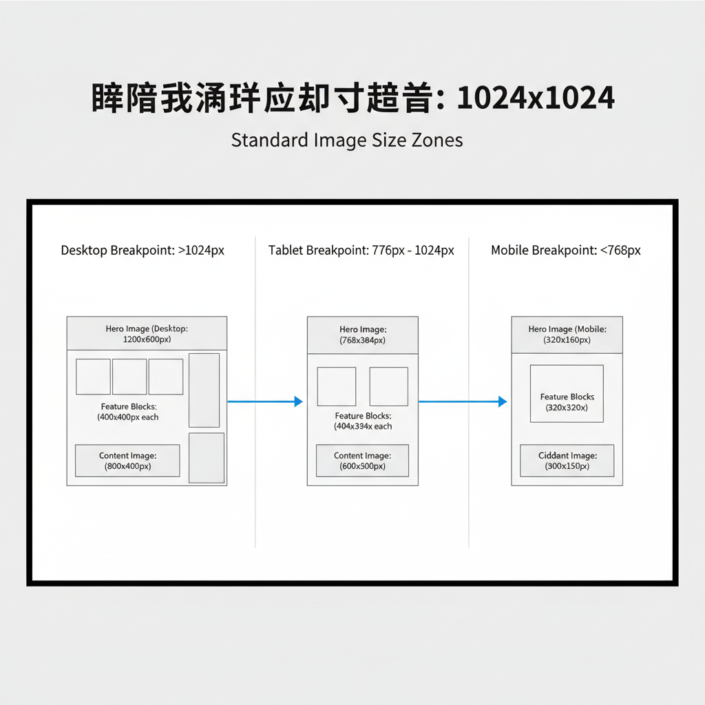
Responsive Design Considerations
In a responsive setup, images must adapt to different screen sizes without losing clarity.
- Define breakpoints for mobile, tablet, and desktop.
- Implement the `srcset` attribute in HTML for multiple resolutions.
- Use percentage-based width in CSS (`max-width: 100%`) for fluid images.
Example of `srcset` usage:
---
File Size Optimization Tips without Losing Quality
- Compress images using tools like TinyPNG or Squoosh.
- Remove metadata (camera info, GPS tags) to save bytes.
- Adjust quality settings: JPEG 70–80% often balances quality and size.
- Convert to WebP for superior compression without quality loss.
---
Retina/High-DPI Image Guidelines
For retina or high-DPI screens, provide images at 2x resolution. For example, a displayed 300 x 300 px thumbnail should be uploaded at 600 x 600 px.
Alternatively, use vector-based SVGs for logos and icons, guaranteeing crisp visuals across all resolutions.
---
Tools and Resources for Resizing and Compressing Images Efficiently
- Adobe Photoshop – advanced resizing and export controls.
- Canva – online design tool with preset dimensions.
- ImageMagick – command-line batch processing.
- Squoosh – free browser-based compression from Google.
- TinyPNG/JPEG – efficient PNG/JPEG compression tools.
---
Checklist for Testing Image Display Across Devices and Browsers
- Preview on multiple devices – mobile, tablet, desktop.
- Cross-browser verification – Chrome, Firefox, Safari, Edge.
- Measure load times – with Google PageSpeed Insights.
- Confirm accessibility – alt text on every image.
- Check responsiveness – avoid cropping or stretching.
- Optimize caching – use proper HTTP cache-control headers.
---
Quick Reference Table for Web Standard Image Sizes
| Category | Dimensions (px) |
|---|---|
| Hero banner | 1920 x 1080 |
| Blog feature image | 1200 x 628 |
| Product image | 1024 x 1024 |
| Thumbnail | 300 x 300 |
| Leaderboard ad | 728 x 90 |
| Medium rectangle ad | 300 x 250 |
---
Conclusion
Following standard image sizes for web ensures your site’s visuals are crisp, fast-loading, and consistent across all devices. By combining correct dimensions with compression, responsive techniques, and retina compatibility, you can deliver an engaging user experience while improving SEO. Start optimizing your images today to enhance performance and keep your audience engaged.