Standard Image Sizes in Pixels for Web Design and Marketing
Learn the standard image sizes in pixels for web design, e‑commerce, and social media to keep your website fast, responsive, and visually consistent.

Why Image Size Matters for Web Performance & Design
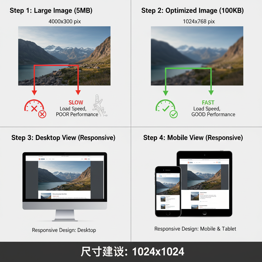
Choosing standard image sizes in pixels for web is a key part of modern web development and design. Optimized image dimensions improve page speed, enhance visual impact, and provide a consistent user experience across devices. From hero banners to thumbnails, knowing the right size for every image type ensures your site looks professional and performs well.
Large, unoptimized files can delay page loads, damaging SEO and user satisfaction. At the other extreme, images that are too small may appear blurry or pixelated, eroding trust in your brand.
By following proven dimension standards and compression strategies, you can keep your website attractive, responsive, and fast.
---
Common Image Formats for the Web
Different content types require different image formats. Knowing which is best for your purpose helps balance quality and file size:
- JPEG
- Best for photographs and complex visuals; offers good compression with minimal quality loss.
- Progressive JPEGs can improve perceived load speeds.
- PNG
- Ideal for graphics, logos, and visuals with transparency; uses lossless compression.
- WebP
- A modern format by Google with excellent compression and quality; supported on most new browsers.
When to choose each:
| Format | Best Use | Pros | Cons |
|---|---|---|---|
| JPEG | Photographs | Small file size, high quality | Lossy compression |
| PNG | Logos, graphics with transparency | Lossless, supports transparency | Larger files |
| WebP | All-round web images | Excellent compression | Older browsers may lack support |
---
Standard Image Sizes for Website Hero Banners
Hero banners capture attention and set tone. To keep them sharp across devices:
- Desktop: 1920 × 1080 px or wider depending on layout
- Tablet: 1280 × 720 px
- Mobile: 800 × 600 px
Design tips:
- Maintain aspect ratios like 16:9 for cinematic feel.
- Focus on key visual elements that stay visible on smaller screens.
- Use `srcset` attributes to serve different resolutions appropriately.
---
Thumbnails, Blog Feature Images, and Gallery Standards
Smaller visuals also require consistent sizing:
- Thumbnails: 150 × 150 px
- Blog Feature Images: ~1200 × 628 px (matches Facebook link preview)
- Gallery Images: 800 × 800 px or scaled to grid layout
Standardized sizes enhance visual harmony and reduce load time.
---
Optimal Dimensions for Product Images in E-Commerce
High-quality product imagery builds trust and sales:
- Primary Product Image: 1000 × 1000 px to 1600 × 1600 px (square format)
- Zoomable Image: At least 2000 px on longest side
- Thumbnail: 300 × 300 px
Consistency across product listings ensures a polished catalog.
---
Standard Sizes for Social Media Embeds on Websites
When displaying social media previews:
- Facebook Link Preview: 1200 × 628 px
- Instagram Post Preview: 1080 × 1080 px
- Twitter Card Image: 1200 × 675 px
Precise sizes ensure crisp visuals in embeds and shares.
---
High-DPI (Retina) Considerations
Retina and other high-DPI displays require more pixels for sharpness:
- Supply images at 2× or 3× target display size.
- Example: For 400 × 300 px display, use an 800 × 600 px image file.
Strategies:
- Implement `srcset` to load higher resolution only when needed.
- Export images at double dimensions while maintaining compression quality.
---
Best Practices for Image Compression
Compressing images correctly balances performance and clarity:
- Tools: TinyPNG, Squoosh
- JPEG: Quality between 75%–85%
- PNG: Use optimized export/minification
- WebP: Prefer where browser support exists
Too much compression can cause visible artifacts and reduce professionalism.
---
Responsive Design Strategies: srcset and picture Elements
Responsive images adapt based on viewport size and device capabilities:
- `` serves multiple sizes.
- `` supports format selection and fallbacks.
---
Accessibility Considerations for Web Images
Accessible images reach more users and meet legal standards:
- Use descriptive alt text.
- Avoid embedding important text in images.
- Apply descriptive file naming for SEO.
- Maintain logical image placement with related content.
---
How to Test and Verify Image Rendering
Testing ensures images look right everywhere:
- Cross-browser: Chrome, Firefox, Safari, Edge.
- Device simulation: Desktop, tablet, mobile screen sizes.
- High-DPI validation: Retina, 4K displays.
- Tools: BrowserStack or real devices.
---
Quick-Reference Table of Standard Pixel Dimensions
| Use Case | Standard Pixel Dimensions |
|---|---|
| Hero Banner (Desktop) | 1920 × 1080 |
| Hero Banner (Tablet) | 1280 × 720 |
| Hero Banner (Mobile) | 800 × 600 |
| Thumbnail | 150 × 150 |
| Blog Feature Image | 1200 × 628 |
| Gallery Image | 800 × 800 |
| Product Image (Primary) | 1000–1600 × 1000–1600 |
| Product Image (Zoom) | 2000 px longest side |
| Product Thumbnail | 300 × 300 |
| Facebook Preview | 1200 × 628 |
| Instagram Preview | 1080 × 1080 |
| Twitter Card | 1200 × 675 |
---
Summary & Next Steps
Selecting correct standard image sizes in pixels for web is vital for SEO, speed, and design success. By following tested size guidelines for each image type, optimizing via compression, and implementing responsive strategies, you’ll boost both visual quality and technical performance.
Start auditing your site’s images today—align them with these recommendations to see immediate improvements in clarity, speed, and engagement.