Standard Picture Sizes in Pixels for Web and Print
Learn standard picture sizes in pixels for web, print, and social media to ensure sharp visuals, fast loading, and professional presentation.
Introduction to Standard Picture Sizes in Pixels
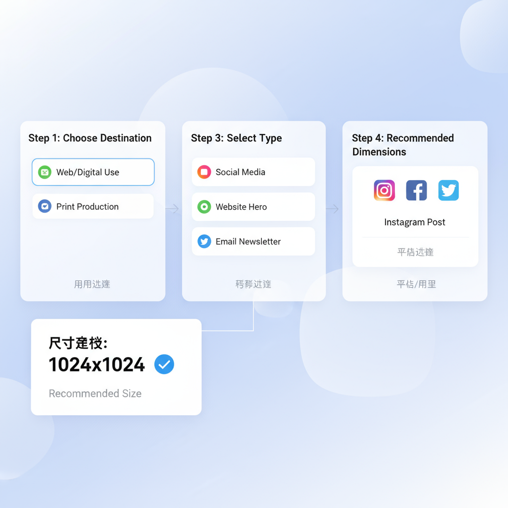
Whether you are designing for the web, preparing assets for print, or crafting posts for social media, understanding standard picture sizes in pixels is crucial for creating professional, visually appealing visuals. The correct image dimensions balance quality with performance: too small and your image may appear blurry; too large and you risk slow loading times or awkward cropping. By mastering standard picture sizes and resolutions, you can consistently deliver sharp, well-fitted images tailored to each platform and medium.
In digital media, "size" often refers to two key attributes:
- Dimensions: Width and height measured in pixels (px) for screens or inches/cm for print.
- Resolution: Pixel density, in pixels per inch (ppi) or dots per inch (dpi), which influences clarity in print.
With these fundamentals, you can select and prepare images that meet technical requirements while enhancing the user experience.
---
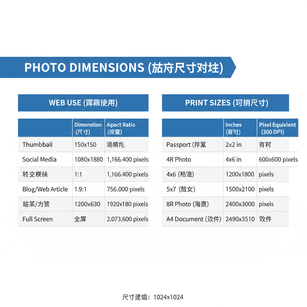
Common Digital Photo Dimensions for Web Use
On websites, image dimensions are given in pixels and optimized to suit screens. Common web sizes include:
- Website content images: 600–1200 px wide to suit layout and responsiveness.
- Hero banners: 1920 × 1080 px (Full HD) for immersive, full-width visuals.
- Thumbnails: 150 × 150 px or 300 × 300 px to maintain recognizability without excess weight.
- Blog featured images: 1200 × 628 px for optimal display on social sharing platforms.
Although modern cameras capture very large images (often 4000 px wide or more), resizing for web is essential to improve load speeds while maintaining visual quality.
---
Standard Print Photo Sizes and Pixel Equivalents
For print projects, sizes are traditionally expressed in inches, but converting to pixels using your target dpi gives precision. Professional quality usually demands 300 dpi.
| Print Size (inches) | Pixel Dimensions (at 300 dpi) | Use Case |
|---|---|---|
| 4 × 6 | 1200 × 1800 px | Small photo prints |
| 5 × 7 | 1500 × 2100 px | Photo frames |
| 8 × 10 | 2400 × 3000 px | Portrait prints |
| 11 × 14 | 3300 × 4200 px | Wall displays |
| 16 × 20 | 4800 × 6000 px | Posters |
Tip: Always begin with a high-resolution original and scale down — enlarging beyond original resolution will reduce quality.
---
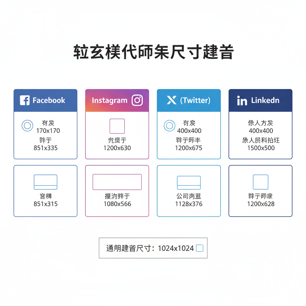
Social Media Image Size Standards
Each social platform has specific dimensions for optimal display. Matching or slightly exceeding these ensures crisp presentation after the platform applies compression.
- Cover photo: 820 × 312 px
- Shared image: 1200 × 630 px
- Profile: 170 × 170 px (desktop), displays circular on mobile
- Square post: 1080 × 1080 px
- Portrait post: 1080 × 1350 px
- Story: 1080 × 1920 px
Twitter (X)
- Header: 1500 × 500 px
- In-stream image: 1200 × 675 px
- Profile: 400 × 400 px
- Background photo: 1584 × 396 px
- Sharing image: 1200 × 627 px
- Profile picture: 400 × 400 px
---
Optimal Pixel Dimensions for Blog Posts and Banners
Blog layouts typically require multiple image types:
- Featured image: About 1200 × 628 px for compatibility with social sharing cards.
- Inline images: 600–800 px wide for a comfortable fit within text columns.
- Full-width banners: Around 1920 × 400–1080 px for modern screens.
Exporting images at double the intended display width helps maintain sharpness on Retina and other high-density displays.
---
Resolution vs Dimensions: DPI and PPI Explained
Confusion often arises between pixel dimensions and resolution.
- Dimensions: Pixel width × height.
- PPI (Pixels Per Inch): Number of pixels per inch on a screen.
- DPI (Dots Per Inch): Number of ink dots per inch on printed materials.
For web:
- PPI is less relevant; HTML/CSS rely on total pixel dimensions.
For print:
- Higher DPI gives better detail; 300 dpi is standard.
- To calculate pixels: multiply inches by dpi.
- Example: 8 × 10 in × 300 dpi = 2400 × 3000 px.
---
Tips for Scaling Images Without Quality Loss
To resize images effectively:
- Begin with original, high-resolution files.
- Avoid repeated JPEG saves to reduce compression artifacts.
- Use vector formats for logos or geometric shapes.
- Upscale cautiously, employing AI tools like Photoshop’s Preserve Details 2.0.
- Retain aspect ratio to prevent stretching or squashing.
---
Tools and Resources for Resizing
Popular options for resizing and checking picture sizes include:
- Adobe Photoshop for professional-grade control.
- GIMP, a free and open-source alternative.
- Canva for quick web-based resizing and design.
- Pixlr for fast online editing.
- ImageMagick for batch command-line resizing.
Checking size:
- Windows: Right-click → Properties → Details
- Mac: ⌘+I in Finder (Get Info)
- Online: Tools like "Get DPI" or "ImageSize.io".
---
Best Practices for Choosing Image Sizes
When selecting the right image size:
- Start from the intended platform (web, print, social).
- Follow the official guidelines provided.
- Optimize for fast load times and suitable formats (JPEG for photos, PNG/WebP for graphics).
- Account for responsive design needs.
- Test across multiple devices and displays.
---
Conclusion and Quick Reference Chart
Appropriate image sizing blends aesthetics with technical efficiency. By aligning both pixel dimensions and resolution with your project goals, you can ensure your visuals look professional across web and print. Refer to this quick chart for common cases:
| Use Case | Standard Dimensions (px) | Notes |
|---|---|---|
| Website banner | 1920 × 1080 | Full HD hero image |
| Blog featured image | 1200 × 628 | Optimized for social sharing |
| 4 × 6 print | 1200 × 1800 | 300 dpi print quality |
| Facebook cover | 820 × 312 | Platform baseline |
| Instagram square | 1080 × 1080 | Feed optimization |
| Twitter header | 1500 × 500 | Wide banner fit |
By keeping these standards in mind, you’ll be confident that every image you publish — whether it’s online or in print — meets its intended purpose. Start applying standard picture sizes in pixels today to elevate your projects and streamline your design process.