Standard Web Picture Sizes for Designers and Marketers
Learn the standard web picture sizes for hero images, banners, products, and social embeds while optimizing performance, responsiveness, and SEO.
Introduction: Why Image Sizes Matter for Web Performance and SEO
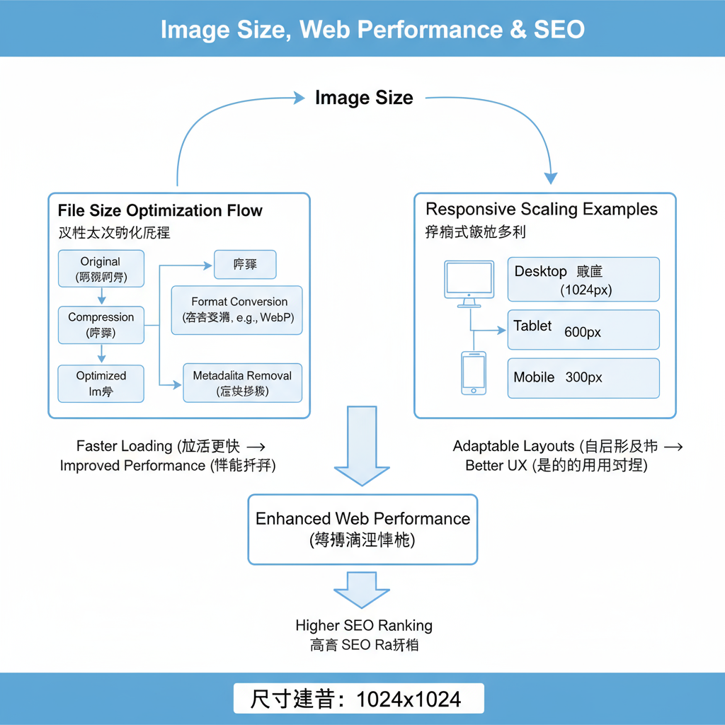
Selecting standard web picture sizes is critical for both visual appeal and technical performance. Images draw users in and communicate ideas quickly, but improper sizing can harm your site’s speed, user experience, and search rankings. By balancing quality, loading speed, and scalability across devices, you can enhance branding and maximize SEO impact.

Optimized images help:
- Reduce page load time
- Improve mobile performance
- Enhance search engine visibility
- Ensure consistent branding across platforms
---
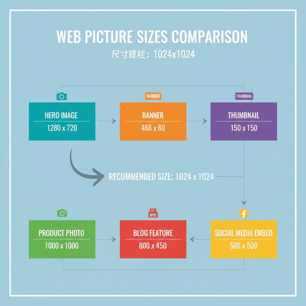
Common Web Picture Dimensions for Different Uses
Different sections of a site have unique requirements. Knowing the right pixel dimensions for each purpose helps maintain consistency and optimize performance.
Hero Images
Hero images are large, full-width visuals placed prominently at the top.
- Typical size: 1920×1080 px (Full HD)
- High quality with optimized file size
- Responsive scaling for mobile and tablets
Banner Images
Banners serve as promotional or section dividers.
- Common size: 1600×500 px or 1200×400 px
- Designed for clarity in text and graphics
Thumbnails
Small preview images aid navigation in galleries or category pages.
- Standard size: 150×150 px to 300×300 px
- Compact files to keep listing pages fast
Product Photos
E-commerce product visuals rely on clear, large images.
- Recommended size: 800×800 px or 1024×1024 px for zoom features
- Uniform aspect ratios for professional presentation
---
Optimal Sizes for Blog Post Feature Images
A blog’s featured image should perform well in both on-site layouts and social shares.
- Typical size: 1200×628 px
- Matches Open Graph and Twitter Card dimensions for previews
- Avoid excessive text to preserve readability across smaller displays
---
Recommended Dimensions for Social Media Embeds on Websites
Embedding social media content requires sharp, correctly proportioned imagery.
| Platform | Recommended Embed Image Size | Aspect Ratio |
|---|---|---|
| 1200×630 px | 1.91:1 | |
| Twitter (Cards) | 1200×675 px | 16:9 |
| 1080×1080 px | 1:1 |
Why Sizes Matter in Embeds
Using the recommended dimensions ensures quality is retained after platform compression or cropping. Incorrect sizing can leave important elements cut off or pixelated.
---
Responsive Design Considerations
Web audiences span multiple devices; responsive strategies keep images sharp at every resolution.
Techniques for Scaling Images
- CSS Media Queries: Deliver smaller images on mobile
- `srcset` attribute: Serve varying resolutions by device pixel density
- Vector Graphics: Ideal for icons and logos to scale seamlessly
Example Code for Responsive Images
---
File Formats and Their Impact
Your choice of format affects both the visual quality and the load performance.
JPEG
- Best for full-color photos
- Compressed efficiently with slight quality loss
- No transparency support
PNG
- Maintains quality, supports transparency
- Larger file sizes—ideal for sharp, simple graphics
WebP
- Modern format offering high compression and quality
- Widely supported across browsers
- Can cut file size by 25–35% compared to JPEG or PNG
---
Design Tips for Maintaining Quality While Reducing File Size
- Crop before resizing – Remove unnecessary areas before scaling.
- Use proper compression – Find the sweet spot between size and clarity.
- Maintain aspect ratio – Avoid distortion.
- Simplify designs – Reduce colors and detail for smaller file sizes.
- Lazy Loading – Load off-screen images only when needed.
---
Using CSS and HTML Attributes to Ensure Correct Display
Appropriate styling and attributes help images blend seamlessly into layouts.
CSS Properties
img {
  max-width: 100%;
  height: auto;
  display: block;
}- `max-width: 100%` keeps visuals within their containers
- `height: auto` maintains proportions
HTML Attributes
- `alt` text improves accessibility and boosts SEO relevance
- `width` and `height` reserve space to minimize layout shifts
---
Tools for Resizing and Compressing Images
Accessible tools simplify optimization without noticeable quality loss.
| Tool | Features | Platform |
|---|---|---|
| TinyPNG | Smart lossy compression for PNG and JPEG | Web |
| ImageOptim | Batch compress multiple formats efficiently | Mac |
| Adobe Photoshop | Professional resizing, compression, and editing | Windows/Mac |
| Squoosh | Browser-based compression with various format options | Web |
---
Quick Reference Table of Standard Web Picture Sizes
| Type | Standard Size | Aspect Ratio |
|---|---|---|
| Hero Image | 1920×1080 px | 16:9 |
| Banner | 1600×500 px | 3.2:1 |
| Thumbnail | 150×150 px | 1:1 |
| Product Photo | 800×800 px | 1:1 |
| Blog Feature | 1200×628 px | 1.91:1 |
| Facebook Embed | 1200×630 px | 1.91:1 |
| Twitter Card | 1200×675 px | 16:9 |
| Instagram Embed | 1080×1080 px | 1:1 |
---
Summary
By carefully selecting standard web picture sizes and applying responsive, optimized formats, you can deliver visuals that are sharp, fast-loading, and consistent across all devices and platforms. Better image sizing directly supports your SEO, improves user experience, and keeps your web performance strong.
Start optimizing your web images today to achieve a professional look with maximum speed and search visibility.