Standard Website Photo Size for Speed and Responsive Design
Learn the best standard photo sizes, aspect ratios, and compression methods to boost website speed, ensure responsiveness, and improve user experience.
Standard Website Photo Size for Speed and Responsive Design
In today’s fast-moving online landscape, images are more than decoration—they’re core to brand identity, user engagement, and conversion rates. Yet if your visuals aren’t optimized, oversized files can slow down pages, frustrate visitors, and damage rankings. Knowing and implementing the standard website photo size for each context ensures fast-loading, responsive pages that look great on any device.

---
Why Image Size Matters for Website Speed and UX
The dimensions and file sizes of your images have a direct effect on page load time, bandwidth consumption, and smoothness of interaction. Large, unoptimized files can cause:
- Increased bounce rates from slow loading.
- Poor mobile experience.
- Lower positions in search results (Google’s Core Web Vitals emphasize speed).
Balancing image quality with performance means your visuals remain sharp while your site stays agile.
---
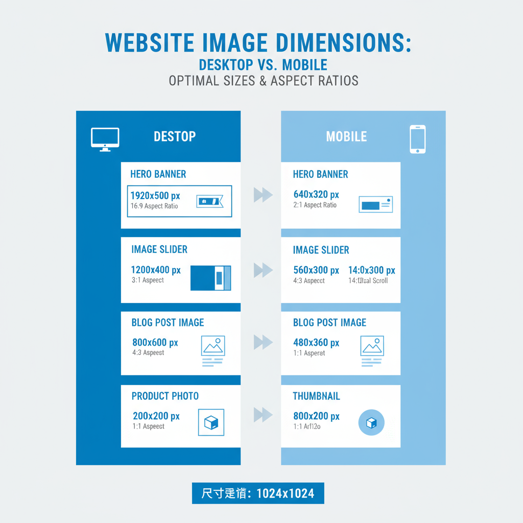
Common Image Dimensions for Hero Banners, Sliders, and Thumbnails
Different layout elements call for different dimensions to achieve maximum impact while minimizing weight:
| Image Type | Common Dimensions (px) | Aspect Ratio |
|---|---|---|
| Hero Banner | 1920 x 1080 | 16:9 |
| Slider Image | 1600 x 600 | 8:3 |
| Thumbnail | 150 x 150 | 1:1 |
Hero banners should be crisp and wide for large screens. Sliders need balanced width and height. Thumbnails remain small but identifiable.
---
Standard Sizes for Blog Post Images and Product Photos
Content images and product photos have different requirements based on layout and functionality:
| Purpose | Recommended Width | Notes |
|---|---|---|
| Blog header image | 1200 px | Full-width in most themes |
| Inline blog image | 800 px | Clear and quick to load |
| Product photo | 1000–1600 px | Detailed enough for zoom views |
---
Recommended Aspect Ratios for Responsive Design
Choosing the right aspect ratio keeps your layout stable across devices:
- 16:9 – Landscape hero images and videos.
- 4:3 – Gallery views and many product listings.
- 1:1 – Profile pictures and square thumbnails.
A consistent ratio reduces cropping issues and unwanted shifts in design.
---
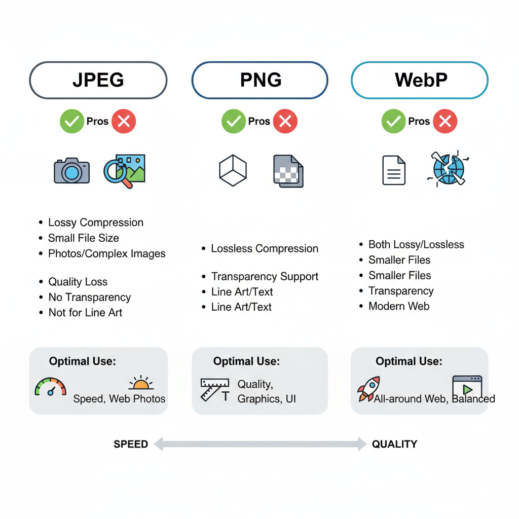
File Formats: JPEG, PNG, WebP – Pros and Cons
Selecting the optimal file format prevents bloat while preserving visual fidelity:
JPEG
- Ideal for photos.
- Small file size via lossy compression.
- Not suitable for sharp text.
PNG
- Lossless, great for graphics and transparency.
- Larger files.
WebP
- Modern format with powerful compression.
- Better size-quality ratio.
- Broad browser support.
---
Best Resolution for Desktop vs Mobile Viewing
Serve the right resolution to the right device for the best experience:
- Desktop hero: ~1920 x 1080 px for HD clarity.
- Mobile hero: ~1080 x 720 px.
- Thumbnails: 150–300 px width.
Scaling appropriately improves speed with no loss of detail.
---
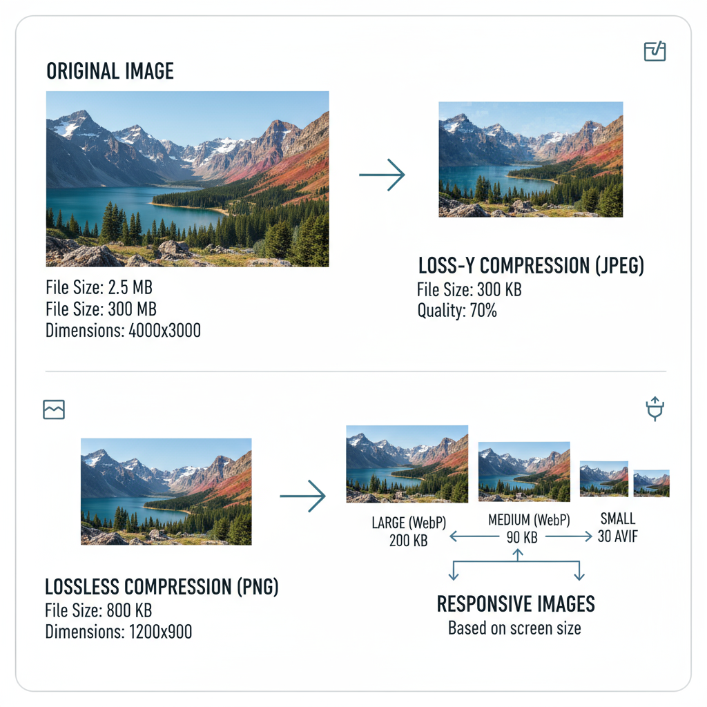
Compression Techniques to Reduce Load Time Without Losing Quality
Compress before uploading. Consider:
- Lossy compression – removes data subtly to shrink size.
- Lossless compression – preserves all detail.
Implement tools like:
- TinyPNG
- ImageOptim
- Adjust JPEGs to 70–80% quality and strip metadata.
---
Using CSS and HTML to Handle Scaling (srcset, picture Tags)
Responsive HTML ensures correct image delivery:
This setup serves optimal sizes for each device, reducing unnecessary bandwidth usage.
---
Tools for Resizing and Optimizing Web Images
Streamline your workflow with:
- Adobe Photoshop – precision control.
- Canva – simple resizing and exports.
- Squoosh.app – free, browser-based compression.
- ImageMagick – automate via CLI.
Integrate with build tools to enforce size and format standards in deployment.
---
SEO Benefits of Properly Sized and Optimized Images
Optimized images boost SEO through faster load times and better content indexing:
- Keyword-rich filenames enhance relevance.
- Descriptive alt text supports accessibility and searchability.
- Structured data helps in image search results.
---
Accessibility Considerations: Alt Text and File Naming
Meet WCAG standards and serve all users by:
- Including meaningful alt text.
- Avoiding generic filenames.
- Maintaining strong contrast when overlaying text.
---
Pitfalls to Avoid: Oversized Uploads, Wrong Formats, Inconsistent Ratios
Avoid these speed-and-design killers:
- Raw, multi-megabyte DSLR uploads without resizing.
- Excessive PNG use for large photos.
- Mixed ratios in a single gallery.
---
Checklist for Maintaining Consistent Website Photo Sizes
- Define standard dimensions per image type.
- Keep aspect ratios uniform.
- Implement responsive image markup.
- Compress before upload.
- Select optimal formats.
- Use keyword-rich filenames.
- Write descriptive alt text.
- Monitor load speed stats.
- Audit for oversized or misformatted visuals.
---
Summary
Applying the correct standard website photo size across your site is essential for seamless performance, visual appeal, and SEO gains. By defining dimensions, ratios, formats, and compression strategies, you can create a responsive, accessible website that delights users and ranks well. Start optimizing your images today to accelerate load times and elevate your brand presence.