StyleX: A Scalable CSS Styling Solution
Introduction to StyleX
StyleX is Meta’s styling system built for large-scale applications.
It merges the ergonomics of CSS-in-JS with the high performance of static CSS, producing collision-free atomic CSS while supporting expressive, type-safe style authoring.
Originally open-sourced in late 2023, StyleX is now used across:
- Messenger
- Threads
- …and on external platforms like Figma and Snowflake.
At its core, StyleX is:
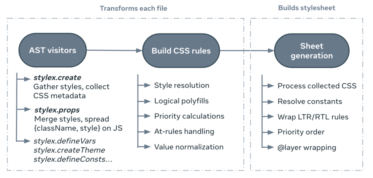
- A compiler: extracts styles at build time and generates a static stylesheet.
- A design philosophy: enforces constraints that promote predictability, composition, and scalability across teams.
---
Why StyleX Exists — CSS at Scale
Delivering CSS at Meta’s scale historically caused:
- Namespace collisions across bundles
- Difficulty in managing stylesheet dependencies
- Specificity battles leading to fragile, hard-to-maintain styles
- Reliance on complex selectors and `!important` flags
- Large monolithic CSS bundles loading hundreds of KB of unused rules on every page
Early solution: Facebook’s `cx` system (similar to CSS Modules) scoped styles per component, solving naming collisions, but limited to static styles.
---
Code Example — cx Usage
// ComponentName.css
.ComponentName/header { margin-top: 10px }
// ComponentName.js
---
The CSS-in-JS Movement
When rebuilding Facebook.com, the CSS-in-JS trend was rising:
- Developers wanted style co-location with components
- Ability to write dynamic styles based on runtime state
- Leverage JS paradigms → Import graphs, module scoping, type systems
Problem: Early CSS-in-JS injected `