Track and Analyze Your Twitter Followers Graph Growth
Learn how to monitor and analyze your Twitter followers graph to track growth, interpret trends, and refine strategies using analytics tools.

Understanding the Twitter Followers Graph and Why It Matters
Monitoring your followers graph Twitter is a powerful way to visualize audience growth and engagement trends over time. This time-series chart reveals whether your social strategy is resonating, enabling informed decisions on content, frequency, and campaigns. By turning raw metrics into actionable insights, you can spot opportunities to expand reach and strengthen community loyalty.
By tracking the followers graph, you can:
- Identify periods of growth or decline
- Link changes to specific tweets, campaigns, or events
- Set realistic, data-backed targets
- Understand audience retention patterns
In short, the followers graph transforms static numbers into a strategic guide for your Twitter success.
---
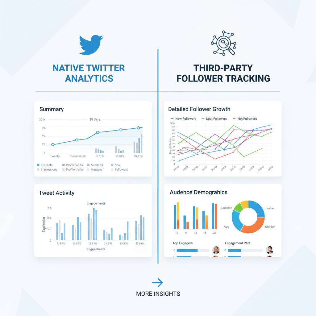
Identifying Reliable Tools to Visualize Follower Growth
A consistent view of your followers graph Twitter requires solid analytics tools. These generally fall into two categories:
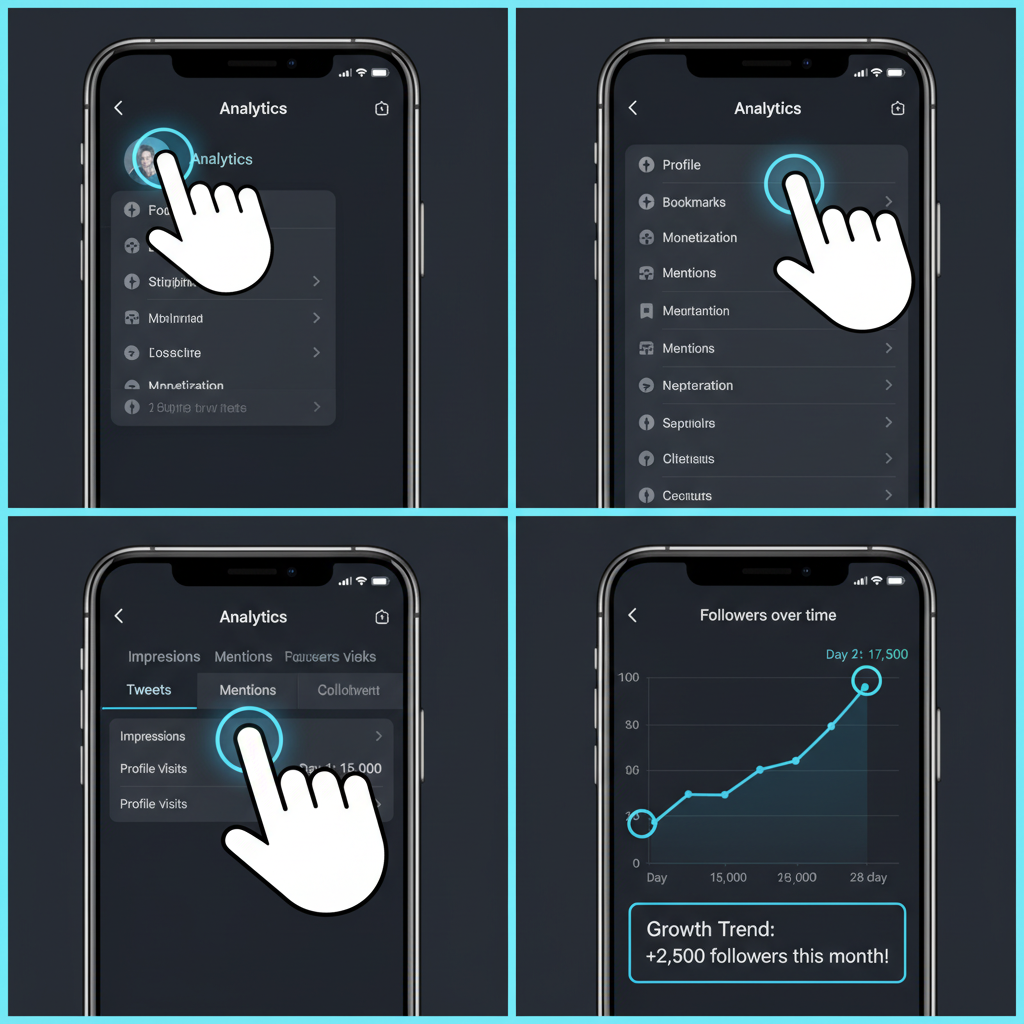
Native Analytics
Twitter Analytics offers a built-in graph, showing follower changes over recent months. It's free, tied to your account’s official data, and simple to use—ideal for a quick health check.
Third-Party Tools
External platforms can dig deeper, offering longer historical views, filtering, and export options:
- Followerwonk – Long-term charts and advanced audience analysis
- Social Blade – Historical snapshots with visual graphs
- Sprout Social – Follower tracking with engagement metrics and scheduling
- Hootsuite – Integrates growth data into broader social dashboards
| Tool | Strengths | Limitations |
|---|---|---|
| Twitter Analytics | Free, official data, easy to access | Limited history, fewer filters |
| Followerwonk | Advanced filtering, CSV exports | Premium features require payment |
| Social Blade | Historical trends view, multi-platform | Data may have gaps for smaller accounts |
| Sprout Social | Integration with other analytics | Higher cost for small teams |
---
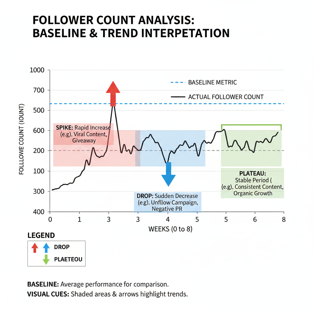
Setting Baseline Metrics for Tracking
Before reacting to spikes or dips, establish reference points to measure future changes:
- Follower Count – current total
- Growth Rate – change within a defined period
- Engagement Correlation – how likes, retweets, and replies coincide with growth
Baseline metrics ensure you interpret trends accurately, separating meaningful shifts from random noise.
---
Interpreting Spikes, Drops, and Plateaus
Your followers graph Twitter will typically show:
Spikes
Strong increases often follow viral content, media coverage, or influencer engagement.
Drops
Sudden declines may reflect controversial posts, a topic shift, or bots being removed.
Plateaus
Flat periods suggest you may need new content formats or more active promotion.
Recognizing these patterns helps replicate successes and avoid repeated mistakes.
---
Understanding Follower Demographics and Behavior
Pair your graph analysis with demographic data for deeper insight:
- Location – adjust posting times to match follower activity zones
- Interests – tailor topics to engage your audience’s passions
- Device Usage – optimize media formats for how followers view your content
Demographic context bridges the gap between "who follows you" and "why they stay."
---
Spotting Viral Tweet Impact
A single viral tweet can cause dramatic spikes in your followers graph. Compare spike dates to post timestamps, and overlay engagement metrics for confirmation.
Tip: Retaining new fans after a viral surge requires consistent, relevant follow-up content.
---
Refining Posting Frequency and Content Mix
Your followers graph can reveal:
- Optimal Posting Times – hours or days linked to upward trends
- Content Mix Adjustments – balancing text, visuals, and interactive posts
- Frequency Control – maintaining regularity without bombarding followers
Regular reviews ensure your schedule supports steady, sustainable growth.
---
Comparing Campaign vs Organic Growth
Segment growth data to assess:
- Campaign Periods – spikes tied to ads, collaborations, contests
- Organic Periods – growth attributable to everyday posting
This distinction helps measure ROI and fine-tune marketing investments.
---
Tracking Unfollows for Strategic Adjustments
Drops in follower count aren’t always negative, but consistent declines require analysis. Align unfollow peaks with content changes or timing shifts to identify root causes.
---
Setting Growth Goals Backed by Historic Data
Your historic followers graph provides realistic benchmarks. Use average monthly or quarterly gains rather than relying on anomalies to set measurable, sustainable targets.
---
Scheduling Reviews and Preserving Data
Make follower analysis a regular habit:
- Review graphs for anomalies
- Export data to CSV or Excel for extended study
- Annotate notable events for context
Archiving results enables richer seasonal or year-over-year comparisons.
---
Avoiding Vanity Metrics
Follower count is important, but not the sole measure of success. Engagement quality—comments, shares, and meaningful discussions—often matters more for long-term influence.
Combining quantity with quality builds trust and community loyalty.
---
Conclusion
The followers graph Twitter offers a clear, visual narrative of your account’s journey. From identifying growth patterns to linking them with campaigns, demographics, or content types, it’s an indispensable tool for social media strategy.
Review it regularly, export your data, and pair insights with creative execution to not only grow your follower base but also foster meaningful engagement.
Ready to boost your Twitter presence? Start tracking your followers graph today and turn trends into actionable success.