Twitter Banner Aspect Ratio and Size Guide for Profiles
Learn the optimal Twitter banner aspect ratio, dimensions, and safe zone tips to design a professional header that looks great on all devices.
Twitter Banner Aspect Ratio Guide for Perfect Profile Headers
A well-crafted Twitter banner—also known as the header image—is essential for making a strong visual impact on your profile. It’s not just decoration; the correct Twitter banner aspect ratio ensures your design looks sharp and professional across desktop, tablet, and mobile devices. This guide covers optimal sizes, safe zones, and design strategies so you can create a header that aligns perfectly with your brand identity, attracts attention, and maintains clarity everywhere it’s viewed.
---
Understanding the Twitter Banner/Header Image
The Twitter banner (header image) is the large, rectangular graphic displayed at the top of a user’s profile page. It spans the full width above the profile picture and bio section, acting as a visual introduction to your brand, personality, or cause.
This banner can be used to:
- Showcase brand imagery
- Promote seasonal campaigns
- Highlight announcements
- Convey a visual mood that complements your tweets

Unlike posted images in tweets, the banner remains static until you update it, making it a powerful branding tool for long-term recognition.
---
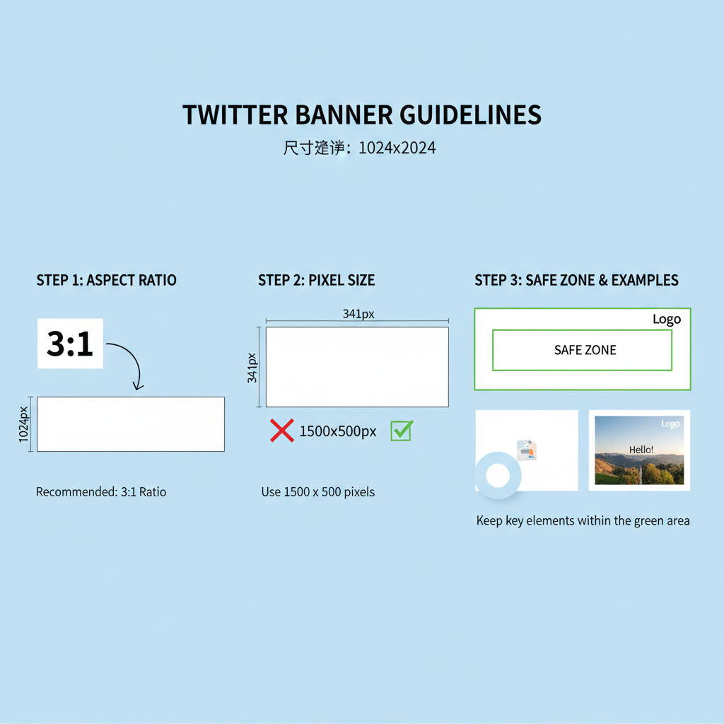
Recommended Twitter Banner Aspect Ratio & Size
The current recommended Twitter banner aspect ratio is 3:1. This means your banner width should be roughly three times its height.
Recommended dimensions:
- Width: 1500 pixels
- Height: 500 pixels
- Aspect Ratio: 3:1
- File size limit: 5 MB
- Accepted formats: JPEG or PNG (GIFs not supported in the banner area)
| Parameter | Recommendation |
|---|---|
| Width | 1500 px |
| Height | 500 px |
| Aspect Ratio | 3:1 |
| File Size Limit | ≤ 5 MB |
| Formats | JPEG / PNG |
---
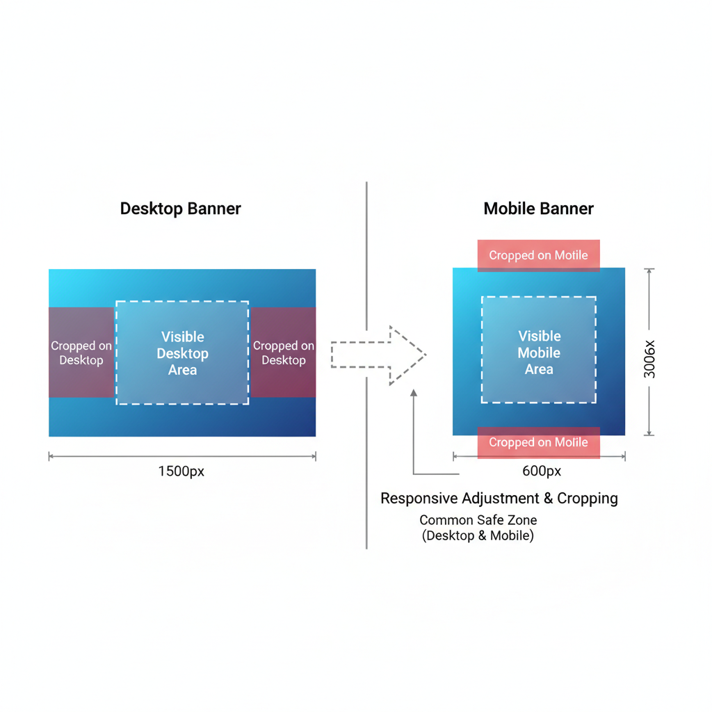
Why Aspect Ratio Matters for Visual Clarity Across Devices
Twitter profiles are viewed on desktop, tablet, and mobile. The correct aspect ratio ensures imagery stays consistent without distortion.
Using the wrong ratio can cause:
- Cropping of important elements
- Stretching or squashing of images
- Misaligned focal points
---
Design Guidelines for Responsive Layouts
A responsive Twitter banner adapts gracefully across screen widths.
Key guidelines:
- Keep central elements and text toward the middle.
- Allow breathing room at the edges—avoid placing critical info there.
- Test visibility on both desktop and mobile.
Desktop vs Mobile View
On desktop, the banner is wide and less cropped vertically. On mobile, vertical space is slightly reduced, and the profile picture overlaps more into the banner.
---
Safe Zone Tips: Preventing Cropping of Text or Important Elements
Because the profile picture and bio overlap the lower-left banner area:
- Avoid placing text in the lower-left quadrant.
- Keep key visuals centered both horizontally and vertically.
- Maintain at least 150 px clearance from the edges for text.
Tip: Use a design template with clearly marked safe zones before finalizing your artwork.
---
Examples of Effective Banner Compositions
- Minimalist branded background – Color gradients or patterns with a centered logo.
- Event promotion – Dates centered with clean typography.
- Lifestyle imagery – Aesthetic photos with the focal point in the center.
Strong banners often feature:
- A dominant central image
- Balanced textures or colors at the edges
- Minimal clutter to retain focus
---
Choosing High-Resolution Images Without Slowing Load Times
High resolution ensures crisp visuals, but huge file sizes can slow loading.
- Use 1500 × 500 px resolution at 72–96 DPI.
- Save as compressed JPEGs for photos.
- Use PNG for flat graphics or text designs.
Tools like TinyPNG or ImageOptim can help reduce file sizes without noticeable quality loss.
---
Step-by-Step Guide to Creating a Banner in Canva or Photoshop
Canva
- Open Canva and select Custom Dimensions – 1500 × 500 px.
- Import your chosen background.
- Add text within safe zones.
- Export as PNG or JPEG under 5 MB.
Photoshop
1. File > New -> Width: 1500 px, Height: 500 px, Resolution: 72 px/in.
2. Import your background layer.
3. Use guides to mark safe zones.
4. Add logo/text centered vertically.
5. Save for Web (JPEG/PNG) ensuring size < 5 MB.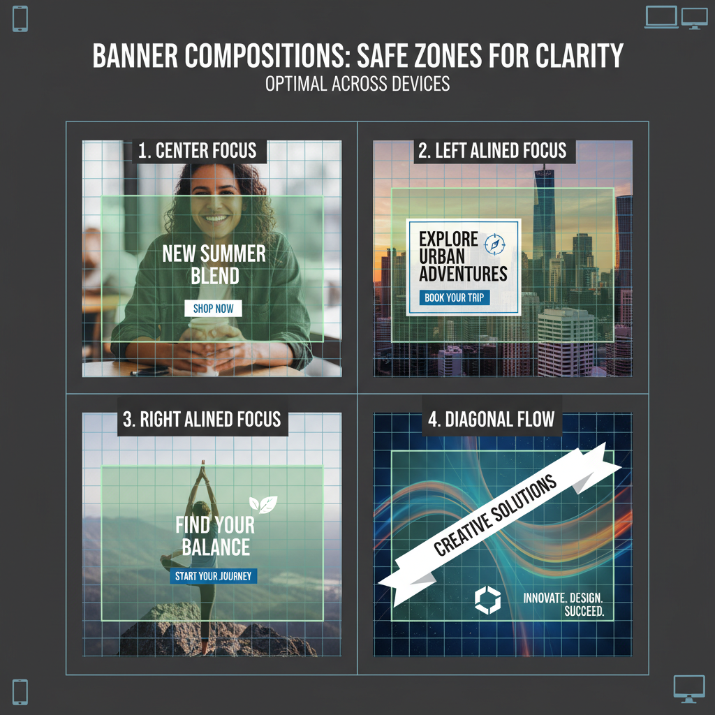
---
Common Mistakes to Avoid
- Stretching images – Crop to ratio instead of stretching.
- Low resolution – Avoid blurry assets; start with quality source images.
- Ignoring safe zones – Overlaps hide text.
- Overcrowded design – Too many elements reduce clarity.
---
Optimizing Banners for Brand Consistency
Brand consistency means your banner complements other visual assets.
- Match color palette with your profile avatar and tweet graphics.
- Include your logo subtly to avoid overpowering the design.
- Use typography aligned with your overall brand style guide.
---
Importance of Consistent Color Palette & Typography Alignment
Consistent colors and fonts:
- Increase instant recognition.
- Visually reinforce campaign messages.
- Create a professional profile aesthetic.
Typography tips:
- Use the same font family across the banner, tweet graphics, and advertisements.
- Keep font sizes proportional to banner dimensions.
---
Testing Your Banner Preview Before Publishing
Before uploading:
- Save in both JPEG and PNG format.
- Preview on desktop and mobile.
- Check for cropping, clarity, and overlaps.
- Make necessary adjustments.
---
Regular Updating Strategy
Keeping the banner fresh:
- Rotate for seasonal events or launches.
- Align with marketing campaigns.
- Reuse safe-zone templates for faster updates.
Plan ahead:
- Keep an update schedule.
- Design changes at least two weeks before the event.
---
Bonus: Free Tools and Templates for Perfect Twitter Banner Sizes
- Canva Free Templates – Preset dimensions ready to go
- Adobe Express – Quick edits and exports
- Figma – Collaborative templates with safe zone guides
- Snappa – Ready-made banner presets
---
By following these Twitter banner aspect ratio recommendations and design best practices, you’ll ensure your header is both visually compelling and functional across all devices. The right banner creates immediate impact, strengthens brand identity, and invites profile visitors to explore more.
Ready to refresh your profile? Start designing now in Canva or Photoshop and apply these tips for a banner that delivers maximum visual appeal.


