Twitter Facebook and Instagram Logo Usage Guidelines
Learn the official logo usage guidelines for Twitter, Facebook, and Instagram, including sizing, colors, media best practices, and common mistakes.

Introduction to Social Media Brand Logos and Their Importance
In the fast-paced world of digital marketing, social media brand logos are vital visual cues that enable instant recognition and trust. The Twitter, Facebook, and Instagram logo designs go beyond mere graphics—they are powerful symbols that convey a platform’s identity, culture, and reliability. Whether you’re a small business owner, influencer, or global enterprise, following each platform’s official logo guidelines safeguards brand integrity and prevents misrepresentation.
These logos act as shorthand for brand values, signaling a platform's presence and encouraging user engagement across websites, apps, print ads, and other marketing channels.

Overview of Twitter, Facebook, and Instagram Branding Guidelines
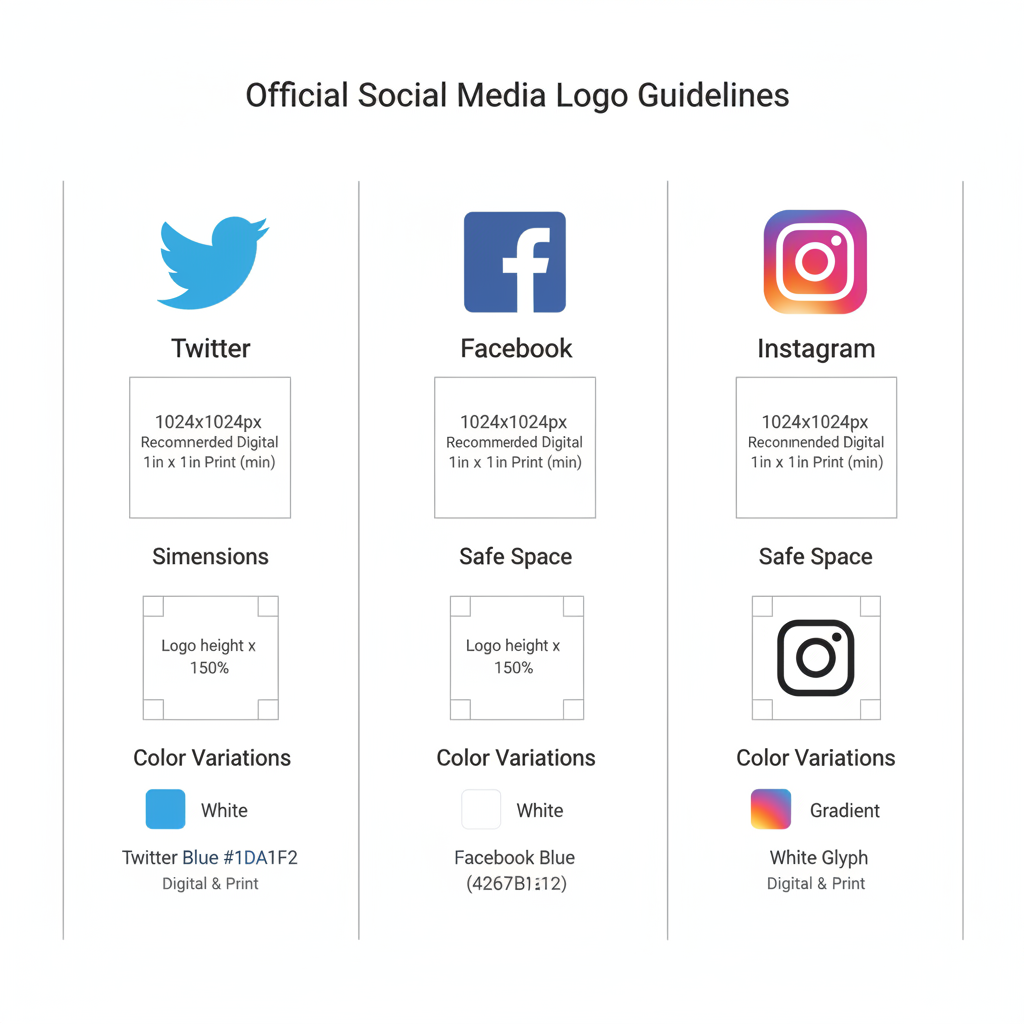
Twitter, Facebook, and Instagram each publish detailed brand usage guides on their official sites. These documents outline logo versions, minimum sizes, clear space requirements, color palettes, and prohibited uses to ensure consistency.
- Twitter: The bird icon should be kept simple, surrounded by clear space, and not altered in any way.
- Facebook: The “f” logo is its primary mark, with defined background color rules and space requirements.
- Instagram: Its camera glyph and wordmark allow for creative use but must follow strict rules, particularly concerning gradients.
These guidelines preserve legibility, prevent distortion, and maintain brand consistency across all channels.

Acceptable Uses of Each Logo in Digital and Print Media
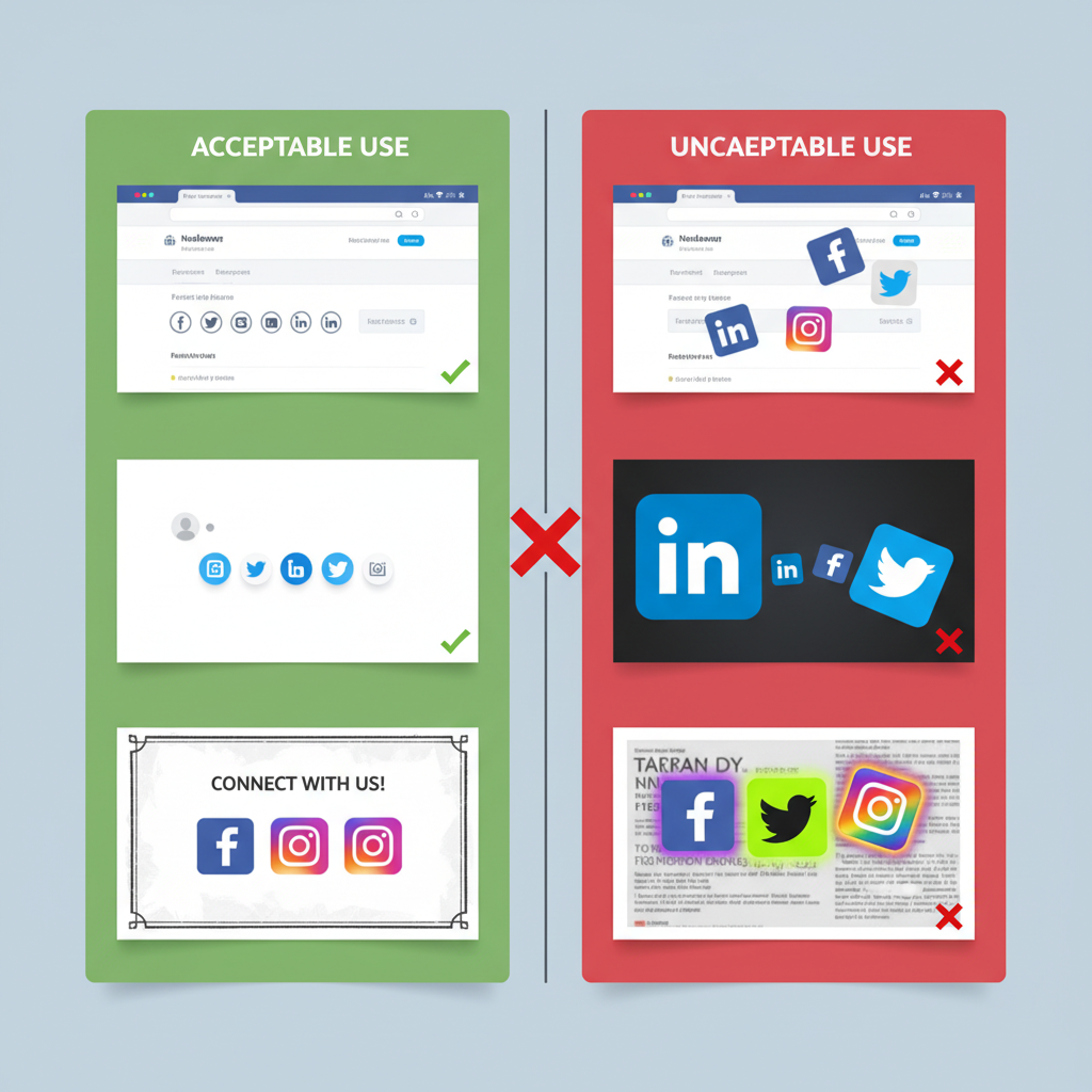
When integrating the Twitter, Facebook, and Instagram logos into campaigns, distinguish between digital media and print media best practices.
Digital Media Best Practices
- Use vector formats (SVG) or high-res PNG files for crisp visuals.
- Maintain aspect ratios to prevent distortion.
- Make logos clickable whenever possible, linking to relevant content.
Print Media Best Practices
- Use CMYK versions for accurate color reproduction.
- Provide adequate clear space around logos.
- Avoid placing logos on busy backgrounds that hinder readability.
Always confirm usage aligns with each platform’s permission requirements.
Color Variations and Sizing Requirements for Accessibility and Clarity
Brand guidelines specify exact color codes and size limits to maintain visual integrity.
| Platform | Primary Color | Hex Code | CMYK | Minimum Size (px) |
|---|---|---|---|---|
| Blue | #1DA1F2 | 69, 14, 0, 0 | 32 | |
| Blue | #1877F2 | 86, 51, 0, 0 | 24 | |
| Gradient | N/A | N/A | 24 |
Accessibility Considerations
- Maintain adequate contrast for visually impaired users.
- Avoid similar-colored backgrounds that reduce visibility.
- Respect minimum size so logos remain identifiable on small devices.
Rules for Combining Logos in Promotional Materials
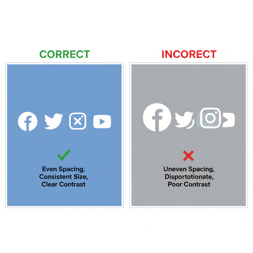
Multi-platform campaigns often require combining Twitter, Facebook, and Instagram logos. Platforms generally allow grouping when:
- All logos have equal size and weight.
- Clear space rules are followed for each logo.
- Layout avoids implying one platform endorses another.
Horizontal or grid arrangements work best, while composite or altered marks should be avoided.

Common Mistakes and Violations to Avoid in Logo Usage
Misusing logos can diminish credibility and create legal risks. Avoid:
- Altering colors outside the official palette.
- Adding unauthorized effects like drop shadows.
- Rotating, flipping, or skewing logos.
- Using outdated versions from unofficial sources.
- Embedding logos into stylized text without permission.
Refer to official guides before publishing materials.
How to Download Official Logos from Brand Asset Libraries
Only use logos from each platform’s official asset library:
- Twitter: Twitter Brand Toolkit offers PNG and vector formats.
- Facebook: Facebook Brand Resources provides logo packs and rules.
- Instagram: Instagram Brand Resources contains approved assets.
Avoid search engine downloads that may be outdated or incorrect.
Tips for Maintaining Visual Consistency Across Platforms
Consistency across Twitter, Facebook, and Instagram logo use helps build brand trust:
- Standardize sizes across campaigns.
- Complementary backgrounds enhance overall visual harmony.
- Uniform spacing prevents one logo from dominating.
- Regular audits help catch errors and update assets when guidelines change.
An organized design workflow ensures a polished, reliable brand presence.
Case Studies of Brands Using Logos Effectively in Campaigns
Case Study 1: Local Café Social Push
A café displayed the three logos on menus with QR codes linking to social pages—all uniform in size, brand colors intact, and high contrast.
Case Study 2: Non-Profit Awareness Campaign
A charity used correctly spaced and colored logos at the footer of digital banners, increasing engagement without breaking guidelines.
Case Study 3: E-Commerce Brand
An online store added platform logos to clickable ad banners, preserving clear spacing while directing traffic effectively.
These examples demonstrate that respecting logo rules strengthens campaigns and boosts interaction.
Conclusion: Why Respecting Logo Guidelines Builds Trust and Brand Alignment
Complying with official usage rules for the Twitter, Facebook, and Instagram logo communicates professionalism, respect for brand partnerships, and attention to visual detail. Proper usage fosters user trust, strengthens your brand’s alignment with major platforms, and ensures marketing channels remain compliant.
Treating these logos with care safeguards your brand’s credibility and helps forge authentic audience connections. Following these practices isn’t only smart design—it’s strategic branding.
Ready to elevate your marketing visuals? Stay up-to-date with each platform’s brand guidelines, and make your campaigns both compliant and impactful.


