Twitter (X) Header Image Size Guide: 1500×500 Pixels, Safe Zones, Quality, and Pro Tips
Design a crisp Twitter (X) header with 1500×500 size, safe zones, and export settings. Learn sRGB, JPG/PNG tips to avoid cropping and artifacts.
A well-crafted Twitter (X) header can anchor your brand identity across devices, densities, and themes. This formatting-focused guide consolidates size specs, safe zones, export settings, and workflow tips so your banner stays crisp and legible everywhere. Follow the steps below to prevent cropping surprises, compression artifacts, and color shifts without changing your creative intent.
Twitter (X) Header Image Size Guide: 1500×500 Pixels, Safe Zones, Quality, and Pro Tips
A strong header on Twitter (X) is a billboard for your brand. It’s the first thing visitors see on your profile, and it often sets the tone for whether they follow you or move on. The challenge: your header is displayed across a range of devices and densities, gets recompressed by the platform, and is partially overlaid by your avatar and profile UI. The good news is that with the right size, safe zones, and export settings, you can ship a header that stays sharp and on-brand everywhere.

---
Why header size matters on Twitter (X)
- First impressions: Your header communicates your brand personality at a glance.
- Cropping risk: Different screens crop the image differently; text near edges can get cut.
- Compression artifacts: Heavy compression can make gradients band, logos blur, and photos look muddy.
- Consistency: A systematized file, grid, and export process keeps your header consistent even as you update it for seasons or campaigns.
---
Official specs and quick answer
The short answer: design at 1500×500 pixels (about 3:1), export in sRGB as JPG or PNG, and keep your key content centered with generous margins.
| Setting | Recommendation | Notes |
|---|---|---|
| Header size | 1500 × 500 px | Approx. 3:1 aspect ratio |
| Formats | JPG (JPEG), PNG | Animated GIFs are not supported as headers |
| File size | ≤ 5 MB (web) | Smaller is better for quick upload; quality still matters |
| Color profile | sRGB, 8‑bit | Embed or convert to sRGB to avoid color shifts |
| DPI | Irrelevant | Web displays ignore DPI; pixel dimensions matter |
---
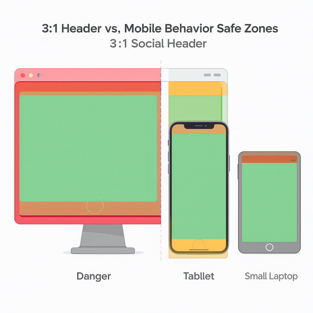
Mobile vs. desktop behavior and “safe zones”
Your header is responsive. X scales and crops it to fit device viewports, and UI elements overlay parts of the image.
- Desktop:
- Full 1500×500 is typically visible.
- The circular avatar overlaps the lower-left area; profile name/handle sit nearby.
- Mobile:
- The header height appears effectively “shorter” relative to width due to viewport—expect slightly more top/bottom cropping.
- The avatar and metadata block can cover more of the lower-left portion than on desktop.
Practical safe zone guidance (approximate, not official):
- Keep all critical text and logos within a centered “safe box” about 1320×330 px. That leaves ~90 px top/bottom and ~90 px left/right as breathing room.
- Reserve the lower-left region for the avatar overlay. Keep important content out of roughly the lower-left 320×320 px area.
- Expect a little more vertical crop on mobile; leave extra vertical padding around text.
| Area | Desktop (approx.) | Mobile (approx.) | Recommendation |
|---|---|---|---|
| Edges (left/right) | Visible, but close to UI edges | Visible, can feel tighter | Leave ≥ 80–100 px margin on each side |
| Top/bottom | Mostly visible | More cropping top/bottom | Leave ≥ 80–100 px vertical padding |
| Avatar overlay | Lower-left overlap | Lower-left, slightly larger impact | Keep a ~320×320 px clear zone in lower-left |
Tip: After uploading, preview your profile on both desktop and mobile, in light and dark modes.
---
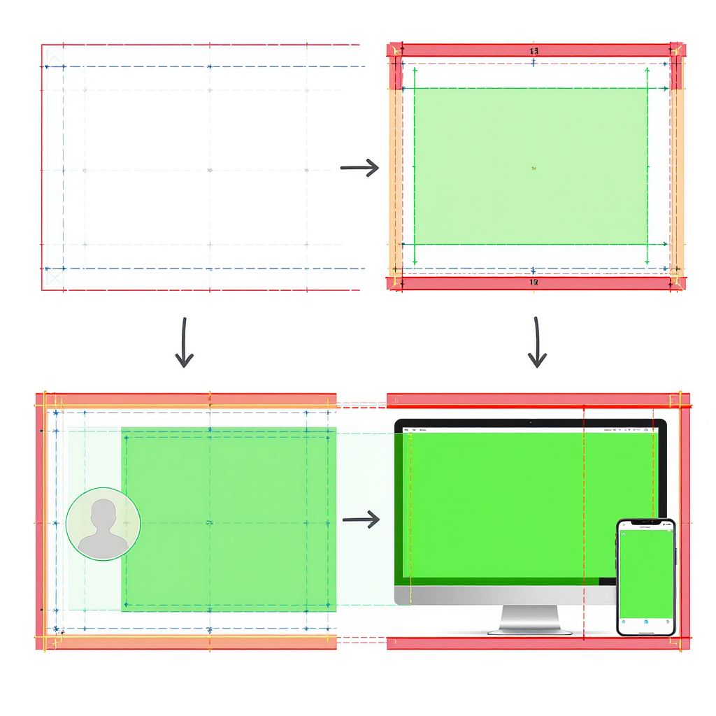
Designing a safe layout
- Use center-weighted composition: Place your logo/tagline near the center horizontally and slightly above center vertically.
- Leave generous margins: Treat the outer ~80–100 px on all sides as “decorative only.”
- Avoid the avatar zone: Don’t place text, logos, or faces in the lower-left 320×320 px region.
- Build for flexibility: If you add seasonal banners or campaign elements, keep your core logo and brand patterns in the safe box so they survive cropping.
- Simplify complexity: Busy photos can fight with UI overlays. Use subtle gradients, blur, or a color block behind text for clarity.
---
Quality and export settings
When to use PNG vs. JPEG:
- PNG:
- Best for flat graphics, sharp logos, vector-style art, type on solid colors, and simple gradients.
- Avoid excessively large PNGs; compress with tools like pngquant/zopfli.
- JPEG:
- Best for photos or textured backgrounds.
- Use high quality to reduce blockiness and banding.
| Scenario | Format | Recommended Settings |
|---|---|---|
| Logo + flat color or subtle gradient | PNG | 24-bit, compressed with pngquant (e.g., 70–95), preserve sRGB |
| Photo background | JPEG | Quality 80–88 (MozJPEG if available), chroma subsampling 4:4:4, sRGB |
| Complex photo + overlaid type | JPEG or PNG | Test both; prefer the sharper result under 5 MB |
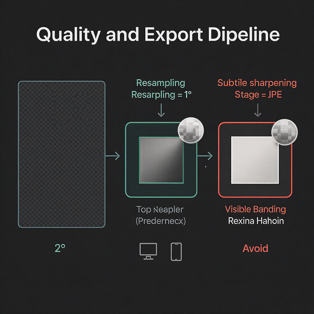
Color management and banding:
- Always convert to sRGB before export. Don’t rely on the platform to interpret wide-gamut profiles correctly.
- Reduce gradient banding:
- Add 1–2% noise over gradients.
- Use slight dither when exporting.
- For JPEG, avoid quality below ~75.
Sharpening:
- After downscaling, apply mild output sharpening (e.g., Unsharp Mask with small radius) to recover crispness in type and edges.
---
Hi‑DPI/retina considerations
Designing at 2× (e.g., 3000×1000) and then downscaling to 1500×500 helps:
- Improves apparent sharpness after platform recompression.
- Reduces jaggies on type and line art when properly sharpened.
Export tips:
- Downscale with a high-quality filter (Bicubic Sharper, Lanczos).
- Export sRGB, strip unnecessary metadata to reduce size.
Example ImageMagick commands:
## Downscale 2× master to 1500×500 with gentle sharpening (JPEG)

magick master-3000x1000.png -resize 1500x500 -filter Lanczos -unsharp 0x0.75+0.75+0.02 -strip -colorspace sRGB -quality 85 header.jpg

## Optimize PNG

pngquant --quality=70-95 --strip --speed 1 header.png --output header-optimized.png
zopflipng -y header-optimized.png header-zopfli.png
---
Branding best practices
- Consistent color: Use your brand palette; check contrast against light/dark UI variants.
- Typography: Keep headers legible at a glance; avoid ultra-thin weights or low-contrast color-on-color.
- Imagery: Choose imagery that reinforces your value proposition; avoid busy edges and faces near the avatar overlay.
- Modularity: Create a master template; only swap seasonal/campaign layers while keeping logo placement and safe margins consistent.
- Accessibility: High contrast and clean composition benefit all users.
---
Tools and templates
Setup suggestions:
- Figma:
- Frame: 1500×500.
- Layout grid: 12 columns, 80 px margins; Safe-zone rectangle 1320×330 centered.
- Add an overlay ellipse 320×320 in the lower-left to represent the avatar.
- Photoshop:
- Canvas: 1500×500 (or 3000×1000 for 2×).
- Guides: 80–100 px from edges; center guide; optional 320×320 avatar overlay.
- Export As: Convert to sRGB; JPEG quality 80–88 or PNG with compression.
- Canva:
- Custom size: 1500×500.
- Use a margin overlay element; keep text/logos inside the central box.
Quick pre-upload checklist:
- Dimensions exactly 1500×500.
- sRGB color profile embedded or converted.
- Critical content inside 1320×330 safe area.
- Lower-left 320×320 area free of critical elements.
- File size under 5 MB.
- Previewed on desktop and mobile, light and dark modes.
---
Troubleshooting FAQ
Q: Why does my header look blurry or pixelated?
- Common causes: Over-compression (low JPEG quality), exporting from small originals, or double compression after upload.
- Fix: Start from a high-res master; export JPEG at quality 80–88 or PNG for flat graphics; consider 2× workflow (3000×1000 → 1500×500) with mild sharpening.
Q: My header is getting cropped weirdly on mobile. What should I change?
- Cause: Tight composition; text near edges or bottom-left.
- Fix: Move key elements into the 1320×330 center area; increase top/bottom padding; keep the lower-left 320×320 clean.
Q: Colors look washed out after upload.
- Cause: Wrong color profile (Display P3/Adobe RGB), or conversion issues.
- Fix: Convert to sRGB before export (not just assign); check “Convert to sRGB” in Export/Save dialogs; avoid wide-gamut exports.
Q: My gradients show banding.
- Cause: Heavy compression + limited tonal range.
- Fix: Add 1–2% noise, dither on export, or export as high-quality JPEG/PNG; avoid flat, long gradients from dark to light without texture.
Q: PNG vs. JPEG—how do I decide?
- Rule of thumb: Logos/type on solid or simple backgrounds → PNG. Photo-heavy backgrounds → JPEG. Test both; pick the one that looks cleaner under 5 MB.
Q: The avatar covers my logo on some devices.
- Cause: Logo placed too low-left.
- Fix: Raise and center the logo; reserve a 320×320 lower-left buffer.
---
A simple workflow for reliable results
- Design at 3000×1000 with guides: 100 px margins; 640×640 avatar exclusion (scaled to 2×).
- Compose center-weighted; keep critical elements inside the inner 2640×660 (2× safe area).
- Downscale to 1500×500 with Lanczos/Bicubic Sharper.
- Export:
- Photo: JPEG quality 85, 4:4:4 subsampling, sRGB, mild unsharp mask.
- Flat/logo: PNG optimized via pngquant/zopfli.
- Upload and preview on desktop + mobile (light and dark). Iterate if needed.
With these practices, your Twitter (X) header will be crisp, readable, and on-brand—no matter where it’s viewed.
---
Summary
Design at 1500×500 in sRGB, keep key content inside a centered 1320×330 safe zone, and avoid the lower-left 320×320 avatar area. Use PNG for flat graphics and high-quality JPEG for photos, ideally exporting from a 2× master with gentle sharpening. Always preview on desktop and mobile in both themes to confirm clarity, cropping, and color accuracy.


