Twitter Header Photo Size (2025): The Complete Guide to Perfect X Banners
Get the 2025 Twitter (X) header size right: 1500×500 (or 3000×1000), safe zones, JPG/PNG choices, color space, and compression tips for crisp banners.
Twitter Header Photo Size (2025): The Complete Guide to Perfect X Banners

Your Twitter (X) header is billboard-level real estate. Get the size, safe zones, and export right, and your brand looks sharp everywhere. Get it wrong, and you’ll fight crops, compression, and unreadable text. Here’s the up-to-date, practical guide you can trust.
---
Quick Answer: Current Specs That Actually Work
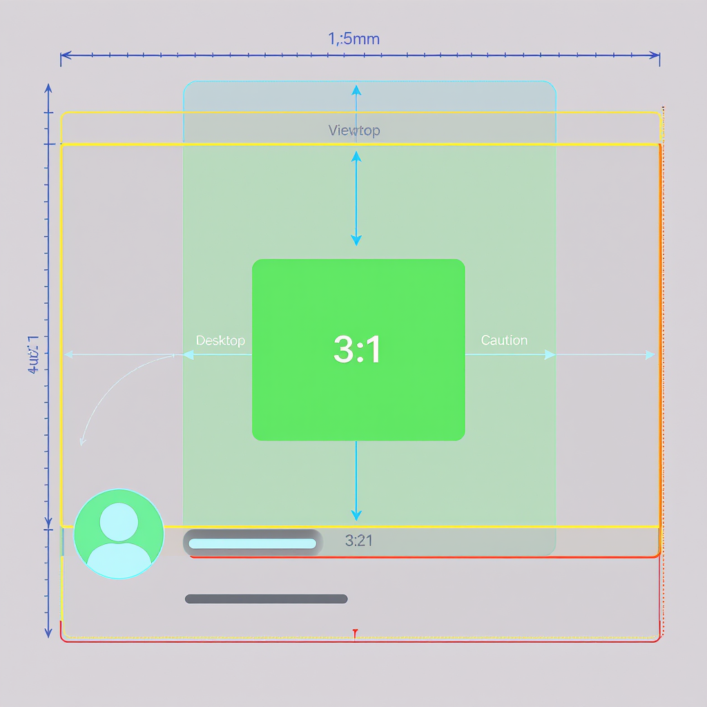
- Canvas size: 1500 × 500 px (3:1 aspect ratio)
- High-DPI export: 3000 × 1000 px (2×) for Retina and 4K/5K displays
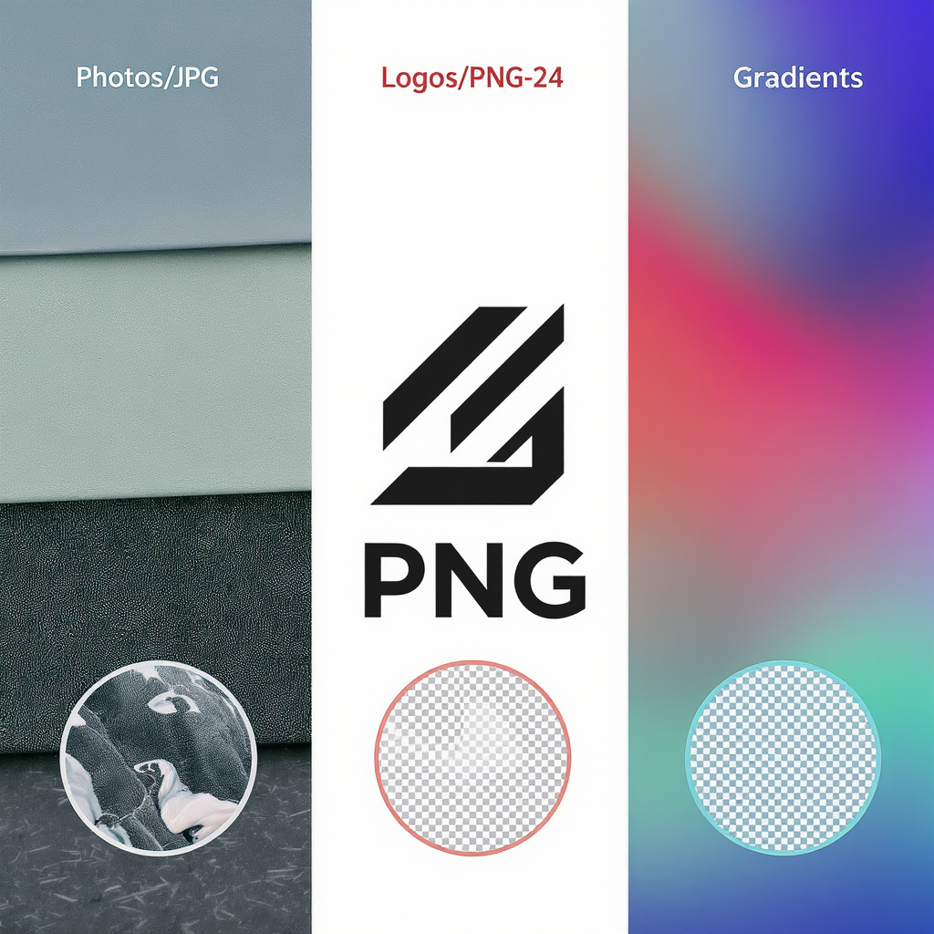
- Formats: JPG (photos), PNG-24 (logos/flat color, text, gradients)
- Color space: sRGB, embedded profile
- File size: Aim for 500 KB – 2 MB. X accepts larger files, but heavier files tend to be recompressed. Keep it lean to preserve detail.
| Item | Recommendation | Notes |
|---|---|---|
| Canvas | 1500 × 500 px | 3:1 ratio; baseline artboard |
| Retina Export | 3000 × 1000 px | Sharpen and preview at 100% |
| Format | JPG or PNG-24 | JPG for photos; PNG for logos/flat colors |
| Color Space | sRGB IEC61966-2.1 | Embed profile to reduce color shifts |
| Target File Size | ≤ 2 MB | Smaller often looks cleaner post-upload |
---
Safe Zones That Actually Work
The header shows at 3:1, but the avatar overlaps the bottom-left and the UI may shift slightly across devices. Use these conservative margins so your logo and text never get covered.
Practical safe-zone margins (based on a 1500 × 500 px canvas):
- Left margin: 360 px (24%)
- Right margin: 80 px (5%)
- Top margin: 70 px (4.7%)
- Bottom margin: 70 px (4.7%)
This yields a center-safe rectangle of 1060 × 360 px where logos and text remain visible across desktop and mobile.
| Area | Pixels (1500 × 500) | Why |
|---|---|---|
| Left unsafe | 0–360 px | Avatar overlap + small layout shifts |
| Right unsafe | 1420–1500 px | Minor cropping/scaling on some screens |
| Top unsafe | 0–70 px | Responsive cropping variance |
| Bottom unsafe | 430–500 px | Avatar shadow/overlap latitude |
| Center-safe content | 360–1420 × 70–430 px | Place logos, key text here |
If you prefer percentage rules: keep important content within the middle 70–75% of the width and 70–75% of the height, centered.
Tip: Avoid placing anything critical within a roughly 280–320 px diameter circle touching the bottom-left corner—this approximates the avatar footprint plus padding.
---
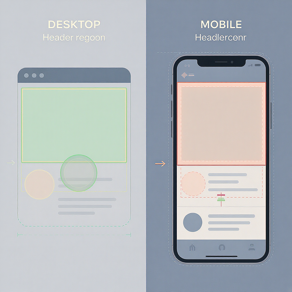
Desktop vs. Mobile Behavior
- Scaling: X scales the header to fill a 3:1 container. Different screen widths slightly change visible edge details. The center remains most stable.
- Avatar overlap: On desktop and mobile apps, the circular avatar overlaps the bottom-left of the header. This overlap can shift a bit with UI updates; the safe margins above account for it.
- Dark mode: The header image itself doesn’t invert in dark mode, but UI chrome and text around it do. If your header edges are very dark, your avatar may visually “sink” on dark mode—use contrast to keep it distinct.
- High-DPI displays: On Retina/HiDPI screens, a 1× (1500 × 500) image can look soft. Export a 2× version (3000 × 1000), and sharpen slightly before export.
---
Format and Compression Choices
JPG (recommended for photos)
- Quality: 78–88 is a sweet spot. Below ~70 often adds visible artifacts; above ~90 yields larger files with minimal gains.
- Use chroma subsampling 4:4:4 if available for crisp type over photos.
- Enable progressive encoding when offered.
PNG-24 (logos, illustrations, flat color, type)
- Avoid PNG-8 for gradients or anti-aliased edges; banding and jaggies are common.
- PNG preserves edges and text but can be larger; keep your canvas simple.
Gradients
- Edit in 16-bit internally.
- Add 1–2% monochromatic noise to the gradient layer to avoid banding.
- If using JPG, bias toward quality 85–90 for smoother ramps.
Color management
- Convert to sRGB and embed the profile.
- Avoid wide-gamut (Display P3/Adobe RGB) exports—without color management they appear washed out.
---
Design Best Practices
- Brand alignment: Reflect your current campaign or brand pillars—color, tone, imagery—without duplicating your avatar.
- Visual hierarchy:
- One focal point (product, portrait, logo or message).
- Secondary support elements (pattern, texture) should be quieter.
- Contrast: Ensure the avatar remains legible against the header. Create intentional contrast behind the avatar area (vignette, soft gradient, or solid field) that doesn’t carry critical content.
- Typography:
- If you include text, keep it large (at least 44–56 px at 1500 × 500) and within the safe rectangle.
- High contrast (white on dark or dark on light).
- Avoid thin weights over photos.
- Grids:
- Use a 12-column grid with 40 px gutters on a 1500 px width to align elements cleanly.
- Center the hero element; keep asymmetry away from the left 360 px.
- Busy photos:
- Reduce clutter with blur, gradient overlays (8–16% black or brand color), or depth-of-field.
- Crop to keep the subject inside the safe zone.
- Seasonal versions:
- Build a reusable master file with locked guides.
- Swap background layers per campaign or season to stay fresh without reworking layout.
---
Step-by-Step Sizing Workflow (Canva, Photoshop, Figma)
- Set up the artboard
- Size: 1500 × 500 px, RGB, sRGB.
- Optional 2× file: 3000 × 1000 px (use the same proportional guides).
- Add safe-zone guides
- Left guide at 360 px
- Right guide at 1500 − 80 = 1420 px
- Top guide at 70 px
- Bottom guide at 500 − 70 = 430 px
- Draw a center-safe rectangle (1060 × 360) to sanity check placement.
Quick JSON you can copy into your notes:
   {
     "canvas": { "w": 1500, "h": 500 },
     "safe": { "x": 360, "y": 70, "w": 1060, "h": 360 }
}- Place content
- Keep logos/text within the center-safe rectangle.
- Use adjustment layers (curves/levels) and mild gradient overlays for readability.
- Export
- 1×: JPG quality ~82 (photos) or PNG (logos/flat).
- 2×: Export 3000 × 1000 as well. Sharpen lightly (0.3–0.5 px radius) to offset platform compression.
- Test quickly
- Paste into a profile mockup in Figma or Canva frame to preview avatar overlap.
- Check on both light and dark UIs and at 100% and 50% zoom.
- Upload and verify
- Upload on web for best control.
- Refresh profile on mobile to confirm no surprises.
Platform-specific notes
- Canva: Create a 1500 × 500 design, add a rectangle for the safe zone, export JPG (Quality 80–90) and PNG if using vector logos.
- Photoshop: File > New (1500 × 500), View > New Guide Layout (custom margins as above), Export As with sRGB and progressive (JPG).
- Figma: Frame 1500 × 500, Layout grid (columns), create a “safe zone” rectangle for alignment, Export @1x and @2x.
---
Accessibility and Inclusivity
- Contrast: If you include text in the header, target at least WCAG AA (4.5:1) contrast against the background.
- Avoid text-on-image for critical info: The header doesn’t support alt text. Do not put essential announcements here; use pinned posts with accessible image descriptions instead.
- Simplicity helps: Busy imagery can hinder users with low vision. Favor clean shapes and ample negative space, especially near the avatar.
- Motion and patterns: Avoid harsh moiré patterns or flicker-like stripes that can be uncomfortable for some users.
---
Troubleshooting Common Issues
- Blurry/soft header
- Export at 2× (3000 × 1000) and let X scale it down.
- Apply subtle sharpening before export.
- Ensure the original isn’t upscaled from a smaller image.
- Washed-out colors
- Convert to and embed sRGB.
- Avoid oversaturated neon tones that compress poorly.
- Add a touch of contrast (+5–10) and vibrance (+5–10) before export.
- Gradient banding
- Edit in 16-bit.
- Add 1–2% noise to gradient layers.
- Use higher JPG quality or switch to PNG-24.
- Awkward avatar overlap
- Respect the left 360 px and bottom 70 px margins.
- Move the hero subject toward the center, not the left edge.
- Create a subtle dark/light patch behind the avatar to maintain separation.
- File too large
- Reduce JPG quality to ~80–85.
- Simplify vector noise/texture layers if exporting as PNG.
- Consider converting subtle texture to a JPG underlay with a PNG logo on top (layered comp before export).
---
Pro Tips and FAQs
- When should I use 3000 × 1000 vs. 1500 × 500?
- Use both. Uploading a high-quality 1× is fine, but keeping a 2× master ensures crispness on Retina/HiDPI and future-proofs your design. Many designers export at 2× and let X downsample.
- JPG or PNG for “twitter header photo size” best quality?
- Photos: JPG at quality 80–88.
- Logos/flat color/line art: PNG-24.
- Photo + logo: Try high-quality JPG; if the logo looks soft, switch to PNG.
- How do I coordinate the header with the profile photo?
- Use complementary, not identical, backgrounds.
- Maintain contrast around the avatar area within the header.
- Harmonize color temperatures and avoid competing focal points.
- Handling seasonal variations
- Build a master file with locked guides and smart objects/placeholders.
- Swap imagery per season or campaign and keep the safe-zone layout.
- Dark mode considerations
- Test on both modes. Ensure the avatar remains distinct against the header in dark UI.
- Avoid pure black at the bottom-left if your avatar has a dark outline.
- Pre-publish checklist
- Canvas 1500 × 500, sRGB, center-safe zone observed
- Exports: 1× JPG/PNG and 2× JPG/PNG
- File size ≤ 2 MB (target)
- Logo/text within 1060 × 360 safe rectangle
- 1–2% noise on gradients (if any)
- Tested against mock avatar overlap
- Viewed on desktop + mobile, light + dark UI
---
Wrap-up
If you remember only one thing: design for the center. A 1500 × 500 px canvas with a 1060 × 360 px center-safe area, exported at 2× in sRGB, will keep your “twitter header photo size” looking crisp and consistent. Respect the left overlap, watch your gradients, and keep the message simple. Your X banner will do the rest.