Twitter (X) Photo Sizes in 2025: The Complete, Up-to-Date Cheat Sheet
Get the 2025 Twitter (X) photo size specs at a glance: dimensions, aspect ratios, and safe areas for profiles, headers, posts, link cards, and ads.

Twitter (X) Photo Sizes in 2025: The Complete, Up-to-Date Cheat Sheet
This guide distills the current image dimensions, aspect ratios, and safe areas you need for Twitter (X) in 2025. It’s built for designers, marketers, and social managers who want fast, reliable specs without guesswork. Skim the quick-reference tables, then dive into workflow tips, accessibility, and QA to keep your visuals sharp in both light and dark modes.
If you need a current, practical answer to “What twitter photo size should I use?” this 2025 cheat sheet is for you. Below you’ll find at-a-glance dimensions, safe areas, and pro tips for profile pics, headers, single and multi-image posts, link cards, and ads—plus optimization, accessibility, and a validation workflow so your visuals look sharp across devices and dark mode.
Quick answers (2025 update)
Use this table as your fast reference. Dimensions listed are recommended upload sizes; X will downscale as needed.
| Placement | Aspect ratio | Recommended pixels | Safe area guidance | Max file size (typ.) | Formats |
|---|---|---|---|---|---|
| Profile photo | 1:1 (displayed as a circle) | 400 × 400 (or 800 × 800 for extra crisp) | Keep critical content within the inner circle; leave ~6–8% padding from the edge | ~2–5 MB | JPG, PNG, GIF (non-animated) |
| Header (cover) | 3:1 | 1500 × 500 | Center-safe zone ~1200 × 380; avoid bottom-left where avatar overlaps; add 60 px top/bottom padding | ~5 MB | JPG, PNG |
| Single image in-feed | 16:9, 1:1, or 4:5 | 16:9 → 1600 × 900; 1:1 → 1200 × 1200; 4:5 → 1200 × 1500 | Desktop often crops tall images toward 16:9 in timeline—keep the focal point in the center 16:9 | ~5 MB (mobile), ~15 MB (web) | JPG, PNG |
| Two-image tweet | Each tile ≈ 7:8 | Per image 1400 × 1600 (or 700 × 800 minimum) | Leave 5–8% padding on all sides for tile crops and spacing | ~5 MB each | JPG, PNG |
| Three-image tweet | Left ≈ 7:8; right two ≈ 7:4 (stacked) | Left 1400 × 1600; right 1400 × 800 each | Keep text centered; avoid edges—stack crops can nibble top/bottom margins | ~5 MB each | JPG, PNG |
| Four-image tweet | Each tile ≈ 2:1 (grid) | Per image 1200 × 600 (or 1600 × 800) | Strong central focus; outer 6–8% may be trimmed on some viewports | ~5 MB each | JPG, PNG |
| Link (Website) Card – Large | 1.91:1 | 1200 × 628 | Keep focal content center; allow 24–40 px padding for title overlays | ~5 MB | JPG, PNG |
| Image Ads (single) | 1.91:1 or 1:1 | 1600 × 900 or 1200 × 1200 | Leave 6% padding; minimal text in image for legibility/compression | ~5 MB | JPG, PNG |
| Carousel Ads (2–6 cards) | 1.91:1 or 1:1 (consistent per carousel) | Per card 1600 × 900 or 1200 × 1200 | Keep CTAs centered; avoid edges—UI dots/arrows may overlap | ~5 MB per card | JPG, PNG |
Notes
- X supports very high-resolution uploads (up to ~4096 px on the longest side) but will transcode. Going far above recommended sizes rarely yields visible gains and can trigger heavier compression.
- Animated GIFs are supported (with size limits) but are often transcoded to looping MP4 for playback.
Profile and header images
Profile photo
- Size and ratio: Upload 400 × 400 or 800 × 800 (1:1). It displays as a circle at various sizes across the app.
- Safe zone: Keep faces/logos within the inner circle with ~6–8% margin to avoid edge clipping and antialiasing halos.
- Format: PNG for logos/flat color; JPG for photos. Transparent PNG works well on varied backgrounds.
- Avoid blurriness:
- Start from a clean 2× source (e.g., 800 × 800).
- Sharpen slightly after downsizing.
- Export sRGB, Q85–90 JPEG (if using JPEG) to avoid over-compression.
Header (cover)
- Recommended: 1500 × 500 (3:1).
- Cropping behavior:
- Mobile vs desktop crops differ slightly; the top/bottom can be trimmed on narrow viewports.
- The avatar overlaps the bottom-left portion of the header; leave a clean area there.
- Safe zone:
- Keep vital text in the central ~1200 × 380 area.
- Add ~60 px padding top/bottom; ~200–240 px padding left to avoid the avatar overlay.
- Format and quality: Use high-quality JPG for photos, PNG for graphics. Avoid heavy gradients banding—add a touch of dithering if needed.
In-feed single images
- Best-performing aspect ratios:
- 16:9 (landscape) for widescreen visuals and linkable content.
- 1:1 (square) for consistent grid-like presence.
- 4:5 (vertical) can boost engagement by commanding more screen space—especially on mobile.
- Export resolutions that stay sharp:
- 16:9 → 1600 × 900 (or 1920 × 1080 if detail demands).
- 1:1 → 1200 × 1200 (or 2048 × 2048 for retina-grade illustrations).
- 4:5 → 1200 × 1500 (or 1600 × 2000).
- Cropping previews:
- Mobile apps increasingly show full proportions for single images.
- Desktop timeline still tends to crop tall images toward a 16:9 center preview—ensure your focal point sits safely within the center 16:9 window.
Tip: If your visual contains text, prefer 1:1 or 16:9 for predictable desktop preview crops.
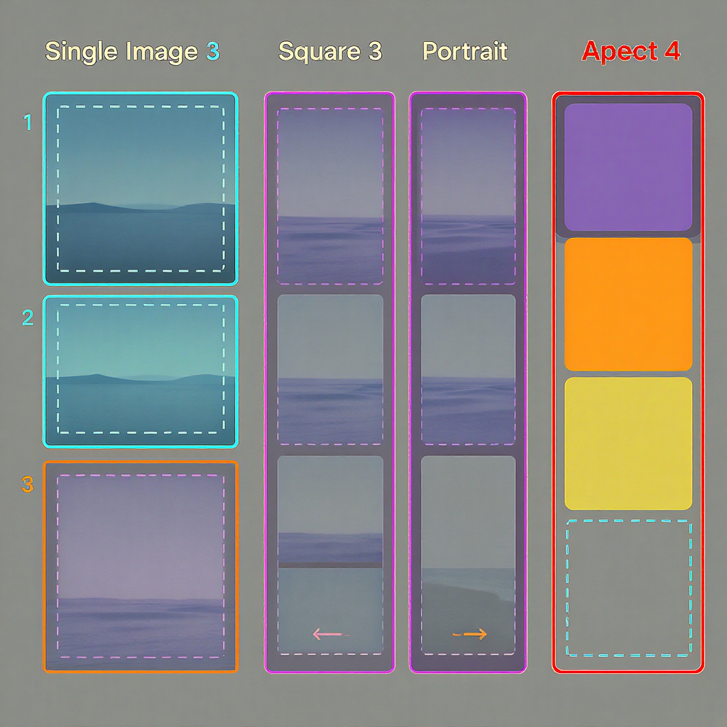
Multi-image tweets
X arranges images into predefined tile grids. Designing to the tiles’ “effective” aspect ratios prevents awkward cuts.
- Two images: side-by-side tiles, each roughly 7:8 portrait. Template per image: 1400 × 1600.
- Three images: large left tile ≈ 7:8; two stacked right tiles ≈ 7:4 each. Templates: left 1400 × 1600; right 1400 × 800.
- Four images: 2×2 grid; each tile ≈ 2:1 landscape. Template per image: 1200 × 600 (or 1600 × 800).
| Layout | Tile | Effective ratio | Template (px) | Safe padding |
|---|---|---|---|---|
| 2 images | Left / Right | ~7:8 | 1400 × 1600 | 5–8% on all sides |
| 3 images | Left (tall) | ~7:8 | 1400 × 1600 | Keep text centered |
| 3 images | Right (top & bottom) | ~7:4 each | 1400 × 800 | Protect top/bottom 6% |
| 4 images | All tiles | ~2:1 | 1200 × 600 (or 1600 × 800) | 6–8% on all sides |
Smart cropping strategies:
- Keep faces/subjects centered and away from edges.
- Avoid captions near tile borders; gutters and rounding can clip.
- Use consistent color/contrast across tiles so the grid feels intentional.
Link previews and cards
X uses Open Graph and Twitter Card metadata to render link previews.
- Recommended image for large Website/App cards: 1200 × 628 (1.91:1).
- Minimum acceptable: 600 × 315 (will look softer).
- Focal point: Centered, with 24–40 px inner padding to protect against text overlays and rounded corners.
- Common pitfalls:
- Wrong aspect ratio (e.g., too tall): causes awkward crops or pillarboxing.
- Slow or blocked image URLs (robots blocked or CDN forbids bots): X can’t fetch the image.
- Wrong MIME type (serve as image/jpeg or image/png).
- Missing og:image dimensions or using very small images.
Add tags to your page head:
Tip: Use X’s Card Validator (if available) or share a private draft link in a test post to verify the image and crop before publishing.
Ads and carousels
- Single image ads:
- Aspect ratios: 1.91:1 (widescreen) or 1:1 (square).
- Recommended sizes: 1600 × 900 or 1200 × 1200.
- Keep text minimal; compression can soften small type.
- Carousel ads:
- 2–6 cards per carousel.
- Use consistent ratio across the set: either 1.91:1 or 1:1.
- Per card: 1600 × 900 or 1200 × 1200, ~5 MB max, JPG/PNG.
- Watch for UI: carousel dots/arrows may overlap corners—leave ~6% safe padding.
- QA checklist before launch:
- Check crops on mobile and desktop (dark and light modes).
- Validate legibility at 100% and 75% sizes.
- Confirm alt text present on each creative.
- Verify landing URLs, UTM tags, and card metadata.
- Test compression by re-saving at Q85–90 and comparing against the served version.
Quality, formats, and color
- JPG vs PNG vs WebP:
- JPG: best for photographs; export at Q85–90. Consider 4:4:4 chroma for crisp UI/text, or lightly sharpen post-scale.
- PNG: best for logos, UI, flat color, transparency. Prefer PNG-24 for gradients; PNG-8 for flat graphics without banding.
- WebP: X may transcode on delivery; uploads are most reliable as JPG/PNG.
- Color management:
- Always export sRGB and embed the ICC profile.
- Avoid CMYK or Display P3 uploads (they may shift on non–color-managed clients).
- Gentle noise/dither reduces gradient banding in headers and backgrounds.
- Compression/export tips (Photoshop/Canva/Figma):
- Downscale to target size with bicubic sharper, then apply subtle output sharpening.
- Avoid 100% JPEG quality—bloats files with negligible visual gain, may trigger server-side recompression.
- Keep longest side within ~4096 px to prevent heavy recompression.
- App setting:
- In the X mobile app, enable High-quality image uploads and viewing (Settings → Data usage) for both Wi‑Fi and mobile to reduce upload-side compression.
Accessibility and brand safety
- Alt text:
- Add descriptive alt text to every image, focusing on meaning, not just appearance. Aim for concise, clear descriptions; include text-in-image content if relevant.
- Keep it scannable; use proper nouns and context.
- Color and contrast:
- Maintain at least 4.5:1 contrast for essential text/logos over photos.
- Add subtle shadows or strokes behind text on busy backgrounds.
- Safe padding for UI and corners:
- Allow ~24–40 px inner padding where possible.
- X applies subtle rounding to image corners—don’t place text flush to edges.
- Dark mode:
- Test both light and dark themes; thin black strokes vanish on dark mode—use semi-transparent or dual-tone outlines.
- Motion sensitivity:
- Minimize flashing/rapid animations in GIFs; include “GIF contains motion” context in the post if motion is essential.
Workflow and templates
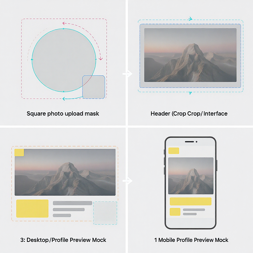
- Downloadable templates (make your own or in Figma/Canva):
- Profile: 800 × 800 with a circle-safe guide.
- Header: 1500 × 500 with center 1200 × 380 safe zone and avatar overlay guide.
- Single images: 1600 × 900, 1200 × 1200, 1200 × 1500 frames with 6% padding guides.
- Multi-image sets: frames as listed in the tables above.
- Repeatable export pipeline:
- Design at 2× size when possible (e.g., 1600 × 900 instead of 800 × 450).
- Convert color to sRGB, embed profile.
- Downscale to target, apply output sharpening.
- Export JPG Q85–90 or PNG-24 depending on content.
- Run a quick visual diff against a recompressed version (e.g., ImageOptim) to ensure quality survives.
- Focal-point guides:
- Overlay a center 16:9 rectangle on tall compositions to protect the desktop timeline preview.
- Annotate safe margins (6–8%) to keep logos/text intact.
- “Does it crop?” quick validation:
- Post to a private/test account, or save as a Draft.
- Check on: iOS/Android (portrait), desktop web (light/dark), and zoomed 90–110%.
- For link cards, validate metadata fetch using a card validator or by forcing a re-scrape.
Example Figma frame setup:
Frames:
- Profile: 800×800 (circle guide: 92% diameter)
- Header: 1500×500 (safe: 1200×380 centered; avatar overlay: 240×240 bottom-left keep-clear)
- Single: 1600×900, 1200×1200, 1200×1500 (safe inset: 6–8%)
- Multi:
  - 2-up: 1400×1600 each
  - 3-up: 1400×1600 (left), 1400×800 (right x2)
  - 4-up: 1600×800 each
Troubleshooting FAQs
- Why do my images look blurry or pixelated?
- They’re being upscaled by the client (upload larger), or the server applied heavy compression. Export at recommended sizes, sRGB, and Q85–90 JPEG. Avoid tiny text; sharpen after downscaling.
- My header keeps cropping weirdly—help?
- Keep critical elements within the central 1200 × 380 area and leave extra bottom-left space for the avatar overlay. Test on desktop and mobile in both themes.
- Should I use PNG or JPG?
- Photos → JPG (Q85–90). Logos/flat color/line art → PNG-24. If gradients band, add light noise or use higher bit-depth PNG.
- How do I handle animated GIFs?
- Keep duration and dimensions moderate. X often converts GIFs to MP4 for playback; avoid text near edges, and ensure motion is not seizure-inducing. File size limits apply (mobile limits are tighter).
- My link preview image is wrong or crops badly.
- Confirm twitter:card and og:image tags point to a 1200 × 628 image with correct MIME type and that your server allows X’s crawler. Re-scrape with a validator or refresh the cache by updating the image URL.
- Text keeps getting cut off in multi-image grids.
- Use the templates above and keep all type within a 6–8% safe inset. Avoid placing text across tile seams.
- How can I verify future spec changes?
- Check X’s Help Center and Ads Creative Specs pages, run periodic live tests on a burner account, and validate with device previews. When in doubt, measure real tiles with screenshots.
Final takeaways
- For everyday posts, 1600 × 900 (16:9), 1200 × 1200 (1:1), and 1200 × 1500 (4:5) cover nearly all needs.
- For multi-image tweets, design to the effective tile ratios to avoid surprises.
- Always export in sRGB, respect safe padding, and test in both light and dark modes.
- When someone asks for the correct twitter photo size, you now have a dependable, 2025-ready answer—and a repeatable workflow to back it up.
Summary
This cheat sheet gives you the exact sizes, aspect ratios, and safe zones to keep your Twitter (X) visuals crisp in 2025. Use the quick tables for fast setup, then follow the workflow and QA steps to ensure consistent results across devices, themes, and ad formats.