Twitter Post Size Guide (2025): Image, Video, and Text Specs for X
2025 X (formerly Twitter) post size guide with image dimensions, video specs, text limits, and file caps. Avoid cropping and compression, boost clarity & reach.

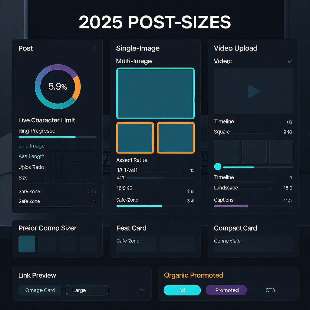
This guide distills the current best-practice sizes and specs for X (formerly Twitter) so your posts look crisp, readable, and consistent across devices. Use it as a quick reference when exporting images, cutting video, or structuring long-form text, and you’ll avoid the most common cropping, compression, and truncation pitfalls. Keep in mind that platform limits can change, so treat these as guardrails and test before major campaigns.
Twitter Post Size Guide (2025): Image, Video, and Text Specs for X

X (formerly Twitter) moves fast, but the fundamentals of “twitter post size” remain the same: choose the right text length, image dimensions, video specs, and file sizes to keep your posts sharp, unclipped, and algorithm-friendly. Getting sizes right improves clarity, reduces awkward crops, and can boost engagement because your media looks intentional on every screen.

Below is a practical, updated reference for 2025 with tips you can apply whether you publish organic posts, run ads, or manage a brand feed.
What “Twitter Post Size” Means in 2025
When creators say “twitter post size,” they typically refer to:
- Text character limits and how the feed truncates long posts
- Image dimensions, aspect ratios, color profiles, and file size caps
- Video dimensions, aspect ratios, codecs, length, and file limits
- Link preview (Website Card) image requirements
- Profile and header image sizes that frame your content
Why it matters:
- Reach and clarity: Properly sized assets reduce cropping and compression artifacts.
- Consistency: Uniform aspect ratios make multi-image posts look polished.
- Performance: Vertical video and legible thumbnails drive more taps on mobile.
- Accessibility: Higher-quality media plays nicer with captions and alt text.
Text Length and Formatting
- Core limit (standard accounts): 280 characters.
- Long-form (Premium): thousands of characters (often well above 10k); the feed shows a preview with “Show more.”
- Truncation: Expect the feed to display a compact preview. Long posts expand on tap.
- Links: All links are wrapped by t.co and count toward your character limit at a fixed, platform-defined length. Budget ~23–24 characters per link to be safe.
- Line breaks: Preserved across devices; use short paragraphs for scannability.
- Emojis: Count as characters; they’re great for emphasis but don’t overdo them.
- Hashtags: Keep them relevant (1–3). Too many looks spammy.
- Best practices:
- Lead with the hook in the first line.
- Use sentence case and short sentences.
- Put the link near the top if it’s the key action.
- Avoid walls of text; break with line breaks or bullets.
Single-Image Posts: Dimensions, Formats, File Sizes
Recommended aspect ratios and sizes (export at 2x if you can to survive compression):
- Landscape: 1200×675 (16:9)
- Square: 1200×1200 (1:1)
- Portrait: 1200×1500 (4:5)
Rendering and cropping:
- Single images often display with minimal cropping, but previews can still vary by device and context. Keep important content away from edges (8–10% safe margin).
- Smart cropping may prioritize faces/subjects; test on both mobile and desktop.
Supported formats and color:
- JPG (photos), PNG (UI/line art), GIF (animated; see size notes).
- Color profile: sRGB. Avoid CMYK or wide-gamut exports.
- HEIC/HEIF is not reliably supported; convert to JPG/PNG before upload.
Typical file size caps (subject to change):
- Photos: up to ~5 MB on mobile, ~15 MB on web.
- Animated GIFs: up to ~5 MB mobile and ~15 MB web.
| Use case | Aspect ratio | Recommended export | Notes |
|---|---|---|---|
| Landscape hero | 16:9 | 1200×675 (JPG/PNG) | Most universal; safe 8–10% inset on all sides |
| Square product shot | 1:1 | 1200×1200 (PNG for graphics) | Good for grids and multi-image sets |
| Portrait for mobile | 4:5 | 1200×1500 (JPG) | High on-screen area; watch top/bottom safe zones |
| Animated GIF | Varies | Up to ~15 MB web | Keep short; heavy GIFs compress poorly |
Multi-Image Posts: Layouts, Ratios, Safe Zones
How X arranges images:
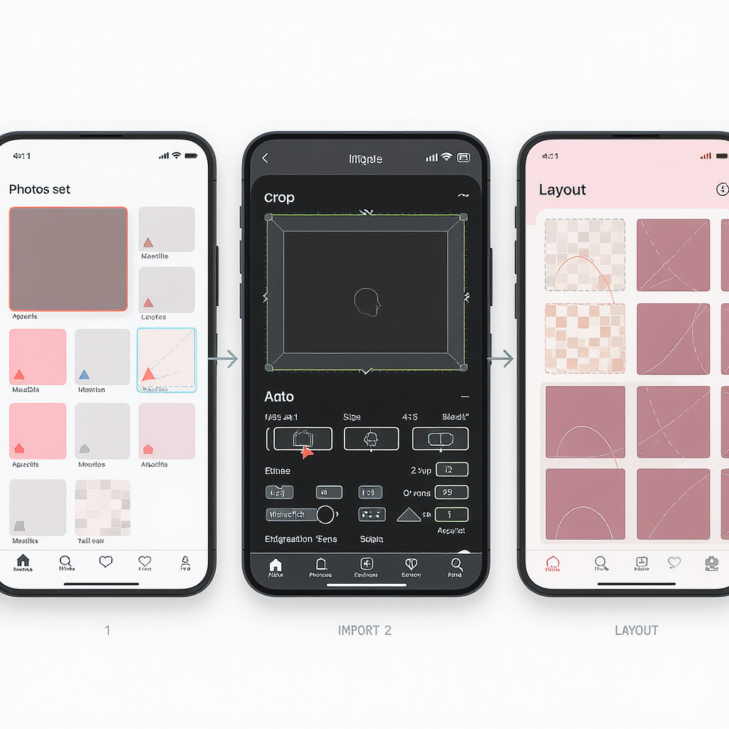
- 2 images: Typically side-by-side. Mixed orientations may crop.
- 3 images: One large image (left) + two stacked smaller images (right).
- 4 images: 2×2 grid.
Tips for clean grids:
- Use consistent ratios across all images to minimize unpredictable crops. Square (1:1) is the most forgiving.
- “Safe zones”: keep faces, logos, and text inside a 10% inset on all edges.
- Avoid thin borders or hairline frames; compression can break them.
Suggested prep sizes:
- 2 images: two 1200×1200 (1:1) or two 1200×675 (16:9) if you want a wide feel.
- 3 images: prepare all three as 1200×1200; if one must be portrait, keep the others consistent.
- 4 images: four 1200×1200 for a uniform 2×2.

| Count | Layout | Prep suggestion | Safe-zone tip |
|---|---|---|---|
| 2 | Side-by-side | 2× 1200×1200 or 2× 1200×675 | Keep text centered; avoid edge captions |
| 3 | 1 large + 2 stacked | 3× 1200×1200 | Place critical content in top/middle areas |
| 4 | 2×2 grid | 4× 1200×1200 | Use bolder strokes; thin lines can alias |
Video Specs: Aspect Ratios, Length, Codecs, Captions
Supported aspect ratios:
- Landscape 16:9 (1280×720, 1920×1080)
- Square 1:1 (1080×1080)
- Vertical 9:16 (1080×1920)
Length and file limits:
- Standard: ~2 minutes 20 seconds (140 seconds).
- Premium: significantly longer uploads (hours) and larger file limits, commonly up to 1080p; exact limits vary by plan and account status—check your subscription details.
Encoding recommendations:
- Container: MP4 or MOV
- Video codec: H.264 (High profile), bitrate ~5–8 Mbps for 1080p (increase for complex motion)
- Frame rate: up to 60 fps (upload native; avoid frame interpolation artifacts)
- Audio: AAC-LC, 128–320 kbps, 44.1 or 48 kHz
- Subtitles: Add captions (SRT or embedded) for accessibility and sound-off viewing
- Thumbnail: Upload a custom thumbnail with legible text (avoid edge placement)
| Orientation | Aspect ratio | Common resolution | When to use |
|---|---|---|---|
| Landscape | 16:9 | 1920×1080 | Trailers, screen demos, widescreen footage |
| Square | 1:1 | 1080×1080 | Balanced feed presence; good for product shots |
| Vertical | 9:16 | 1080×1920 | Mobile-first stories, talking heads, events |
Link Previews and Website Cards
For links that render a card:
- Ideal image: 1200×628 (1.91:1). This matches common Open Graph/Twitter Card specs.
- Keep text away from edges (10% inset). Cards can crop differently than uploaded images.
- Compress thoughtfully (JPG ~80–90 quality) to reduce artifacts; OG images are often recompressed.
Add metadata to your page:
How cards differ from uploaded images:
- Cards pull from your site metadata and are cached; replacing the image requires cache refresh.
- Uploaded images are attached directly to the post and usually show larger previews in the media viewer.
Ads vs. Organic: What Changes?
- Size parity: Promoted posts use the same aspect ratios and file specs as organic posts.
- Creative guardrails:
- Keep vital text and logos within a 10% inset.
- Test readability in both light and dark mode.
- Avoid tiny legal text; keep body copy ≥28–32 px when designing at 1200 px width.
- Performance considerations:
- Vertical video often wins on mobile because it occupies more screen real estate.
- A/B test square vs vertical, short hooks (≤2 seconds), and thumbnail variants.
Profile and Header Images That Frame Your Posts
- Profile image: 400×400 (displayed as a circle). Keep the subject centered; avoid edge text.
- Header image: 1500×500 (wide banner). Place key elements in the vertical middle; edges can crop on smaller screens.
Alignment tips:
- Use sRGB JPG/PNG.
- Preview on desktop and mobile; the avatar overlaps the header on profile pages, so give it breathing room.
Quality, Accessibility, and Export Checklist
Export choices:
- Photos: JPG, quality 80–90, sRGB.
- UI/illustrations/text: PNG (or high-quality JPG if gradients band in PNG).
- Avoid heavy sharpening; X recompresses uploads.
Compression and clarity:
- Start with clean, high-resolution masters (1200–2000 px wide).
- Use gentle noise reduction; watch for color banding in gradients—add subtle dithering if needed.
Accessibility:
- Add alt text to every image.
- Provide captions or subtitles for video.
- Maintain high color contrast for on-image text (WCAG-aware palettes).
Production workflow:
- Create reusable templates (16:9, 1:1, 4:5, 9:16).
- Add a 10% safe-zone guide to each template.
- Keep brand elements consistent (logo size, corner placement).
Quick Reference
| Element | Recommended size/limit | Key notes |
|---|---|---|
| Text (standard) | 280 characters | Links count via t.co; use short paragraphs |
| Text (Premium) | Long-form (thousands) | Feed shows preview; “Show more” expansion |
| Image (landscape) | 1200×675 (16:9) | JPG/PNG, sRGB; ~5 MB mobile/~15 MB web |
| Image (square) | 1200×1200 (1:1) | Good for grids; consistent crops |
| Image (portrait) | 1200×1500 (4:5) | Mobile-friendly; watch top/bottom |
| Video (standard) | Up to ~2:20 | MP4/MOV, H.264, AAC, ≤60 fps |
| Video (Premium) | Longer; 1080p supported | Hours and larger files by plan |
| Link card image | 1200×628 (1.91:1) | Set via OG/Twitter Card tags |
| Profile image | 400×400 | Displayed circular; center subject |
| Header image | 1500×500 | Keep key content in middle band |
Final tip: Specs evolve. Before major campaigns, upload unlisted tests on a spare account, review on multiple devices and themes, and fine-tune crops and compression. That extra 10 minutes saves countless headaches after publishing.
Summary
Use standard text limits, export images in sRGB at recommended aspect ratios, and encode video in H.264 with captions to ensure consistent quality on X. Keep critical content inside a 10% safe zone, test across devices, and set proper Open Graph/Twitter Card metadata for reliable link previews. When in doubt, run small uploads first to validate crops, compression, and readability before scaling your campaign.


