Typical Photo Dimensions for Web, Print and Social Media
Learn standard photo dimensions for web, print, and social media to keep images sharp, on-brand, and optimized for each platform’s requirements.

Introduction: Why Photo Dimensions Matter
In today’s digital-first environment, images are more than decoration — they’re vital for effective communication and brand identity. Whether you’re creating a blog post header, a Facebook ad, or printing cherished memories, understanding and applying the correct photo dimensions is key to:
- Preserving clarity and detail
- Meeting each platform’s technical requirements
- Preventing awkward cropping or stretching
Neglecting image size best practices can result in blurry visuals, distorted layouts, and an unprofessional look. By mastering standard dimensions for web, social media, and print, you can ensure your content is sharp, consistent, and engaging.
---
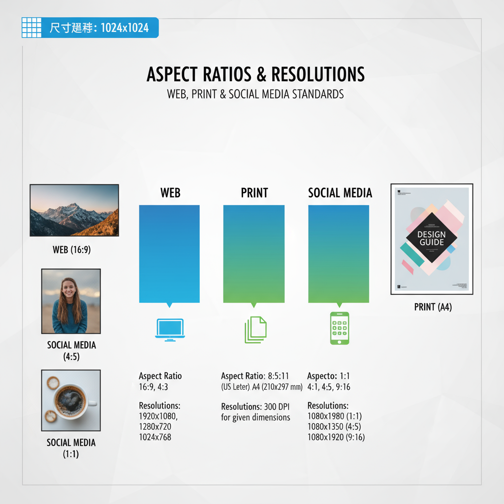
Understanding Aspect Ratio vs. Resolution
Before we cover common photo sizes, it’s essential to distinguish between aspect ratio and resolution—two concepts that often get confused.
Aspect Ratio
Aspect ratio describes the proportional relationship between an image’s width and height, expressed as two numbers separated by a colon (e.g., 16:9). Common aspect ratios include:
- 1:1 – Square
- 4:3 – Classic photographs and monitors
- 16:9 – Widescreen
- 9:16 – Portrait video or stories
Resolution
Resolution is the number of pixels in an image, shown as width × height (e.g., 1920 × 1080 px). Higher resolutions have more pixels, allowing for finer detail.
Pro Tip: Images can share the same aspect ratio at different resolutions—for example, 1280 × 720 px and 1920 × 1080 px both use a 16:9 ratio.
---
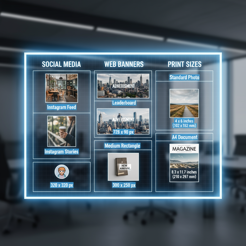
Common Photo Dimensions for Web Use
Web visuals need to balance quality with speed. Lightweight, optimized images load faster and still look sharp.
Typical Web Image Dimensions:
- Full-width banner: 1920 × 1080 px (16:9)
- Blog featured image: 1200 × 628 px or 1200 × 800 px
- In-article images: 800 × 600 px
- Email newsletter header: ~600 × 200 px
For responsive design, prepare multiple size versions for different devices. Compression tools help cut file size without losing quality.
---
Standard Print Photo Sizes and Recommended Resolutions
For print, resolution is measured in DPI (dots per inch). Aim for 300 DPI to ensure sharpness and vibrant color.
Print sizes at 300 DPI:
| Print Size (inches) | Aspect Ratio | Pixels at 300 DPI |
|---|---|---|
| 4 × 6 | 3:2 | 1200 × 1800 px |
| 5 × 7 | 5:7 | 1500 × 2100 px |
| 8 × 10 | 4:5 | 2400 × 3000 px |
| 11 × 14 | 11:14 | 3300 × 4200 px |
| 16 × 20 | 4:5 | 4800 × 6000 px |
For items like posters viewed from a distance, 150–200 DPI may be sufficient.
---
Popular Social Media Image Sizes
Using incorrect dimensions can lead to unwanted cropping or poor display, affecting engagement.
- Feed (square): 1080 × 1080 px (1:1)
- Feed (portrait): 1080 × 1350 px (4:5)
- Stories/Reels: 1080 × 1920 px (9:16)
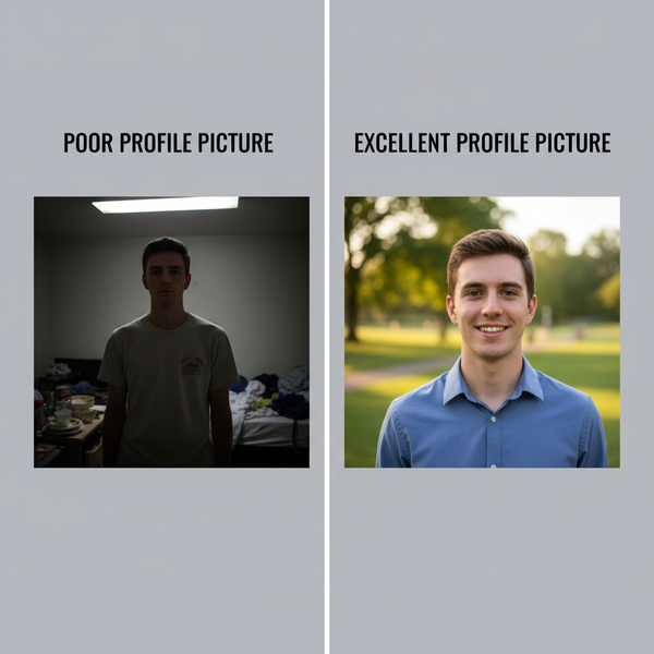
- Profile picture: 170 × 170 px (circular display)
- Cover: 820 × 312 px
- Shared image: 1200 × 630 px
- Ads: Commonly 1080 × 1080 px or 1200 × 628 px
Twitter (X)
- Profile: 400 × 400 px
- Header: 1500 × 500 px
- In-stream: 1200 × 675 px
- Profile: 400 × 400 px
- Personal banner: 1584 × 396 px
- Company cover: 1128 × 191 px
- Standard pin: 1000 × 1500 px (2:3)
- Square pin: 1000 × 1000 px
---
How to Choose the Right Dimensions for Your Needs
When deciding on photo sizes:
- Follow platform guides—they change regularly
- Match orientation—landscape or portrait to suit the medium
- Protect safe areas—avoid placing critical elements at edges
- Ensure brand consistency—stick to the same proportions for all marketing materials
---
Impact of Scaling and Compression on Photo Quality
Scaling changes image dimensions:
- Upscaling decreases sharpness if the original is small
- Downscaling is safer but can still strip fine details
Compression: JPEG reduces file size but may introduce visible artifacts. PNG preserves detail but results in larger files.
---
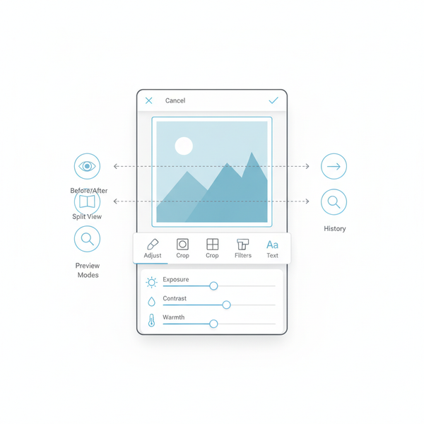
Tools and Resources for Resizing Images Without Losing Quality
Resize images without quality loss using these tools:
- Adobe Photoshop – Includes “Preserve Details” for resampling
- GIMP – Free, open-source image editor
- Canva – Easy presets for social platforms
- TinyPNG / Squoosh – Smart web image optimization
Python Pillow Example:
from PIL import Image

with Image.open("input.jpg") as img:
    img = img.resize((1200, 800), Image.LANCZOS)
    img.save("output.jpg", quality=95)
---
Best Practices for Maintaining Consistency in Image Sizing for Brand Identity
To support brand recognition:
- Maintain a brand style guide with image specs
- Use reusable templates for standard formats
- Match colors to correct profiles (sRGB for web, CMYK for print)
- Batch process images with automation platforms
---
Conclusion
Knowing and applying typical photo dimensions ensures your visuals are professional, platform-optimized, and consistent. From responsive web banners to high-resolution print materials and engaging social media posts, correct sizing maintains image integrity and reflects your brand’s quality.
---
Quick Reference Table: Typical Photo Dimensions
| Use Case | Dimensions (px) | Aspect Ratio |
|---|---|---|
| Web Banner | 1920 × 1080 | 16:9 |
| Blog Feature | 1200 × 628 | 1.91:1 |
| Email Header | 600 × 200 | 3:1 |
| Instagram Post (Square) | 1080 × 1080 | 1:1 |
| Facebook Cover | 820 × 312 | 2.63:1 |
| Twitter Header | 1500 × 500 | 3:1 |
| Pinterest Pin | 1000 × 1500 | 2:3 |
| Print 4×6 @ 300 DPI | 1200 × 1800 | 3:2 |
---
Want to master your visual content strategy? Apply these sizing guidelines to keep your photos crisp and compelling on any platform. Optimize now to make every pixel count!