Typical Picture Size Guide for Web, Print, and Social Media
Learn typical picture sizes for web, print, and social media, including resolution, aspect ratios, DPI standards, and platform-specific dimensions.

Understanding Picture Size: Resolution, Aspect Ratio, and File Type
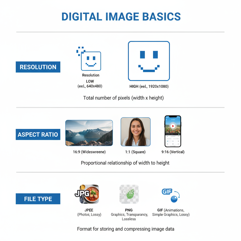
When discussing typical picture size, it’s important to understand three core components: resolution, aspect ratio, and file type.
- Resolution refers to the number of pixels in the image, usually described as width × height.
- Aspect ratio is the proportional relationship between width and height (e.g., 4:3, 16:9, 1:1).
- File type (JPEG, PNG, WebP, TIFF) influences image quality and compression efficiency, affecting both digital and print performance.
Picture size impacts visual clarity, loading speed, and how well the image adapts to different devices or formats.
---
Common Digital Image Dimensions for Web Use
Web-friendly image dimensions depend on where and how the picture will be displayed. Typical ranges include:
- Small thumbnails: 150 × 150 pixels
- Medium content images: 600 × 400 pixels
- Full-width hero images: 1920 × 1080 pixels or 2560 × 1440 pixels for high-DPI screens
- Blog post illustrations: around 1200 × 800 pixels for balance of quality and speed
Using overly large images on the web can slow page load times, impacting user experience and SEO. Conversely, too small images can appear pixelated on larger displays.
---
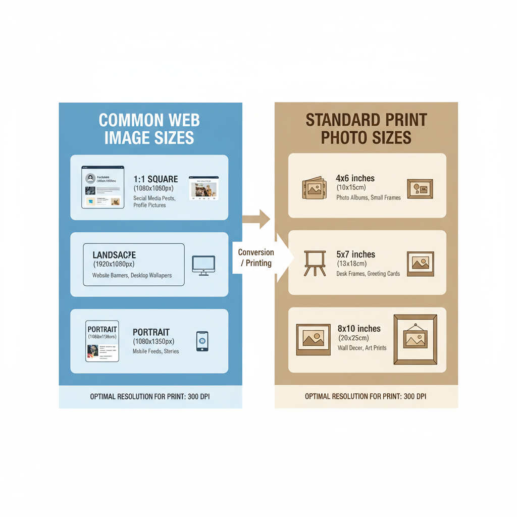
Standard Print Photo Sizes and Use Cases
For print, dimensions are specified in inches or centimeters rather than pixels. The most common print sizes include:
- 4 × 6 in (10 × 15 cm) — Standard photo albums and casual prints
- 5 × 7 in (13 × 18 cm) — Framing gifts and portraits
- 8 × 10 in (20 × 25 cm) — Wall décor or professional portfolios
- 11 × 14 in / A3 size (28 × 36 cm) — Posters
- 16 × 20 in (40 × 50 cm) — Large wall art
Print sizing must account for the image’s resolution in DPI (dots per inch) to ensure sharpness. Most quality prints use 300 DPI for optimal detail.
---
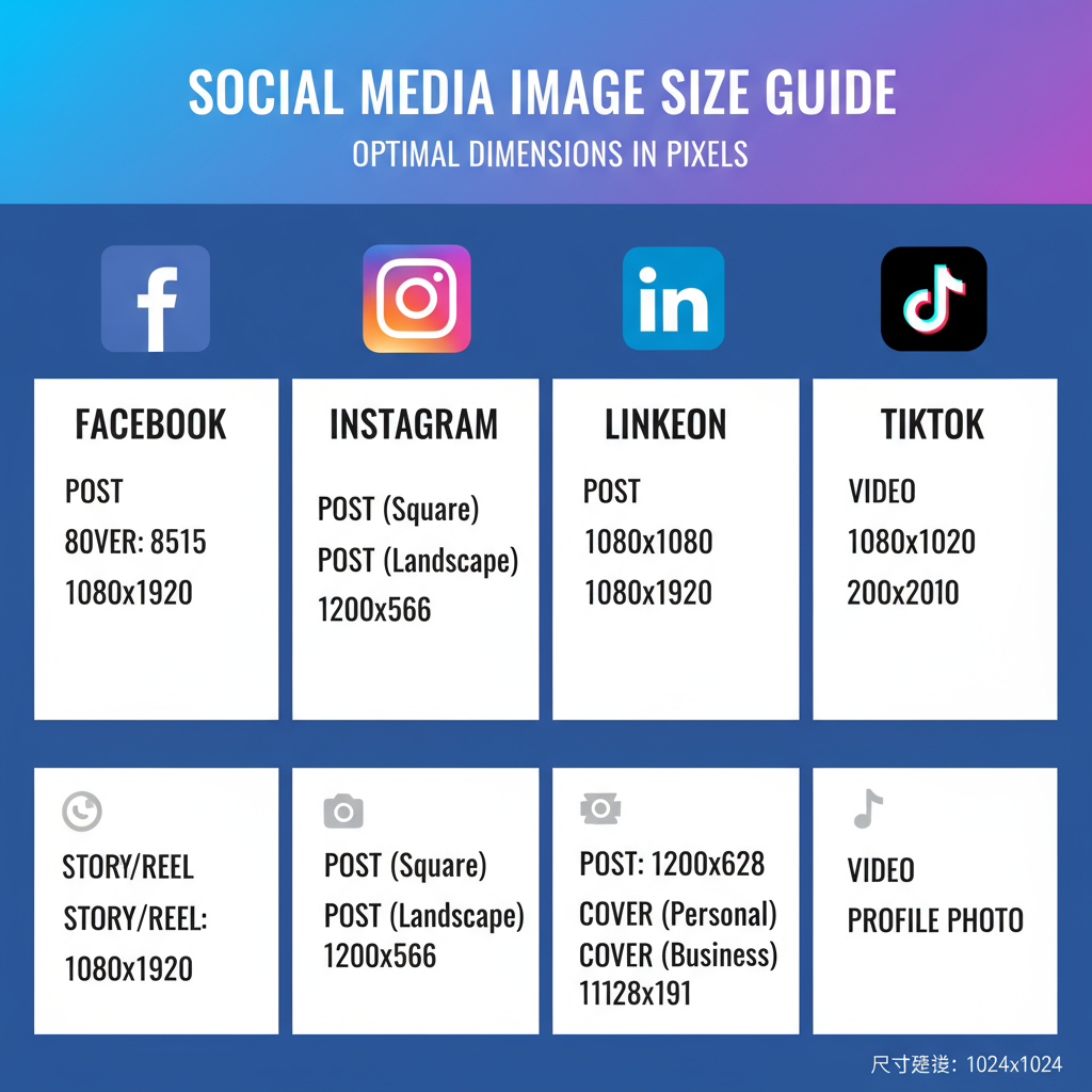
Social Media Platform Image Size Guidelines
Each social media platform has unique picture size requirements. Using the proper dimensions ensures your images look sharp and professional.
- Profile picture: 180 × 180 px
- Cover photo: 820 × 312 px
- Shared image: 1200 × 630 px
- Profile picture: 320 × 320 px
- Square post: 1080 × 1080 px
- Portrait post: 1080 × 1350 px
- Story: 1080 × 1920 px
- Profile picture: 400 × 400 px
- Banner: 1584 × 396 px
- Shared image: 1200 × 627 px
TikTok
- Profile picture: 200 × 200 px
- Video cover: 1080 × 1920 px
- Pin image: 1000 × 1500 px
- Square pin: 1000 × 1000 px
---
Picture Formatting: Portrait, Landscape, and Square
The orientation of an image differs by platform and purpose:
- Portrait — Taller than it is wide (e.g., 3:4 or 9:16). Common on Instagram Stories, TikTok videos, and mobile-focused designs.
- Landscape — Wider than tall (e.g., 16:9). Ideal for YouTube thumbnails, banners, and cinematic presentations.
- Square — Equal width and height (1:1). Often used for Instagram posts and consistent layouts.
Choosing the right format helps retain focus on the subject and ensures proper alignment across devices.
---
How DPI Affects Print Quality and File Size
DPI (dots per inch) determines how many ink dots are placed within a linear inch of print. Higher DPI values produce sharper images but require larger file sizes.
- High quality prints: 300 DPI or greater
- Standard prints: 150–200 DPI
- Web images: 72 DPI (not critical for digital display, but common convention)
An image sized at 300 DPI with large pixel dimensions will create a significantly bigger file.
---
Compression and Scaling Impact on Image Clarity
Compression reduces file size by removing redundant data. Scaling changes the number of pixels.
- Lossy compression (JPEG) reduces quality with smaller file sizes.
- Lossless compression (PNG, WebP) maintains quality but may produce larger files.
- Upscaling—increasing dimensions beyond the original—can cause softness or visible pixelation.
- Downscaling may retain clarity if handled with proper interpolation.
---
Choosing the Right Picture Size for Responsive Websites
Responsive websites adjust layout based on device size. To ensure images adapt:
- Use srcset and sizes attributes in HTML to serve different image versions.
- Provide multiple resolutions for different screen densities.
- Avoid uploading extremely large images unless necessary for high-DPI displays.
This approach balances load times with image quality.
---
Picture Size and SEO
Picture size affects SEO in several ways:
- Site speed — Smaller images load faster, improving Core Web Vitals.
- User engagement — Clear visuals keep users longer.
- Indexability — Properly optimized images with descriptive alt text help search engines understand content relevance.
Large files without optimization can negatively impact rankings.
---
Recommended Tools for Resizing and Optimizing Images
Several tools can resize and enhance images without noticeable quality loss:
- Adobe Photoshop — Industry standard with advanced optimization options.
- GIMP — Free, open-source alternative.
- TinyPNG/TinyJPG — Web-based compression tools.
- ImageMagick — Command-line utility for batch processing.
- Squoosh — Browser-based app from Google for fast optimization.
---
Best Practices for Maintaining Quality Across Platforms
To maintain consistency:
- Export at appropriate resolutions for each platform.
- Keep original high-resolution files for future edits.
- Test across devices to ensure scaling and cropping work correctly.
- Use vector graphics (SVG) for logos to ensure sharpness at any size.
- Leverage modern formats like WebP for web to reduce size without losing detail.
---
Summary Chart: Typical Picture Sizes
Here’s a quick reference chart for common picture sizes across web, print, and social media:
| Use Case | Dimensions | Unit | Notes |
|---|---|---|---|
| Web Thumbnail | 150 × 150 | px | Small preview images |
| Web Hero Image | 1920 × 1080 | px | Full-width banners |
| Print Photo | 4 × 6 | in | Standard print size |
| Instagram Square Post | 1080 × 1080 | px | Best for feed consistency |
| Facebook Cover | 820 × 312 | px | Displayed on desktop |
| LinkedIn Banner | 1584 × 396 | px | Wide panoramic format |
---
By understanding and applying the typical picture size for each medium, you can ensure your images look professional, load efficiently, and perform well—whether for a responsive website, a high-quality print, or a social media campaign. The right dimensions improve user experience, protect clarity, and support SEO efforts, making image optimization an essential part of digital and print design strategy.