Typical Picture Sizes: A Complete Guide to Standard Dimensions for Print, Web, and Social Media
Master typical picture sizes for print, web, and social. Learn pixels, aspect ratios, and resolution, plus standard dimensions, formats, and responsive tips.
Choosing the right picture size can feel complicated, but a few consistent rules make it simple. This guide organizes the most typical dimensions for print, web, and social platforms, and clarifies how pixels, aspect ratios, and resolution work together. Use it as both a quick reference and a planning checklist to avoid last-minute cropping and quality loss.
Typical Picture Sizes: A Complete Guide to Standard Dimensions for Print, Web, and Social Media

If you’ve ever wondered which dimensions to choose for a print, blog post, or Instagram post, this guide distills typical picture sizes into practical recommendations you can use immediately. We’ll demystify pixels, aspect ratios, and resolution, then walk through standards for print, web, and social platforms.
---
What “picture size” really means
Picture size is a combination of:
- Dimensions: physical inches or centimeters (for print) or pixels (for screen).
- Aspect ratio: the proportional relationship of width to height (e.g., 3:2, 4:5).
- Resolution: pixels per inch (PPI, often called DPI in print contexts) that determines detail at a given physical size.
How they interact:
- Pixels define how much detail you have. More pixels allow larger prints or sharper crops.
- Aspect ratio dictates shape. A 3:2 image won’t fill a 4:5 frame without cropping or borders.
- Resolution converts pixels into physical size: print inches = pixel dimension / target PPI.
Example:
- A 6000 × 4000 px photo (24 MP) printed at 300 PPI yields 20 × 13.3 in. At 200 PPI, it yields 30 × 20 in.
---
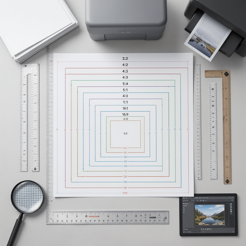
Standard print photo sizes and aspect ratios
The most common print sizes map to a handful of aspect ratios. Knowing which sizes preserve your camera’s native ratio reduces awkward cropping.
| Print size (in) | Aspect ratio | Metric equivalent (approx.) | Notes / Ready-made frames |
|---|---|---|---|
| 4 × 6 | 3:2 | 10 × 15 cm | Matches most DSLR/mirrorless 3:2 sensors; very common frames |
| 5 × 7 | 7:5 (~1.4) | 13 × 18 cm | Slight crop from 3:2; common frame size |
| 8 × 10 | 4:5 (1.25) | 20 × 25 cm | Significant crop from 3:2; many ready-made frames |
| 11 × 14 | 14:11 (~1.27) | 28 × 36 cm | Close to 5:4; popular for portraits |
| 16 × 20 | 5:4 (1.25) | 40 × 50 cm | Gallery-friendly; many pre-made frames |
| 20 × 30 | 3:2 | 50 × 75 cm | Big print that preserves 3:2; dramatic wall art |
Metric/A-series options:
- A4 (8.27 × 11.69 in / 210 × 297 mm)
- A3 (11.69 × 16.54 in / 297 × 420 mm)
- 30 × 40 cm, 40 × 50 cm, 50 × 70 cm are common frame-friendly sizes in Europe.
Tip: If you want zero cropping from a 3:2 photo, choose 4×6, 8×12, 12×18, or 20×30.
---
Typical digital image sizes for websites and blogs
Use sizes that balance quality with performance:
- Hero/banner:
- 1920 × 1080 px (Full HD) or 1920 × 1280 for taller heros
- 2400–2560 px wide for large displays (serve responsive variants)
- Content images:
- 1200–1600 px wide for article images (retina: 2400–3200 px)
- Thumbnails/cards:
- 400 × 300 (4:3), 400 × 400 (1:1), or 480 × 270 (16:9)
- Favicons/social preview:
- 512 × 512 px (square)
File formats:
- Photos: JPEG (quality 75–85), WebP (quality 70–80), AVIF (quality 40–60) for smaller files.
- Graphics/icons: PNG for transparency, SVG for vector logos/illustrations.
- Always use sRGB color profile for web.
Responsive example (retina-friendly):
CSS to keep images fluid:
img, svg, video { max-width: 100%; height: auto; }
.object-cover { width: 100%; height: 100%; object-fit: cover; }
---
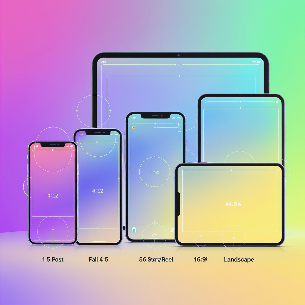
Social media image sizes and aspect ratios that work across platforms
Create once, adapt smartly. These aspect ratios travel well:
- 1:1 (square) — 1080 × 1080: Universal feed posts; easy cropping.
- 4:5 (portrait) — 1080 × 1350: Max vertical for Instagram feed; strong on mobile.
- 16:9 (landscape) — 1920 × 1080: YouTube, Twitter/X headers, landscape video.
- 9:16 (vertical) — 1080 × 1920: Stories, Reels, Shorts, TikTok.
Safe areas (avoid UI overlays):
- 9:16 vertical: keep vital text within the middle 1080 × ~1420 px (leave ~250 px padding top/bottom).
- 4:5 feed: to look good in IG grids, keep critical content inside a centered 1:1 square.
- 16:9 thumbnails: avoid edges where time badges or play icons may overlap.
Platform quirks change; always check current guidelines before a campaign.
---
Choosing the right size for printing
Consider:
- Viewing distance:
- Handheld/close (photo books, small frames): target 300 PPI.
- Wall prints at couch distance: 180–240 PPI is often indistinguishable from 300.
- Posters/billboards: 100–150 PPI (or less) is acceptable due to distance.
- Wall space and framing:
- Measure available space; leave room for mat and frame width.
- Mats can adapt aspect ratios and make 3:2 photos fit 4:5 frames elegantly.
- Camera megapixels vs maximum print size:
- Print width (in) = pixel width / target PPI
- Example: 24 MP (6000 × 4000) → 20 × 13.3 in at 300 PPI; 30 × 20 in at 200 PPI.
- Try test prints:
- Print an 8 × 10 crop at your intended PPI to evaluate sharpness and noise.
---
Orientation and composition by ratio
- Landscape vs portrait vs square:
- Landscape emphasizes context and leading lines.
- Portrait focuses attention on vertical subjects and people.
- Square is balanced, centered, and social-friendly.
- How ratios affect composition:
- 3:2 (wider): suits environmental portraits, sweeping landscapes. Rule-of-thirds grids feel roomy.
- 4:3: slightly taller; common in smartphones; good for general use.
- 4:5 / 5:4: tighter horizontally; flattering for portraits; mind edge tension.
- 1:1: encourages central compositions and symmetry; watch headroom.
- Cropping tips:
- Compose with extra room if you expect 8 × 10 or 4:5 outputs.
- Place key elements away from edges to survive cross-platform crops.
---
DPI and PPI made simple
- PPI (pixels per inch) controls print detail. Printers may talk about DPI (dots per inch), which is a device metric; focus on PPI when sizing your files.
- Good targets:
- 300 PPI: small prints, albums, art where viewers get close.
- 240 PPI: excellent quality for most framed prints.
- 150–200 PPI: large wall art and posters viewed from several feet.
- When 300 isn’t necessary:
- If the viewing distance is 3–6 feet, 180–200 PPI is usually visually indistinguishable from 300 PPI.
---
Resizing, cropping, and exporting without quality loss
Maintain aspect ratio:
- Lock proportions when resizing; avoid non-uniform scaling.
Resample correctly:
- Downsize with bicubic/bilinear or Lanczos; enable “sharpen on export.”
- For large downsizes, do it in two steps (e.g., 200% → 100%) to preserve detail.
Apply output sharpening:
- “Standard” or “High” for matte paper; “Low” to “Standard” for glossy.
- For web, a subtle unsharp mask after export can restore crispness.
Compression and color:
- JPEG: quality 75–85 balances detail and size; avoid re-saving multiple times.
- WebP/AVIF: smaller files at similar quality; test for banding in gradients.
- Convert to sRGB for consistent web color.
- Strip unnecessary metadata to reduce file size (preserve copyright/IPTC if needed).
Automation examples:
## ImageMagick: resize to max 1600 px on the long edge, convert to sRGB, and compress

magick input.jpg -colorspace sRGB -resize 1600x1600\> -quality 82 output.jpg

## Create WebP at good quality

cwebp -q 78 input.jpg -o output.webp
---
Common pitfalls and quick fixes
- Stretching images:
- Symptom: people look too wide/tall.
- Fix: keep aspect ratio locked; use “object-fit: cover” for crops instead of distortion.
- Uploading overly large files:
- Symptom: slow pages, high bounce rates.
- Fix: cap content images at ~1600–2000 px wide; serve responsive srcset.
- Compression artifacts:
- Symptom: blocky gradients, halos.
- Fix: increase quality slightly; switch to WebP/AVIF; add mild noise/dither for smooth gradients.
- Cropping surprises on social:
- Symptom: text or faces cut off.
- Fix: design inside safe areas; test previews; export multiple aspect ratios (1:1, 4:5, 9:16).
- Bleed and safe margins for borderless prints:
- Symptom: edges trimmed unpredictably.
- Fix: add 0.125 in (3 mm) bleed beyond the trim; keep critical content at least 0.25 in (6 mm) inside the final trim line.
---
Quick reference: typical picture sizes at a glance
- Print (imperial): 4×6, 5×7, 8×10, 11×14, 16×20, 20×30
- Print (metric): 10×15 cm, 13×18 cm, 20×25 cm, 28×36 cm, 40×50 cm, 50×75 cm, plus A4/A3
- Web: heroes 1920–2560 wide; content 1200–1600; thumbs 400–480
- Social: 1:1 1080, 4:5 1080×1350, 16:9 1920×1080, 9:16 1080×1920
---
Summary
This guide streamlines picture sizing by linking dimensions, aspect ratios, and resolution to real-world outputs for print, web, and social media. Refer to the standard print sizes, responsive web image patterns, and cross-platform aspect ratios to minimize cropping and preserve quality. With sensible PPI targets and careful export settings, your images will look sharp, load fast, and display correctly wherever they appear.