Graphic Dimensions for Web and Print Sizes Explained
Learn graphic dimensions for web and print, covering units, aspect ratios, resolution, and standard sizes to keep designs sharp and well-scaled.
Introduction to Graphic Dimensions
Mastering graphic dimensions—the width and height measurements of images—is critical for designers, marketers, and content creators who want visuals to look sharp, professional, and correctly scaled across web, print, and multimedia platforms. From ensuring clarity and proportionality to avoiding pixelation and cropping issues, understanding dimensions directly impacts the quality and effectiveness of your creative work.
In this guide, we’ll explore measurement units, standards for web and print, aspect ratios, responsive design tips, common pitfalls, and tools to help you get dimensions right every time.
---
Understanding Graphic Dimensions and Their Importance
Graphic dimensions refer to the measurable width and height of an image or design. They are fundamental to ensuring your visuals appear crisp, properly scaled, and professional—whether they’re displayed on a website, printed on paper, or projected on a billboard.
Accurate dimensions help designers maintain consistent quality across different media, prevent distortion, and guarantee correct proportions. Getting this wrong can result in pixelation, cropping issues, or poor visual balance that diminishes the impact of your work.

When planning any graphic, knowing its correct size is key to design success.
---
Common Units of Measurement
To work effectively with graphic dimensions, it’s essential to understand the main units and their roles.
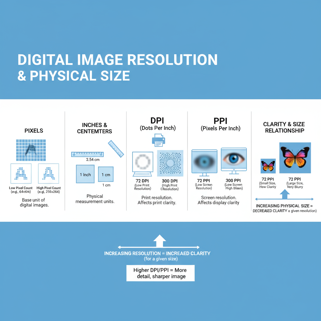
Pixels (px)
- Primary unit for digital graphics.
- Each pixel is a single point in a raster image.
- Defines digital resolution and affects how sharp an image appears on screen.
Inches (in) & Centimeters (cm)
- Used in physical print measurements.
- Essential for understanding print layout sizes.
DPI and PPI
- DPI (Dots Per Inch): Printing term, measures ink dots per inch.
- PPI (Pixels Per Inch): Digital term, measures pixel density on screen.
- Higher DPI/PPI means higher detail and smoother images.
Example: A high-resolution print might be 300 DPI, while standard screen graphics are 72 PPI.
---
Standard Web Image Sizes for Social Media
Each social platform has recommended dimensions to ensure your graphics look their best.
Below are some of the most common standard sizes (as of 2024):
| Platform | Image Type | Recommended Dimensions (px) |
|---|---|---|
| Cover Photo | 820 x 312 | |
| Shared Image | 1200 x 630 | |
| Square Post | 1080 x 1080 | |
| Story | 1080 x 1920 | |
| Header Image | 1500 x 500 | |
| Company Cover | 1128 x 191 | |
| Pin | 1000 x 1500 |
Following recommended social media dimensions prevents auto-cropping and maintains your visual message.
---
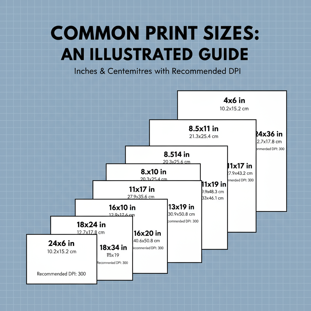
Print Graphic Dimensions
Printing involves translating your design into a physical medium. Maintaining correct dimensions ensures crisp prints that match your intended layout.
Examples:
- Business Cards: Standard 3.5 x 2 inches (add bleed).
- Flyers: Common size includes 8.5 x 11 inches (letter).
- Posters: Can range from 11 x 17 inches (small) to 24 x 36 inches (large).
- Banners: Highly variable; e.g., 33 x 80 inches for roll-up banners.
Consider print bleed (extra border) to avoid cutting off important elements.
---
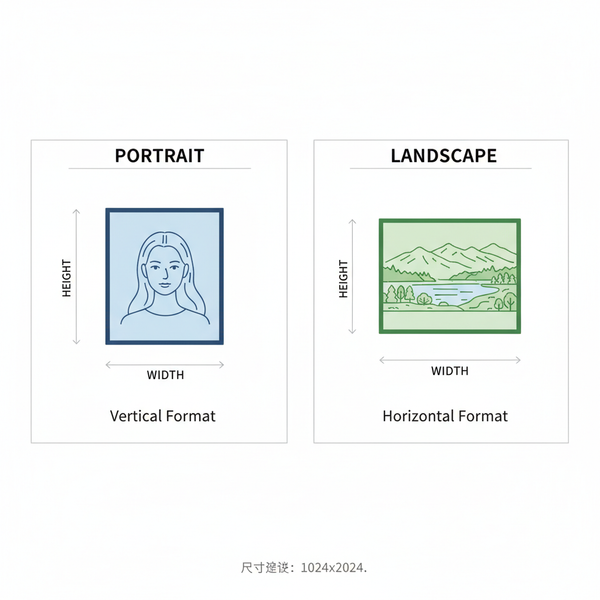
Aspect Ratios and Their Role
Aspect ratio is the proportional relationship between width and height.
Examples:
- 1:1: Square images, popular on Instagram.
- 16:9: Widely used for video and web sliders.
- 4:3: Older TV and projector formats.
Changing an aspect ratio can crop or distort images, so plan for it early in design.
---
Responsive Design Considerations
With audiences accessing content on multiple devices, responsive graphics are essential.
Tips for responsive graphics:
- Use scalable vector graphics (SVG) for icons and simple illustrations.
- Prepare multiple raster versions of images for different breakpoints (mobile, tablet, desktop).
- Test graphics on different devices and orientations.
- Keep critical visual elements within a safe zone to prevent cropping.
---
Best Practices for Optimizing Resolution and File Size
Optimized graphics load quickly without sacrificing quality.
Strategies:
- Choose the right format: JPEG for photographs, PNG for transparency, WebP for modern compression.
- Resize before upload: Avoid loading huge images only to scale them down in code.
- Use compression tools: Tools like TinyPNG or Squoosh strike a balance between quality and file size.
- Target proper resolution: 72 PPI for web, 300 DPI for print.
---
Tools and Resources for Adjusting Dimensions
There are many free and paid tools that make checking and adjusting graphic dimensions easy:
- Adobe Photoshop: Professional raster image editing and resizing.
- GIMP: Free alternative with robust features.
- Canva: Online editing, includes templates for common sizes.
- Figma: Great for UI design with responsive sizing controls.
- ImageMagick: Command-line tool for batch resizing images.
---
Common Mistakes to Avoid
Even seasoned designers hit snags with graphic dimensions. Avoid these pitfalls:
- Stretching: Maintain aspect ratio when resizing to prevent distortion.
- Pixelation: Do not upscale small images significantly; source high-resolution originals.
- Ignoring bleed: In print, forgetting bleed can result in unwanted trim errors.
- Wrong format: Using PNG for large photographic banners can cause unnecessarily heavy files.
---
Quick Reference Dimension Chart for Designers
Here’s a handy chart for fast lookup:
| Use Case | Dimensions | Notes |
|---|---|---|
| Web Banner | 1920 x 600 px | Hero section on websites |
| Facebook Post Image | 1200 x 630 px | Follow current platform guideline |
| Instagram Story | 1080 x 1920 px | Vertical format |
| Business Card | 3.5 x 2 in | Include 0.125 in bleed |
| A4 Flyer | 8.27 x 11.69 in | European standard size |
| Poster - Large | 24 x 36 in | High DPI for print |
---
Summary and Next Steps
By fully understanding and applying correct graphic dimensions, you ensure your visuals are optimized for their intended medium—whether on social media, in print, or across responsive devices. Mastering measurement units, platform-specific standards, aspect ratios, and optimization best practices will significantly improve the quality and impact of your content.
Call to Action: Start by auditing your current graphics for compliance with these dimension standards, then adjust to deliver consistently professional results. Your audience—and your brand—will notice the difference.