Photo Sizes for Web Print and Social Media Platforms
Learn the best photo sizes for print, web, and social media, including pixel dimensions, resolution tips, and responsive image optimization.
Introduction to Choosing the Correct Photo Sizes
Selecting the correct photo sizes is essential for delivering high-quality visuals across print, web, and social media. This guide will help you understand standard dimensions, resolutions, platform-specific requirements, and optimization best practices. By tailoring your images to each medium, you can improve visual impact, user experience, and SEO. Whether you’re a photographer, designer, marketer, or blogger, knowing how to size, crop, and compress your photos properly is a skill worth mastering.
---
Why Correct Photo Sizes Matter
When it comes to creating visual content for the web, print, and social media, photo sizes play a crucial role. Using the wrong dimensions can result in blurry images, slow page load times, or cropping that cuts out important parts of your picture. The correct sizing ensures:
- Quality: Images maintain sharpness and detail.
- Speed: Properly optimized sizes reduce file weight, improving loading speed.
- Platform Compatibility: Each medium has its own optimal dimensions.
Whether you are preparing a banner for your website, a post for Instagram, or a brochure for printing, understanding dimensions, resolution, and aspect ratios is fundamental.

---
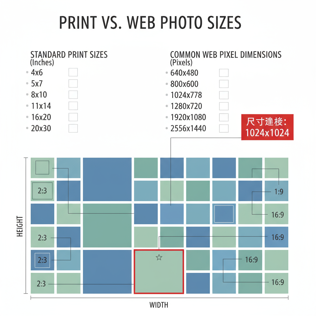
Standard Photo Dimensions for Print
Printed images require higher resolution than web graphics, measured in DPI (dots per inch). The industry standard for professional-quality prints is 300 DPI.
Here’s an overview of common print sizes:
| Print Size (inches) | Pixel Dimensions (at 300 DPI) | Aspect Ratio |
|---|---|---|
| 4 × 6 | 1200 × 1800 px | 3:2 |
| 5 × 7 | 1500 × 2100 px | 5:7 |
| 8 × 10 | 2400 × 3000 px | 4:5 |
| 11 × 14 | 3300 × 4200 px | 11:14 |
Tip: Always design or photograph in higher resolution and reduce only when needed. Upscaling low-resolution images generally results in pixelation.
---
Common Pixel Dimensions for Websites and Blogs
When targeting website or blog use, file sizes and pixel dimensions should strike a balance between clarity and speed.
Typical web image recommendations:
- Full-width banner: 1920 × 1080 px
- Content images: 1200 × 800 px
- Thumbnails: 400 × 400 px
- Backgrounds: 2560 × 1440 px (optimized)
Why it matters: Large, uncompressed images can slow page loading dramatically, harming both user experience and SEO rankings.
---
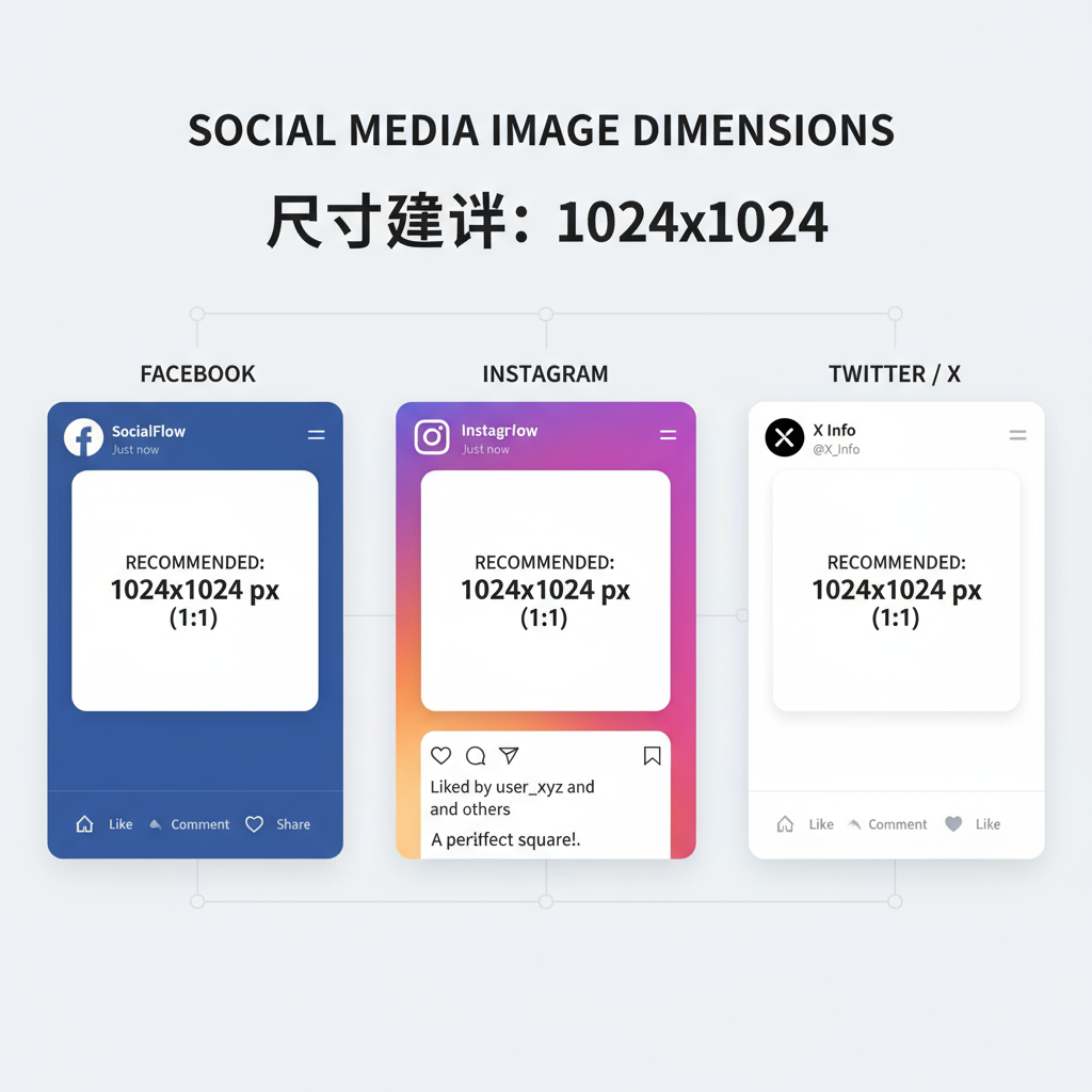
Popular Social Media Image Sizes
Each social media platform has its own required or recommended sizes. Keeping them up to date ensures images display correctly without awkward crops.
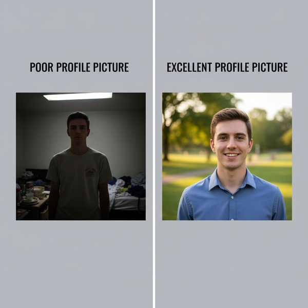
- Profile picture: 400 × 400 px
- Cover photo: 820 × 312 px (desktop), 640 × 360 px (mobile safe zone)
- Shared image: 1200 × 630 px
- Profile picture: 320 × 320 px
- Square post: 1080 × 1080 px
- Portrait post: 1080 × 1350 px
- Landscape post: 1080 × 566 px
- Stories/Reels: 1080 × 1920 px
Twitter / X
- Profile picture: 400 × 400 px
- Header image: 1500 × 500 px
- In-stream photo: 1200 × 675 px
- Profile picture: 400 × 400 px
- Background photo: 1584 × 396 px
- Shared image: 1200 × 627 px
- Pin: 1000 × 1500 px (2:3 aspect ratio recommended)
TikTok
- Profile picture: 200 × 200 px
- Video cover image: 1080 × 1920 px
---
Responsive Image Sizing for Mobile vs Desktop
Modern websites and apps need responsive images that adapt to various screen sizes. Serving a 2500 px image to a smartphone is unnecessary and wastes bandwidth.
Best practices for responsive design:
- Use the HTML `` element to serve different resolutions.
- Generate multiple breakpoints: e.g., 480 px (mobile), 768 px (tablet), 1200 px (desktop).
- Consider lazy loading to defer off-screen images.
---
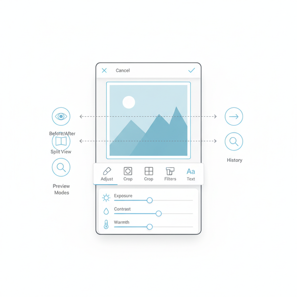
Tools to Resize and Compress Photos Without Quality Loss
There are many free and premium tools available to maintain quality while resizing or compressing.
Popular options:
- Adobe Photoshop – Manual control over dimensions and export settings.
- GIMP – Free, open-source alternative.
- TinyPNG / TinyJPG – Online compression for PNG and JPG.
- Squoosh – Google's online image optimization tool.
- Canva – Online editing with custom size presets.
Tip: Save web images in WebP format where supported to significantly reduce file size.
---
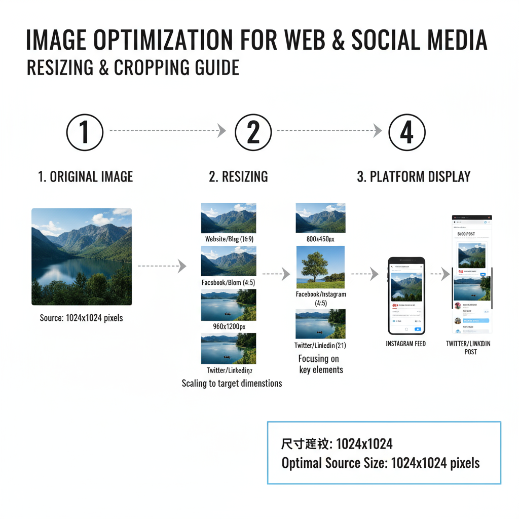
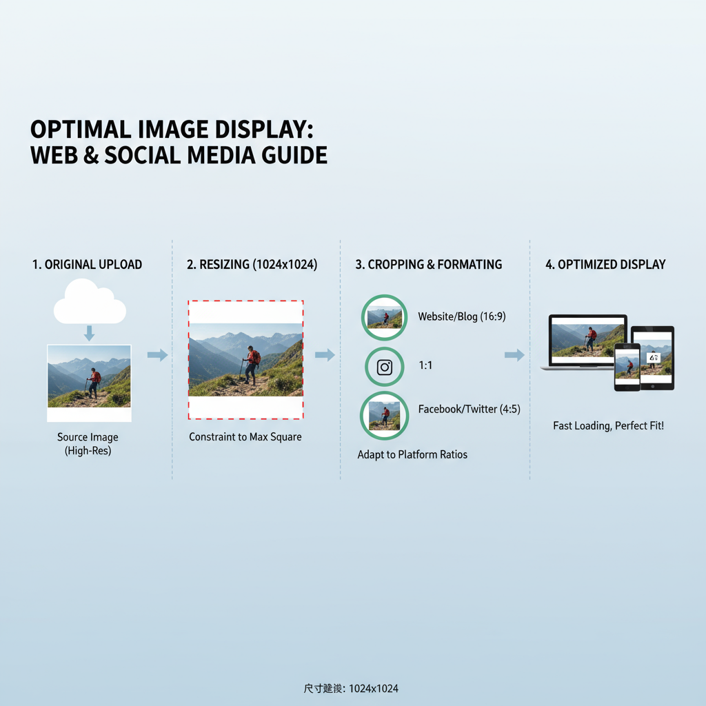
How to Crop for Different Aspect Ratios
Aspect ratio defines the proportional relationship between width and height.
Common aspect ratios:
- 1:1 (square) – Instagram profile pictures, thumbnails
- 4:5 – Tall portrait posts for Instagram to maximize vertical space
- 16:9 – Standard landscape for videos and YouTube covers
When cropping:
- Start with a high-resolution source to preserve detail.
- Select the aspect ratio before cropping, to avoid guesswork.
- Position your subject intentionally to avoid cutting off key elements.
Useful tool feature: Many photo editors offer “lock aspect ratio” functions.
---
Optimizing Photo Sizes for SEO and Faster Load Times
Google considers page speed an important ranking factor, and images significantly affect load times.
Steps for better SEO and performance:
- Use descriptive file names (`product-name-red-shoes.jpg`).
- Add `alt` text with relevant keywords (but avoid stuffing).
- Compress large files to under 200 KB where possible.
- Consider using a Content Delivery Network (CDN) to serve images faster.
- Implement lazy loading to improve perceived speed.
Remember: It's not just about dimensions—format, compression, and delivery all matter.
---
Avoiding Distortion: Maintaining Resolution and Proportions
Distorted images happen when the aspect ratio is ignored. Always resize proportionally unless intentionally creating a stylistic stretched effect.
Best practices:
- Use editing software that maintains aspect ratio by default.
- Avoid dragging images to resize in layout software without locking proportions.
- For print, match your dimensions to the printer's requirements from the start.
Distortion can make professional materials appear amateur and can hurt trustworthiness.
---
Summary Checklist for Choosing the Right Dimensions Every Time
Follow this quick checklist to ensure your photo sizes are always optimal:
- Identify the platform or medium (print, web, social).
- Check the latest official size guidelines—they can change yearly.
- Start with high resolution and crop/resize down.
- Preserve aspect ratio to avoid distortion.
- Compress and optimize for fast loading.
- Test on multiple devices to confirm proper display.
- Save in appropriate format (JPG, PNG, WebP).
- Name files and add alt text to support SEO.
---
Conclusion
Correct photo sizes are more than a matter of pixels—they bridge the gap between technical precision and creative presentation. By applying the guidelines in this comprehensive guide, you ensure that your visuals always look sharp, load quickly, and present your work in the best light on any platform.
Take action now: review your existing images, adjust them to correct dimensions, and use the optimization tips provided to improve both aesthetics and performance.