4 5 Aspect Ratio Size Guide for Social Media and Design
Learn how to use the 4:5 aspect ratio for social media posts, including recommended pixel sizes, benefits, and tips for creating optimized visuals.

Understanding Aspect Ratio and Its Importance in Digital Media
When creating images or videos for digital platforms, aspect ratio is a crucial factor influencing how your content is displayed and perceived. Aspect ratio refers to the relationship between the width and height of an image or video, expressed as two numbers separated by a colon (e.g., 4:5). Choosing the correct aspect ratio ensures your visual content displays properly across devices, maintains visual balance, and improves user engagement.
In this guide, we’ll focus on the 4:5 aspect ratio size, exploring its meaning, popular uses, pixel dimensions, benefits over other formats, and how to create optimized visuals without sacrificing quality.
Aspect ratio impacts:
- Screen coverage — how much of the display your image occupies
- Storytelling potential — framing subjects effectively
- Engagement — keeping viewers’ attention longer
---
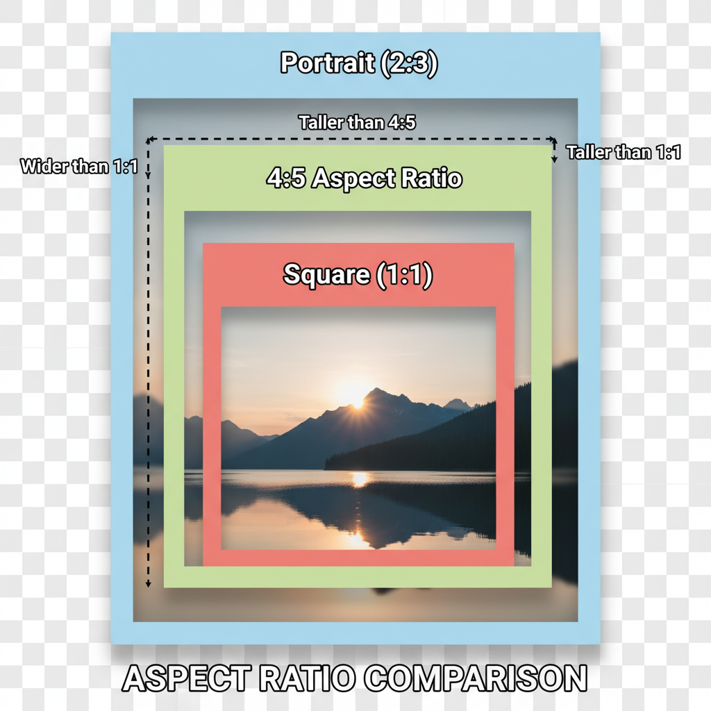
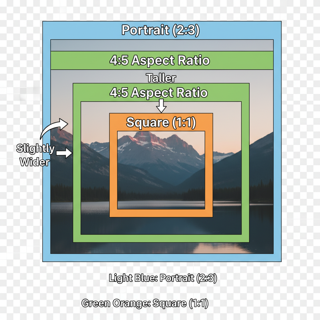
What Does the 4:5 Aspect Ratio Mean?
The 4:5 aspect ratio means every 4 units of width correspond to 5 units of height. It produces a vertical (portrait) format that is less tall than the ubiquitous 9:16 ratio used in Stories or TikTok videos.
For example:
- Width: 4 parts
- Height: 5 parts
This creates a tall rectangle suited to mobile scrolling, engaging users without occupying the full screen height. It’s particularly effective for in-feed posts.
---
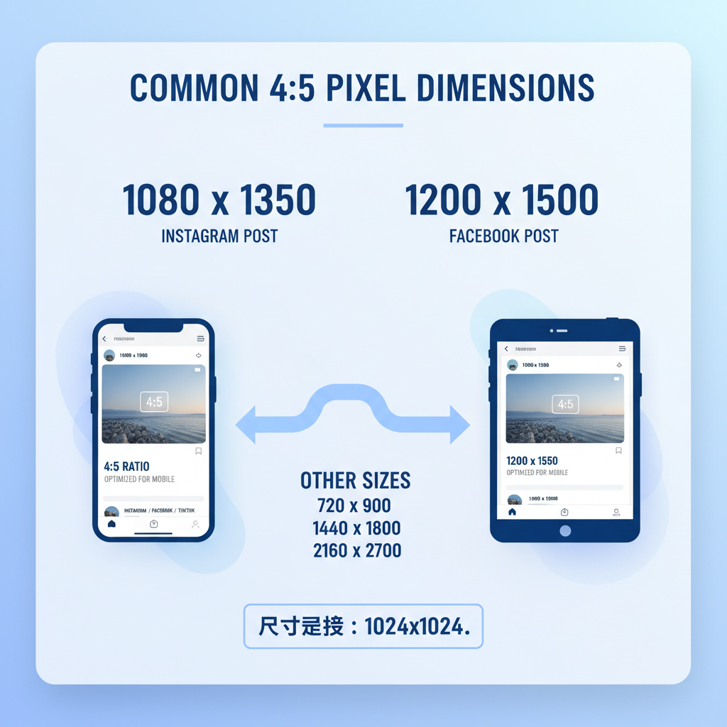
Common Pixel Dimensions for the 4:5 Aspect Ratio
Different platforms prefer different resolutions, but for the 4:5 format, these are widely recommended to balance quality, file size, and compatibility:
| Platform | Recommended Pixels | Notes |
|---|---|---|
| Instagram Feed | 1080 x 1350 | Most popular resolution for 4:5; prevents automatic cropping |
| Facebook Timeline | 960 x 1200 | Common for vertical image posts |
| 1000 x 1250 | Crisp pins without distortion |
---
Why 4:5 Is Popular on Social Media Platforms
On Instagram and Facebook, the 4:5 aspect ratio takes up more vertical space in the feed, which:
- Draws attention for longer durations
- Reduces the chance of being skipped while scrolling
- Increases engagement by commanding more visual real estate
By contrast:
- 1:1 square images appear smaller, offering less impact.
- 9:16 tall formats may be cropped in feeds, losing intended visual elements.
---
Benefits of 4:5 Versus Square or Portrait Formats
Choosing 4:5 aspect ratio size offers several advantages:
- Better visibility than square 1:1 without feed cropping
- Mobile compatibility that fits most devices comfortably
- Optimized for ads in mobile campaigns
- Flexible storytelling space accommodating visuals and text harmoniously
---
Creating 4:5 Images in Photoshop, Canva, or Mobile Apps
You can easily design correctly sized 4:5 visuals using popular tools:
In Photoshop
- File > New to open a blank document.
- Set dimensions: 1080 px width x 1350 px height.
- Choose 72 PPI resolution for web.
- Design within this canvas.
In Canva
- Create a Design → "Custom Size".
- Enter 1080 x 1350 px.
- Add visuals/text and export as PNG or JPG.
Mobile Apps
Using tools like Snapseed or VSCO:
- Import your image
- Select Crop tool → 4:5
- Adjust framing and save
---
Optimizing Images and Videos for 4:5 Without Quality Loss
Maintain professional quality by:
- Starting with high-resolution files — avoid enlarging low-res images
- Using lossless formats (PNG for stills, high bitrate MP4 for videos)
- Compressing only after all edits are complete
- Leveraging platform-specific export settings to minimize server compression
Pro Tip: Preview draft uploads to catch unexpected cropping or compression before publishing.
---
Best Practices for Composition in a 4:5 Frame
Composition brings the aspect ratio to life:
- Rule of Thirds to position elements at intersection points
- Centered vertical focal points to avoid odd framing
- Safe zones around text to prevent responsive cut-offs
---
Examples of Posts That Perform Well in 4:5 Format
Visual types that excel:
- Portrait Photography with sharp focus on the subject
- Product Shots integrated into lifestyle context
- Infographics that utilize vertical space efficiently
- Quotes & Typography for high-impact text delivery
These gain from increased feed visibility and balanced proportions.
---
Mistakes to Avoid
Avoid common pitfalls with 4:5 visuals:
- Distorting proportions by incorrect scaling
- Placing text too close to edges causing crop loss
- Using arbitrary dimensions leading to platform auto-adjustments
- Poor lighting which becomes more apparent in taller frames
---
Tips for Testing and Measuring Engagement
To gauge performance of 4:5 aspect ratio content:
- Run A/B tests comparing 1:1 vs 4:5 posts.
- Track reach, impressions, likes, and click-through rates.
- Use native analytics like Instagram Insights or Facebook Analytics.
- Optimize based on data trends for future campaigns.
---
Conclusion
The 4:5 aspect ratio size offers an ideal compromise between immersive visual impact and platform adaptability. By understanding its dimensions, optimizing for quality, and applying thoughtful composition, you can significantly boost engagement. Start experimenting with your own 4:5 images and videos in upcoming campaigns to enhance visibility and capture attention in crowded social feeds.
Ready to master your social media visuals? Apply these 4:5 best practices today to elevate your content strategy.