4x5 Pixels Size Guide for Photography and Social Media
Learn what the 4:5 aspect ratio means, where to use it, and how to create optimized images for social media and print without losing quality.
Understanding 4x5 Pixels: Aspect Ratio and Resolution Explained
If you're designing content for photography, social media, or print, understanding 4x5 pixels (or more precisely, the 4:5 aspect ratio) is essential. This ratio has become a go-to format for vertical visuals that attract attention in feeds and maintain professional quality in print. In this guide, we’ll break down what 4x5 really means, how it differs from resolution, its uses across platforms, and how to create and optimize your own images for maximum impact.
---
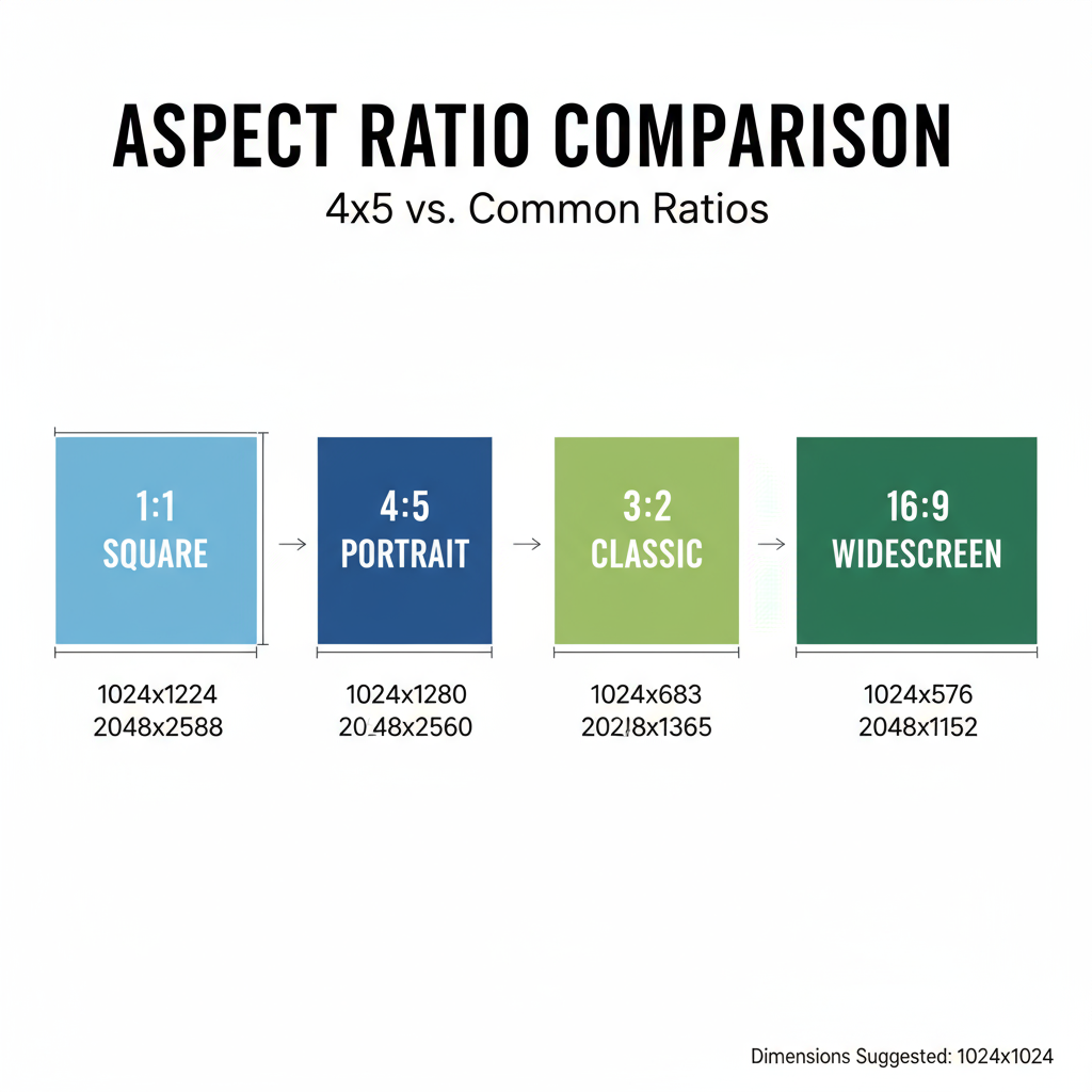
What Does “4x5 Pixels” Really Mean?
Strictly speaking, there’s no realistic image that is simply “4 pixels by 5 pixels” — that would be too tiny to see clearly. Instead, 4x5 usually refers to an aspect ratio, which is a proportional relationship between width and height:
- 4:5 aspect ratio = width is 4 units, height is 5 units
- It is most commonly used in portrait orientation
Examples:
- 800 × 1000 px – still 4:5
- 1200 × 1500 px – still 4:5
In all cases, the ratio stays the same even if the pixel count changes.
---
Aspect Ratio vs. Pixel Dimensions
Although they are often confused, aspect ratio and resolution are different:
- Aspect Ratio: The fixed proportion between an image’s width and height
- Resolution: The total pixel dimensions (width × height) that determine clarity and detail
Example Calculation:
An image at 1080 × 1350 px has a 4:5 aspect ratio because:
1080 / 4 = 270
1350 / 5 = 270
The scaling factor matches, confirming the ratio.
---
Where the 4x5 Ratio is Commonly Used
You’ll encounter this aspect ratio often in:
- Portrait Photography – Ideal for vertical framing of people
- Social Media Posts – Instagram feeds, Pinterest graphics, Facebook posts
- Marketing Materials – Posters, flyers, and ads
- Infographics and Pins – More vertical scrolling real estate in feed layouts
---
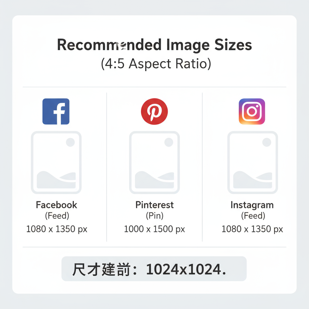
4x5 Image Sizes on Popular Platforms
Different platforms have size recommendations for 4:5 content to display at its best.
| Platform | Suggested 4:5 Dimensions | Notes |
|---|---|---|
| Instagram Feed | 1080 × 1350 px | Higher-resolution uploads are compressed |
| Pinterest Standard Pin | 1000 × 1250 px | Minimum recommended for vertical pins |
| Facebook Feed | 1200 × 1500 px | Optimized for both mobile and desktop |
| Print (8" × 10") | 2400 × 3000 px (300 DPI) | Standard high-quality print size |
---
Why Choose 4x5 for Social Media Engagement?
The 4x5 vertical format is advantageous for:
- Increased Screen Space – Fills more of the vertical feed and holds attention longer
- Flexibility in Storytelling – Extra height for subjects, text, or backgrounds
- Cross-Platform Usability – Avoids excessive cropping between Instagram, Facebook, and Pinterest
Because this ratio matches many platforms’ portrait standards, it reduces the need for re-cropping.
---
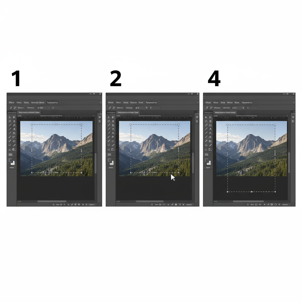
Creating a 4x5 Aspect Ratio Image in Popular Software
Photoshop
- Open your image
- Select the Crop Tool (`C`)
- Set the ratio to 4:5
- Adjust composition and crop
Canva
- Create a custom size (e.g., 1080 × 1350 px)
- Upload image and adjust placement
Figma
- Make a frame in a 4:5 ratio
- Place your image
- Resize and align for the best layout
---
Resolution Choices: Web vs. Print
Choosing the right resolution avoids unnecessary file sizes or blurry outputs:
- Web / Social Media: 72–150 DPI — e.g., 1080 × 1350 px
- Print: 300 DPI high-resolution — e.g., 2400 × 3000 px for 8"×10"
Note: DPI affects print quality, but web browsers only use pixel count.
---
Composition Tips for 4x5 Photography and Design
The taller frame opens possibilities for vertical storytelling:
- Rule of Thirds – Balance elements across vertical/horizontal lines
- Leading Lines – Use elements that guide the viewer’s eye upward
- Centering Symmetry – Works when subjects are symmetrical
Pro tip: Leave headroom and footroom so that mobile cropping doesn’t cut off important parts.
---
Common Issues with 4x5 Sizing and Fixes
Cropping Problems
- Issue: Important details get cut off in the feed
- Solution: Keep focal points in a central “safe zone”
Compression Artifacts
- Issue: Images look blurry online
- Solution: Export at optimal platform resolution so the site compresses it only once
Image Distortion
- Issue: Stretched or squashed photos
- Solution: Lock aspect ratio when resizing
---
Best Practices for Exporting and Optimizing 4x5 Images
For clarity and quick loading:
- Match Platform Dimensions – Prevent over-compression
- Choose Correct File Types – JPEG for photos, PNG for graphics, or WebP for smaller sizes
- Pre-Optimize Files – Use tools like TinyPNG or Squoosh
- Embed sRGB Profile – Maintains color consistency across devices
Photoshop Export Example:
- Format: JPEG
- Quality: 80–85%
- Resolution: 72 DPI (for web)
- Size: 1080 × 1350 px
---
Summary and Next Steps
Mastering the 4x5 aspect ratio means confidently creating content that looks sharp, fits perfectly, and performs well across platforms. By understanding the difference between ratio and resolution, matching platform guidelines, and applying good composition, you can maximize both visual impact and audience engagement.
Whether you’re a photographer, designer, or marketer, start applying the 4x5 format to your next project — you’ll quickly see how it elevates your images in feeds and in print.