800 x 600 Aspect Ratio Explained and Modern Uses
Learn the history, benefits, and modern uses of the 800 x 600 (4:3) resolution, from retro gaming to embedded systems and projector applications.

Introduction to the 800 x 600 Aspect Ratio and Resolution
The 800 x 600 aspect ratio has been a foundation in display technology for decades, particularly in the early era of computing. With its classic 4:3 ratio and straightforward pixel dimensions, it delivered clarity and compatibility across countless devices. Although modern screens favor widescreen formats such as 16:9, this traditional resolution still holds value in specialized fields like retro gaming, embedded systems, and industrial interfaces. Understanding its role, history, benefits, and limitations can help you decide when and how to use the 800 x 600 resolution effectively.
---
Understanding the 800 x 600 Aspect Ratio
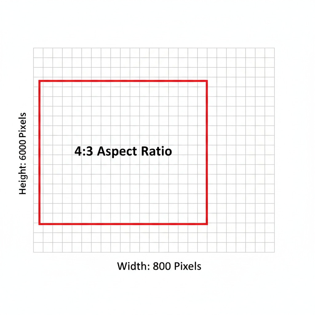
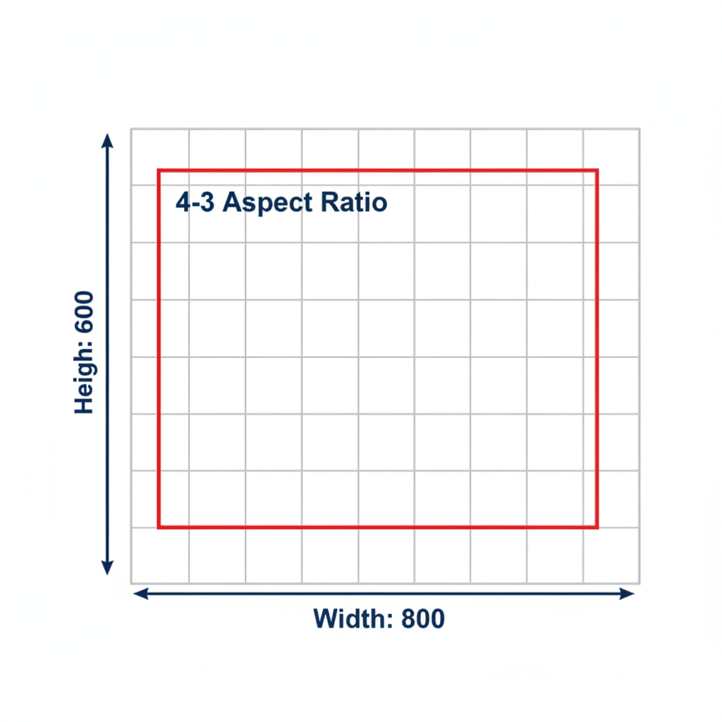
The 800 x 600 resolution refers to a display that is 800 pixels wide and 600 pixels tall.
Its aspect ratio is 4:3, meaning for every 4 units in width, there are 3 units in height. This ratio was dominant in the early days of computer monitors and continues to appear in targeted use cases.
The Math Behind 4:3
Aspect ratio is calculated as `width ÷ height`. For 800 x 600:
800 ÷ 600 = 1.333...This equals 4/3, or roughly 1.33, which defines the classic 4:3 standard.
---
A Brief History of 800 x 600 Displays
During the late 1990s and early 2000s, SVGA (Super Video Graphics Array) was a common standard for desktops and laptops. SVGA’s peak resolution of 800 x 600 provided:
- Adequate readability for text-heavy applications
- Compatibility with VGA hardware
- Moderate demand on GPUs and memory
In projector technology, 800 x 600 became the go-to for affordable presentation tools.
Schools, meeting rooms, and conference halls often relied on projectors locked to 4:3 resolutions.
---
4:3 Versus Modern Widescreen Ratios
Widescreen resolutions like 16:9 and 21:9 have largely replaced 4:3 for media consumption due to their cinematic feel and ability to display HD video without letterboxing.
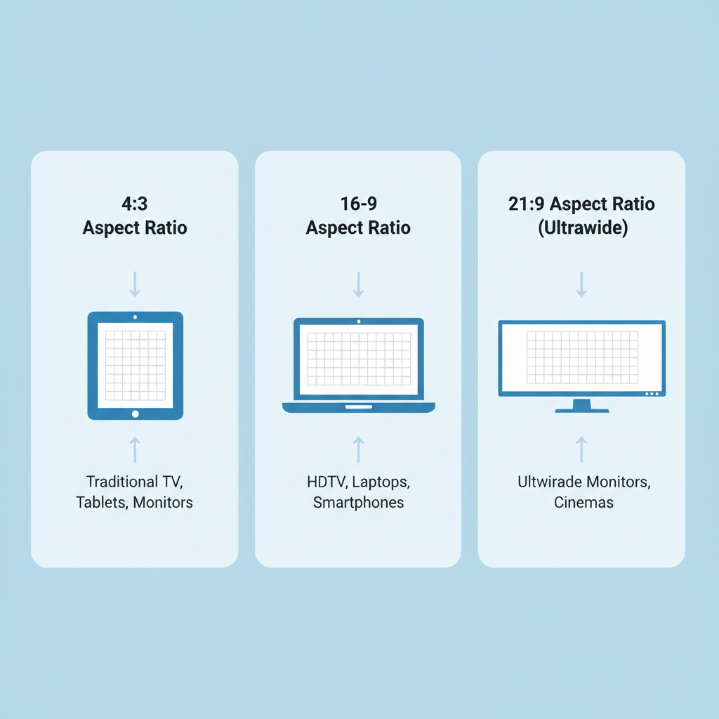
Comparison Table
| Resolution | Aspect Ratio | Common Width × Height | Primary Use |
|---|---|---|---|
| SVGA | 4:3 | 800 × 600 | Legacy PCs, Projectors |
| HD | 16:9 | 1920 × 1080 | Modern PCs, TV, Streaming |
| UltraWide | 21:9 | 2560 × 1080 | Gaming, Creative Media |
---
Modern Use Cases for 800 x 600
Even though it’s considered low resolution today, the 800 x 600 aspect ratio still thrives in certain fields.
Retro Gaming
- Many classic PC games were designed for 4:3 screens.
- Running them at native 800 x 600 avoids stretching and distortion.
Embedded Systems
- Industrial control panels use 800 x 600 LCDs for reliable interface layouts.
- Small embedded PCs and ARM devices often have hardware-limited resolutions.
POS (Point of Sale) Terminals
- Retail checkout systems prefer 4:3 for touch interface stability.
- Low GPU requirements keep power consumption down.
---
Benefits of Using 800 x 600
- Broad Compatibility – Works with older hardware, VGA cables, analog projectors.
- Readability – Larger UI elements compared to high-DPI screens.
- Low Resource Demand – Requires minimal CPU/GPU power.
- Ease of Scaling – Matches perfectly with 1600 x 1200 for simple 2× scaling.
---
Drawbacks and Limitations
While 800 x 600 has advantages, it also has significant limitations today:
- Media Restrictions – Cannot display full HD without scaling.
- Letterboxing – Wide content leaves black bars above and below.
- Reduced Workspace – Less room for multitasking; cramped for advanced tools.
- Software Incompatibility – Certain modern apps expect wider layouts.
---
Designing Graphics for 800 x 600
When creating visuals intended for 800 x 600, follow these best practices to avoid distortion:
- Keep the 4:3 aspect ratio in mind throughout the design process.
- Set your canvas size to 800 x 600 px for pixel-perfect alignment.
- Test at native resolution to check readability and positioning.
Example in CSS for a fixed 800 x 600 container:
.fixed-layout {
  width: 800px;
  height: 600px;
  aspect-ratio: 4 / 3;
  background-color: #222;
}
---
Tips for Scaling and Converting Images
Scaling from or to 800 x 600 can be tricky if the target ratio differs.
Downscaling from Widescreen
- Crop the sides to preserve aspect ratio before resizing.
- Maintain central focus; avoid cutting critical elements.
Upscaling Old Graphics
- Use nearest-neighbor scaling for pixel art to avoid blurring.
- For photos, apply bicubic scaling for smoother results.
---
The Role in Web Design and Responsive Layouts
Although modern web design emphasizes fluid layouts, fixed aspect ratios remain relevant:
- Game emulators – Preserving the original resolution inside a web player.
- Virtual museum exhibits – Maintaining scans in original dimensions.
- Kiosk interfaces – Fixed designs for predictable user interaction.
In CSS, the `aspect-ratio` property helps maintain shape:
.responsive-box {
  width: 100%;
  aspect-ratio: 4 / 3;
}
---
Future Relevance and Niche Applications
In 2024 and beyond, 800 x 600 aspect ratio displays will remain important for:
- Low-power embedded devices
- Hobby retro computing
- Specialized industrial control panels
- Educational institutions using legacy projectors or monitors
As mainstream displays continue embracing widescreen and high-DPI formats, 800 x 600 will persist in niches where its simplicity, compatibility, and reliability matter most.
---
Final Thoughts
The 800 x 600 resolution is more than a relic of computing history—it’s a functional, reliable format for specific applications. Understanding its 4:3 aspect ratio, historical importance, and design guidelines can help you optimize user experience in contexts where this resolution shines.
If your work involves restoring classic games, configuring POS terminals, or building embedded interfaces, leveraging the strengths of 800 x 600 ensures your project looks correct and performs smoothly. Explore this resolution’s possibilities and keep its legacy alive in today’s diverse digital ecosystem.