Optimizing 800 x 600 Image Size for Web and Design
Learn how to optimize 800x600 images for web and design, including benefits, drawbacks, best formats, and techniques to improve performance.
Introduction to the 800 x 600 Image Size
The 800 x 600 image size has a long history in digital media and web design, offering a reliable 4:3 aspect ratio that balances clarity with performance. Whether used in legacy systems, lightweight graphics, or presentations, understanding how to optimize 800x600 images is key to improving usability, accessibility, and SEO. Below, we’ll cover its origins, advantages, drawbacks, and best practices for making the most of this classic resolution.

---
Understanding the 800 x 600 Image Size
An 800 x 600 image size refers to an image with a width of 800 pixels and a height of 600 pixels. This corresponds to an aspect ratio of 4:3, a classic proportion that has been widely used in photography, computer monitors, and video displays.
Pixels are the smallest units of an image, and measuring dimensions in pixels allows designers and developers to control quality, clarity, and file size precisely.
---
History and Common Uses
In the early days of web design and digital photography, the 800x600 resolution was a standard choice. Here’s a brief timeline:
- Early Web Design (1990s–2000s): Most desktop monitors supported 800x600 as a default resolution. Websites were often built to fit this size to ensure compatibility.
- Presentation Software: Tools like PowerPoint offered slide dimensions based on the 4:3 ratio, making 800x600 a natural fit.
- Early Digital Cameras: Consumer cameras captured images at resolutions close to 800x600 in the late 1990s.
Even today, 800x600 images remain useful for specific applications such as small embedded graphics, thumbnails, lightweight slides, or legacy hardware compatibility.
---
Advantages of the 800 x 600 Image Size
- Faster Loading Times
- Smaller dimensions mean fewer pixels and reduced file sizes, which decrease page load times—crucial for user experience and SEO.
- Legacy Screen Compatibility
- Many older devices and embedded systems still use 800x600, ensuring your images display correctly without scaling.
- Balanced Clarity
- For small on-screen spaces, 800x600 offers a clean look without excessive data usage.
---
Drawbacks in the Modern Context
While practical, the resolution has limitations:
- Lower Resolution for HD Displays
- On 1080p or 4K screens, an 800x600 image may appear small or pixelated.
- Limited for High-Detail Graphics
- Images requiring fine detail—like professional photography—may lose quality.
---
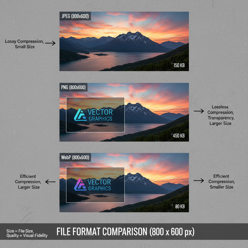
Ideal Formats for Saving 800x600 Images
Choosing the right format impacts both quality and performance.
| Format | Pros | Cons |
|---|---|---|
| JPEG | Good for photos, efficient compression, wide compatibility | Lossy compression can degrade quality |
| PNG | Lossless compression, supports transparency | Larger file sizes, not ideal for large photo collections |
| WebP | Advanced compression, supports transparency and animation | Not supported in some older browsers |
---
Optimization Tips for Web Use
Optimizing images ensures performance without degrading quality. Key methods include:
- Compression Tools: Use TinyPNG, Squoosh, or ImageOptim to reduce file size.
- Lazy Loading: Defer loading of images outside the viewport to save bandwidth.
- Alt Text: Provide descriptive `alt` attributes for SEO and accessibility.
Example HTML snippet for lazy loading:
---
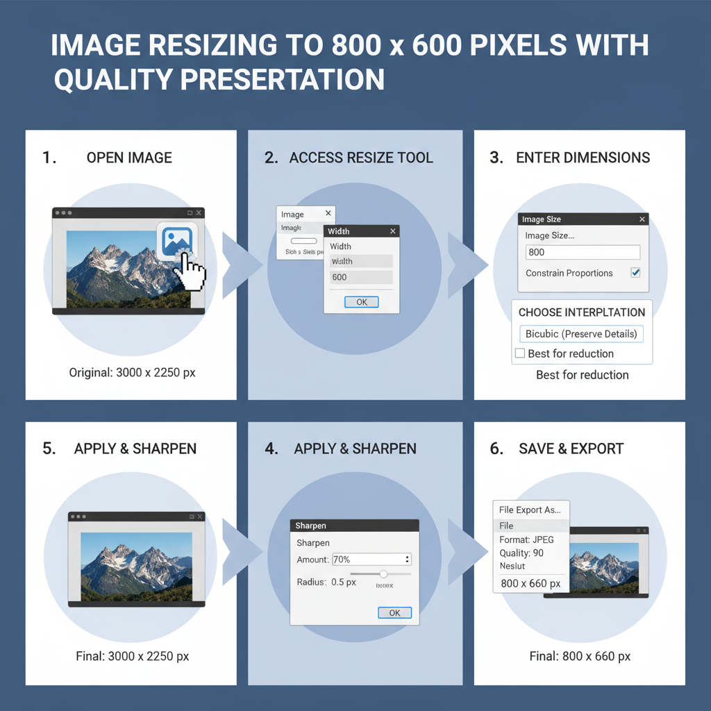
Resizing Without Quality Loss
It’s important to understand image types:
- Bitmap Images: Composed of pixels; upscaling beyond original resolution (800x600) can cause pixelation.
- Vector Graphics: Defined by mathematical paths; can be resized without loss of quality, but only suitable for illustrations/logos.
For bitmaps, upscale cautiously using AI-powered tools like Gigapixel AI or Photoshop’s “Preserve Details” option.
---
Best Practices for Creating 800x600 Images
Creating effective 800x600 images requires thoughtful composition:
- Grid Alignment
- Use a grid when designing to keep elements balanced.
- Crop Strategically
- Maintain the focal point while adhering to a 4:3 ratio.
- Consistent Color Profiles
- Ensure colors look consistent across devices.
---
SEO Benefits of Optimized Images
Optimized 800x600 images can boost rankings:
- Filename Keywords: Use descriptive names like `product-demo-800x600.jpg`.
- Metadata: Include EXIF data for photographers or IPTC info for editors.
- Responsive Scaling: Offer `srcset` attributes so browsers choose the appropriate size for the device.
Example:
---
Accessibility Considerations
Good accessibility practices include:
- Alt Descriptions: Clear and meaningful descriptions for screen readers.
- Contrast: Ensure foreground and background have sufficient contrast.
- Readability: If text is embedded in the image, keep it large enough to be legible at 800x600.
---
Testing Across Devices and Browsers
Even with a standardized resolution, rendering can differ. Recommendations:
- Test on multiple browsers (Chrome, Firefox, Safari, Edge).
- Check scaling behavior on mobile devices and tablets.
- Confirm colors render accurately under different OS settings.
---
When to Choose 800x600 vs Higher Resolutions
In modern design workflows, you might opt for higher resolutions because of retina displays and UHD screens. However, 800x600 remains relevant when:
- Performance is critical.
- Working with legacy systems.
- Creating icons, thumbnails, or diagram images that don’t require high detail.
For social media, higher resolutions are usually recommended, but keep optimized smaller versions for backups or specific niches.
---
Summary and Next Steps
The 800 x 600 image size is a versatile and historically significant resolution. Despite modern trends toward larger, high-definition images, it still holds value for certain contexts—especially for fast-loading, universally compatible content. By selecting the right file format, applying compression, following accessibility guidelines, and testing across devices, you can ensure this resolution delivers maximum performance.
When choosing between 800x600 and higher resolutions, factor in your project’s goals, your audience’s devices, and your need for speed. For more design and optimization tips, explore additional resources on responsive images and modern SEO strategies, and consider experimenting with different resolutions to find what works best for your visual content.