400 x 400 Pixels Guide for Digital Design and Web Use
Learn how to create, optimize, and use 400 x 400 pixel square images for social media, web, and mobile with best practices for clarity and speed.
Introduction to 400 x 400 Pixel Images
When working with digital content, understanding specific pixel dimensions like 400 x 400 pixels is essential for achieving crisp, platform-ready visuals. This square format offers a 1:1 aspect ratio, making it ideal for social media profiles, product thumbnails, and other web assets. In this guide, we'll explore how to create, optimize, and maintain 400 x 400 pixel images for maximum clarity and compatibility across devices.
Understanding Pixel Dimensions and Aspect Ratios
Pixels are the smallest units of a digital image or display. When we mention image dimensions like 400 x 400 pixels, we are referring to the width and height in terms of pixels.
An aspect ratio is the proportional relationship between width and height. A 400 x 400 pixel image has an aspect ratio of 1:1, meaning it is perfectly square. This shape is popular for avatars, thumbnails, and icons because it displays consistently across a wide range of devices and platforms.
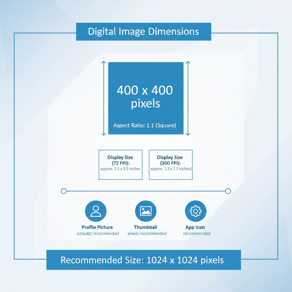
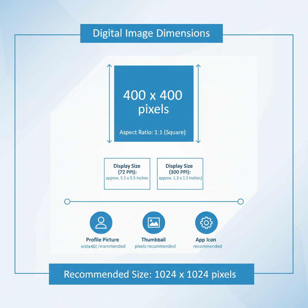
What 400 x 400 Pixels Means for Resolution and Display Size
A 400 x 400 pixel resolution means:
- Width: 400 pixels
- Height: 400 pixels
- Total pixel count: 160,000 pixels
The physical display size depends on the device’s pixel density, measured in PPI (pixels per inch). On a standard 72 PPI screen, a 400 x 400 image appears approximately:
- Width: ~5.56 inches
- Height: ~5.56 inches
On a Retina display with 144 PPI, that same image would be roughly half that size physically but boast much greater clarity.
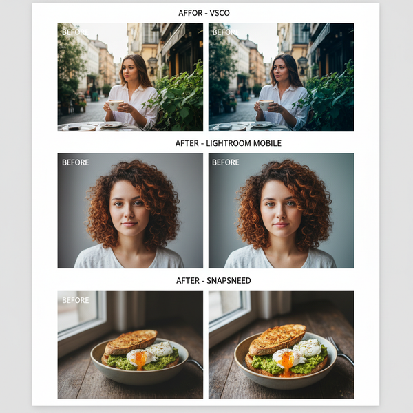
Common Use Cases for 400 x 400 Pixels
Square 400 x 400 images are highly versatile in digital and web contexts. Common applications include:
- Social media profile pictures (Facebook, Twitter, Instagram)
- Video thumbnails (YouTube channel branding elements)
- Product previews on e-commerce platforms
- Icons or UI graphics in apps and websites
- QR codes or small illustrations
Most platforms resize these images automatically, so starting with the right aspect ratio and resolution helps ensure the best possible outcome.
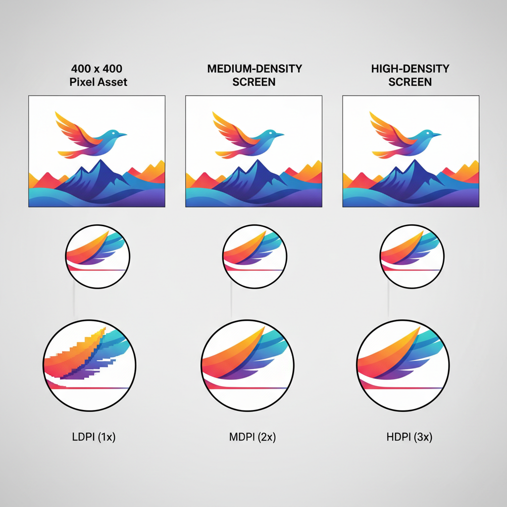
The Impact of Pixel Density (PPI/DPI) on Image Clarity
PPI (pixels per inch) measures pixel density for screens, while DPI (dots per inch) refers to print resolution. Higher PPI/DPI results in sharper, more detailed images.
For example:
| Display Type | PPI | Approximate Physical Size (400 px width) |
|---|---|---|
| Standard monitor | 72 | 5.56 inches |
| High-density mobile screen | 300 | 1.33 inches |
| Retina laptop | 220 | 1.82 inches |
Key takeaway: Same pixel dimensions will physically appear smaller on high-density screens but with increased detail.
Creating a 400 x 400 Pixel Image in Popular Design Tools
Photoshop
- Open File → New
- Set Width = 400 px, Height = 400 px, Resolution = 72 PPI (web) or higher for print
- Choose RGB Color mode for digital
- Click Create
- Design or import your image
File > New
Width: 400 px
Height: 400 px
Resolution: 72 PPI
Color Mode: RGB
Canva
- From the homepage, click Create a design → Custom size
- Enter 400 (width) x 400 (height) in pixels
- Design using templates or upload your own assets
GIMP
- File → New
- Set Image size = 400 x 400 px
- Adjust resolution based on output requirements
- Design, then export in your desired format
Optimizing 400 x 400 Pixels for Web and Mobile
Optimization ensures fast loading without compromising quality.
Key practices:
- Use JPEG for photos, PNG for graphics with transparency
- Balance compression and quality (JPEG quality ~70–80)
- Consider WebP for modern browsers
- Keep file size under ~200 KB
Recommended Tools:
- TinyPNG
- ImageOptim
- Squoosh
Importance of Maintaining Aspect Ratio Across Platforms
Keeping the original 1:1 aspect ratio prevents distortion. Platforms may automatically crop or resize, so mismatched proportions can result in:
- Squashed or stretched visuals
- Missing key elements
- Weakened brand presentation
Designing in the correct aspect ratio from the outset avoids structural issues in layouts.
Examples of Platform-Specific Requirements for Square Images
Different platforms have preferred square image sizes:
| Platform | Recommended Size | Why 400 x 400 Works |
|---|---|---|
| Instagram Profile | 320 x 320 px | 400 px ensures higher quality when compressed |
| Twitter Profile | 400 x 400 px | Exact match |
| Facebook Profile | 170 x 170 px | Sharper downscaled image from 400 px |
| LinkedIn Profile | 400 x 400 px | Exact match |
Starting with 400 x 400 pixels meets or exceeds most square image specifications.
Troubleshooting Issues with 400 x 400 Images
Common issues and fixes:
- Stretching: Lock aspect ratio during resizing.
- Cropping: Keep important elements centered.
- Quality loss: Avoid multiple JPEG saves and use correct export settings.
Checklist:
- Confirm 1:1 aspect ratio
- Use high-quality source images
- Save once with optimal settings
- Test on various platforms/devices
Best Practices for Exporting and Maintaining Quality
- Design at target resolution — avoid later upscaling
- Choose correct format:
- PNG for graphics with transparency
- JPEG for photos
- WebP for browser optimization
- Descriptive filenames for SEO, e.g., `profile-photo-400x400.jpg`
- Provide multiple resolutions for responsive layouts
- Archive originals in lossless formats like PSD or TIFF
Final Tip: Always preview exported 400 x 400 pixel images on both desktop and mobile to confirm clarity, cropping, and load speed.
---
Summary & Next Steps
By mastering 400 x 400 pixel image creation, optimization, and export techniques, you can ensure your visuals remain sharp, professional, and consistent across all platforms. Whether for social media, e-commerce, or app design, this square format delivers adaptable and reliable results. Start designing your own optimized images today to elevate your brand’s visual impact.