Dimensions and Pixels Explained for Web and Print Use
Learn how dimensions, pixels, and resolution affect image clarity, performance, and sizing for both web and print, with tips for optimal results.
Understanding Dimensions and Pixels in Digital Media
When creating or optimizing images for digital media, understanding image dimensions and pixels is crucial for achieving clarity, fast loading speeds, and proper display across devices. These core concepts impact everything from image sharpness to SEO performance, whether for web or print.
Simply put:
- Pixels are the smallest square units of an image, representing a single color.
- Dimensions refer to the width and height of an image in pixels.
An image that is 1920×1080 pixels has a width of 1920 pixels and a height of 1080 pixels.
Mastering how dimensions and pixels work together will help you create visuals that appear crisp, are appropriately sized for their platform, and provide an optimal user experience.
---
Resolution, Dimensions, and Pixel Count
Resolution measures how many pixels are displayed per inch: PPI (pixels per inch) for digital displays and DPI (dots per inch) for printing. It works in combination with image dimensions to define visual quality.
You can calculate pixel count by multiplying width × height:
Example:
1920 × 1080 = 2,073,600 pixels (~2.07 megapixels).
Key relationships:
- Dimensions: determine the total number of pixels.
- Resolution: determines pixel density in a physical space.
- Pixel count: affects clarity and potential print size.
---
Pixel Density vs. Image Size
A frequent misconception is confusing pixel density (PPI/DPI) with pixel dimensions.
- Pixel Density (PPI/DPI): How tightly pixels are packed together.
- Image Size (in pixels): Total number of pixels horizontally and vertically.
For the web, pixel dimensions matter more than PPI, as browsers display images based on their pixel count. In print, however, higher PPI results in sharper images.
---
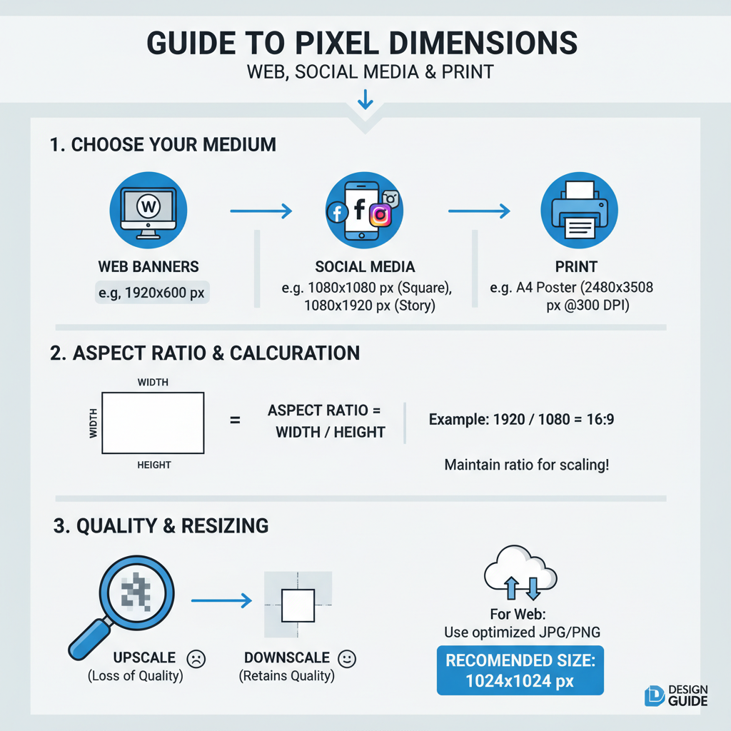
Common Pixel Dimensions for Various Uses
Choosing optimal dimensions depends on your platform or purpose.
| Use Case | Typical Dimensions (pixels) | Notes |
|---|---|---|
| Full HD Screen | 1920 × 1080 | Standard for videos and large images |
| 4K Display | 3840 × 2160 | High-resolution, large file sizes |
| Web Banner | 1920 × 600 | Hero sections, responsive scaling needed |
| Instagram Post | 1080 × 1080 | Square format |
| Facebook Cover | 820 × 312 | Display scaling on mobile and desktop |
| Print (A4 at 300 DPI) | 2480 × 3508 | High quality for professional prints |
---
Calculating Aspect Ratios and Maintaining Quality
The aspect ratio is the ratio of width to height, written as two numbers separated by a colon (e.g., 16:9).
width ÷ height = aspect ratio valueExample:
1920 ÷ 1080 = 1.777... ≈ 16:9
When resizing:
- Lock aspect ratio in editing tools.
- Use proportional CSS settings, e.g.,
- `max-width: 100%; height: auto;`
This prevents stretching or squashing.
---
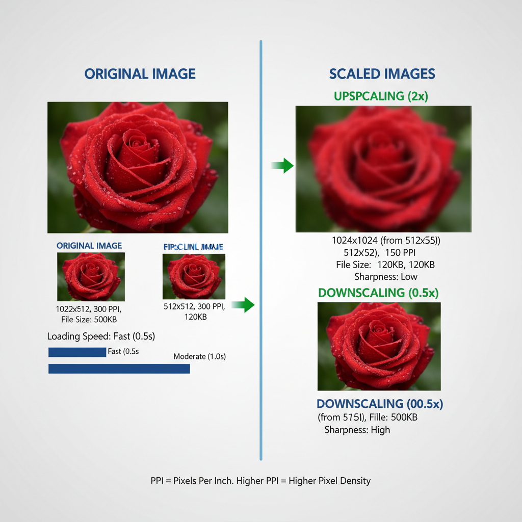
Effects of Upscaling and Downscaling
- Upscaling: Enlarging images beyond their original pixel count often causes blurriness due to interpolation.
- Downscaling: Reducing size generally retains sharpness but may lose detail if too extreme.
Optimization tip: Start with a high-resolution source and use advanced algorithms like Bicubic Smoother for enlarging.
---
Choosing the Right Dimensions for Website Optimization
Dimensions influence both load time and SEO. Larger images = more pixels = bigger files.
Best practices:
- Limit size to the maximum needed display width.
- Serve responsive images using `srcset`.
- Consider modern formats like WebP or AVIF.
Example responsive HTML:
---
Impact on File Size and Loading Speed
More pixels mean larger files, which can harm:
- Loading speed
- SEO ranking
- User engagement
Balance pixel dimensions, compression quality, and format choice for optimal results.
---
Tools for Checking and Adjusting Dimensions
Popular tools:
- Adobe Photoshop – advanced resizing options.
- GIMP – open-source, versatile.
- TinyPNG / Squoosh – compression-focused.
- Figma / Canva – quick layout and social media sizing.
- ImageMagick – command-line bulk resizing.
---
Maintaining Quality Across Devices
Tips for sharp images everywhere:
- Use vector graphics for scalable icons/logos.
- Provide 2× pixel density images for retina screens.
- Test on multiple devices and browsers.
- Implement lazy loading for performance.
---
Best Practices for Exporting Images
- JPEG: Photographs, adjustable compression.
- PNG: Lossless, ideal for transparency.
- WebP: Modern, smaller file sizes with high quality.
- AVIF: Even smaller, but check browser support.
Photoshop export steps:
- File > Export > Save for Web (Legacy)
- Select file format.
- Adjust compression until quality–size balance is met.
- Preview before saving.
---
Troubleshooting Blurry or Distorted Images
Causes:
- Wrong aspect ratio.
- Over-upscaling.
- Excessive compression.
- Low-resolution source.
Fixes:
- Re-export from the highest-quality version.
- Maintain aspect ratio during scaling.
- Use correct PPI for print; focus on pixels for web.
---
Summary
In digital media, image dimensions and pixels are the foundation of visual quality and performance. Understanding their relationship with resolution, file size, and aspect ratio helps you create sharp, fast-loading visuals for both web and print.
By following the best practices above, you can:
- Deliver crisp, adaptive images.
- Enhance site speed and SEO.
- Avoid common image quality issues.
Start applying these optimization techniques today to improve your visual assets and give your audience the best possible experience.